10 finishes that give you the high-end look for less
You don’t have to chase expensive materials. Choose finishes that photograph well, wear well, and play nicely together.
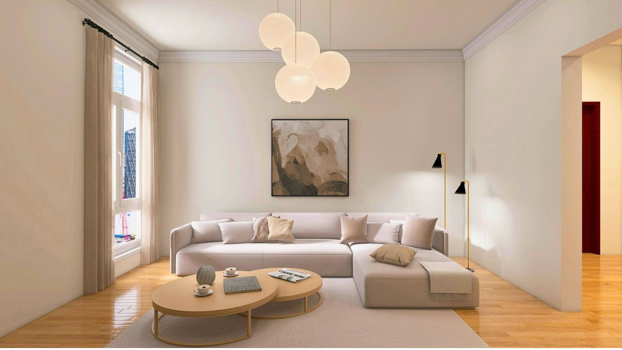
Warm white paint with a soft sheen
A creamy, not yellow, white in eggshell on walls and semi-gloss on trim looks tailored without feeling sterile. It flatters wood tones and softens shadows. Test large swatches in daylight and at night before you commit.
Matte black metal
Black frames, curtain rods, or a simple sconce add definition the way eyeliner does—clean edges, not drama. Repeat the finish at least twice so it reads intentional. Matte hides fingerprints better than shiny.
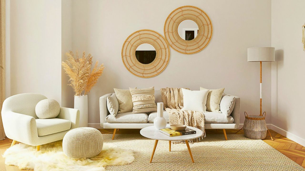
Soft brass (not mirror-shiny)
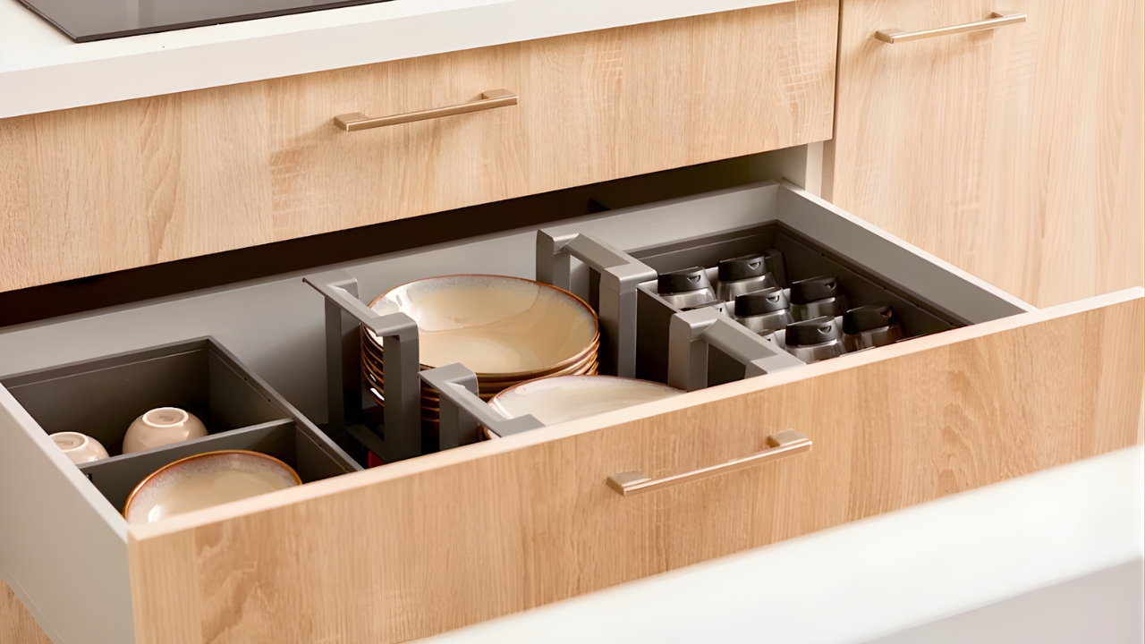
A warm brass faucet or cabinet pull brings age and warmth to plain cabinets. Keep it brushed or satin so it doesn’t feel costume. Repeat in a frame or lamp base and you’ve got a quiet throughline.
Linen and cotton blends
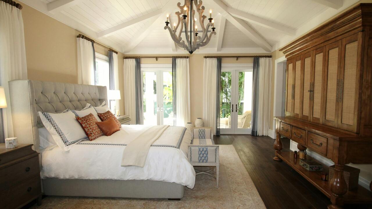
Natural fibers make budget rooms feel calmer. Linen panels that kiss the floor, cotton pillow covers with real texture, and a simple quilt add “hand” you can feel. Neutrals let the weave do the talking.
Natural fiber rugs
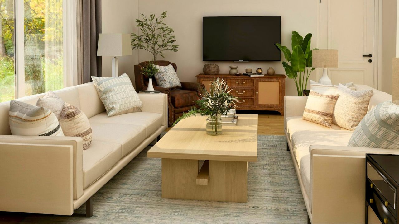
Jute and sisal create a foundation that makes everything above look better. Layer a patterned wool or vintage-look rug on top for comfort. The texture is what sells “elevated,” not the label.
Honed or matte surfaces
High gloss shows every fingerprint and glare. Honed stone, matte tile, and eggshell paint read softer and more expensive in real life and in photos. If you already have shiny, balance it with matte textiles and wood.
Porcelain that looks like stone

You can get believable stone looks in porcelain for a fraction of the cost and maintenance. Choose subtle veining and larger tile sizes with tight grout lines. Keep grout close to the tile color for a seamless read.
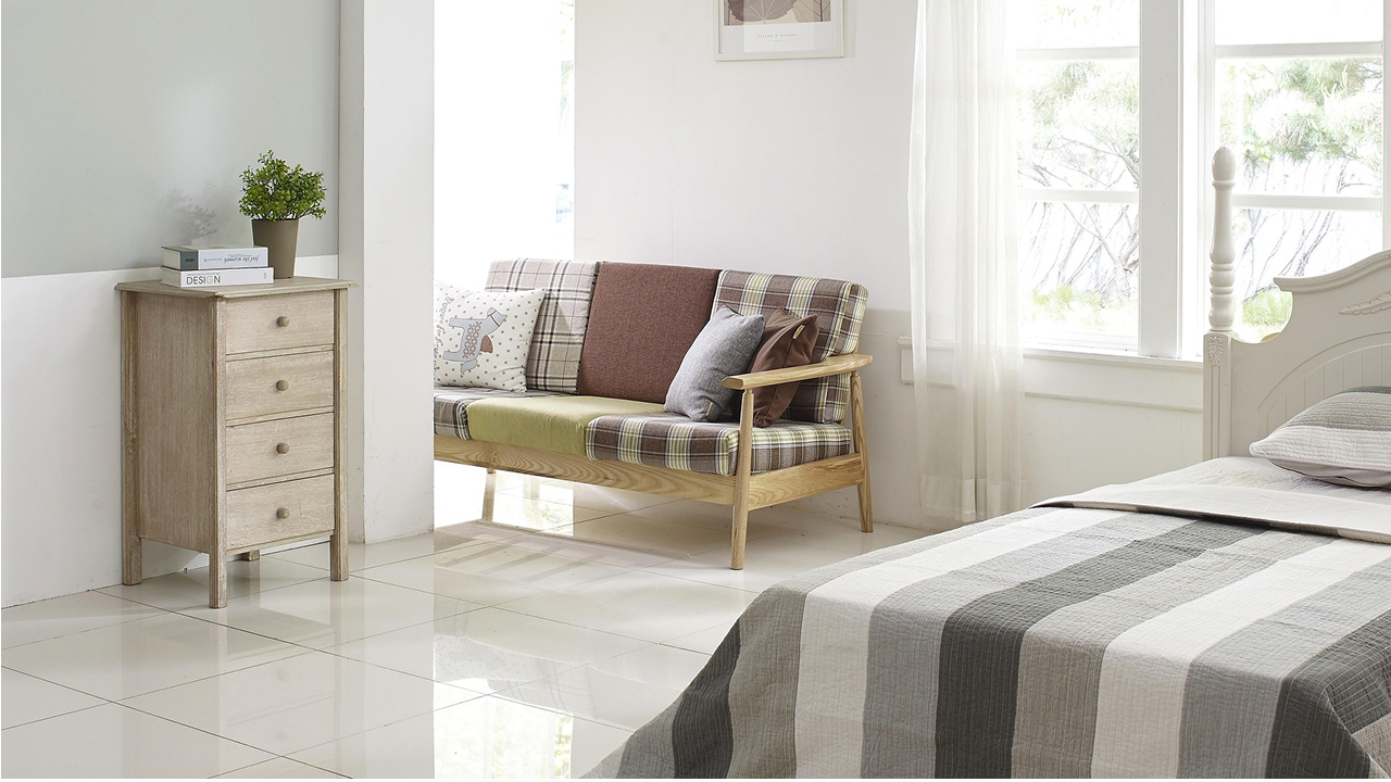
Wood tones with visible grain
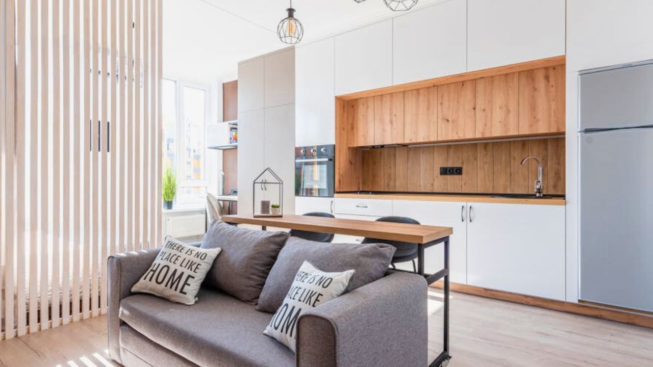
Even a simple console looks pricier when the grain shows. Skip heavy red or orange stains; aim for mid-tone oak, walnut, or a light natural finish. Repeat the tone in a bowl or frame so it belongs.
Subtle, color-matched caulk and grout

Nothing wrecks a finish like bright white grout on a dark floor or mismatched caulk lines. Color-match grout to tile and caulk to counters and trim. The seam should disappear so the surface can shine.
Simple edge details
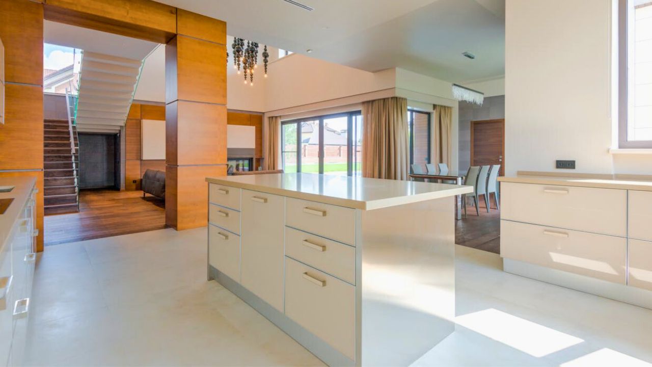
Flat-front cabinets with a beefier pull, countertop edges that are square or eased (not fussy), and clean baseboards give you that “quiet architecture” look. When lines are crisp, the whole room feels more expensive—even if the pieces weren’t.
Like Fix It Homestead’s content? Be sure to follow us.
- Man Says He Found Out the Fence He Paid For Wasn’t Actually on His Property
- Woman Says Her Neighbor Started Taking Mulch From Her Delivery Pile Before She Could Even Spread It
- I made Joanna Gaines’s Friendsgiving casserole and here is what I would keep
- What Caliber Works Best for Groundhogs, Armadillos, and Other Digging Pests?
*This article was developed with AI-powered tools and has been carefully reviewed by our editors.