10 Paint Choices That Make Any Room Look Bigger
The right colors can completely change how a space feels—making it look bigger, brighter, and more open without moving a single wall. You don’t need to stick with plain white to get that effect either. Certain tones naturally reflect more light, trick the eye, and soften harsh edges.
If you’re ready to make a room feel more spacious, these paint choices actually help—and they don’t require a full renovation to work.
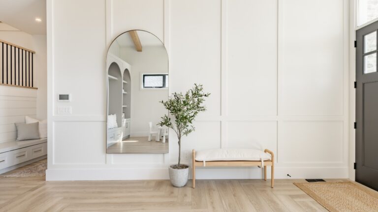
Soft Off-White
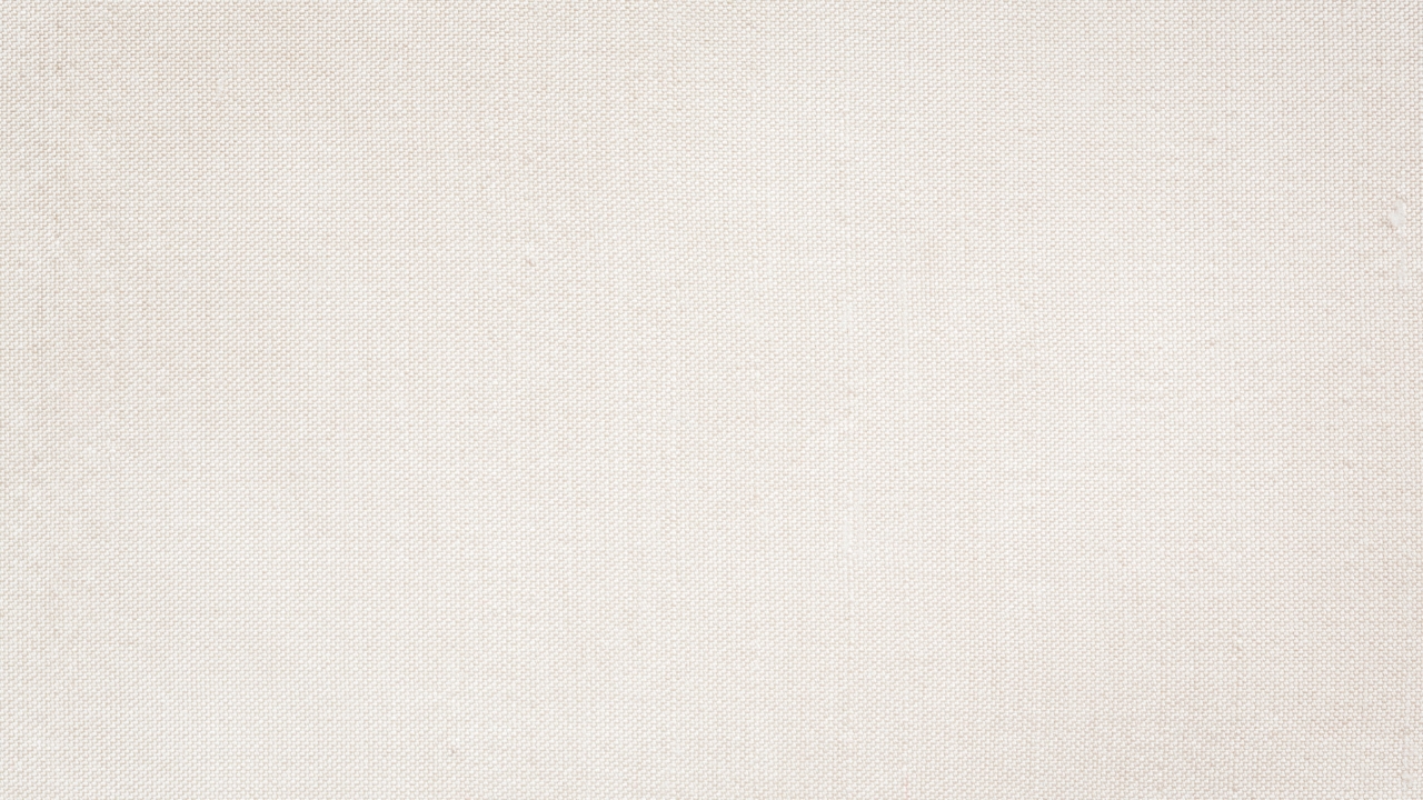
You don’t have to default to pure white to make a room feel larger. Off-white adds a bit of warmth, which makes a space feel inviting while still reflecting light well. It’s one of the easiest ways to brighten up tight corners or low ceilings without making the space feel sterile.
Stick to something with a creamy base if your room doesn’t get much natural light. Cooler off-whites can look dingy in darker spaces, but a soft warm white will keep things feeling light and clean.
Light Taupe
If you’re not into white walls, light taupe is a safe bet. It adds color without closing in the room and pairs well with almost any style. It works especially well in living rooms or bedrooms where you want a neutral backdrop that still feels cozy.
You can layer it with soft grays, beige tones, or wood accents and still keep the space looking open. It also does a good job hiding scuffs or smudges, which is a bonus in high-traffic areas.
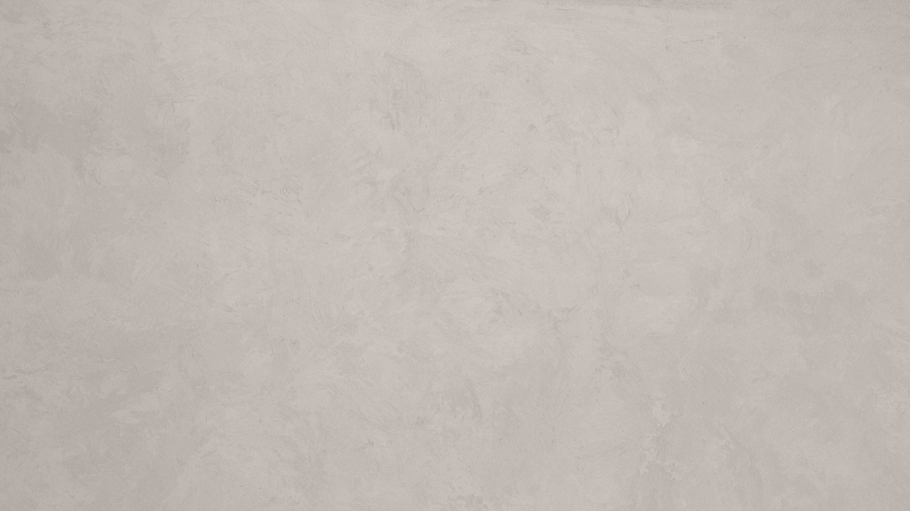
Pale Gray

Pale gray is a solid go-to if you want something modern but not too dark. It gives you contrast without shrinking the space. Look for tones with a slight blue or green undertone to keep the room feeling cool and airy.
Avoid darker charcoal shades if you’re working with a small or windowless room. The lighter you go, the more you’ll benefit from the gray’s clean lines without making the space feel boxed in.
Cool Blue

A soft blue with a cool base can make walls seem to recede, which instantly adds depth. It’s a great choice for bathrooms or bedrooms, especially if you want to give the space a calm, breezy feel.
Blues tend to reflect light well, especially in natural daylight. Just make sure you test the shade in your space first—some can turn icy or too vibrant depending on your lighting.
Warm Beige

Beige gets a bad rap, but the right shade can work wonders in a small space. Warm beige tones keep things feeling grounded while still reflecting light. It’s a good match for homes with traditional or farmhouse-style decor.
It’s also incredibly forgiving. If you’ve got kids, pets, or textured walls, beige hides a lot and still looks pulled together. It won’t make your room feel boxed in the way darker warm colors sometimes do.
Greige

Greige—gray mixed with beige—is a favorite for a reason. It gives you a little warmth, a little coolness, and a whole lot of flexibility. It works in modern, rustic, or transitional spaces without fighting the light.
In rooms that change throughout the day, greige adapts to the lighting well. It won’t feel too dark at night or too washed out in the sun. That balance makes it ideal for keeping your space looking open and clean.
Pale Sage

Pale sage is a light green-gray that feels fresh without being loud. It adds personality while still helping the space breathe. In kitchens, bathrooms, or even nurseries, it gives off a clean, airy vibe.
Sage pairs well with white trim, wood tones, and even black hardware if you want some contrast. Just steer clear of deeper greens unless the room gets a lot of light—those can close in a space quickly.
Soft Blush
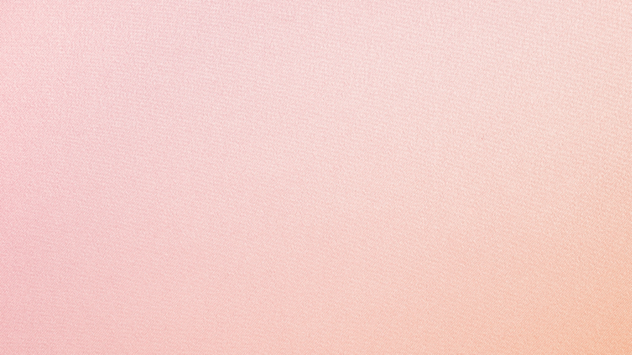
If you want a subtle hint of color without shrinking the room, blush is worth considering. It adds a touch of warmth without being overpowering, especially when used in bedrooms or powder rooms.
Blush tones reflect light better than you’d think, especially those with a beige or peach undertone. They’re also easier to match with flooring and furniture than bright pinks or corals.
Pale Yellow

A soft yellow can make a dim room feel like it’s full of sunlight. It’s a good pick for hallways, laundry rooms, or kitchens where you want energy without the walls feeling like they’re closing in.
Stick to buttery or muted shades, not anything too bright or golden. Those can overwhelm a small room fast. A pale yellow with a warm undertone will keep things cheerful and light without looking dated.
Light Terracotta

For a bit more character, a faded terracotta can bring warmth and openness at the same time. It works best in well-lit rooms where the natural light can soften the color even more.
This shade can make a room feel grounded without feeling heavy. It’s especially nice in sunrooms, entryways, or any space that could use a little personality without sacrificing that open, airy feel.
*This article was developed with AI-powered tools and has been carefully reviewed by our editors.