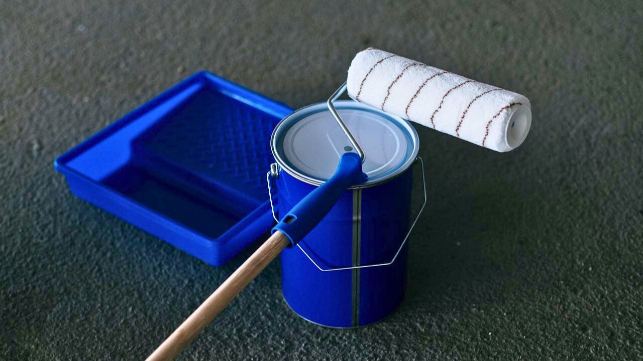
10 ways to use paint that feel more expensive than they are
Paint is the fastest transformation you’ve got. The trick is using it to clean up lines, add structure, and flatter what you already own.
Pick one house white and stick to it
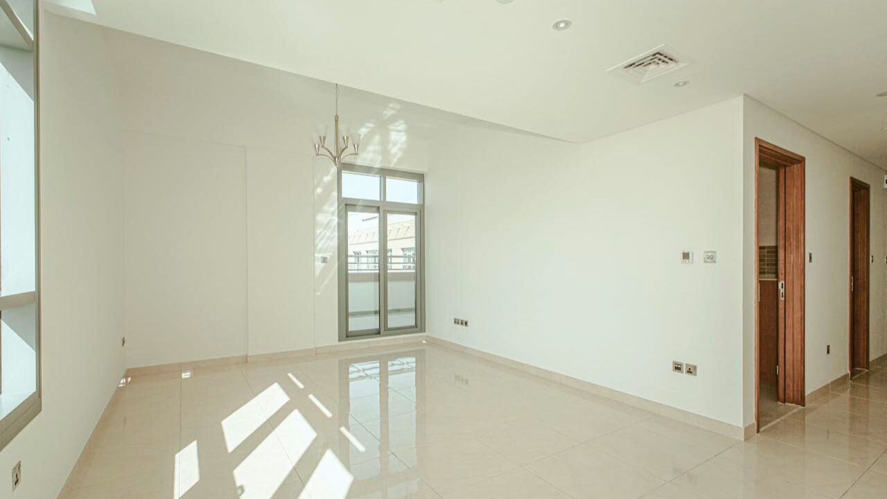
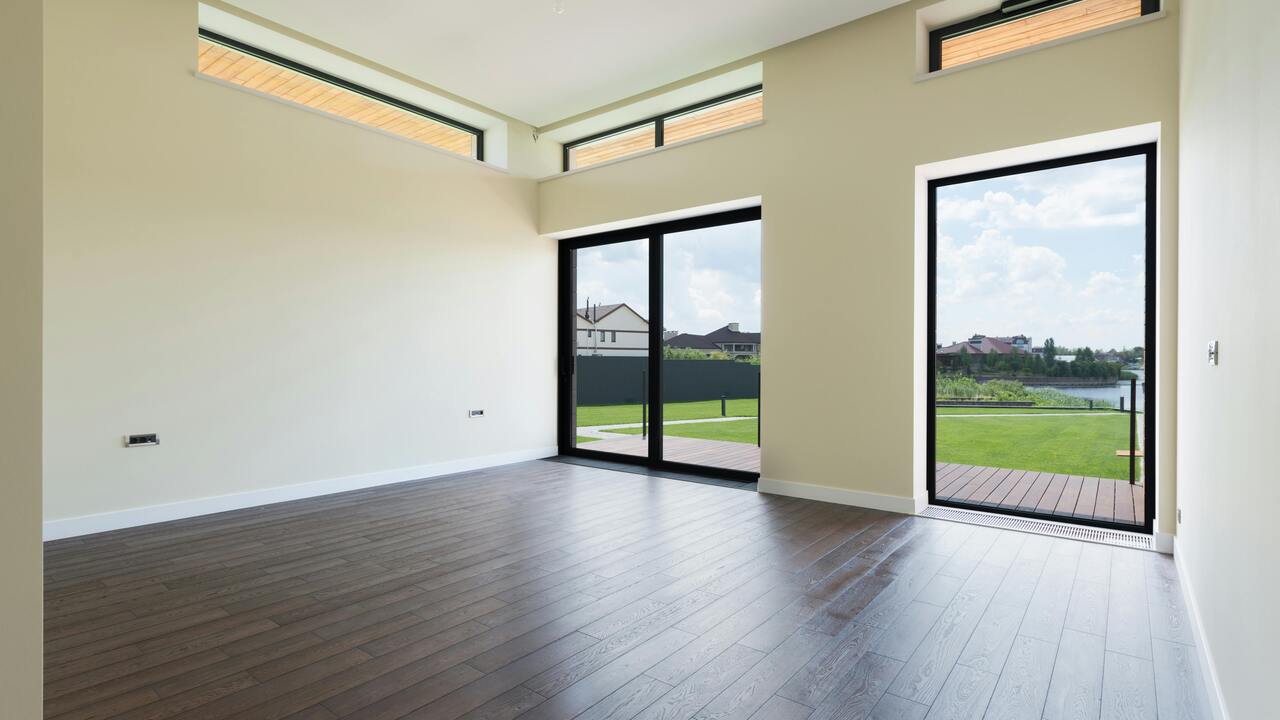
Choose a warm, soft white for trim, doors, and ceilings. Keep it consistent throughout shared spaces so your eye isn’t relearning the palette every doorway. Semi-gloss on trim, eggshell on walls. Consistency is what makes rooms handshake as you move.
Color-drench small rooms for calm
Powder rooms, offices, and dens love a color-drench—walls, trim, and doors all one deep tone. It hides wonky angles and makes millwork look richer. Keep the ceiling one shade lighter if you need lift. Add warm bulbs and the room suddenly feels intentional, not dark.
Wrap the ceiling to fix chop
Choppy rooms with lots of breaks—beams, soffits, odd angles—benefit from carrying the wall color onto the ceiling. It erases visual stops and makes low ceilings feel less low. If you’re nervous, use the same hue cut to 50% strength overhead.
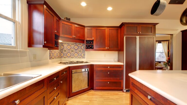
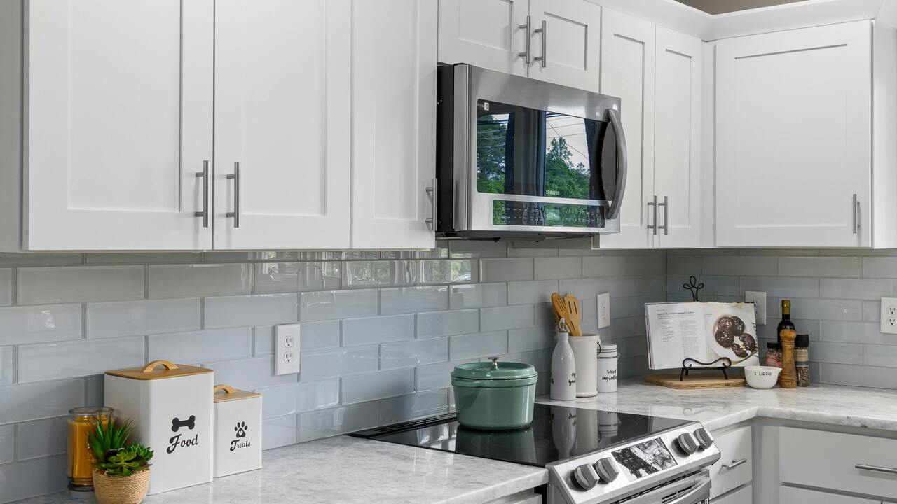
Use tone-on-tone frames and vents
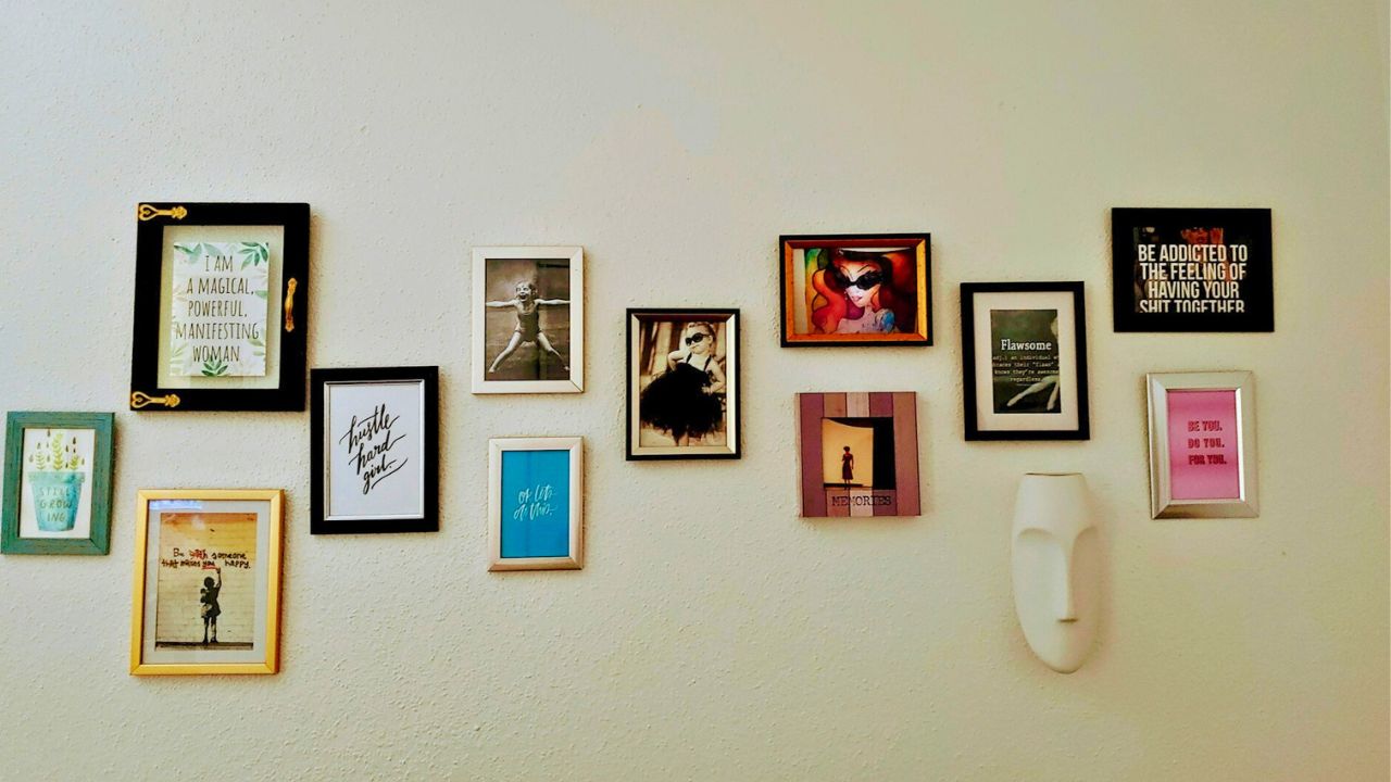
Nothing ruins a wall like a bright white vent or a black TV frame around pale art. Paint vents the wall color. For gallery walls, paint frames in one tone (black, wood, or the wall color) so the art does the talking. Quiet hardware lets your paint choice shine.
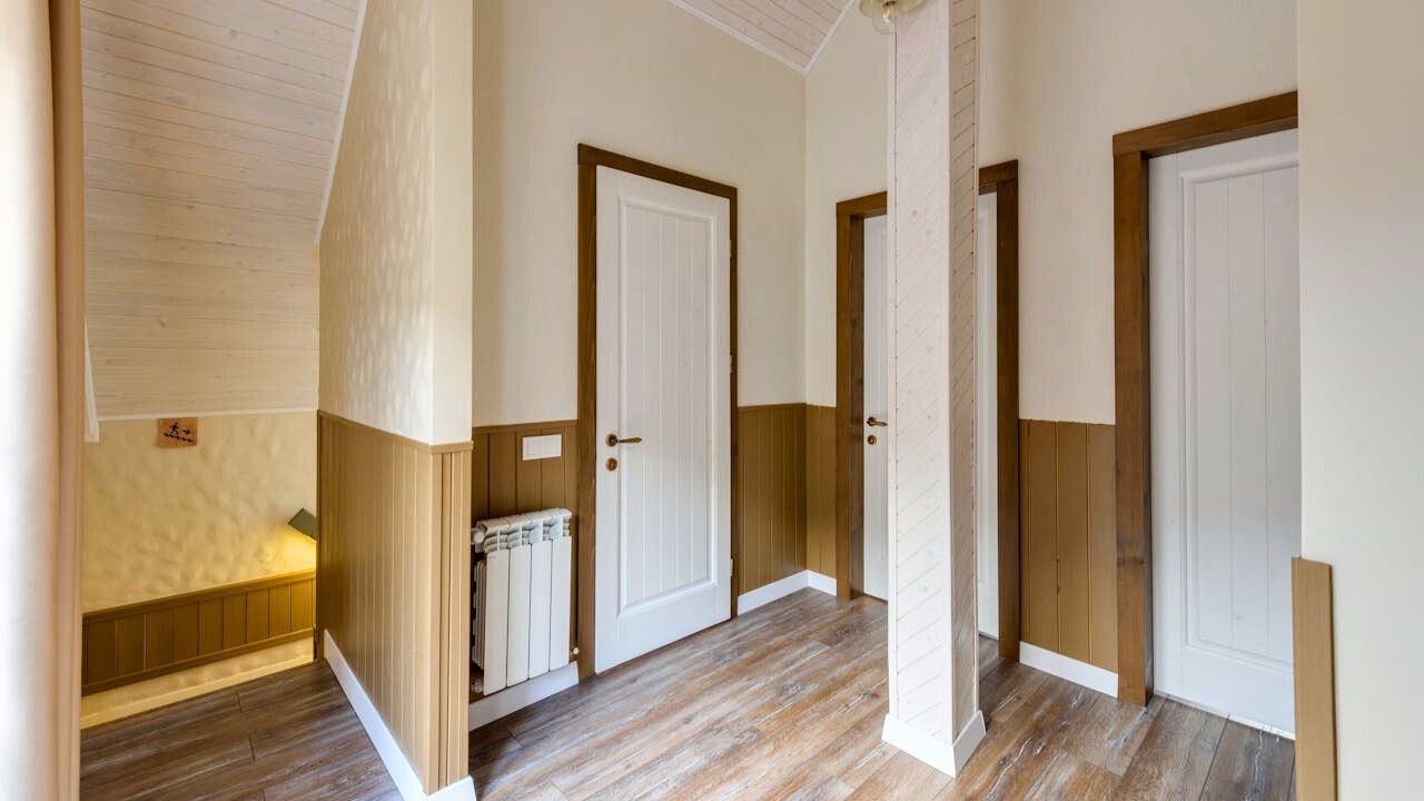
Fake architecture with a painted wainscot
If a room lacks detail, add a painted “chair rail” height band around the perimeter—darker below, lighter above. Keep the line at 34–38 inches. It gives you proportion and protects walls where chairs and backpacks hit. A simple strip of molding later can turn it into the real thing.
Make doors part of the story
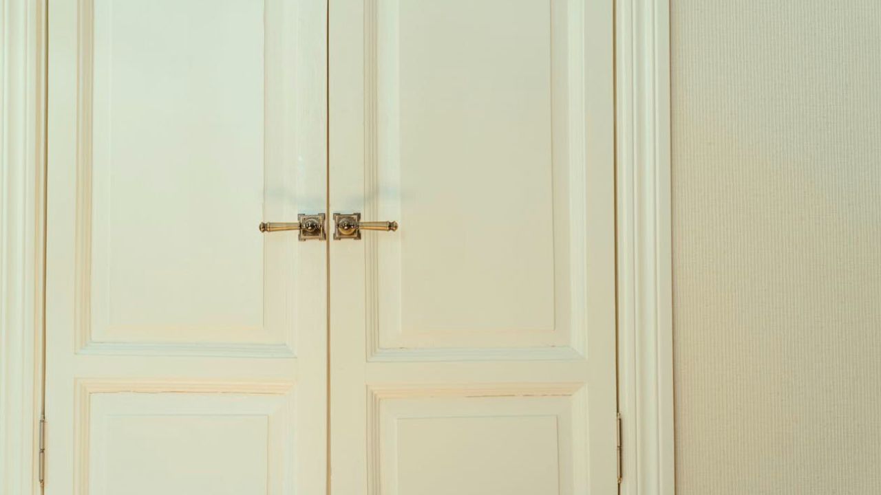
Paint interior doors the trim color for a classic look, or the wall color to make them disappear. In mudrooms or kids’ rooms, a darker door hides fingerprints and looks tailored. Add a heavier lever in a finish that matches your lights and the whole wall grows up.
Blend odd tile with a strategic wall color
When swapping tile isn’t happening, pick a wall color that softens its undertone. Busy brown-speckled granite calms with mushroom or greige. Cool gray tile warms up with a creamy white. You’re harmonizing, not matching, so the tile stops shouting.
Paint built-ins to disappear or star
If your bookcase is shallow and cluttered, paint it the wall color so display fades and the room feels bigger. If the built-in has great lines, paint it a few shades darker than the walls to spotlight the architecture. Either choice looks deliberate.
Use a dark back wall to deepen a skinny room
In long, narrow rooms, paint the far short wall a deeper color. It visually pulls the wall closer, correcting the bowling alley feel. Keep side walls lighter so the depth trick lands.
Respect sheen so surfaces read right
Flat hides sins but scuffs fast. Eggshell for most walls, satin in baths and kitchens, semi-gloss on trim, and flat on ceilings. When sheen is right, light plays nicely and paint looks pricier than it was.
Like Fix It Homestead’s content? Be sure to follow us.
- Man Says He Found Out the Fence He Paid For Wasn’t Actually on His Property
- Woman Says Her Neighbor Started Taking Mulch From Her Delivery Pile Before She Could Even Spread It
- I made Joanna Gaines’s Friendsgiving casserole and here is what I would keep
- What Caliber Works Best for Groundhogs, Armadillos, and Other Digging Pests?
*This article was developed with AI-powered tools and has been carefully reviewed by our editors.