11 signs your home feels dated (and how to fix them fast)
Most “dated” rooms aren’t old. They’re stuck on the wrong details—shiny bulbs, short curtains, busy surfaces, and hardware that never grew up. Fixing them is fast.
Your bulbs are cool blue

Blue light flattens paint and skin. It makes white look dingy and wood look orange.
Swap to warm (2700–3000K) in living spaces. Keep one color temperature throughout a room.
You’ll see the change the second the sun goes down.
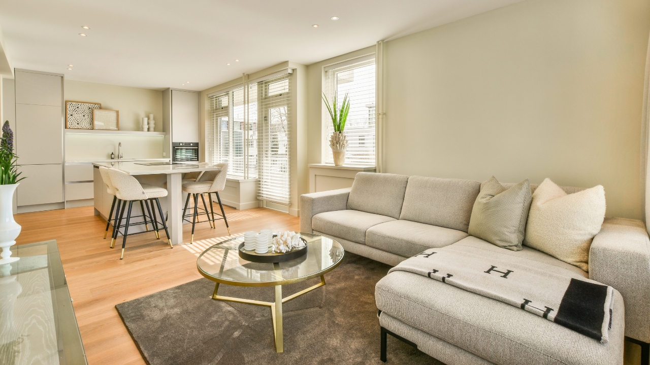
Your curtains are too short and too narrow
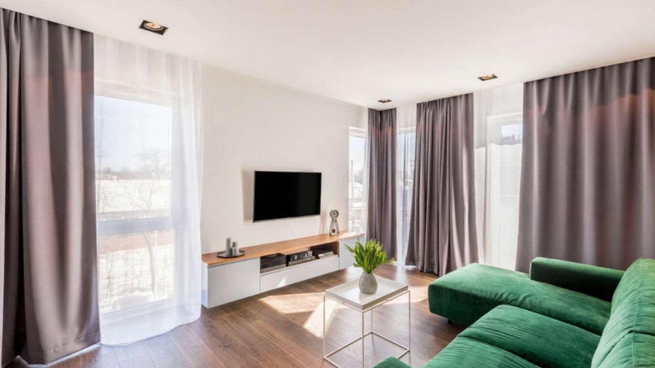
High-water panels chop a wall. Skinny panels look skimpy.
Mount rods near the ceiling, extend past the window, and let panels kiss the floor. If you need height, add clip rings or a simple bottom band.
Windows suddenly look custom, not rental.
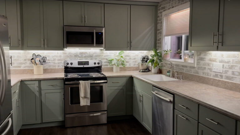
Your hardware is tiny and shiny
Lightweight knobs and slick surface finishes read “builder basic.”
Choose heavier pulls that fit adult hands. Match the metal story to your frames and lights. Install with a jig so lines stay true.
Hardware is the cheapest way to add age and intention to stock cabinets.
Your rug floats

Small rugs make furniture look like it’s waiting for a bus.
Layer a bigger base—jute or sisal—and set your favorite pattern on top. Front legs on the rug, always.
The room feels bigger because the group finally connects.
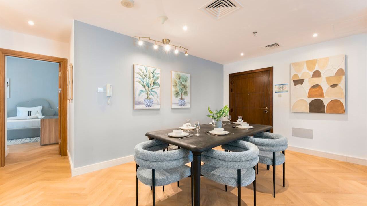
Your art is scattered and small
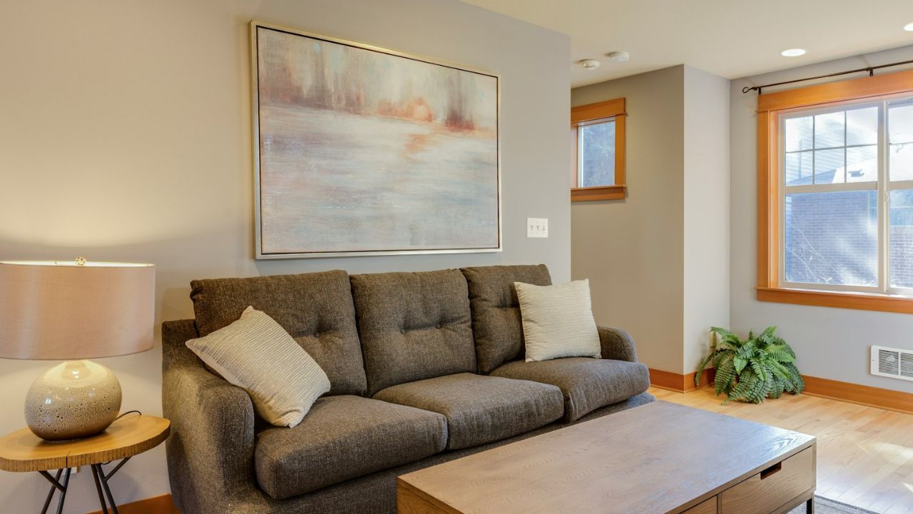
A dozen tiny frames make walls look busy and young.
Go larger and fewer. Center over furniture. Keep the bottoms in a straight line so the eye can rest.
If you love a gallery wall, use consistent frames and mats. Order brings age.
Your finishes don’t repeat
One brass lamp, one black frame, one chrome faucet—your eye has to relearn the language in every corner.
Repeat each finish twice more. Three quiet echoes beat one loud statement.
Suddenly the mix reads intentional, not accidental.
Your backsplash or counters are fighting your palette
Busy granite with busy mosaic tile is an old argument.
If swapping isn’t in the cards, calm the wall with a single solid paint color and keep accessories quiet. Use wood boards and matte ceramics instead of shiny metals.
Let one surface lead and the others support.
Your furniture sits flat against the wall
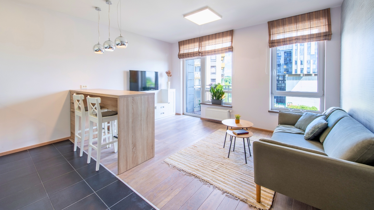
Rooms feel like waiting areas when everything hugs the perimeter.
Float the sofa a few inches, add a narrow console behind it, and pull chairs into conversation distance. Use a floor lamp to light the new layout.
Depth is modern. Perimeter is dated.
Your mirrors are undersized or too high
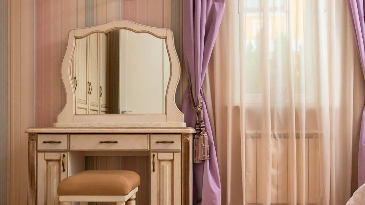
A tiny mirror over a big vanity chops the room. A mirror hung high loses the group.
Choose mirrors two-thirds the width of the furniture below and hang 6–8 inches above the surface.
Bigger reflection equals bigger room, no remodel.
Your entry doesn’t have edges
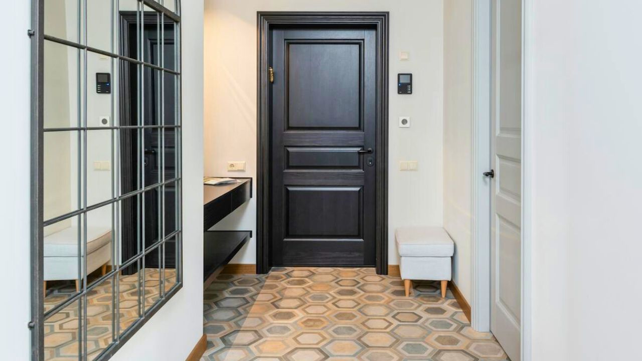
Keys, mail, and backpacks spill because there’s nowhere for them to land.
Add a bench or console, a lidded tray, hooks at kid height, and a boot tray. One mirror to finish the wall.
Function is what makes an entry feel grown-up.
Your color story is all over the map
Too many hues read young and cluttered.
Pick one neutral and two accents for shared spaces. Repeat them across textiles and art. Let texture do the variety work.
When colors settle, the house instantly feels current.
Like Fix It Homestead’s content? Be sure to follow us.
- Man Says He Found Out the Fence He Paid For Wasn’t Actually on His Property
- Woman Says Her Neighbor Started Taking Mulch From Her Delivery Pile Before She Could Even Spread It
- I made Joanna Gaines’s Friendsgiving casserole and here is what I would keep
- What Caliber Works Best for Groundhogs, Armadillos, and Other Digging Pests?
*This article was developed with AI-powered tools and has been carefully reviewed by our editors.