5 “upgrades” buyers now see as weekend demolition projects
The things that screamed “fancy” twenty years ago don’t always land the same now. Some upgrades age well. Others turned into the avocado-green appliances of this era. Buyers walk in, see them, and mentally start calculating what it will cost to rip them out.
If you’re thinking about selling in the next few years—or just don’t want to sink money into the wrong place—it helps to know what’s on the chopping block.
1. Heavy faux-Tuscan everything
Remember the era of dark gold walls, heavy columns, and stone-look everything? That faux-Tuscan look had its moment. Now, it often reads as dark and dated. Buyers see textured brown paint, ornate iron details, and busy backsplashes and start thinking “weekend with a sander and a spray gun.”
If you’re updating, skip anything that leans hard into that old-world theme. Lighter walls, cleaner lines, and simpler finishes instantly make a house feel newer without touching the structure.
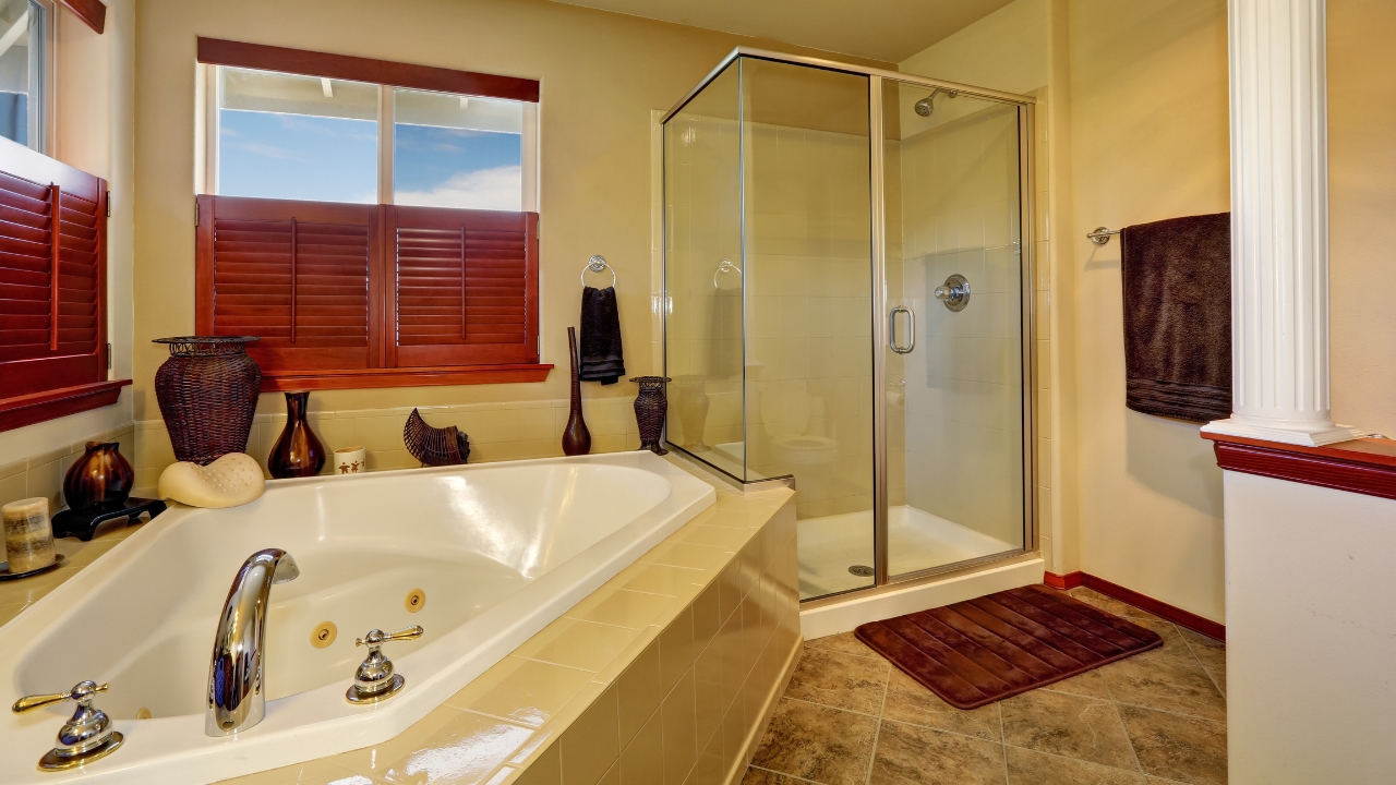
2. Giant corner jetted tubs that eat the whole bathroom
Those big triangle tubs with jets used to be the dream. These days, most buyers see them as space hogs that are hard to clean and almost never used. They also scream, “This bathroom hasn’t been touched in a while.”
Buyers would rather have a larger shower, more storage, or both. If you’re renovating, don’t pour money into a new tub that dominates the room. Consider a standard-size tub or a walk-in shower with good lighting and practical storage instead.
3. Dark cherry cabinets with heavy ornamentation
There was a time when dark cherry or mahogany cabinets with big crown molding, arches, and fancy corbels felt high-end. Now, a lot of buyers associate that look with older listing photos they scroll right past. The room feels cramped and heavy, especially paired with dark counters.
You don’t have to tear out solid wood, but you can simplify. Swapping heavy hardware, removing a few fussy trim pieces, and painting or refacing doors in a lighter color can bring a kitchen or bath into this decade much faster than adding more detail.
4. Busy granite that fights everything else
Granite with heavy movement—lots of swirls, speckles, and multiple colors—had a long run. The problem is, it locks in a whole color scheme. Buyers walk in and instantly know they’ll be stuck matching paint, tile, and decor to one loud surface.
If you’re putting in new counters, aim for calmer patterns and fewer colors. They still look finished and solid, but they don’t boss the rest of the room around. That flexibility matters to buyers who want to put their own stamp on a space.
5. Built-in entertainment centers and desks that eat a wall
Those big, built-in entertainment centers and corner desks made sense back when TVs were deep and everyone had a desktop computer. Now they mostly take up a full wall and force the room into one layout. Buyers see old niches and shelves and start doing mental demo plans.
In living areas, buyers like simple walls that can handle a mounted TV or different furniture setups. In kitchens, that old built-in desk often looks like a clutter magnet. If you’re thinking about updating, removing or simplifying these built-ins goes a long way toward making the house feel more open and flexible.
Like Fix It Homestead’s content? Be sure to follow us.
- I made Joanna Gaines’s Friendsgiving casserole and here is what I would keep
- Pump Shotguns That Jam the Moment You Actually Need Them
- The First 5 Things Guests Notice About Your Living Room at Christmas
- What Caliber Works Best for Groundhogs, Armadillos, and Other Digging Pests?
- Rifles worth keeping by the back door on any rural property
*This article was developed with AI-powered tools and has been carefully reviewed by our editors.