6 paint colors people are copying in 2026 — and the ones that make a house feel dated fast
Paint is still the fastest way to make your home feel current, and in 2026 the gap between fresh and dated is widening. You are seeing a clear pivot away from cold, high-contrast palettes toward softer neutrals and grounded, nature-inspired hues that feel calm but still characterful. The colors you choose now can either align your rooms with that shift or lock them into a look that already feels a step behind.
Designers are converging around six families of shades that homeowners are copying on repeat, while quietly retiring a handful of once-popular tones that now read flat, harsh, or overly sweet. If you are planning to repaint, it pays to know which paints are rising, which are fading fast, and how to use both to your advantage.
1. Soft whites and “Cloud Dancer” neutrals are in, cold whites are out
The biggest change you will notice in 2026 is not that white walls have disappeared, but that the type of white has softened. Instead of crisp, blue-based whites, you are seeing creamy, aerated neutrals that still read clean but feel far less clinical. Pantone captured this mood with PANTONE 11-4201, the 2026 pick named Cloud Dancer, described as a lofty white neutral with a light, calming presence suited to a fast-paced world. It is the kind of white that flatters natural light, soft furnishings, and wood tones instead of fighting them.
By contrast, designers are increasingly blunt that cold, pure whites now make a house feel stuck in the last decade. One report singles out Cold, Pure Whites as a prime example, noting that while white still works as a supporting color, using it as the “main act” no longer delivers enough warmth or depth. Another analysis of outdated shades calls out stark white specifically, explaining that those crisp, blue-based whites that once dominated interiors now feel harsh next to the softer neutrals that are taking over. If your walls lean icy, even a subtle shift toward a creamier white can instantly modernize the room.
2. Earthy greens and grounded naturals are the new default
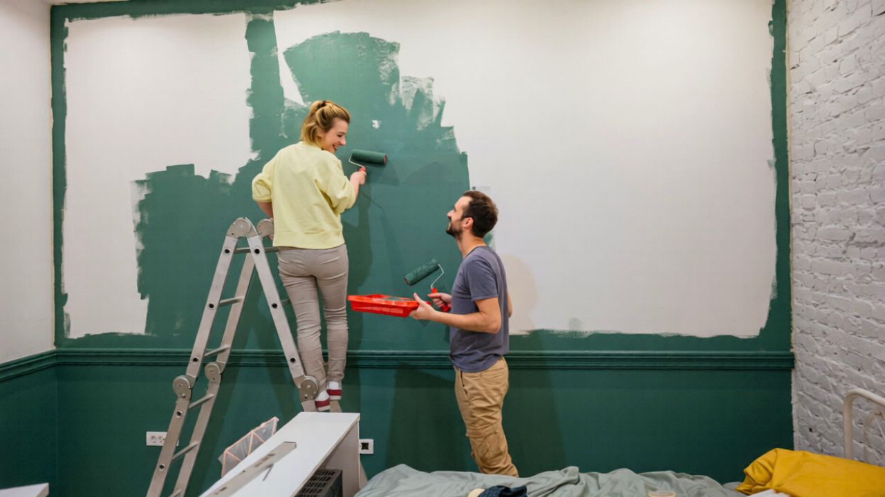
Alongside softer whites, you are seeing a surge of grounded, nature-inspired colors that feel like an extension of the landscape. Paint brands’ 2026 palettes are full of these hues, from “Your New Favorite Green” to inky garden tones. One roundup of Color of the Year We Know So Far highlights Midnight Garden by Dunn-Edwards as a key example, a deep green that nods to foliage and shadowy outdoor spaces. Another list of Every 2026 Color of the Year notes choices like Pantone Cloud Dancer, Benjamin Moore Silhouette, and Sherwin-Williams Universal Khaki, all of which sit comfortably in this grounded, nature-linked spectrum.
Trend forecasters are clear that these hues are not just pretty, they are replacing the cool grays and beiges that defined the 2010s. A breakdown of 2026 paint color trends points out that dark, moody blues and greens are stepping back, while nature-inspired, grounded tones are gaining ground. In living rooms specifically, a separate look at living room paint color trends notes that bolder shades are going to be popular in 2026, replacing cool grays and beiges, and that this is especially true for blues and greens. If you want your home to feel current, a soft olive, eucalyptus, or khaki on the walls will do more for you than another round of greige.
3. Dusty, complex hues are replacing sugary pastels
One of the clearest divides between “now” and “then” is how you use color to create joy. The dopamine decor wave brought in pastel blues, lavenders, and sugary pinks, but those candy tones are already reading as a fad. Designers now favor dustier, more complex versions that feel grown-up and livable. A report on Paint Trends That Will Transform Homes notes that after years of crisp whites, homeowners are embracing dusty hues that bring warmth without overwhelming a space. These are the mauves, clay pinks, and muted blues that look like they have a bit of gray or brown mixed in, so they sit comfortably with wood, stone, and linen.
By comparison, overly pretty pastels are being singled out as a shortcut to a dated look. One designer-focused piece on Outdated Colors Designers Don’t Want To See explains that 2025 was full of dopamine decor and overly pretty pastels, but that look now feels less sophisticated. The same shift shows up in another guide to pastels going out of style, which notes that these soft shades can still work in a nursery or a young child’s bedroom, but elsewhere they risk making a room feel juvenile. A separate analysis of Pastel blues, lavenders, and sugary pinks underscores that while they were joyful, they now read as less relevant, and that earthier, dusky pinks are a better way to keep your space feeling fun without tipping into saccharine.
4. Warm grays, taupes, and charcoals are eclipsing cool gray and millennial pink
If your walls are still painted in the cool gray that dominated the last decade, designers are gently telling you it is time to move on. A detailed look at cool gray notes that the icy grays that dominated interiors are being replaced by warmer neutrals that feel more inviting. Another rundown of Paint Colors Designers Say Will Be Out Of Style In points out that “Cool grays have dominated for years,” but that one designer is shifting her focus to warmer tones. The message is consistent: if your gray reads icy or blue, it is likely dating your space.
At the same time, the once-ubiquitous millennial pink is also losing its grip. That same list of Millennial Pink as an out-of-style shade groups it with gray, stark white, and certain blues and greens as colors that no longer feel fresh. A separate piece on Paint Colors That Designers Agree Will Look Outdated notes that every year brings a new trending palette, and that some hues start to make spaces feel flat and uninspired once their moment passes. The alternative is not to abandon gray or pink entirely, but to choose warmer, more nuanced versions, like greige, taupe, or a dusty rose that leans into the earthier side of the spectrum.
5. Deep reds, moody blues, and heavy greens are losing steam
While bold color is still very much part of the 2026 story, the specific dark shades that were everywhere a few years ago are starting to feel heavy. One guide to paint colors going out of style lists Deep Red as one of six hues expected to fade, noting that this intense color can overwhelm a room and limit how you decorate around it. The same report, which highlights Deep Red alongside pastels, underscores that both extremes, overly dark and overly sweet, are losing favor in favor of more adaptable tones.
Dark, moody blues and greens are also being dialed back. The overview of Key Points for 2026 paint trends notes that dark, moody blues and greens are stepping back in the year ahead, while nature-inspired, grounded tones are gaining momentum. Another look at Bolder living room shades explains that while bold colors are still popular, the trend is moving away from the deepest, moodiest versions toward hues that feel more vibrant and less cave-like. A separate list of Blues And Greens among colors expected to be out of style clarifies that it is the cooler, more saturated versions that are falling away. If you love these families, consider lighter, more muted takes that still give you color without weighing the room down.
6. How to use trends without falling for “fake” ones
With so many lists of “in” and “out” colors, it is easy to feel like you are chasing a moving target. Designers themselves warn you to be selective about which trends you follow. One essay on how Now fads and trends work points out that there are design hucksters, also called marketers, who create FAKE TRENDS, pushing ideas like a must-have color of the year or insisting that wallpaper never left. The piece uses the phrase FAKE TRENDS to underline how some of these cycles are manufactured to sell products rather than respond to how people actually live. The takeaway is that you should treat any trend as a tool, not a rule, and filter it through your own space, light, and lifestyle.
That same skepticism can help you avoid colors that are already reading as dated. A rundown of dated paint colors notes that some shades once felt fresh but now read as saccharine, and suggests that instead of those, you try earthier tones like clay, terracotta, and warm browns. Another designer survey on Paint Colors That Designers Agree Will Look Outdated reiterates that every year brings a new trending palette, and that some colors inevitably start to make spaces feel flat and uninspired. If you focus on the throughlines in the 2026 guidance, you will see a consistent message: lean into softer whites like Cloud Dancer, grounded greens and khakis, dusty hues, and warmer neutrals, and step away from cold whites, icy grays, sugary pastels, and heavy, moody tones. Used thoughtfully, those shifts will make your home feel current now and flexible enough to evolve with whatever comes next.
Like Fix It Homestead’s content? Be sure to follow us.
Here’s more from us:
- I made Joanna Gaines’s Friendsgiving casserole and here is what I would keep
- Pump Shotguns That Jam the Moment You Actually Need Them
- The First 5 Things Guests Notice About Your Living Room at Christmas
- What Caliber Works Best for Groundhogs, Armadillos, and Other Digging Pests?
- Rifles worth keeping by the back door on any rural property
*This article was developed with AI-powered tools and has been carefully reviewed by our editors.

