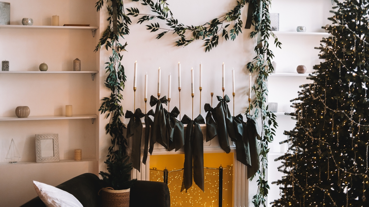
7 Christmas Color Schemes That Aren’t Red and Green (But Still Feel Festive)
Red and green are classic, but they’re not the only way to make a house feel like Christmas. If those colors clash with your furniture or you’re just tired of the same look every year, you can still get a cozy, seasonal feel with other palettes. The trick is choosing colors that feel wintery and repeating them enough that it looks intentional, not random.
Here are color schemes that still read “holiday,” even without the usual red and green.
Soft gold and cream
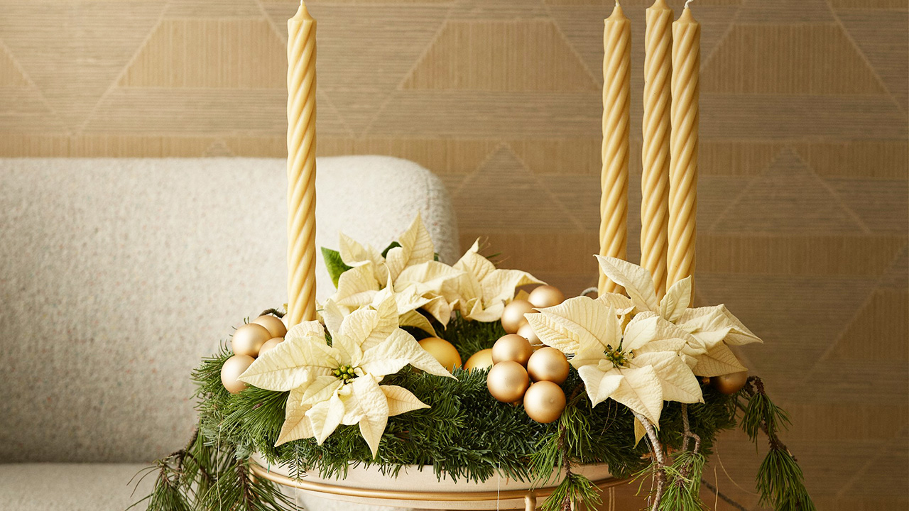
Gold and cream together feel warm, calm, and a little fancy without being loud. Use cream or white as your base for stockings, throws, and ribbon, then layer in gold ornaments, candle holders, and frames.
Add texture so it doesn’t fall flat—knit blankets, velvet pillows, and metallic finishes that are more brushed than shiny. The look is simple, but the mix of light and warm metallic makes it feel special.
Navy and champagne

Navy gives you that winter-night feeling, and champagne (a soft, warm metallic) keeps it from feeling too serious. Think navy stockings, ribbon, or pillows paired with champagne ornaments and candle holders.
Use lots of warm white lights with this combo. The navy soaks up some of the brightness, and the champagne picks it back up in a softer way. It works especially well if you already have darker furniture or wood in your space.
Forest green and linen
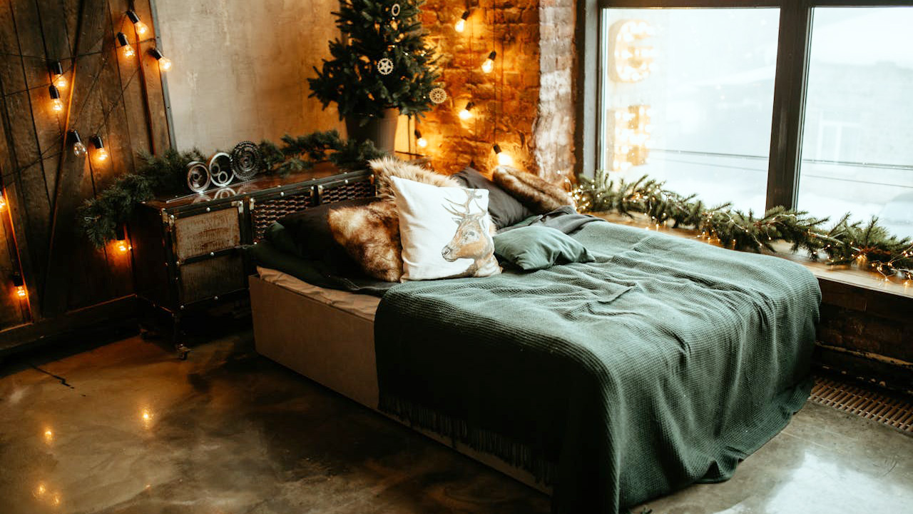
If you’re not ready to ditch green entirely, pair a deeper, more muted green with linen tones instead of bright red. Use forest green on pillows, ribbon, or a blanket, and lean on beige, cream, and soft tan for everything else.
This palette feels like walking in the woods more than standing in front of a toy store. It pairs easily with wood, black hardware, and simple greenery, so you don’t have to change much else in the room.
Copper and charcoal
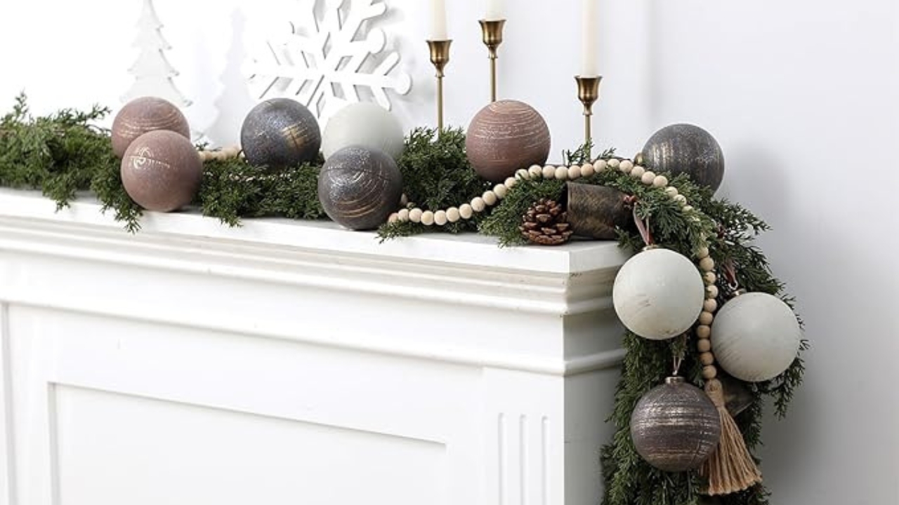
Copper’s warmth plus charcoal’s depth gives you a modern-but-cozy look. Bring in copper through candle holders, bells, or ornaments, and use charcoal on pillows, throws, or even a rug if you’re feeling bold.
Balance it with plenty of lighter neutrals so it doesn’t feel heavy—cream or white on walls, tree skirts, and table linens. The copper catches the light and keeps the whole thing from feeling too dark.
Blush and warm white
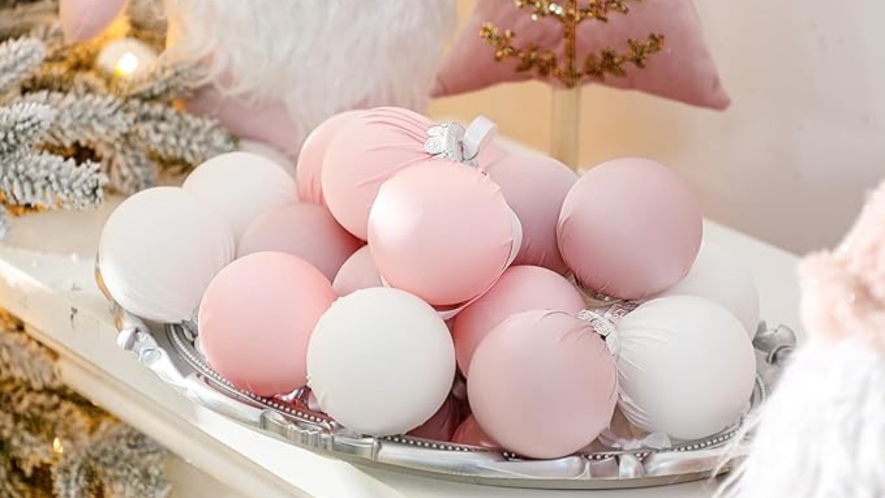
If you like a softer, slightly romantic look, blush and warm white work surprisingly well for Christmas. Use blush in small doses—ornaments, ribbon, or a throw—and let warm white and soft gold do the heavy lifting.
It pairs nicely with lots of glass and soft textures like faux fur or knits. You end up with a quieter, almost snow-globe feel instead of a traditional, bold holiday look.
Black, white, and wood
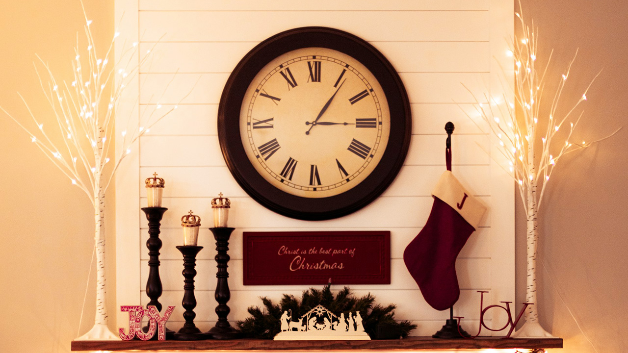
Black and white sound minimal, but once you add wood and greenery, they feel timeless and cozy. Use black picture frames, candle holders, or plaid pillows with white dishes, stockings, and ornaments.
Wood tones in trays, bead garlands, and furniture keep it from feeling stark. This is a good option if your house is already mostly neutral and you don’t want to bring in a lot of new color.
Deep plum and bronze
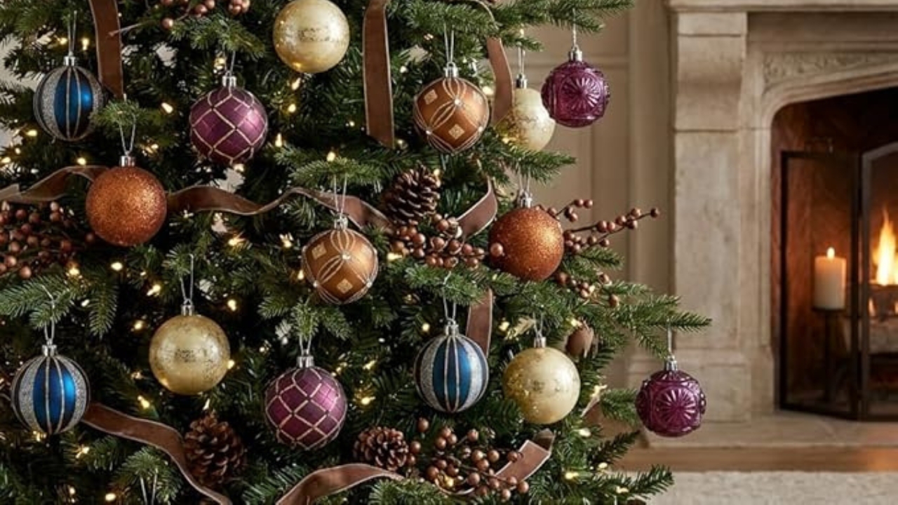
Plum gives you that rich, jewel-tone feel without leaning into red. Pair it with bronze metals and warm neutrals. Use plum ornaments, ribbon, or pillows, and bronze for candle holders, bells, and frames.
The mix feels a little moody in a good way—especially at night with the lights on. It’s different without looking trendy-for-one-year.
Like Fix It Homestead’s content? Be sure to follow us.
- Man Says He Found Out the Fence He Paid For Wasn’t Actually on His Property
- Woman Says Her Neighbor Started Taking Mulch From Her Delivery Pile Before She Could Even Spread It
- I made Joanna Gaines’s Friendsgiving casserole and here is what I would keep
- What Caliber Works Best for Groundhogs, Armadillos, and Other Digging Pests?
*This article was developed with AI-powered tools and has been carefully reviewed by our editors.

