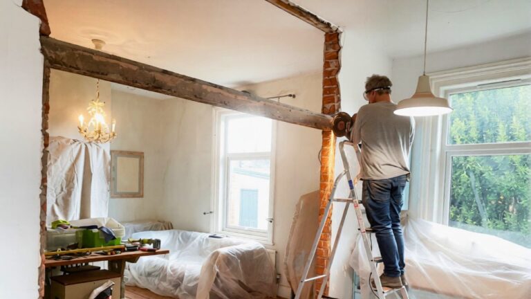
8 decisions that make a house feel older than it is
A house can be freshly built and still feel stuck in another decade if your finishes, furniture, and lighting quietly point backward. That disconnect is most obvious when you have invested in a new space, yet the daily experience is closer to a time capsule than a clean slate.
By paying attention to a handful of recurring design habits, you can keep your rooms from aging themselves prematurely and start making choices that match the actual age of your home. These eight decisions are the ones that most reliably add years, and sometimes whole eras, to a space that should feel current.
1. Discontinuous decor and “matchy-matchy” sets
When every room follows a completely different script, your house can feel like a series of unrelated eras stitched together. Designers describe this as Discontinuous Decor, where abrupt shifts in color, style, and mood make even new construction feel like it has been renovated in fragments over decades. You see it when a sleek kitchen opens into a Tuscan dining room, which then leads to a farmhouse living space, each one pulling your eye in a different direction.
At the other extreme, buying everything in a single suite can freeze your rooms in the year that catalog dropped. A sofa, loveseat, coffee table, and side tables from one set create what designers call Matchy Furniture, which reads as flat and predictable. Instead of a showroom vignette, you want your space to feel collected, with pieces from different styles and periods that still share a common thread in scale, color, or material.
2. Heavy finishes that lock you into a past decade
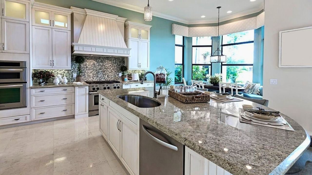
Some surfaces are so tied to a specific era that they timestamp your home the second someone walks in. Designers now point to Granite countertops, especially busy, speckled patterns, as a prime example of a material that instantly recalls past trends. The stone itself is durable, but the visual noise and high contrast make kitchens feel older than they are, particularly when paired with ornate edge profiles and dark cabinets.
Cabinetry can be just as revealing. One designer notes that One of the biggest telltale signs of age, especially in Texas, is the cabinetry style that dominates so many builder-grade homes. Heavy arches, orange-toned stains, and overly ornate doors are hard to disguise and signal a specific time in residential construction. Swapping them for simpler Shaker fronts or painted finishes immediately pulls a kitchen or bath closer to the present.
3. Color schemes that flatten or darken your rooms
Color can either refresh your house or quietly date it. All-gray interiors are a clear example, with Too Much Gray, often called “Millennial Gray,” now seen as a trend that did not age well. When every wall, sofa, and rug sits in the same cool mid-tone, your rooms lose depth and start to feel like a snapshot from a specific few years rather than a flexible backdrop for evolving furniture and art.
Heavy, saturated palettes can have the opposite problem, making spaces feel smaller and older. Dimness in particular is singled out as a major culprit, since low light combined with dark paint can read as gloomy and dated rather than cozy. Updating your palette with a mix of warm neutrals and a few grounded accent colors, then supporting it with better lighting, helps your home feel fresher without chasing every micro trend.
4. Window treatments and lighting that belong to another era
Your windows broadcast the age of your decorating choices before anything else. Designers in Georgia, including Meredith McKenzie and Shivani Vyas of, call out Heavy or Dark Window Treatments as one of the fastest ways to make a room feel stuck. Thick, swagged draperies and ornate rods block light and recall formal styles that have largely fallen out of favor, especially when paired with busy patterns.
Outdated lighting has a similar effect. Older fixtures that were once standard, from shiny brass chandeliers to builder-basic flush mounts, dull your rooms even if the rest of your finishes are new. Light fixtures are often listed among the top features that make a house look tired, especially when they provide poor illumination. When you combine dated fixtures with limited sources of light, you amplify that sense of age and make every surface appear dingier.
5. Texture overload and fussy details
Layered texture can feel rich, but there is a tipping point where it starts to read as clutter. One design guide warns about Too Much Texture, noting that while playing with different materials adds dimension, some elements no longer feel current. Shag rugs, faux fur throws, chunky cable knits, and plaster-effect walls all in one room can overwhelm the eye and recall short-lived trends rather than timeless comfort.
Fussy architectural details fall into the same trap. Overly ornate moldings, intricate medallions, and heavy corbels can make a newer home feel like it is trying too hard to mimic a different era. If you want character, you are better off following advice that suggests you Install Crown Molding thoughtfully, choosing profiles that suit your ceiling height and architecture instead of slapping on the most decorative option. Restraint keeps your details from dragging your house into a theatrical past.
Like Fix It Homestead’s content? Be sure to follow us.
Here’s more from us:
- I made Joanna Gaines’s Friendsgiving casserole and here is what I would keep
- Pump Shotguns That Jam the Moment You Actually Need Them
- The First 5 Things Guests Notice About Your Living Room at Christmas
- What Caliber Works Best for Groundhogs, Armadillos, and Other Digging Pests?
- Rifles worth keeping by the back door on any rural property
*This article was developed with AI-powered tools and has been carefully reviewed by our editors.