8 upgrades that make every space feel connected
A connected house doesn’t mean every room looks the same. It means colors handshake, metals repeat, and lines feel consistent as you move. These upgrades are simple, practical, and they make the whole place read as one story instead of a bunch of separate chapters.
Choose a house palette you’ll actually live with
Pick one trim/door color, one main wall family, and two accents. Keep them consistent in shared spaces and let private rooms bend the rules a bit. Repetition is what stops the stop-start feeling between kitchen, dining, and living. When colors keep their promise from room to room, the house calms down before you add a single pillow.
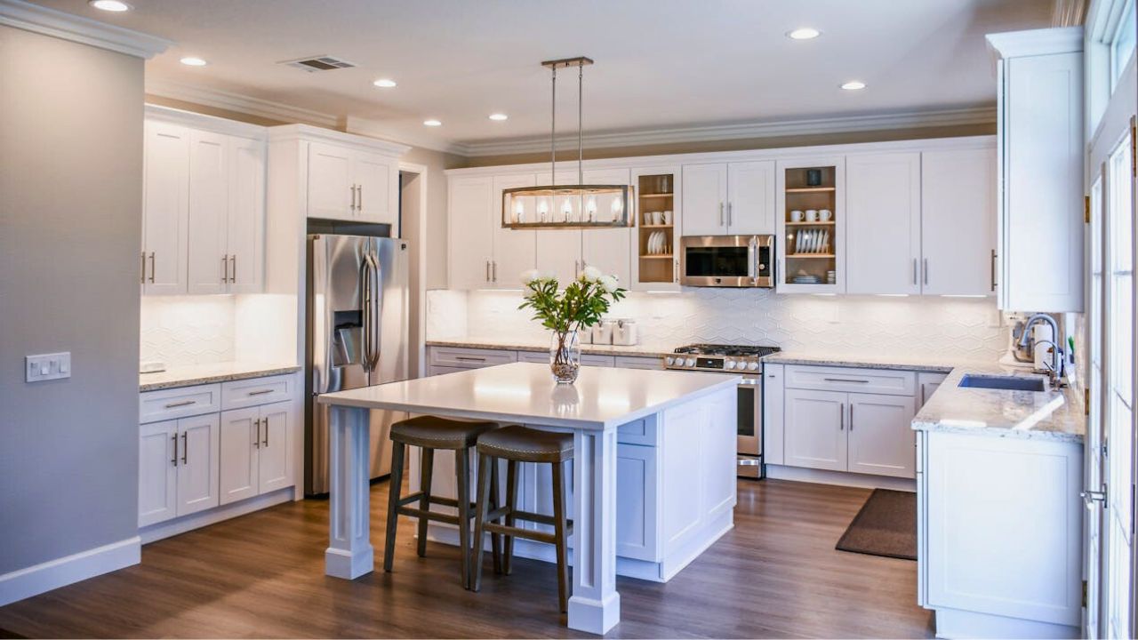
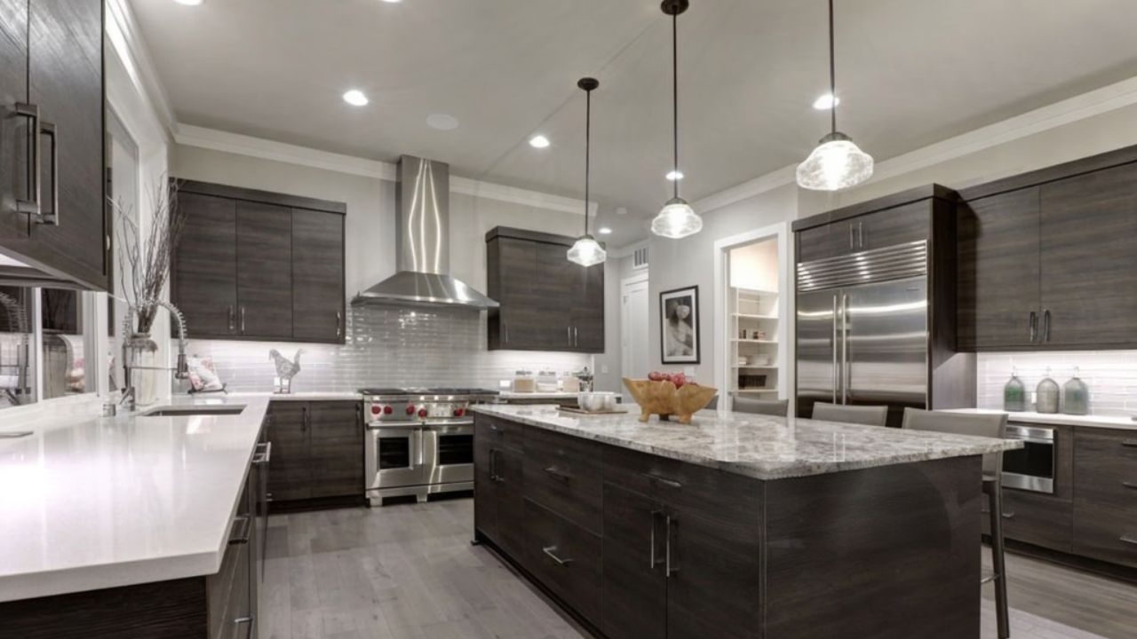
Standardize metal finishes in sightlines

In any one view, limit yourself to two metals and repeat them at least three times. If the living/dining span is black + brass, let that story show up in rods, frames, pulls, and a floor lamp. Group oddball finishes together (bar cart, powder room) so they feel intentional, not random. Quiet echo beats loud variety every time.
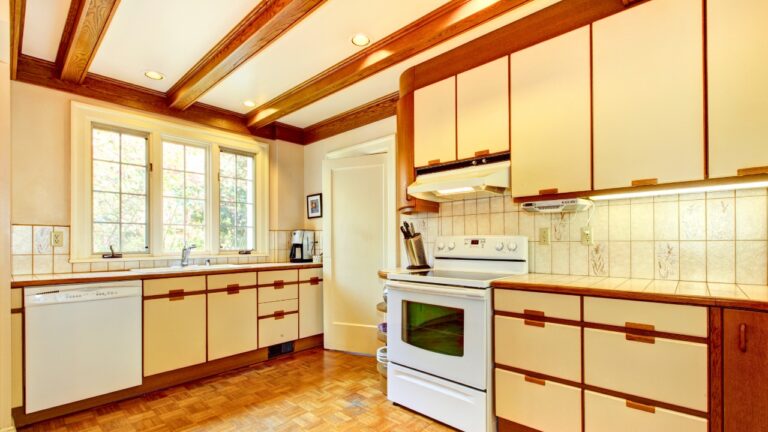
Keep doors and trim consistent
Paint interior doors the same color throughout and match trim profiles where you can. A unified door color makes hallways feel considered and elevates even basic builder profiles. If you’re changing only one thing, swap plastic switch plates for screwless covers in a single finish. Touchpoints tell a bigger truth about your house than most decor does.
Repeat window treatment “rules”
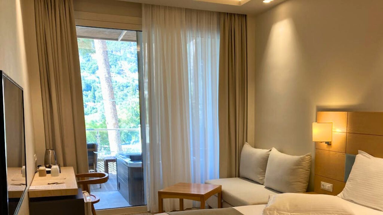
You don’t need identical fabric everywhere, but the rules should match: rods mounted high and wide, panels that kiss the floor, and woven shades used consistently on street-facing windows or rooms that need privacy. When the hang and the length are consistent, your eye stops recalculating at every window.
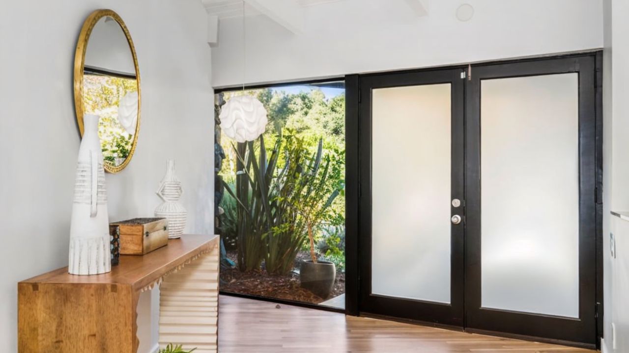
Align heights like you mean it
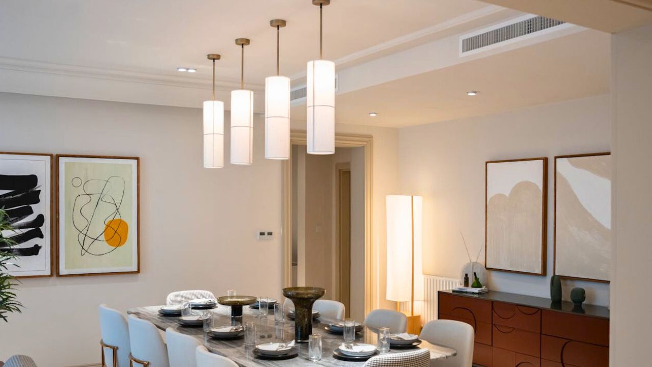
Choose a common visual band—bottoms of frames, top of door trim, pendant height—and stick to it across shared spaces. The human eye loves a line to follow. When lampshades land near seated eye level and art bottoms align over furniture, rooms handshake without you thinking about it.
Tame your flooring transitions
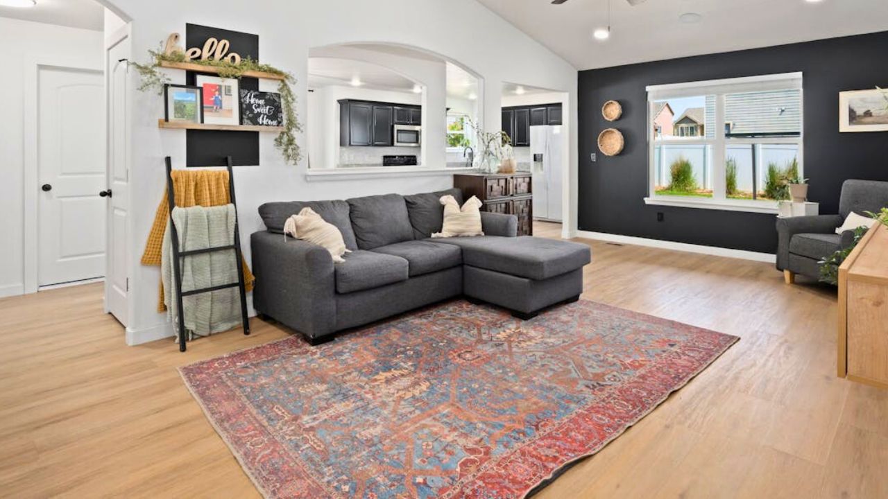
If you can’t run one surface through, keep transitions clean and thresholds low-profile. Use rugs to soften material changes and repeat the floor tone elsewhere (a frame, a bowl, a chair leg) so it feels like part of the palette, not an interruption. Even a color-matched reducer does more for connection than people realize.
Keep lighting temperature consistent per zone
Warm white (2700–3000K) in living spaces, something slightly brighter in utility areas, but never mix temperatures in the same view. Add dimmers where you live at night so glow can shift with the mood. Better light ties rooms together faster than any matching set ever will.
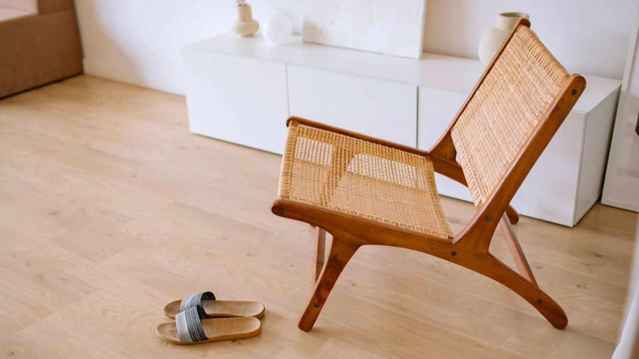
Echo textures on purpose

Pick two or three “house textures”—linen, rattan, matte black metal, raw wood—and let them reappear. Linen shows up in drapery and a throw. Rattan in a tray and a bench. Raw wood in a bowl and a console. Texture is how neutral homes feel connected without turning into duplicates.
Like Fix It Homestead’s content? Be sure to follow us.
- I made Joanna Gaines’s Friendsgiving casserole and here is what I would keep
- Pump Shotguns That Jam the Moment You Actually Need Them
- The First 5 Things Guests Notice About Your Living Room at Christmas
- What Caliber Works Best for Groundhogs, Armadillos, and Other Digging Pests?
- Rifles worth keeping by the back door on any rural property
*This article was developed with AI-powered tools and has been carefully reviewed by our editors.