9 paint colors designers say are hard to live with
Paint is one of the cheapest ways to transform a room, but certain colors can wear on you over time. Designers often warn against choosing shades that feel fun at first but quickly become overwhelming or hard to decorate around. If you’re planning a paint refresh, these are the colors experts say to think twice about.
Bright Red
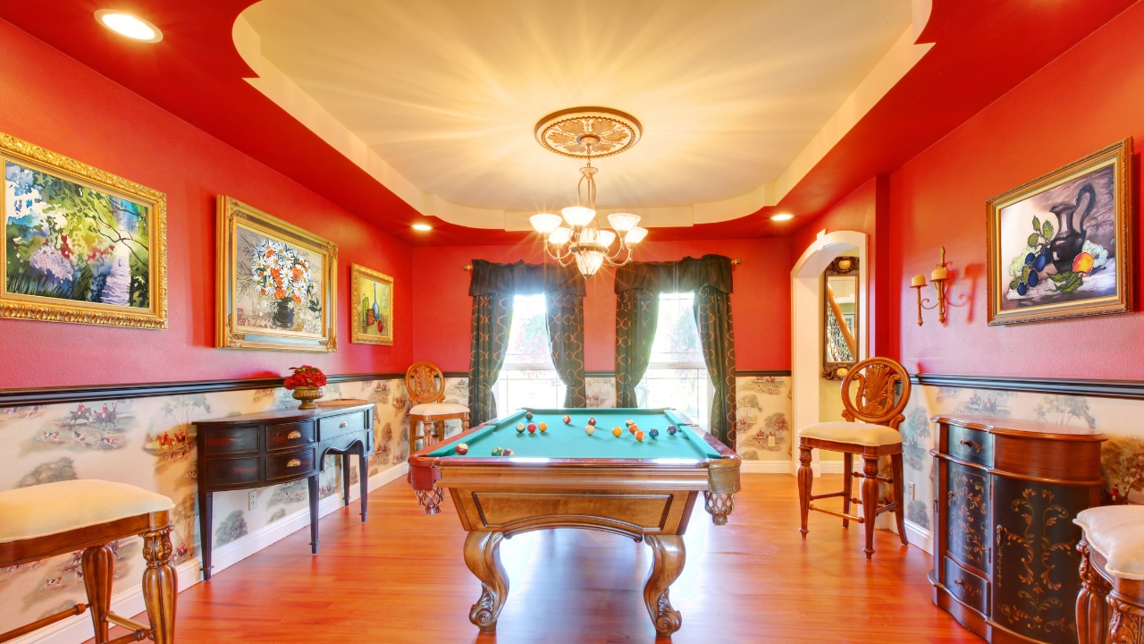
Red walls can feel exciting at first, but designers say the intensity can be hard to live with day after day. It’s overstimulating and makes it tough to create a calming environment. Red also clashes with many furnishings, making it harder to change décor without repainting.
Neon Shades
Neon pinks, greens, or yellows can look fun in small doses, but on walls they’re overwhelming. The brightness can make it uncomfortable to relax in a space. Designers often point out that neon shades can distort natural light, making a room feel harsh and tiring on the eyes.
Dark Brown
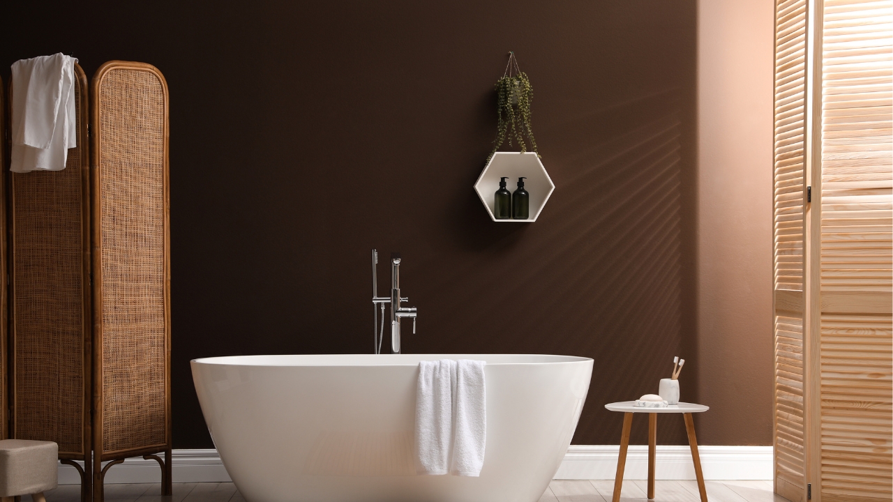
While some earthy tones work well, dark brown on walls tends to feel heavy and dated. Designers say it makes spaces look smaller and harder to brighten up. Unless it’s a rich wood finish, brown paint rarely feels inviting in the long term.
Black
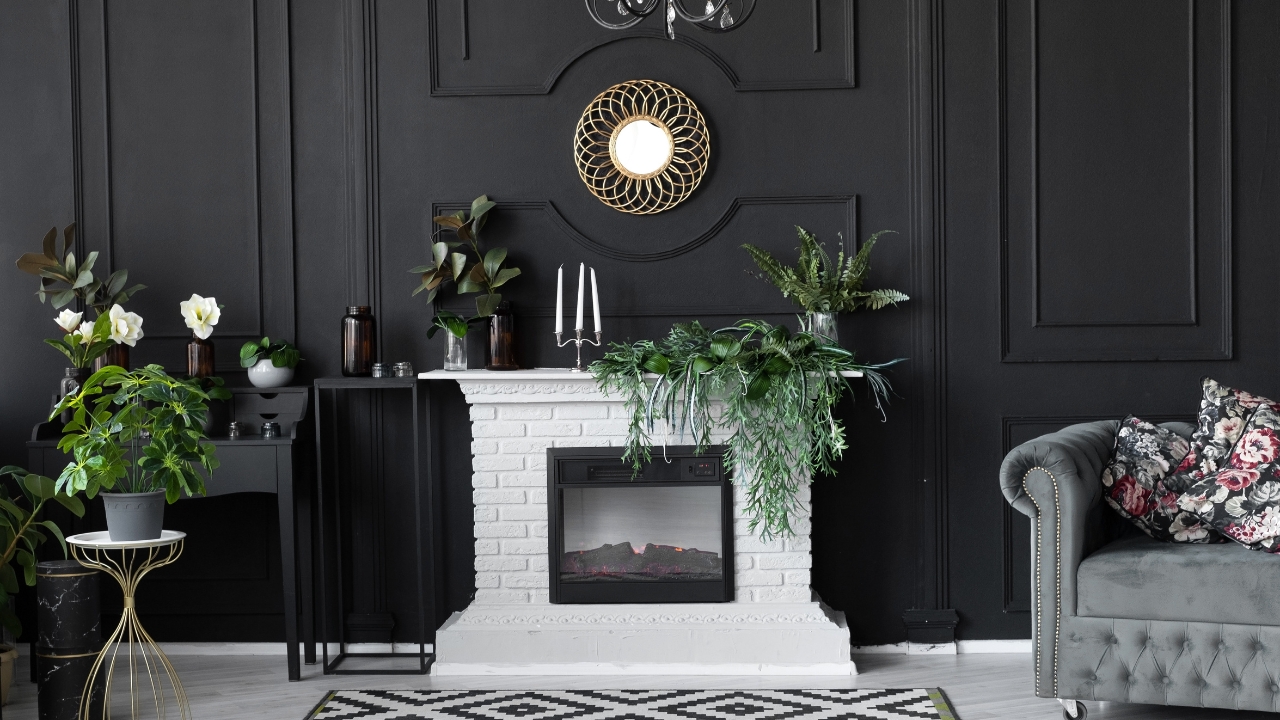
Black walls can look chic in magazines, but in real life, most people struggle to live with them. Designers note that black absorbs light, making rooms feel smaller and more enclosed. It also highlights dust and imperfections, so upkeep is harder than you’d expect.
Bright Orange
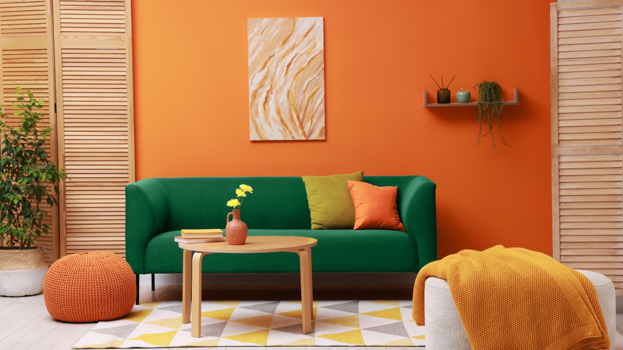
A full room of bright orange can be overwhelming. Designers often say it makes people restless instead of comfortable. It can work as an accent but rarely as the main wall color. It’s also tough to pair with other furniture colors, making it limiting.
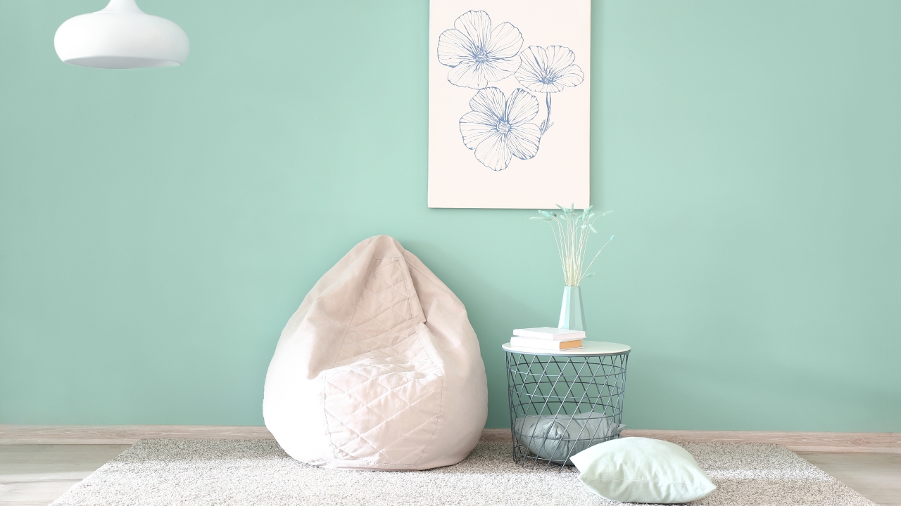
Pastel Pink
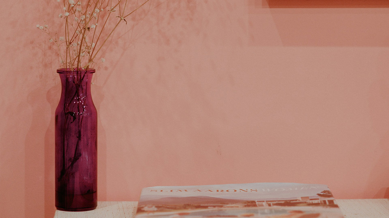
While soft pinks can look sweet in nurseries, designers say pastel pink often feels dated in other rooms. It limits the décor choices and can quickly feel childish. Neutral tones or warm blush shades tend to age better if you want a softer look.
Yellow-Green
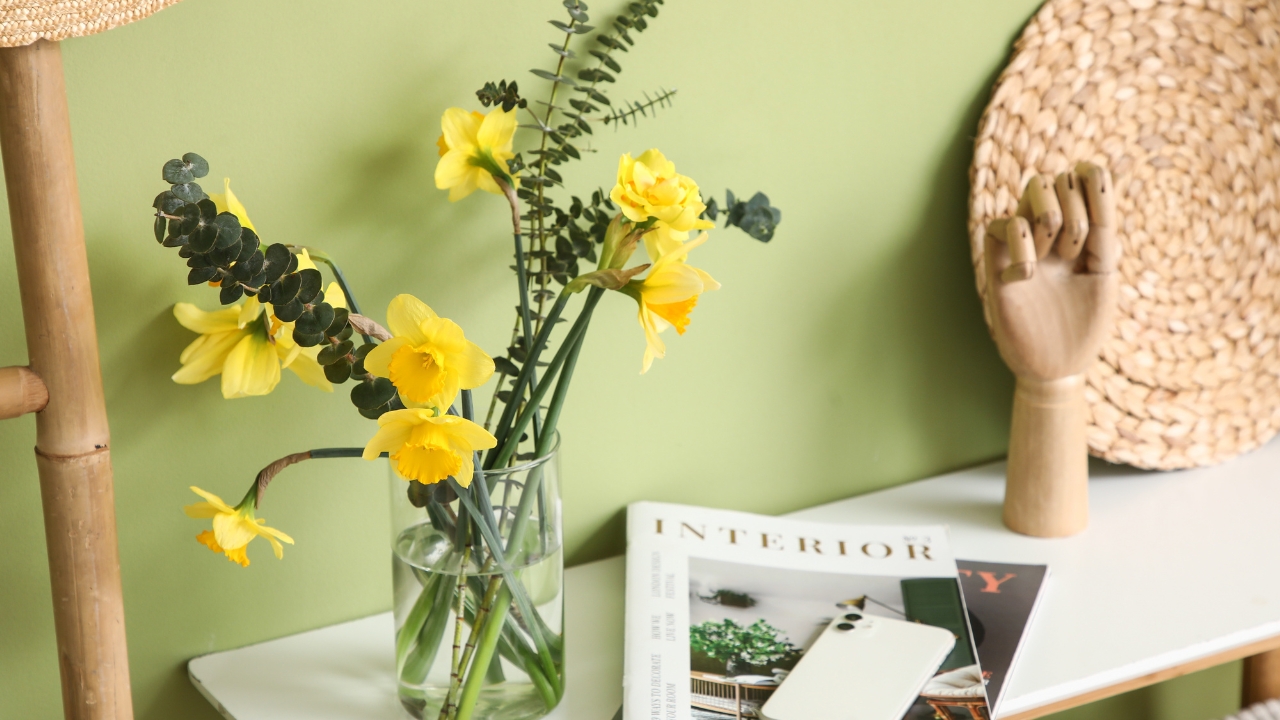
Chartreuse and other yellow-green tones are colors designers almost always avoid for walls. They tend to cast unflattering light on skin and furniture, and they feel hard to balance in a room. It’s a tricky color that usually feels more jarring than cozy.
Bright Yellow
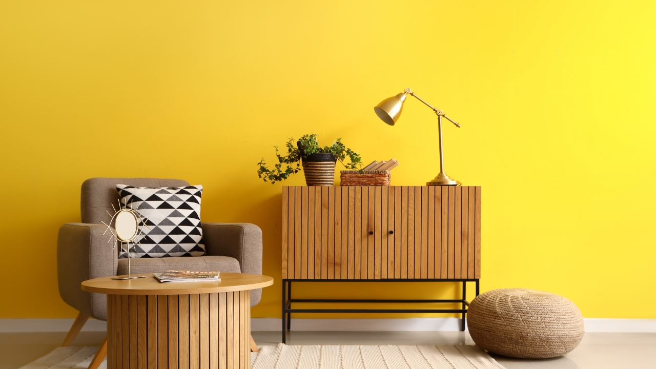
Sunny yellow walls sound cheerful, but designers say they rarely work long-term. The brightness can feel overwhelming in large doses and can even cause headaches. Muted or buttery yellows are a safer option if you want warmth without the intensity.
Eggplant Purple
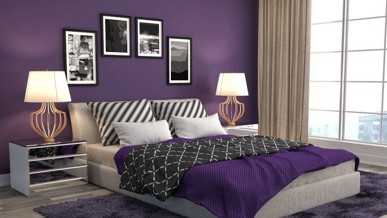
Deep purple shades often look elegant in small amounts, but covering whole walls with them tends to feel oppressive. Designers say it limits flexibility in decorating since it clashes with many furniture tones. It’s also a color that feels trendy fast, making it harder to enjoy long-term.
*This article was developed with AI-powered tools and has been carefully reviewed by our editors.