What’s out this fall (and what decorators are replacing it with)
Every season brings its own design shifts, but this fall, decorators are making bigger changes than usual. The focus is moving away from overdone trends and sterile spaces toward warmth, character, and comfort.
That means some of the styles that ruled the last few years are officially being swapped out for softer textures, richer colors, and natural materials that actually feel lived in.
Here’s what decorators are quietly phasing out this fall—and what they’re using instead to make homes feel updated and inviting.
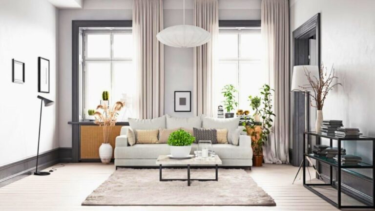
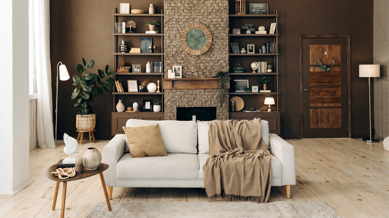
Cool gray tones → Warm neutrals
Gray had a long run, but cooler shades are fading fast. They can make a space feel flat and lifeless, especially in fall light. Designers are steering toward warmer tones that bring out natural wood and soften a room’s atmosphere.
Expect to see taupe, beige, and creamy off-whites taking over. These colors make furniture pop, look better in natural light, and work with nearly any decor style. The overall look feels cozier and more timeless than cold gray walls ever did.
All-white kitchens → Warm, mixed materials
White-on-white kitchens are losing their grip as designers bring texture and warmth back into the heart of the home. All that bright white can look sterile instead of fresh.
This fall, you’ll see more natural wood cabinets, soft color on lower cabinetry, and stone with visible veining. Brass or bronze hardware adds warmth that stainless steel can’t match. The goal is still clean, but with character that makes the kitchen feel lived in, not showroom-perfect.
Minimalist decor → Layered comfort
Minimalism had its moment, but bare walls and empty shelves are starting to feel unfinished. Decorators are adding personality back into rooms with layered textiles, books, and personal touches that make spaces feel welcoming.
Instead of stripping everything down, they’re focusing on balance—clean lines paired with soft materials and meaningful decor. Think cozy throws, stacked books, and collected objects instead of everything perfectly matched.
Fast furniture → Quality pieces
Trendy, low-cost furniture that falls apart after a few seasons is being replaced with investment pieces. Designers are encouraging people to buy fewer items that last longer. The shift isn’t just about style—it’s about sustainability.
Warm wood, vintage finds, and reupholstered chairs are back in focus. They bring personality and longevity that mass-produced pieces can’t. Even mixing one quality piece into a room makes a noticeable difference.
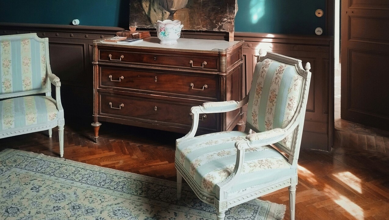
Matchy-matchy spaces → Mixed finishes
Coordinated sets and identical finishes make a home feel one-dimensional. Designers are trading that uniform look for more variety. Mixed metals, layered textures, and contrasting woods create depth and interest without looking chaotic.
This fall, you’ll see gold mixed with black hardware, or walnut furniture paired with lighter oak. The result feels natural—like a space that’s evolved over time instead of being bought all at once.
Cool lighting → Warm glows

Bright white LED lighting is officially out. It washes out paint colors and makes a home feel cold. Designers are switching to warmer bulbs and layered light sources that make rooms more flattering and comfortable.
You’ll see table lamps, sconces, and pendant lights used together instead of relying on a single overhead source. The goal is lighting that adds atmosphere instead of glare.
Overstyled decor → Lived-in layers
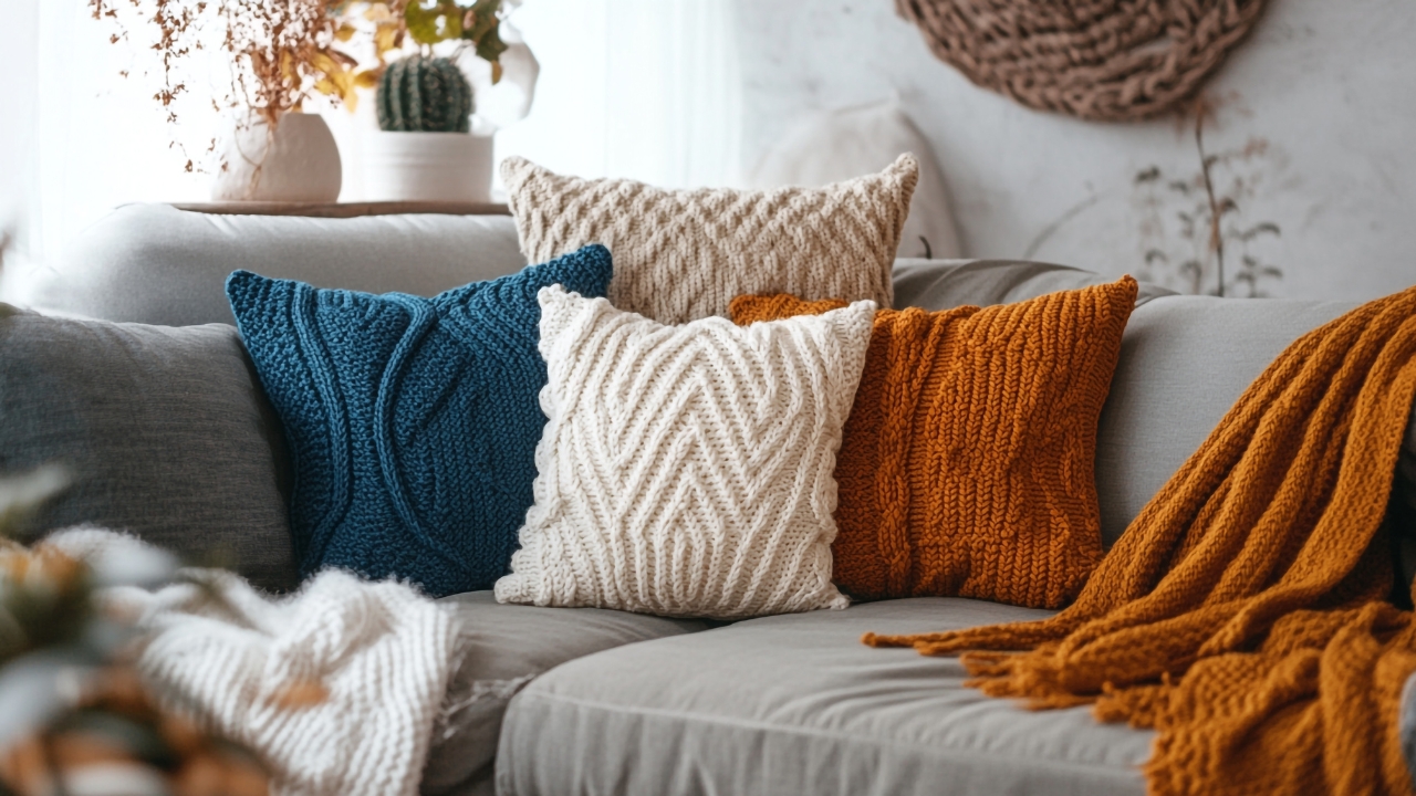
The “perfectly staged” look that once filled design feeds is fading. Homes that feel too curated lack personality, and decorators are shifting toward relaxed, authentic spaces that reflect real life.
This doesn’t mean clutter—it means items that tell a story. A few mismatched pillows, a stack of worn books, or a lived-in leather chair all add warmth that perfectly coordinated decor can’t match.
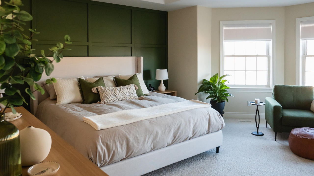
Stark black accents → Earthy contrast
For years, matte black was the go-to accent color. It looked modern at first but now feels too harsh for the softer direction interiors are heading. Designers are replacing it with deep browns, aged bronze, and earthy greens.
These tones still give contrast but in a way that feels grounded and natural. They’re easier to live with and pair better with the warm neutrals that are dominating this fall.
Generic wall art → Personal pieces
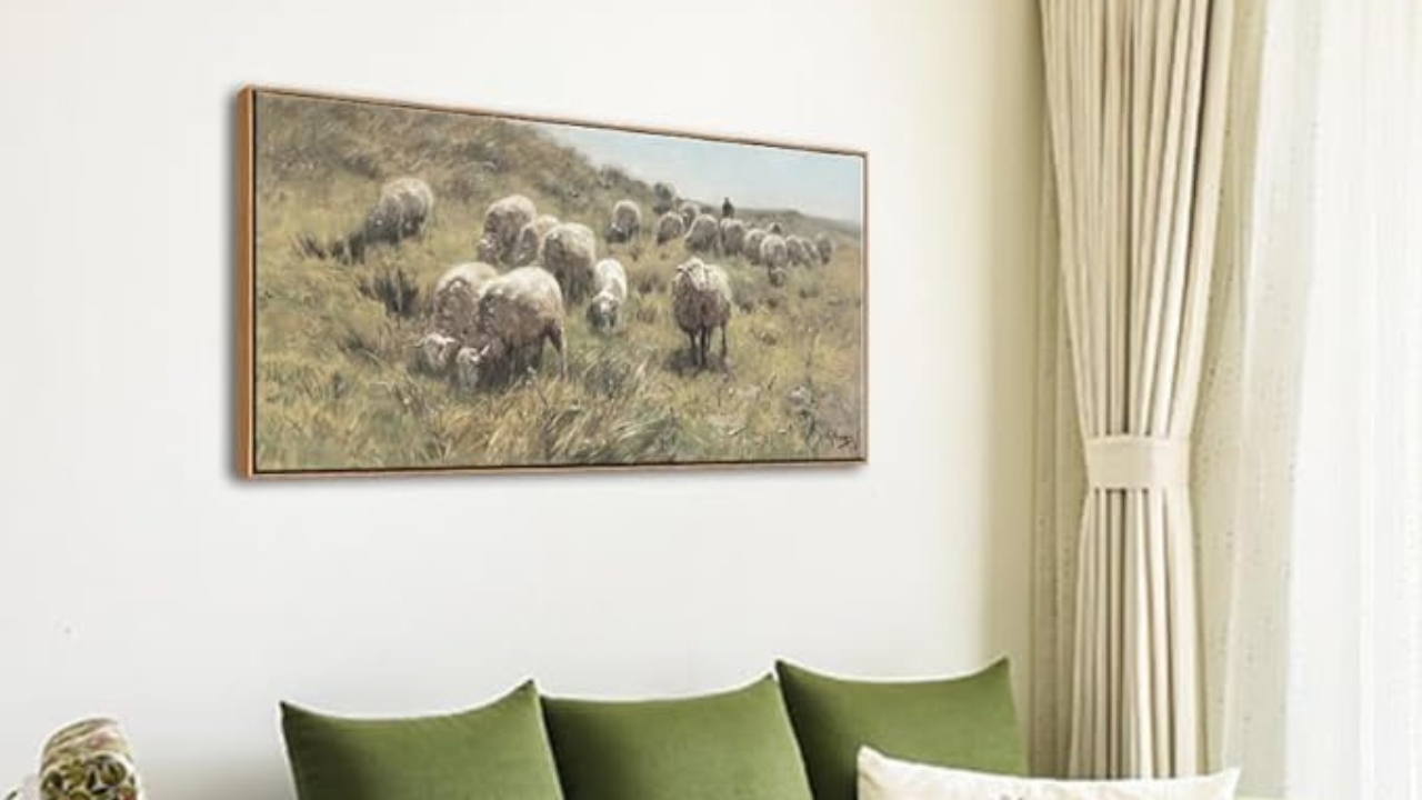
Mass-produced prints are being swapped for artwork with meaning—photographs, vintage finds, or handmade pieces. Designers say people are craving homes that feel personal, not like copies of what’s trending online.
Adding art with texture, like linen canvases or framed sketches, gives depth to walls that flat prints can’t. It’s less about filling space and more about curating pieces that make your home feel individual.
Basic rugs → Natural texture
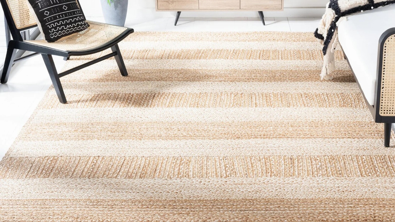
The flat gray and white rugs that were everywhere are being replaced by ones with warmth and texture. Designers are turning to wool, jute, and handwoven materials that feel organic and timeless.
These rugs add depth and movement to a room while holding up better to daily life. They complement the natural materials and layered look that define this fall’s design trends—cozy, grounded, and quietly sophisticated.
*This article was developed with AI-powered tools and has been carefully reviewed by our editors.