You probably bought this for the aesthetic — but designers hate it
Trends move fast, and sometimes what looks great on social media doesn’t hold up in real life. Designers see it all—the fads that photograph well but age badly, or the choices that make a room look flat instead of elevated.
You might’ve fallen for one of these “aesthetic” picks thinking it would pull your space together, but to professionals, it’s a design misstep that keeps a house from feeling finished.
Matching furniture sets
Buying everything from the same collection might seem like an easy way to get a polished look, but it usually backfires. When every piece matches perfectly, your space loses personality. Designers prefer mixing finishes and styles so things look collected over time—not straight off a showroom floor. Swapping one or two pieces for something with contrast instantly adds life back to the room.
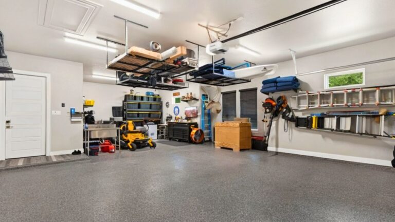
Floating shelves filled to the brim
Open shelving looks great in staged photos, but in daily life, it’s one of the hardest looks to keep clean. Designers say cluttered shelves make a space feel smaller and busier than it is. A few styled items—like plants, cookbooks, or dishes—can work beautifully. But if you’ve packed every inch, it’s probably time to edit down and let the space breathe.
Oversized wall signs and word art

You’ve probably seen them: large “gather” or “family” signs that were everywhere a few years ago. Designers are over it. Those pieces tend to flatten a space instead of giving it depth. If you love the sentiment, try framed family photos or meaningful art instead. It still tells your story—without looking like everyone else’s living room.
Cheap light fixtures that copy designer looks
The wrong lighting can drag down an entire room, especially when it’s a flimsy knockoff of something high-end. Designers notice poor proportions, harsh light tones, and cheap finishes instantly. You don’t have to spend a fortune—midrange fixtures with classic lines or vintage finds often look better and last longer than trendy budget pieces that yellow or warp.
All-white everything
White kitchens, white walls, white decor—designers say this “clean look” trend went too far. In real life, it shows every scuff and fingerprint, and it can make a room feel sterile instead of fresh. Adding texture and warmth with natural wood, metal, or soft color tones makes your home feel more lived-in and less like a blank canvas.
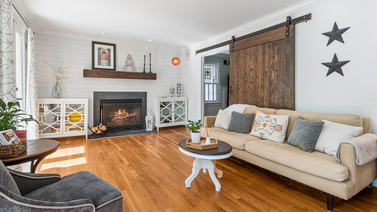
Faux farmhouse overload
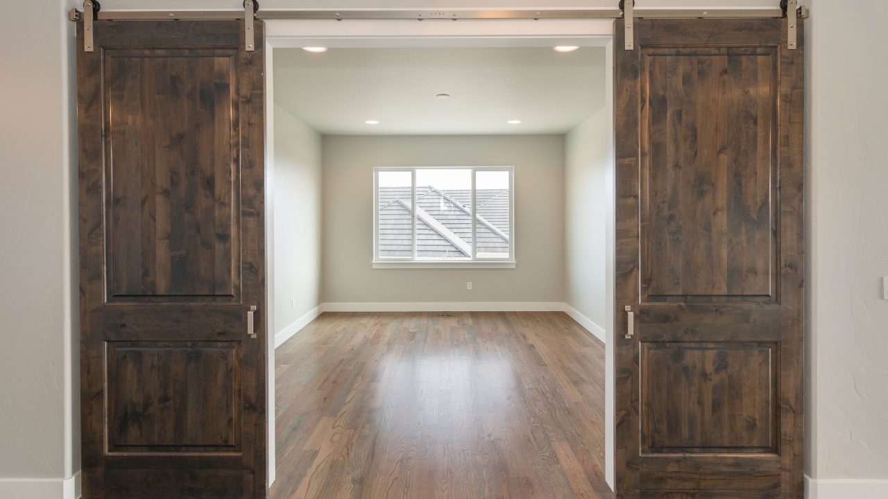
The farmhouse look had its moment, but designers agree it’s easy to take too far. Sliding barn doors, faux shiplap, and distressed everything can make a newer home feel forced. Mixing rustic pieces with modern or classic elements gives the same cozy feel—without looking like a theme. Less “set design,” more authenticity.
Copying influencer decor without scale in mind
Something that looks amazing online can look awkward in your own space. Designers see this all the time—mirrors hung too high, rugs too small, or furniture too big for the room. Before buying, measure and visualize how each piece fits. Scale and proportion matter more than copying a Pinterest photo.
Like Fix It Homestead’s content? Be sure to follow us.
- Man Says He Found Out the Fence He Paid For Wasn’t Actually on His Property
- Woman Says Her Neighbor Started Taking Mulch From Her Delivery Pile Before She Could Even Spread It
- I made Joanna Gaines’s Friendsgiving casserole and here is what I would keep
- What Caliber Works Best for Groundhogs, Armadillos, and Other Digging Pests?