How to style around things you can’t afford to replace
Photo credit: Artazum/Shutterstock.com
Every home has pieces you’d swap in a heartbeat—orange tile, off-scale sofa, dated countertops. You don’t have to love them to live with them well. You style around them: control the color story, shift attention, and use texture and layout to make the “loud” thing part of a plan.
This is how you do it without wasting money.
Neutralize with repetition
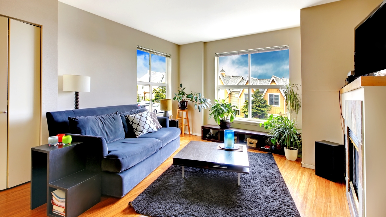
If the fixed element is loud—tile, counters, a sofa color—repeat a softened version of that hue once or twice so it looks intentional. An orange tile wall calms down when a clay pot and a striped tea towel echo it. A navy sofa feels planned when pillow covers pick up navy in a smaller dose. Repetition turns “mistake” into “choice.”
Keep the rest of the palette quiet. Let the echo do the work.
Shift the focal point
Create a competing moment that feels good to look at: a large piece of art, a styled bookshelf, a layered bed. People look where you tell them to. In a kitchen with dated counters, hang one great print and a slim sconce above a styled cutting board zone. The eye moves there first.
Lighting is a cheat code here. Light what you want people to notice.
Layer texture over sheen
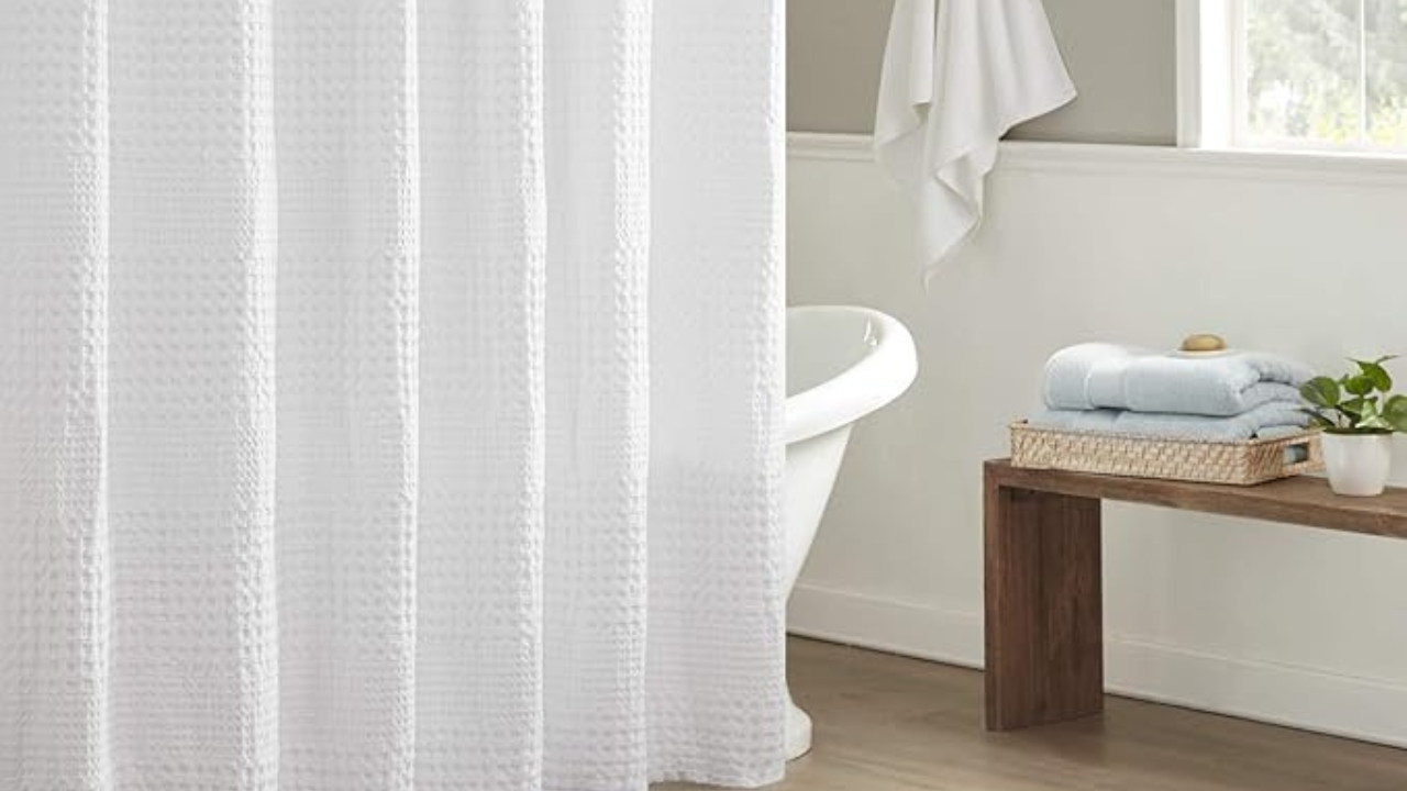
Shiny, dated finishes look calmer next to matte textures. Wood boards, woven baskets, linen runners, and stone trivets soften glossy surfaces and make them feel less aggressive. In a bath with shiny tile, a waffle shower curtain and a wooden stool change the read without a demo.
Texture also photographs better, which helps you like your own rooms more.
Change scale to fix proportion
If a sofa is too big, balance it with a larger rug and taller lamps so it stops dwarfing everything. If cabinets are too short, hang simple panels high and wide to raise the perceived ceiling height. Scale solves awkwardness faster than any small decor swap.
Measure lamps. Tall lamps save more rooms than new side tables.
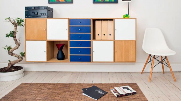
Use trays and runners to break up surfaces
A busy counter looks calmer under a runner with a tray on top. You’re creating lanes so your eye doesn’t see one big sheet of “meh.” On coffee tables, a tray plus one stack of books contains visual clutter and pulls attention from the table finish you don’t love.
Choose solid fabrics so patterns aren’t fighting.
Paint the right thing, not everything
Sometimes painting the walls is the wrong move. If the floor is loud, a deeper wall color can make it look like a choice. If a built-in is dated, paint just the built-in and leave the walls alone. The contrast will look purposeful and you’ll save your budget for a real change later.
Test big swatches on poster board and move them around all day before you commit.
Edit what competes and hide what screams

If the countertops are busy, clear appliances and jars. Keep out one coffee maker and a fruit bowl. That’s it. Visual clutter adds noise to something already loud. In living rooms, hide cords and toy bins so the fixed elements aren’t battling extra distractions.
Make a “daily tuck” habit—five minutes at night resets the whole look.
Bring in plants to soften edges
Greenery pulls attention and makes dated finishes feel warmer. One plant on the counter, one on the console, and a branch in a vase can do more for mood than any small decor shop. Keep pots simple so you’re not adding another pattern to the mix.
If you’re not a plant person, use branches. They last a week and look clean.
Styling around “stuck” pieces is about repetition, scale, texture, light, and editing. You’re making what you have look like part of the plan until the day you can replace it. And honestly, once the room is calm, you might not hurry that replacement nearly as much.
Like Fix It Homestead’s content? Be sure to follow us.
- Man Says He Found Out the Fence He Paid For Wasn’t Actually on His Property
- Woman Says Her Neighbor Started Taking Mulch From Her Delivery Pile Before She Could Even Spread It
- I made Joanna Gaines’s Friendsgiving casserole and here is what I would keep
- What Caliber Works Best for Groundhogs, Armadillos, and Other Digging Pests?