10 layout mistakes that make even beautiful rooms feel off
Photo credit: Vlada Karpovich/Pexel.com
You can own great pieces and still feel like the room never lands. Most of the time, it’s layout—where the furniture points, how people walk through, and what your eye hits first. Fix those three, and the space calms down before you even touch decor.
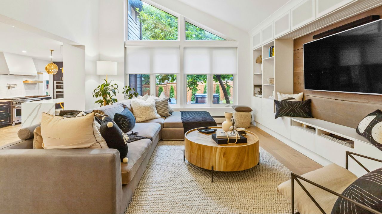
Every seat faces a wall, not a focal point
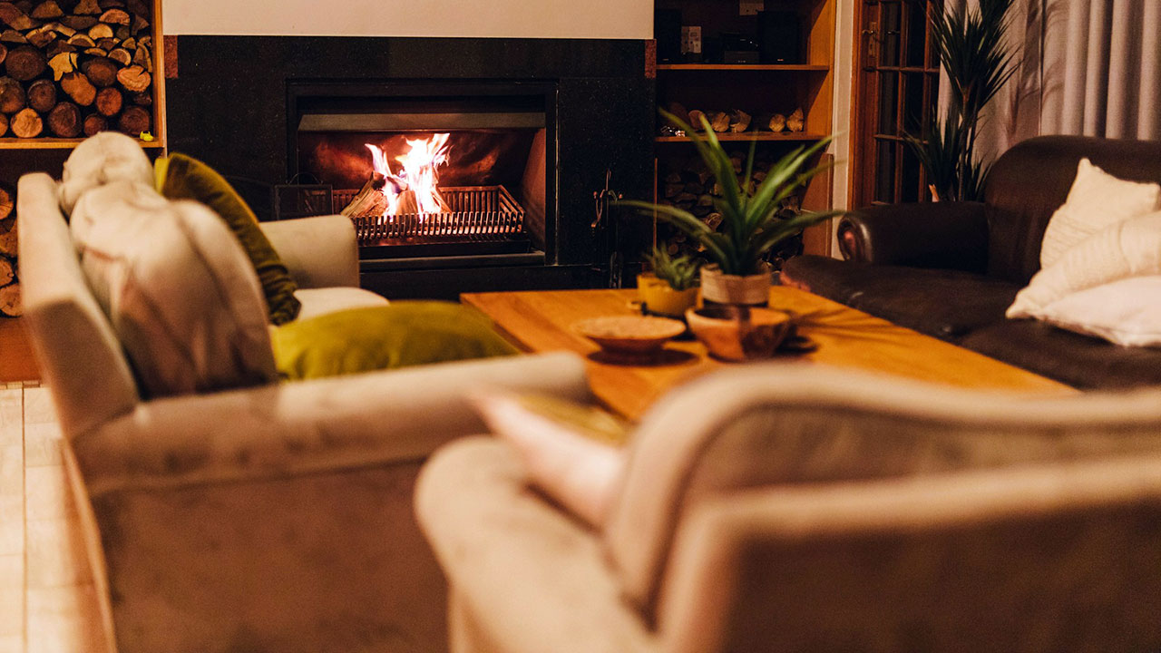
If your sofa looks at a blank wall and your chairs stare at corners, the room feels aimless. Pick one leader: a fireplace, a big window, a built-in, or a single large piece of art. Aim seating toward that point and let everything else support it. Side chairs can angle in 10–15 degrees to catch conversation without blocking sightlines. Once your eye knows where to land, the chaos drops. You’ll also notice you stop moving decor around, because the room finally has a job.
Furniture hugs the perimeter like a waiting room
When everything clings to the walls, the middle of the room goes dead and conversation dies with it. Pull the sofa forward a few inches, float the chairs, and drop a rug that actually catches the front legs of each major piece. Add a slim console behind the sofa for lamp light and cord control. Even a tiny “float” creates depth, which makes the room feel larger and more intentional. The goal isn’t awkward gaps—it’s a little breathing room so the layout stops feeling like a lobby.
Walkways are pinched to ankle width
If you’re side-stepping the coffee table or scooting around chair arms, the footprint is wrong. Leave 16–18 inches from cushion to coffee table and 30–36 inches on main traffic paths. In tight rooms, swap chunky tables for leggy ones so you see more floor. When bodies can move without a dance routine, the room reads generous, even if it’s not big. This is the fastest fix for a space that “feels small” no matter how much you declutter.
The coffee table is the wrong size and height
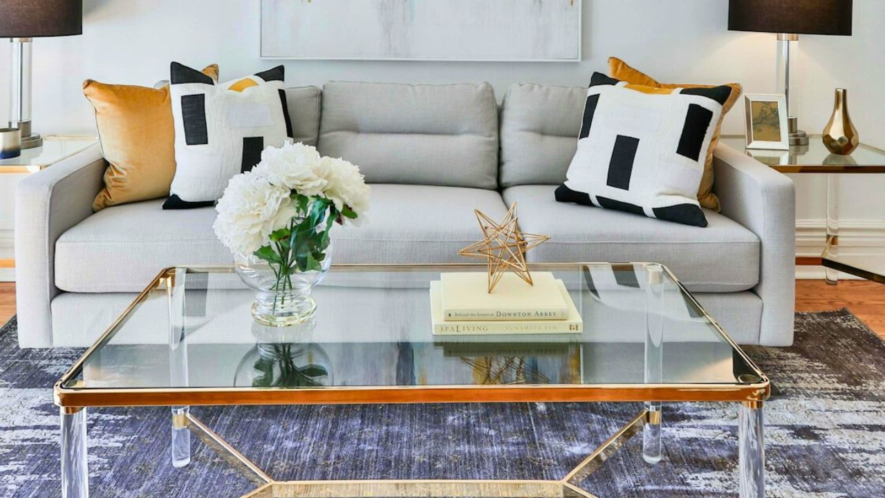
Too small makes everyone lean; too tall feels clunky. Aim for a table roughly two-thirds the sofa length and an inch or two lower than the seat. If your favorite piece is undersized, nest a second table or tray a sturdy ottoman to gain surface area and softness. The right reach changes how the room functions—snacks, coffee, board games—and when function clicks, the whole space looks better for free.
Lighting lives in one place—overhead
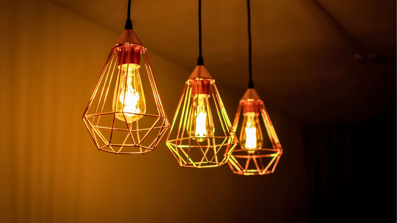
A single ceiling fixture gives you glare and lonely corners. Layer instead: ceiling for volume, lamps at face height, and a sconce or picture light at eye level if you can swing it. Keep bulbs warm (2700–3000K) and consistent per room so paint and skin tones look good after dark. The minute you light people instead of just the ceiling, the layout feels welcoming and the furniture arrangement makes more sense.
The rug floats like a bath mat
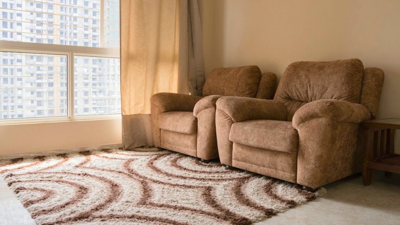
Small rugs chop rooms and make furniture look disconnected. Size up or layer: a big jute or sisal base under your patterned favorite so front legs land on the field. Treat the rug like an island that defines the group, not a postage stamp under a table. When the seating connects to one shared surface, the eye relaxes and the room reads as one story.
Pairs everywhere, rhythm nowhere
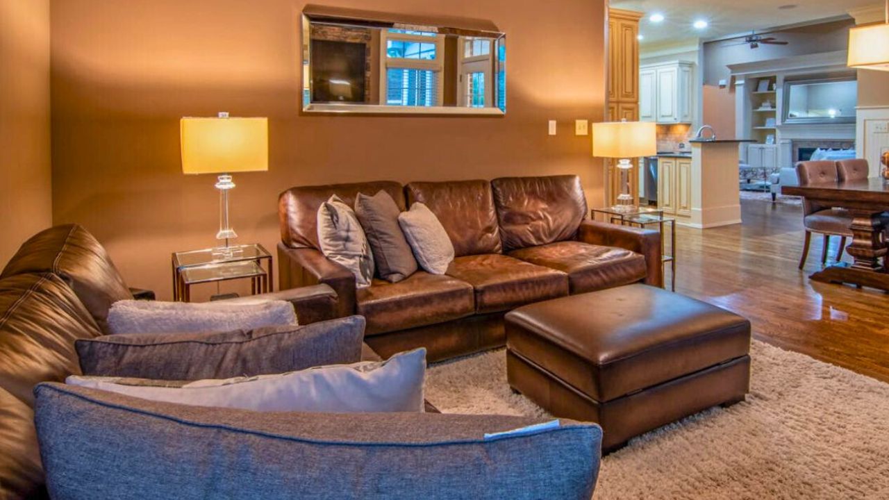
Two lamps, two chairs, two frames on every wall turns stiff fast. Pick one “pair moment” where symmetry matters—entry console, fireplace wall—and let the rest be collected. Mix a matched pair of chairs with a single vintage side table, or flank the sofa with two different lamps in the same metal. You’re aiming for rhythm, not mirroring every view like a furniture catalog.
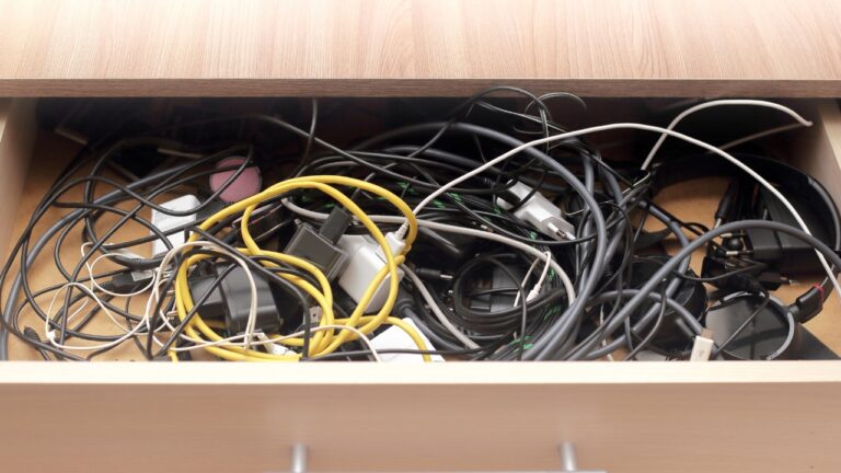
Sightlines stop at clutter
If the first thing you see is a cord nest, a shoe pile, or a toy bin, the layout feels messy before you sit down. Shift the “life zone” off the main view—use a lidded basket, a cabinet with doors, or a single low bin under a console. Mount a power strip to the back of furniture and run cords through stick-on clips. Clean floor lines sell the entire plan, and suddenly your best pieces can breathe.
Doors and windows are bullying the plan
Swing paths and glare can push furniture into weird corners. If a window washes out the TV, angle one chair 10–15 degrees toward the light source and add a lamp that grazes the seat, not the screen. Use lower profiles under windows so you don’t fight the sill. If a door constantly bumps a chair, it’s the wrong chair for that spot—swap to something slimmer or move the chair two inches and test for a week.
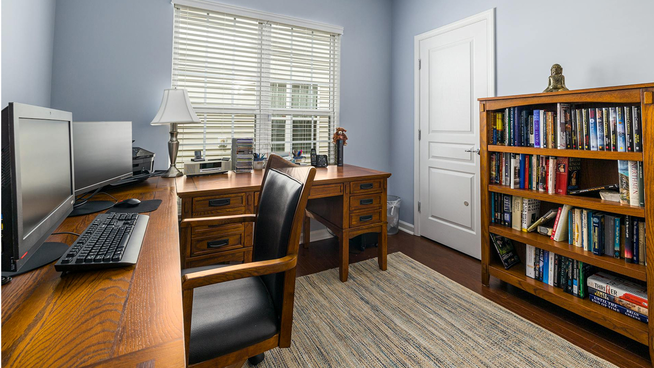
The secondary corner doesn’t have a job
Unassigned corners become pile zones. Name the corner: reading chair plus a floor lamp and a basket, a small desk with a task light, or a kid craft table with a lidded bin. Give it the tools it needs and nothing extra. When every zone has a purpose, the whole room feels planned—like a home you live in, not a space you keep tidying.
Like Fix It Homestead’s content? Be sure to follow us.
- Man Says He Found Out the Fence He Paid For Wasn’t Actually on His Property
- Woman Says Her Neighbor Started Taking Mulch From Her Delivery Pile Before She Could Even Spread It
- I made Joanna Gaines’s Friendsgiving casserole and here is what I would keep
- What Caliber Works Best for Groundhogs, Armadillos, and Other Digging Pests?