What designers are doing with tile that no one expected
Photo credit: Deekens/istock.com
Tile used to be the “hard finish” you picked at the end: one backsplash, one floor, done. Lately, designers are using tile to shape the whole mood of a room—quiet, textural, and a little more grown-up—without shouting for attention.
The surprise isn’t the patterns; it’s how restrained the choices are and how much the grout, scale, and sheen are doing the heavy lifting.
Scale and grout are the real design move
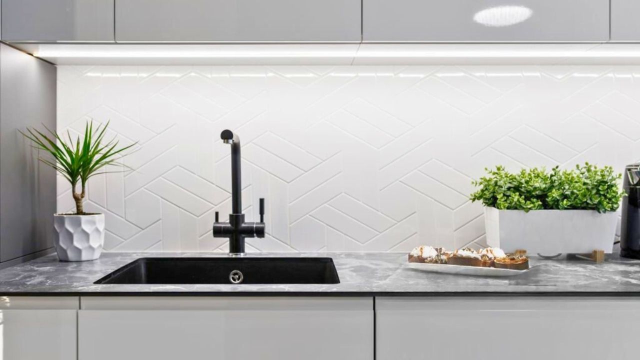
Large-format tile with tight, color-matched grout makes spaces read calmer and bigger. You’re not counting lines; you’re feeling continuity. In kitchens and baths, that means 12x24s or larger on floors with grout that nearly disappears. On walls, oversized squares or elongated rectangles stacked neatly (not staggered) look intentional and modern without feeling cold. It’s the opposite of the busy mosaics we all tried ten years ago—fewer seams, more surface, and a room that breathes.
Texture over gloss
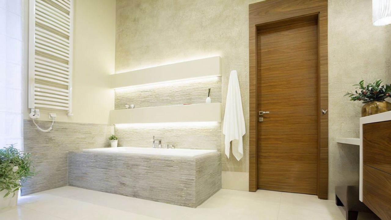
High-gloss finishes bounce light but can feel harsh in real life. Designers are reaching for matte, honed, or subtly undulated surfaces that catch light softly. Think a handmade-look subway with a slight ripple instead of a mirror finish, or a honed porcelain that reads like limestone without the babysitting. The sheen shift is small, but the room instantly feels quieter and more expensive.
Low-contrast checkerboard
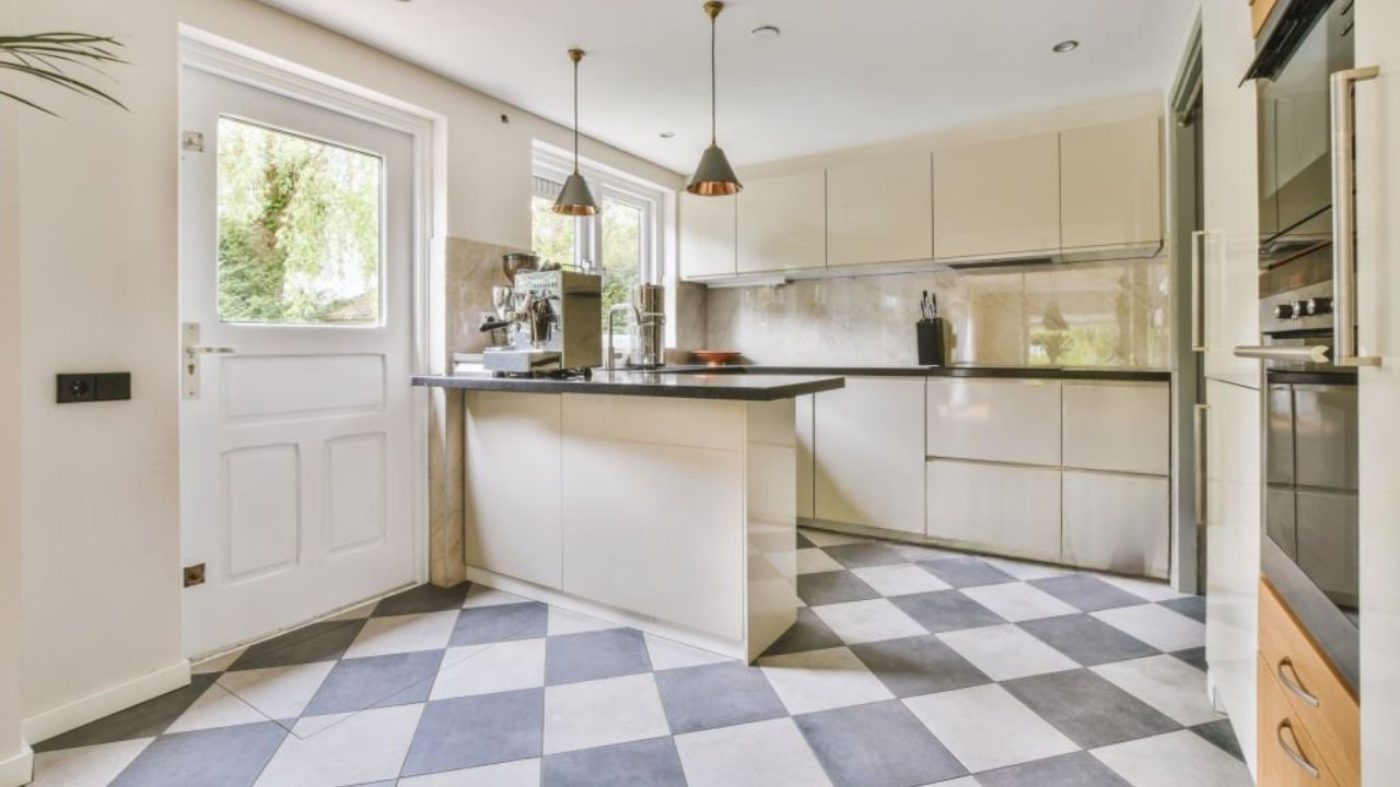
Checkerboard isn’t gone—it just grew up. Instead of black-and-white, you’ll see warm gray with putty, cream with sand, or two greens in the same family. The pattern gives movement without turning the floor into the headline. If your house has a lot of visual noise already, this gentler contrast lets you have personality without breaking the palette.
Vertical stack and picture-frame edges
Running rectangular tile vertically (stacked, not offset) pulls the eye up and can make low ceilings feel taller. Around mirrors, niches, or a stove, designers “picture-frame” the focal area by turning the tile and using a clean edge trim so there’s an intentional border. It reads tailored instead of “we tiled until we ran out.”
One hero, everything else supports
The new rule is choose one leader—floor, shower wall, or backsplash—and keep the rest quiet. If the shower is a softly veined porcelain slab, the floor becomes a matte, plain field that disappears. If the kitchen floor is the star with a checkerboard, the backsplash calms down to a softly textured square with near-match grout. Rooms feel layered because the roles are clear.
Thresholds that handshake, not shout
Transitions matter. Instead of harsh metal strips or jarring material changes, designers are using color-matched reducers or continuing the tile into an adjacent “wet zone” so the break is soft. If you can’t extend tile, echo its tone in a nearby stool, frame, or wood bowl so the story continues.
Function that doesn’t feel clinical
Porcelain with the look of stone, matte finishes that hide water spots, and grout sealed the day it’s installed—none of this is flashy, but it changes how a room lives. The best tile work right now is practical first and quietly beautiful second. You notice it at 9 p.m. when the room still looks calm instead of streaky or busy.
Like Fix It Homestead’s content? Be sure to follow us.
- Man Says He Found Out the Fence He Paid For Wasn’t Actually on His Property
- Woman Says Her Neighbor Started Taking Mulch From Her Delivery Pile Before She Could Even Spread It
- I made Joanna Gaines’s Friendsgiving casserole and here is what I would keep
- What Caliber Works Best for Groundhogs, Armadillos, and Other Digging Pests?