12 Color Mistakes That Make Rooms Feel Darker Than They Are
If a room feels gloomy, we usually blame the lack of windows. But color choices have a lot to do with it too. The wrong paint, fabrics, and finishes can steal light, even in a space that technically gets sun. You don’t have to repaint the whole house to fix it—just understand what’s dragging it down.
Here are common color mistakes that quietly make rooms feel darker and heavier.
1. Painting everything one flat, dark shade
Dark colors can be beautiful, but painting every wall, trim, and ceiling in the same deep shade can feel like the room is closing in—especially without strong natural light.
If you love a deep color, balance it with lighter trim, a pale ceiling, or one lighter wall so the room has contrast and places for light to bounce.
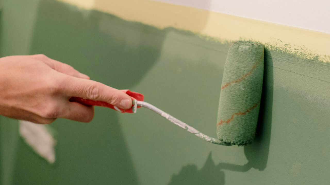
2. Using muddy off-whites in low light
Not all “off-whites” brighten a room. Some have gray, green, or beige undertones that turn dingy in low light. That’s how you end up with walls that look dirty instead of fresh.
In darker rooms, lean toward cleaner, slightly warmer whites that don’t go gray when the sun disappears. Sample them on multiple walls, not just one.
3. Covering floors with dark, heavy rugs
A big, dark rug can make a room feel grounded, but in a small or dim space it also eats light. If you already have dark floors, piling on a deep-colored rug doubles the effect.
Lighter rugs with subtle pattern reflect more light and visually open the floor back up. You still get warmth without the heaviness.
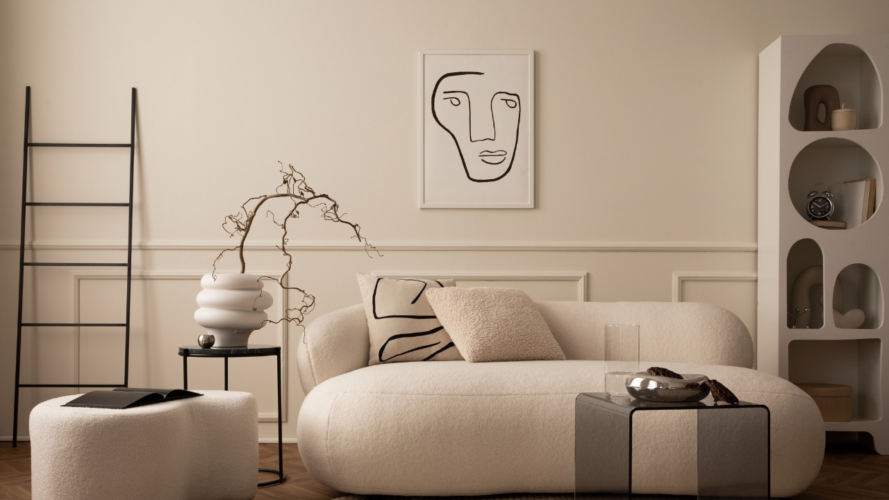
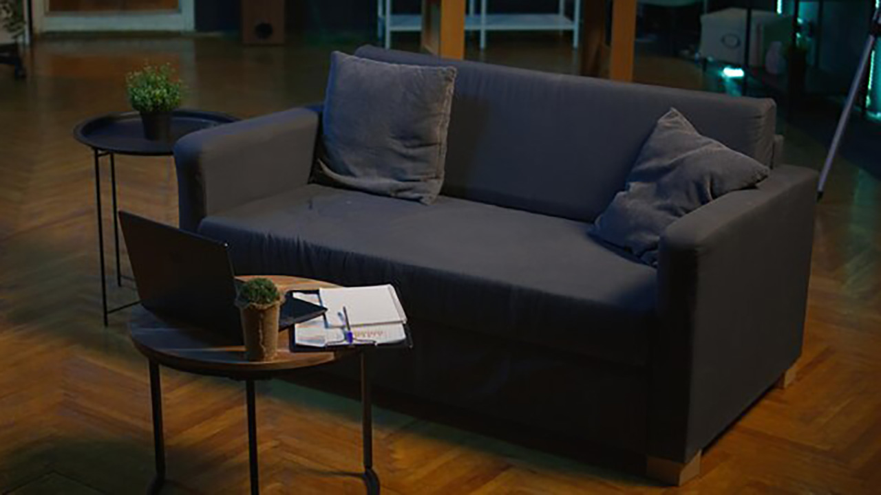
4. Matching furniture and walls too closely
When furniture and walls are almost the same medium-dark shade, everything blends into a block. The room loses depth and reads as one large, heavy mass.
You want contrast: light sofa, slightly deeper walls, or vice versa. Even a few lighter pillows or a throw can break up the sameness enough to help.
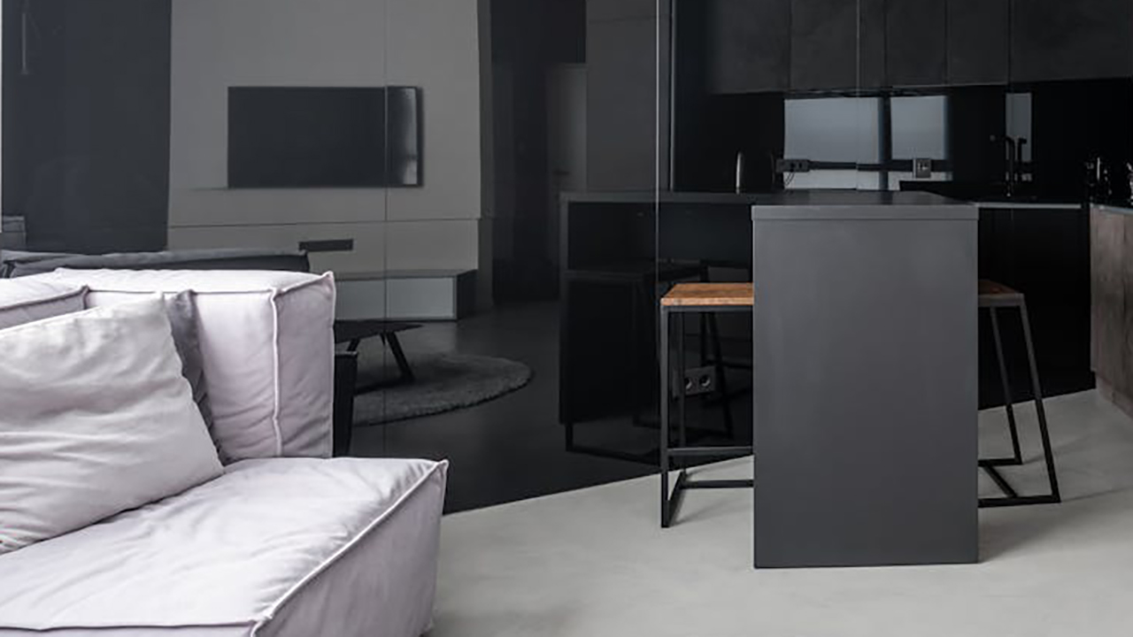
5. Overloading the room with cool grays

Cool grays can feel crisp in bright spaces, but in darker rooms they can skew cold and flat. Combine that with low winter light and suddenly everything feels like a cloudy day.
If your room is already gray-heavy, pull in warmth with wood tones, creams, warm metals, and textiles in tan, rust, or muted gold.
6. Using small, high-contrast patterns everywhere
Strong contrast patterns—like black-and-white stripes or busy geometric prints—can be fun, but too many in a small space make the eye work overtime. It feels visually “loud,” which often reads as dark and cramped.
Reserve high-contrast patterns for smaller accents and keep big surfaces (walls, large rugs, major furniture pieces) in softer, more blended tones.
7. Painting ceilings a darker color without enough height

Dark ceilings can be dramatic, but in standard-height rooms they often just feel low. The eye stops sooner, making the room feel more compressed.
If you want interest overhead, try a slightly warmer white, a very soft color, or even a subtle pattern instead of a full dark ceiling.
8. Using only cool-toned lighting with cool colors

Cool bulbs plus cool paint equals a space that feels icy. If your walls already lean blue, gray, or crisp white, bright white bulbs push everything further that direction.
Soft white bulbs warm things up and help colors look more flattering, especially at night. Sometimes changing bulbs does more than changing paint.
9. Ignoring trim and doors

Leaving old, dingy trim and doors the same color they’ve always been can drag the whole room down, even if you repaint the walls. Yellowed or dark trim soaks up light around the edges.
A fresh coat of brighter, clean white on trim and doors frames the room and bounces light back into the center.
10. Choosing heavy, dark window treatments
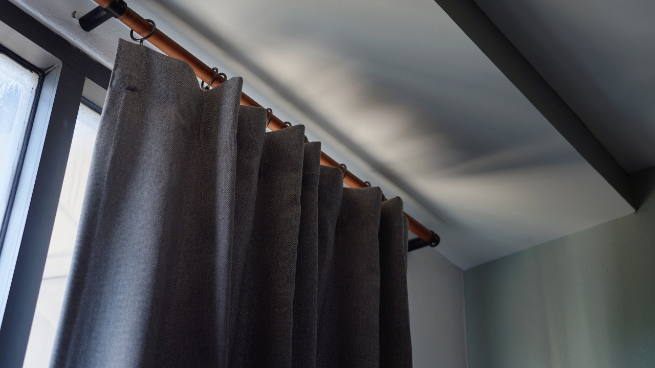
Thick, dark curtains that never open all the way might as well be a wall. They block light even when the sun is trying its best.
If you need privacy, layer lighter sheers with simple side panels so you can let in daylight without feeling exposed. Keep rods wide enough that curtains can clear the glass when open.
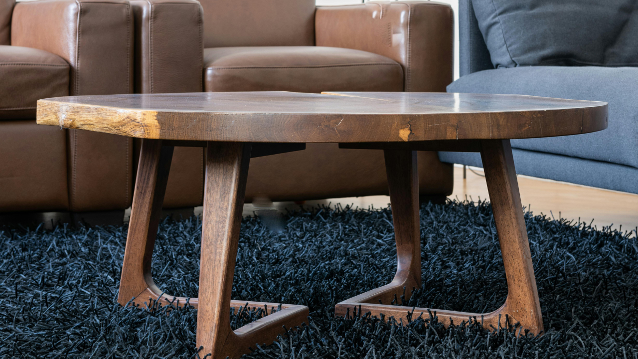
11. Filling the room with glossy, dark wood
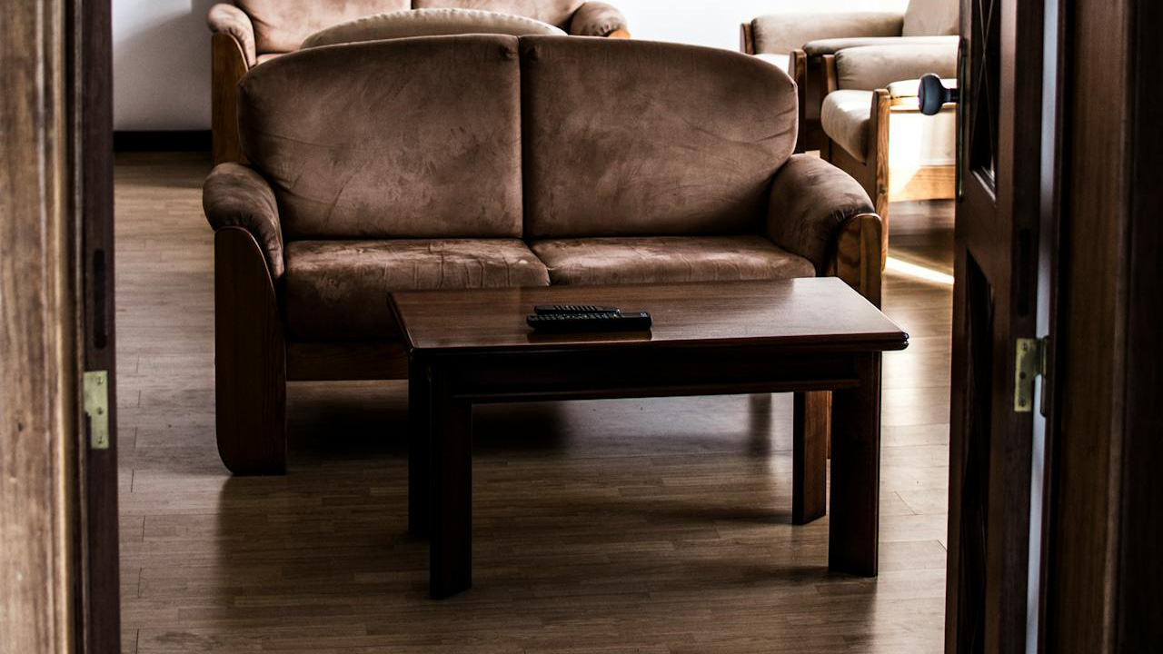
Dark wood furniture can be beautiful, but a room full of it—table, chairs, shelves, side tables—soaks up light, especially if the floor is dark too.
Mix in some pieces with lighter finishes, painted elements, or textiles that break up those big dark surfaces. Contrast doesn’t mean you have to get rid of what you own—it means balancing it.
12. Forgetting about color in decor
Even if your walls are light, filling the room with only dark pillows, throws, and accessories can weigh it down. You’ve essentially re-darkened everything with fabric and decor.
Add a few lighter, softer pieces into the mix. Creams, warm neutrals, and muted colors soften harsh contrasts and help light bounce around instead of disappearing.
Like Fix It Homestead’s content? Be sure to follow us.
- Man Says He Found Out the Fence He Paid For Wasn’t Actually on His Property
- Woman Says Her Neighbor Started Taking Mulch From Her Delivery Pile Before She Could Even Spread It
- I made Joanna Gaines’s Friendsgiving casserole and here is what I would keep
- What Caliber Works Best for Groundhogs, Armadillos, and Other Digging Pests?