6 living room paint colors that are about to take over—and 3 that will age your house overnight
Paint trends come and go, but you can feel the shift right now. Cool gray everything is fading out, and richer, more grounded colors are taking over. Designers and paint brands are all leaning into earthy greens, warm browns, and soft whites with actual warmth to them—colors that feel like real life instead of a staged listing photo.
If you’re thinking about repainting the living room, here’s what’s on the way in—and the shades that quietly drag your house backward the minute the roller hits the wall.
Olive and muddy green
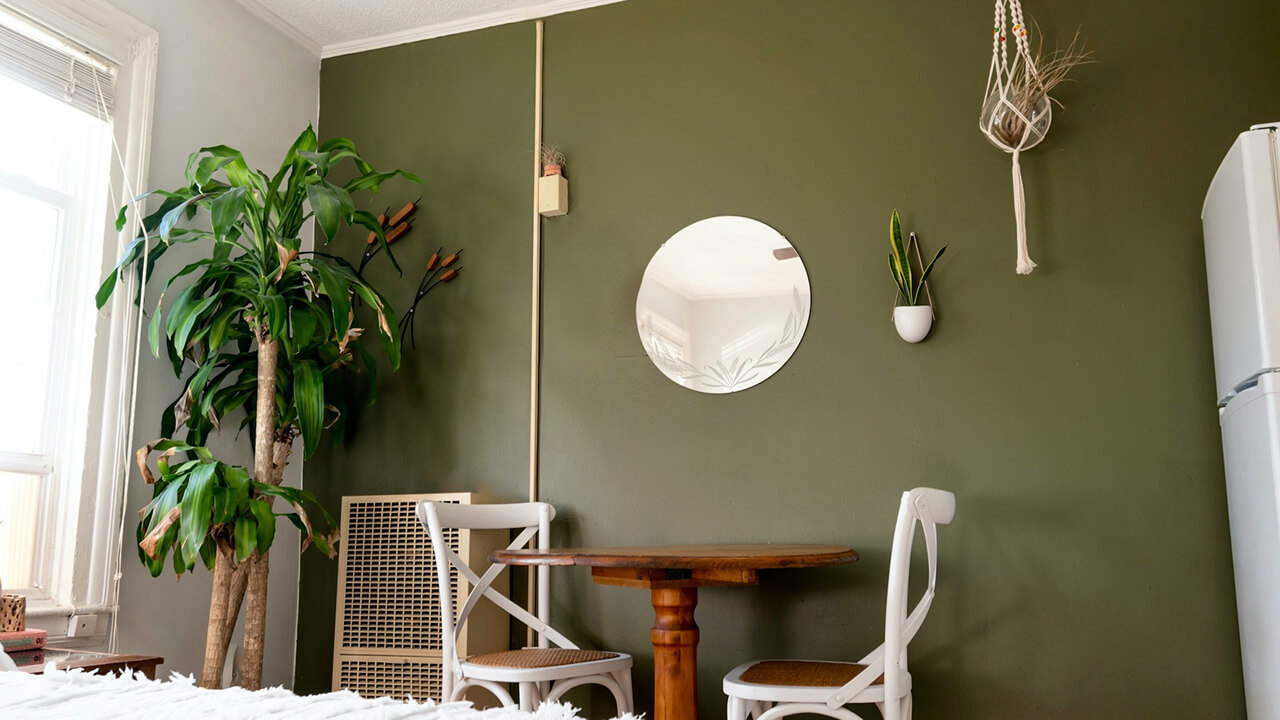
Olive and muted “botanical” greens are everywhere in 2026 forecasts. They’ve got enough depth to feel grown-up, but they’re still calm and easy on the eyes. Designers like them because they play nice with wood, leather, and stone, not just crisp white trim.
On walls, olive works well when you keep ceilings and trim light and add texture instead of a ton of bright color. Think linen, jute, and warm wood. If your house leans traditional or farmhouse, this green feels right at home instead of like a trend you forced into the room.
Smoky blue and inky teal
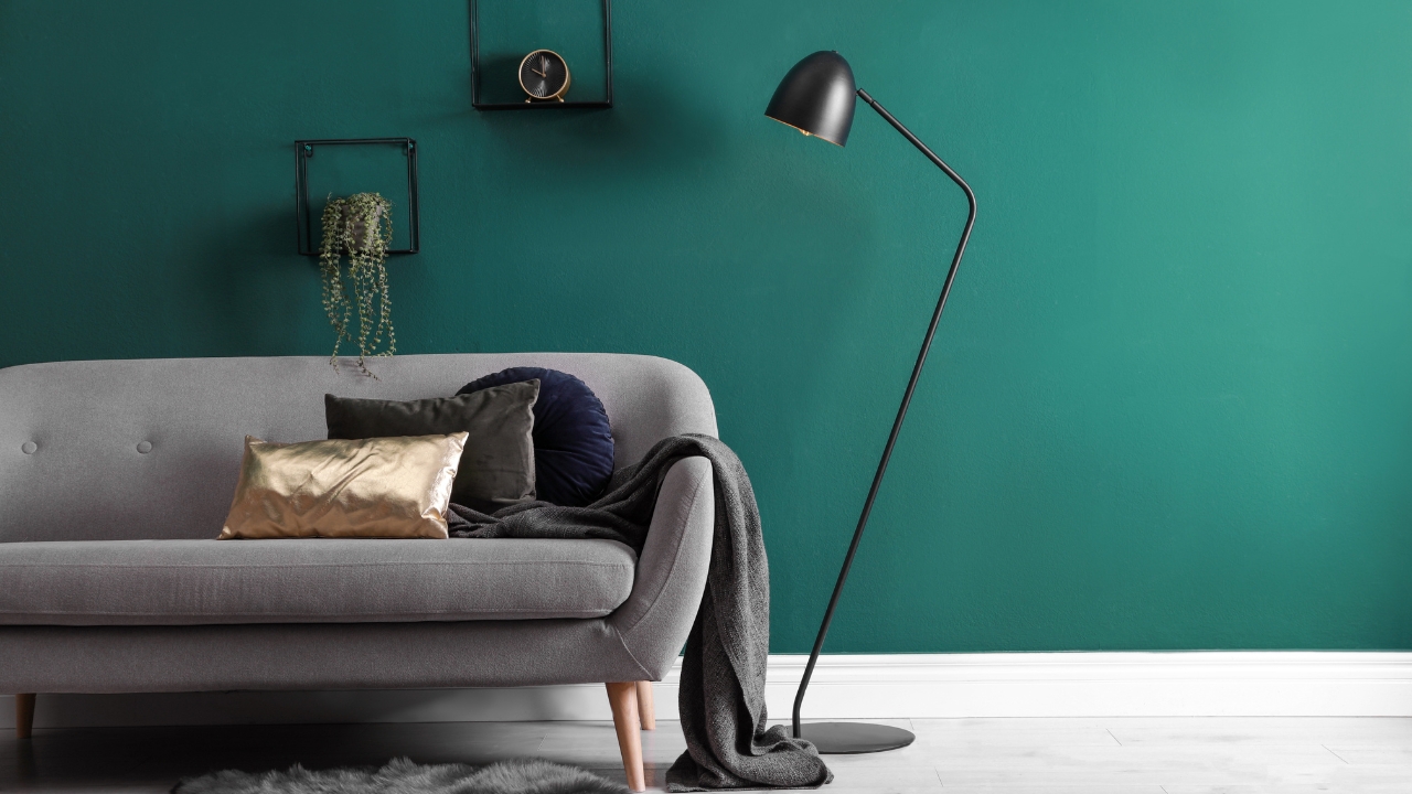
Instead of icy blue, you’re seeing smoky, inky versions—colors that sit somewhere between blue, green, and gray. They show up in the “color of the year” palettes as moody teals and slate blues meant to feel grounding instead of cold.
These shades are great for living rooms that get decent natural light. Paint all four walls and balance them with lighter furniture, or use them on one big wall in a smaller space. Pair with warm white, brass, wood, and soft textiles so it feels like a hug, not a cave.
Soft clay and terracotta
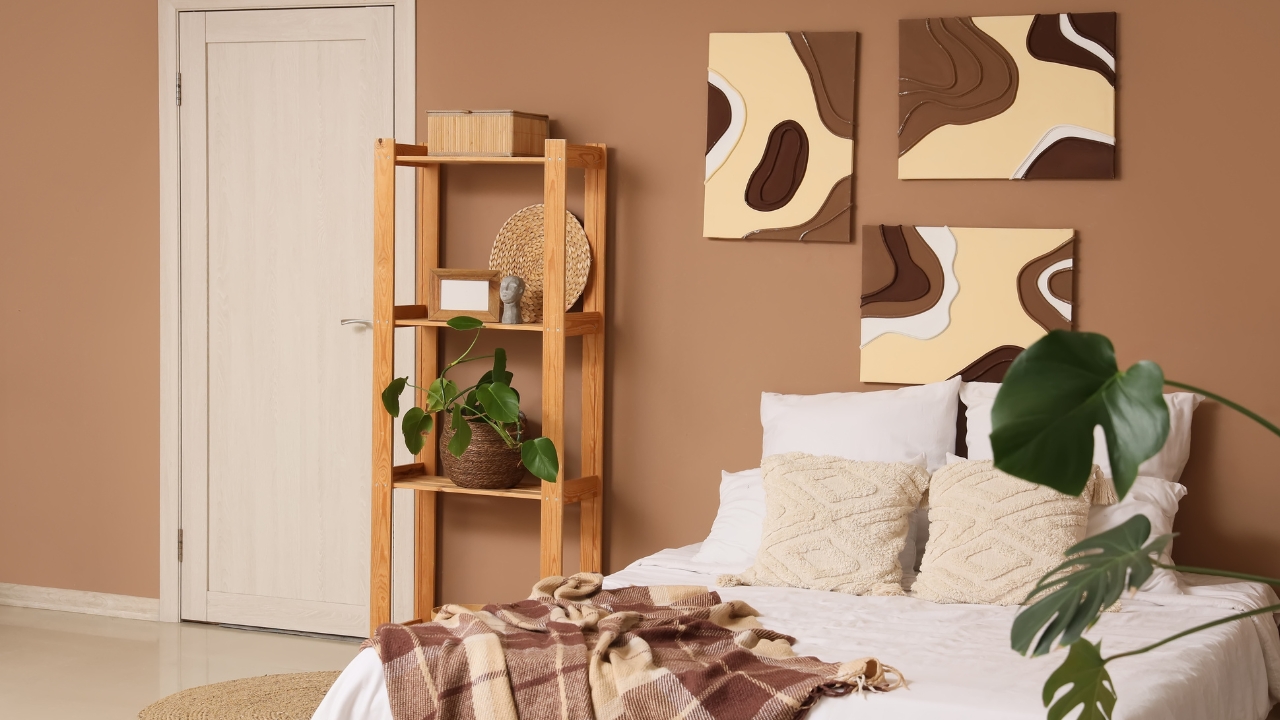
Warm, earthy colors—clay, terracotta, ochre—are replacing the old beige. They give a room some color without screaming at you, and they look especially good with black, brown, and natural materials.
In a living room, a soft clay reads like a sunbaked neutral. It’s strong enough for a full room if the furniture is more relaxed, or it can be an accent wall behind a sofa. Just steer clear of the super-orange versions from the 90s; look for words like “dusty,” “smoky,” or “muted” on the swatch.
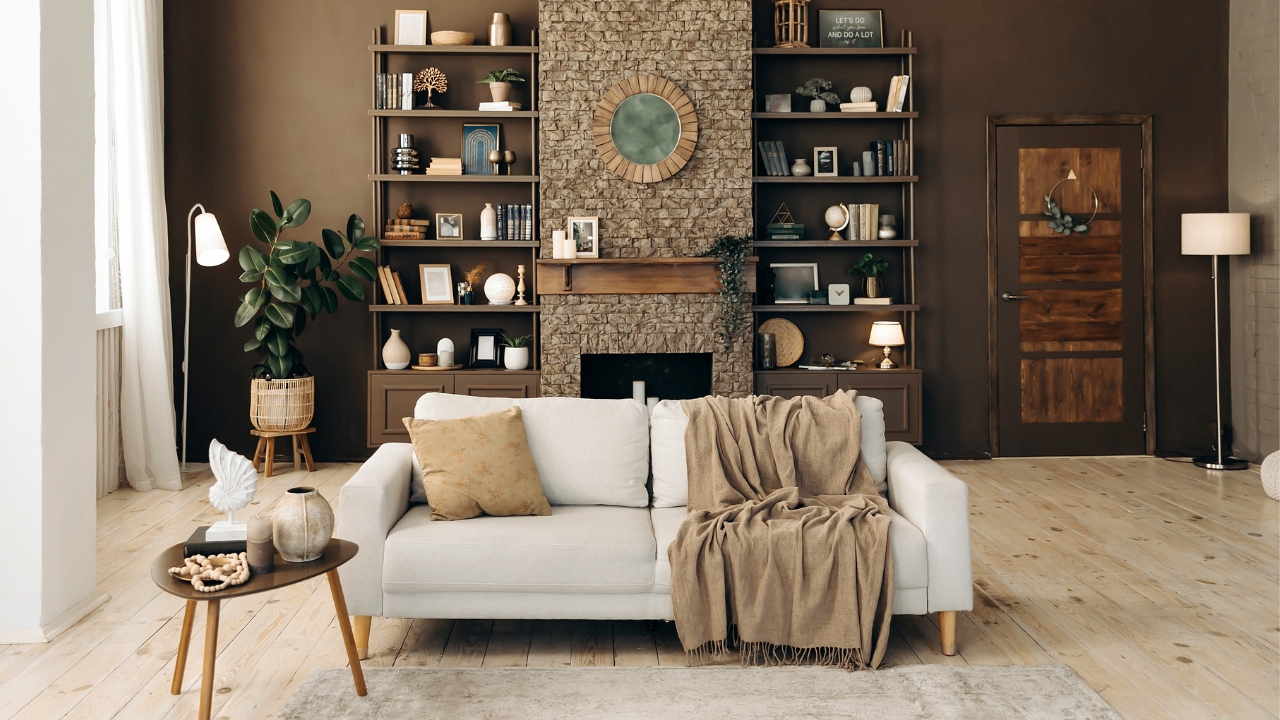
Deep chocolate and caramel browns
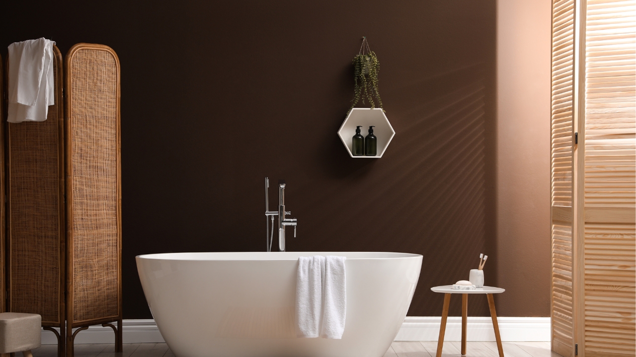
Rich browns are all over the 2026 color trend reports—a reaction to years of gray everything. They show up as chocolate walls, caramel trim, and darker, cocoon-like spaces that still feel welcoming, not gloomy.
These work best in rooms with decent light or in homes that lean more traditional. Keep ceilings and some furniture lighter so the whole room doesn’t feel like a cave. Even a single chocolate-brown accent wall behind a TV or fireplace can ground the whole space.
Warm whites that aren’t cold or chalky
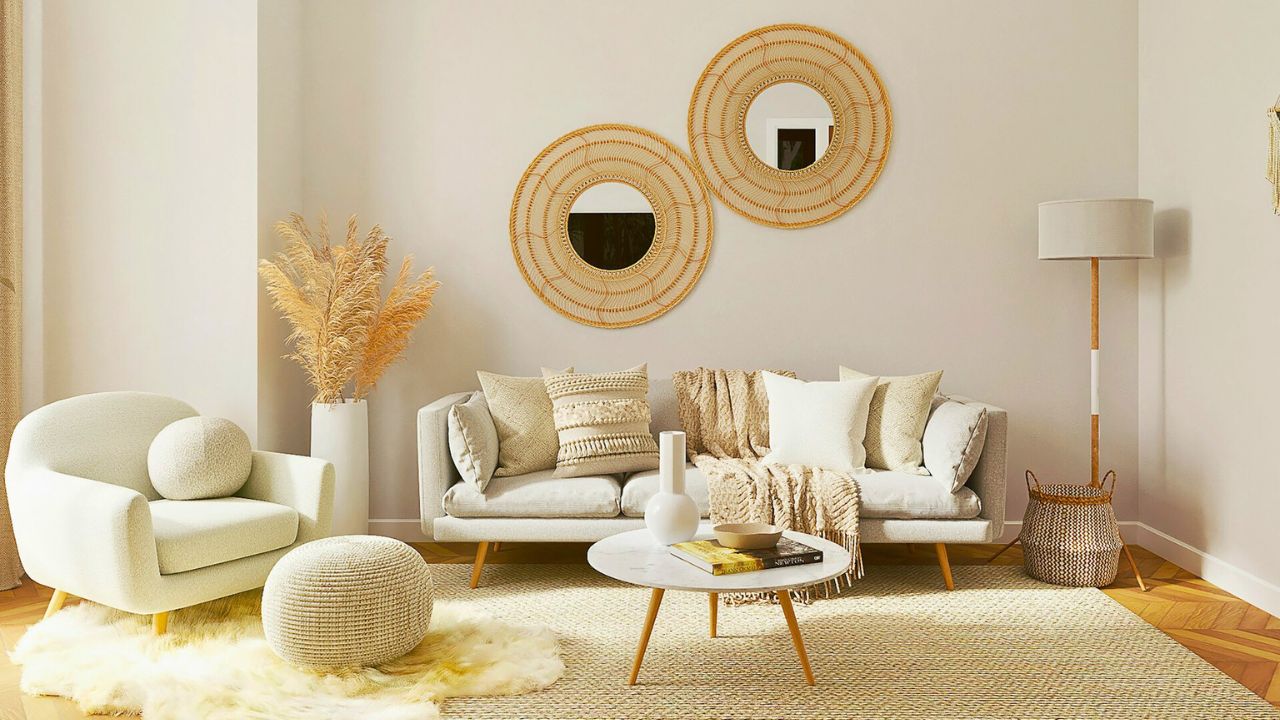
White isn’t going anywhere; it’s just shifting warmer. Paint companies keep releasing soft, “buttery” whites and creamy off-whites instead of the stark blue-tinted ones that made houses feel like empty rentals.
If you’re not ready to commit to strong color, a warm white living room gives you room to play with pillows, rugs, and art. Check your swatch in the actual room; it should look soft and clean, not dingy or blue under your lighting.
Muted greige with more warmth than gray
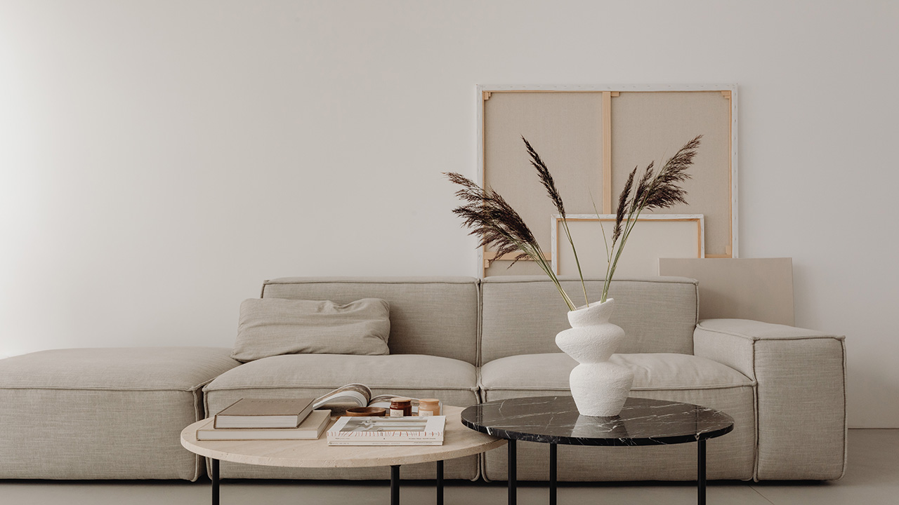
Gray isn’t entirely dead; it’s just warming up. Newer greige shades lean more beige and taupe, with less of that cold, blue undertone that made everything feel like an office.
Greige still works if you like a cleaner look, but the safest bets are the ones that sit comfortably next to wood tones and cream rather than sharp white and chrome. If your trim and floors already skew warm, pick a greige that matches that energy instead of fighting it.
Colors that age your living room overnight: icy cool gray

The super-cool, almost blue grays that were everywhere in the 2010s now give away the age of a remodel. They flatten wood tones, make skin look odd, and fight with warmer furniture.
If your living room is still painted in one of those shades, swapping it out for a warmer neutral or a grounded color will make the whole house feel more current without changing anything else.
Stark, bright white on every surface
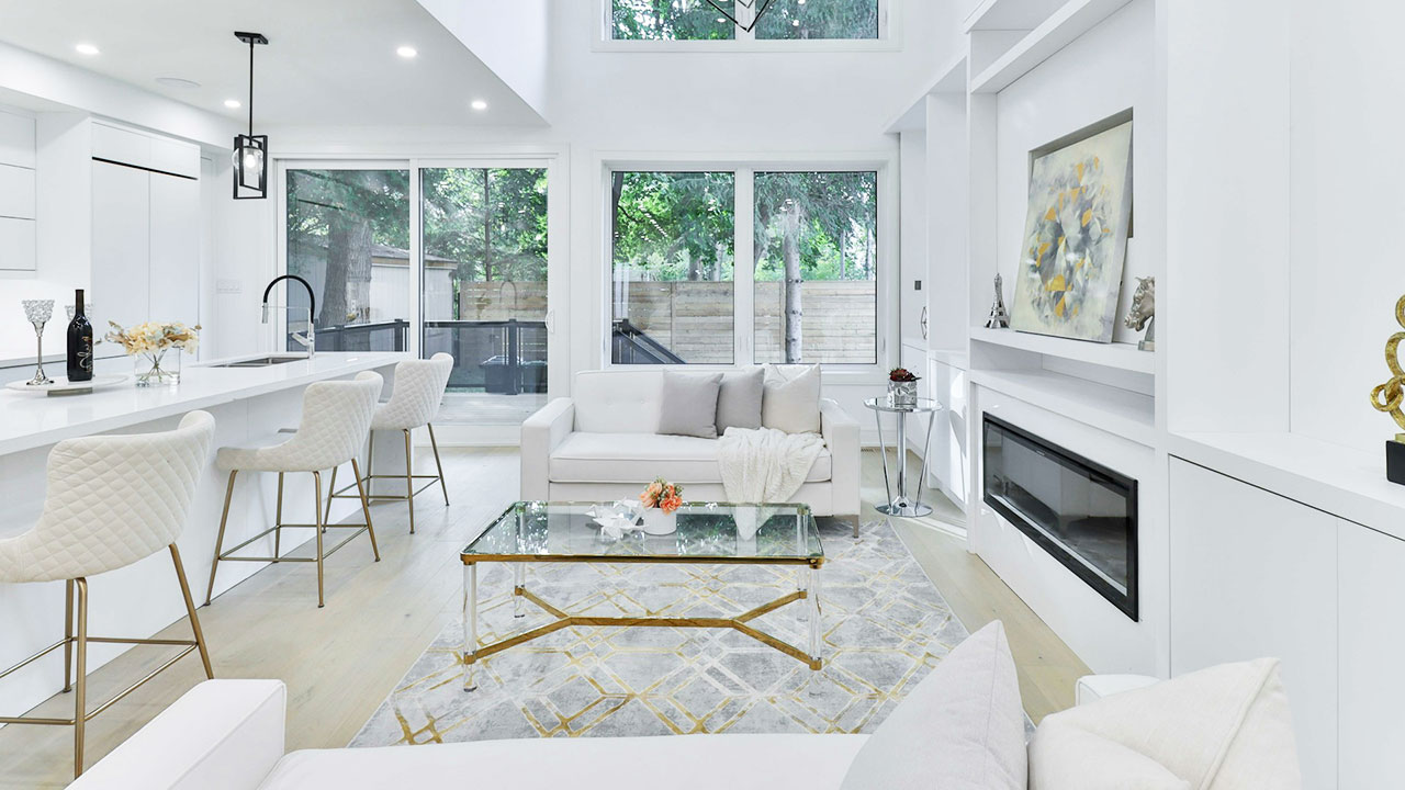
Pure, bright white can be stunning in certain modern spaces, but in most homes it looks unfinished or harsh. It highlights every scuff and makes rooms feel more like galleries than places people actually live.
A slightly warmer white is kinder to real-life walls, fabrics, and skin tones. If you already painted everything bright white and regret it, even dropping one notch warmer on the paint card can soften the whole room.
Loud accent walls in random colors
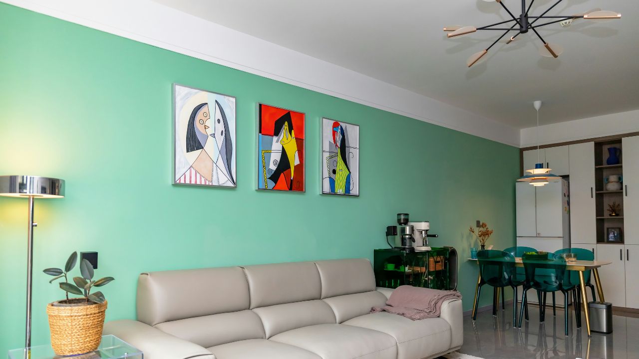
Accent walls are still around, but the neon teal, fire-engine red, and painter’s-tape blue versions make a space feel stuck in a specific year. They also box you into one rug and one sofa forever.
If you love color, go for it—but use colors that tie into the whole house and have some depth, not whatever was on sale. Or do the reverse: paint the whole room a rich color and let your trim and furniture be the “accent” instead of one random wall.
Like Fix It Homestead’s content? Be sure to follow us.
- Man Says He Found Out the Fence He Paid For Wasn’t Actually on His Property
- Woman Says Her Neighbor Started Taking Mulch From Her Delivery Pile Before She Could Even Spread It
- I made Joanna Gaines’s Friendsgiving casserole and here is what I would keep
- What Caliber Works Best for Groundhogs, Armadillos, and Other Digging Pests?

