5 countertop colors that make a kitchen scream “builder grade” no matter what else you do
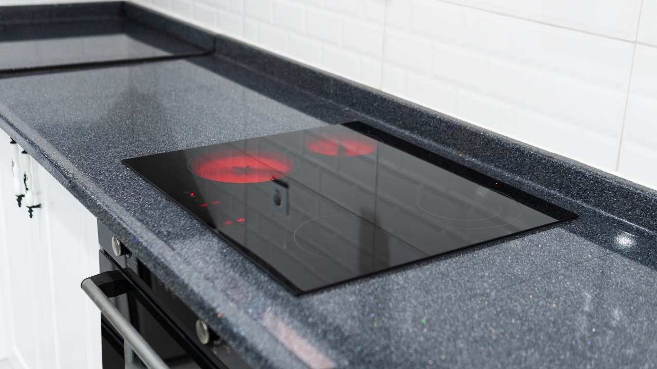
You can swap hardware, add pretty stools, and style the counters all day, but certain countertop colors will still drag the whole kitchen back to “starter spec house.” Designers keep saying the same thing: calmer, more subtle counters look higher-end, and loud or flat colors look cheaper, fast.
If your kitchen feels “off” and you can’t figure out why, it might be one of these.
1. Muddy, speckled brown granite
That brown, busy granite with black and cream specks had a long run. Now, it’s a dead giveaway your kitchen hasn’t been touched in a while. It tends to clash with newer paint colors and makes everything feel heavy and yellow.
If you’re stuck with it for now, keep surrounding finishes simple: soft white or warm greige walls, cleaner cabinet colors, and solid or very subtle backsplashes. The more pattern you pile around this granite, the more it shouts “builder grade.”
2. Stark, blinding white laminate or solid surface
Crisp white sounds safe, but on cheaper laminate or older solid-surface counters, it reads more like breakroom than kitchen. Designers actually call stark white one of the tackiest countertop looks when it’s flat and plasticky, because it shows every crumb and scratch.
To make it work until you can upgrade, add warmth everywhere else—wood cutting boards, woven trays, and softer off-white on the walls. The goal is to make the counter feel intentional, not like it came straight out of a catalog from 2005.
3. High-contrast, blotchy black-and-white granite
Black-and-white “Dalmatian” granite with big swirls and speckles used to be the dream. Now that trends favor quieter veining and simpler patterns, designers say this kind of granite feels visually busy and cheap.
If full replacement isn’t happening yet, keep your backsplash extremely simple—no mosaics, no wild shapes—and choose flat cabinet colors that don’t compete. Lighting helps a lot too; warmer bulbs soften the harsh contrast.
4. Super-bright colors (red, yellow, or primary green)
Bright red, lemon yellow, or primary green counters look fun on Pinterest and in showrooms, but most designers now list them as colors that instantly make a kitchen feel tacky.
If you already have them, your best move is to neutralize everything else: white or light wood cabinets, simple metal hardware, and very quiet decor. Long term, these are the tops that are worth swapping if you want your kitchen to look more “grown” and less like a set piece.
5. Faux-stone laminate in a pattern everyone recognizes
Laminate has its place, but the older fake-stone patterns—lots of tiny speckles, odd veining, and obvious “printed” texture—are a big part of that builder-grade feel. Fabricators even call older plastic laminate one of the main materials people are trying to replace now.
If you’re not ready for stone, look at newer laminates in softer, less busy looks or wood-look tops that actually suit the house. And while you’re stuck with the old ones, lose the clutter. A clear, styled counter with one plant and a cutting board will always look better than patterned laminate buried in stuff.
Like Fix It Homestead’s content? Be sure to follow us.
- Man Says He Found Out the Fence He Paid For Wasn’t Actually on His Property
- Woman Says Her Neighbor Started Taking Mulch From Her Delivery Pile Before She Could Even Spread It
- I made Joanna Gaines’s Friendsgiving casserole and here is what I would keep
- What Caliber Works Best for Groundhogs, Armadillos, and Other Digging Pests?
