The one lighting change that makes paint look better without repainting
Photo credit: CartoonFotoVid/Shutterstock.com
You can spend days choosing the perfect paint color and still feel disappointed once it dries on the wall. The missing piece is rarely the paint itself, it is the light you are using to see it. The single most effective change you can make, without touching a brush again, is to swap your bulbs and fixtures so they flatter the color that is already there.
By choosing the right color temperature, quality, and direction of light, you can make tired walls look cleaner, richer, and more intentional. With a few targeted upgrades, you turn “wrong shade” into “designer choice” and stretch your decorating budget much further than another round of repainting.
The real problem is not your paint, it is your light
When a wall color looks muddy, harsh, or strangely different from the paint chip, you are usually seeing the influence of your bulbs, not a failure of the paint. Artificial lighting changes how pigments read, shifting undertones and contrast so that a calm gray suddenly looks blue or beige, or a soft white turns yellow. As one expert on color notes, Artificial lighting adds another layer of complexity to color appearance, which is why the same paint can feel serene in one room and oppressive in another.
Lighting is also one of the fastest and least invasive ways to change how a room feels overall. Interior stylists consistently point out that if you Upgrade Your Ambient Lighting, you can dramatically change the mood of a space without touching the furniture or finishes. That is why the smartest first move, when a color disappoints you, is not to schedule a repaint, but to look up at the ceiling and into your lamps and ask whether the light itself is sabotaging the paint you chose.
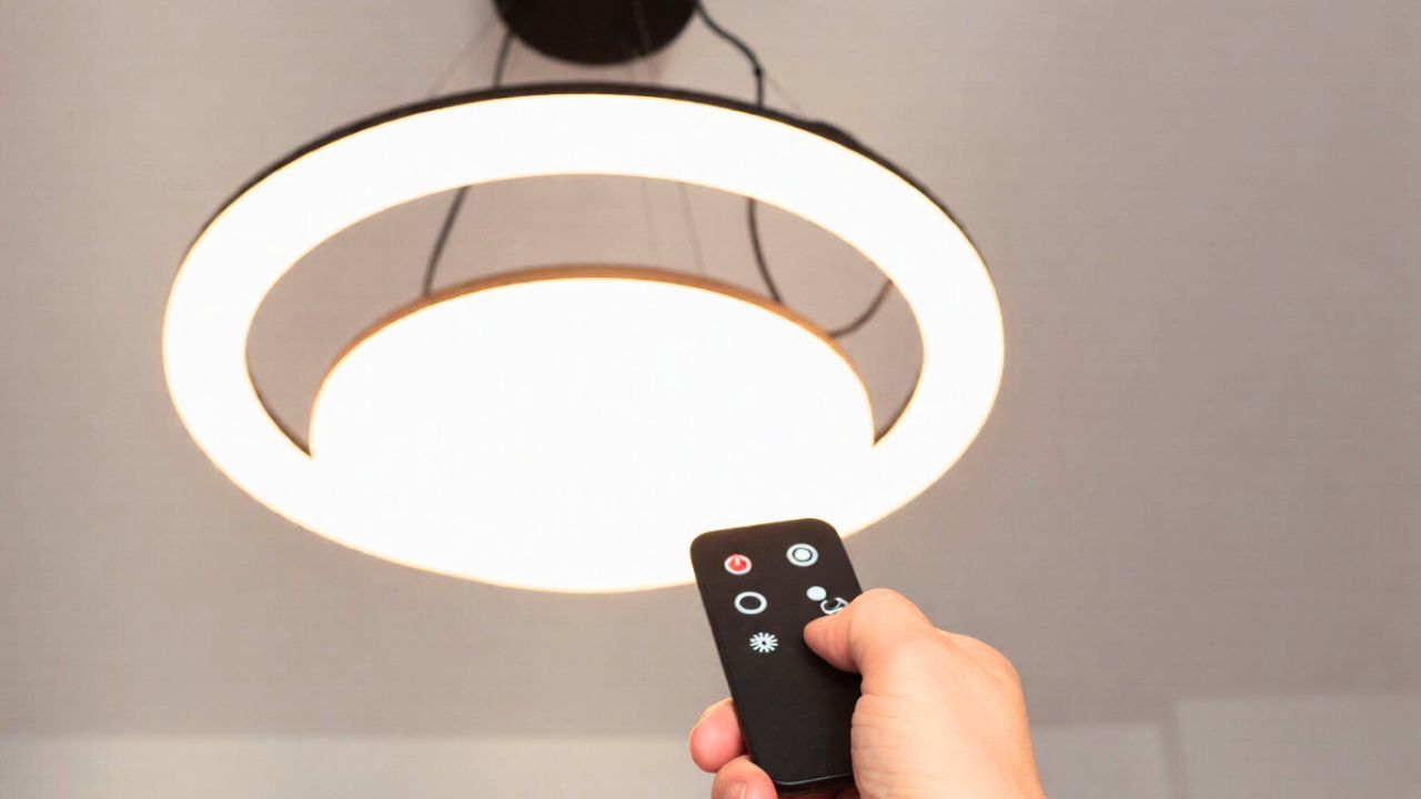
The one change that unlocks better color: neutral, high quality bulbs
The most powerful single adjustment you can make is to replace mismatched or low quality bulbs with neutral white LEDs that have both the right color temperature and strong color rendering. Color temperature is measured in Kelvin and describes whether a bulb looks warm and golden or cool and bluish. Specialists in LED lighting explain that Color temperatures around 4000K to 5000K, often called daylight or neutral light, are comfortable for the eyes while boosting focus, whereas many household lamps sit closer to 2700K on the temperature scale and cast a much warmer glow.
Alongside temperature, you need bulbs that reveal color accurately rather than flattening it. That is where CRI, or Color Rendering Index, comes in. Lighting designers advise that CRI values above 90 are essential in spaces where color precision matters, because they keep surfaces from looking flat or dull. When you combine a neutral 3000K to 4000K bulb with a CRI above 90, you give your existing paint a fair chance to look like itself, often revealing depth and nuance that were completely hidden under older, low grade lighting.
Why Kelvin and CRI matter more than you think
To understand why this one swap is so effective, it helps to decode the numbers on the bulb box. Kelvin is the scale that tells you whether a light source leans warm or cool, and lighting guides describe What Color Temperature is as the hue of a light source measured in Kelvin (K). Lower values create a cozy, amber tone, while higher values move toward crisp daylight. At the same time, CRI measures how faithfully a light shows colors compared with a natural reference, and technical overviews warn that Less than 80 CRI leads to Poor color accuracy, where colors may appear washed out or unnatural.
In practice, that means a beige wall under a 2700K bulb with 80 CRI can look dingy and slightly green, while the same wall under a 3500K bulb with a CRI of 93 suddenly appears clean and sophisticated. Detailed comparisons note that CRI at 80 is described as Functional but Limited, with fine reds and subtle tones looking muted, which is the opposite of what you want on a carefully chosen wall color. By prioritizing both Kelvin and CRI, you are not just brightening a room, you are correcting the way your eyes perceive every pigment on that surface.
How different bulbs distort (or rescue) your wall color
Once you start paying attention, you will notice that different bulb types can make the same paint look like three different colors. Warm incandescent style bulbs typically sit in the 2500K to 3200K range, and detailed Kelvin guides for LIGHT BULBS explain that the lower the number, the warmer and more yellow the light appears. That warmth can be flattering to skin tones, but it can also exaggerate yellow or red undertones in paint, making a neutral cream look almost peach or a greige skew orange at night.
Cooler or more neutral LEDs, especially those in the 3000K to 5000K range, tend to show paint more honestly, but they can also highlight undertones you did not realize were there. Lighting specialists note that if the natural light from trees outside is making your walls appear green, you can adjust your fixtures to a range between 3000K and 5000K in temperature to counteract that cast, as explained in guidance that begins with If the. The key is to choose a bulb that supports the mood you want while still keeping whites crisp and colors believable, rather than letting an extreme warm or cool lamp rewrite the palette you worked so hard to select.
Daylight, task, and ambient: using layers to flatter your paint
Even the best bulb will fall short if you rely on a single overhead fixture to light an entire room. Professional decorators talk about the impact of layered lighting on The Impact of Lighting on Modern Interiors, noting that Light affects and changes perception and that Soft, even illumination is one of the signs of good lighting. When you add floor lamps, wall washers, and table lamps to your ceiling fixture, you reduce harsh shadows that can make paint look patchy or darker than it is.
Designers who specialize in calm, neutral interiors often recommend creating layers of soft, diffused lighting so walls feel luxurious rather than stark. One stylist explains that When it comes to artificial lighting, the key is to Add lamps and wall lights that spread light gently, which makes even simple white paint feel cosy. By combining neutral, high CRI bulbs with this layered approach, you give your walls a consistent, flattering wash of light that smooths out imperfections and lets the color read as intentionally as it did in your inspiration photos.
Warm glow or crisp daylight: matching light to your paint style
The right lighting choice also depends on the kind of palette you are working with. If your home leans traditional, with warm woods, creams, and terracotta accents, a gentle, golden tone will usually make those colors feel inviting. Trend reports describe a shift toward Warm Glow Over Harsh Hues, noting that Across styles, designers are emphasizing a softer lighting quality that flatters a room instead of washing it out. In that context, a 2700K to 3000K bulb with a high CRI can make beige walls look creamy rather than dull and help deeper colors feel cocooning instead of heavy.
If your taste runs more modern, with cool grays, inky blues, or crisp white walls, you may prefer a slightly cooler, cleaner light. Color experts at major paint brands offer a Styling Tip that suggests using certain bright sources to create a crisp, airy atmosphere that shows off bright colors, while warning that overly dark surroundings can make even light paint appear dark in comparison. In practice, that means pairing cool or saturated wall colors with 3500K to 4000K bulbs so whites stay white, blacks stay rich, and you avoid the dingy cast that can creep in under very warm lamps.
Wall washing and accent light: using direction to “repaint” with photons
Beyond the bulb itself, the direction of light can subtly reshape how your paint reads, almost like repainting with photons instead of pigment. When you aim light across a wall rather than straight down from the center of the ceiling, you soften texture and create a gentle gradient that makes color feel more expensive. Lighting designers suggest that you look toward the outer walls for downlighting that can gently wash the walls, curtains, and art with warm, functional brightness, as described in guidance that begins with Then. That wall wash effect evens out color and minimizes the blotchy look you sometimes see under a single bare bulb.
Accent lighting can also rescue tricky colors by drawing the eye to their best qualities. Picture lights and directional spots, for example, are designed to highlight artwork, and specialists in art illumination note that the best lights for paintings typically fall within the warm white range so they enhance tones without casting a harsh glare, as outlined in advice on Temperatures To Illuminate Wall Art Optimally. When you apply the same principle to a feature wall or a niche, you can make a color feel intentional and gallery worthy, even if it once struck you as a mistake.
Borrowing tricks from art studios to fix your living room
Artists are acutely aware that light can make or break color, so their habits offer useful shortcuts for your home. Painters are trained to ask, “Is it the light warm or cool?” and to Use the color of the light for the tone of the painting surface, adjusting their base layer so the final work looks right under the intended illumination. You can borrow that mindset in reverse: instead of repainting the wall to suit your current bulbs, you adjust the bulbs so they match the light your paint was chosen under, usually the store’s neutral showroom or a daylight sample.
The same logic drives how galleries and collectors light their pieces at home. Detailed guides on CRI & Color Temperature recommend that you Choose fixtures with a CRI above 90, with 93 ideal, and a 2700K to 4000K temperature for optimal effect, because that combination keeps colors true without glare. Another overview on Color Rendering and Temperature The Color Rendering Index explains that a higher CRI, typically 90 or more, ensures that the colors of artwork appear vibrant and accurate. When you apply those same standards to your general room lighting, your walls benefit from gallery level color fidelity, even if the paint itself is a standard off the shelf shade.
Practical steps: exactly what to buy and change first
Once you understand the principles, the fix becomes refreshingly straightforward. Start by checking the packaging on your existing bulbs and replacing anything with a CRI below 80, since home theater experts note that Most LED manufacturers provide CRI values higher than 80 but recommend using fixtures with a CRI of at least 90 to avoid colors looking flat or unflattering. For living rooms, bedrooms, and kitchens where you care about how paint, fabrics, and even food appear, treat 90 as your baseline and aim for that 3000K to 4000K sweet spot unless you have a very specific warm or cool effect in mind.
Next, tackle the layout of your fixtures so light is layered rather than concentrated in one harsh source. Homeowners who share practical advice often point out that simply changing the bulbs can transform a disappointing paint job, and one widely shared LPT suggests swapping lightbulbs if the shade looks off after painting before you commit to repainting. Combine that with a few inexpensive plug in floor lamps or wall washers aimed along the outer walls, and you will often find that the “wrong” color you were ready to cover suddenly looks richer, more deliberate, and far closer to what you originally imagined.
Like Fix It Homestead’s content? Be sure to follow us.
Here’s more from us:
- I made Joanna Gaines’s Friendsgiving casserole and here is what I would keep
- Pump Shotguns That Jam the Moment You Actually Need Them
- The First 5 Things Guests Notice About Your Living Room at Christmas
- What Caliber Works Best for Groundhogs, Armadillos, and Other Digging Pests?
- Rifles worth keeping by the back door on any rural property
*This article was developed with AI-powered tools and has been carefully reviewed by our editors.