The neutral paint choice that looks great online and weird in real lighting
On a phone screen, that soft greige you saved from Instagram looks calm, expensive, and perfectly neutral. Then you roll it onto your walls and, under your actual lights, it suddenly reads purple, green, or oddly dingy. The disconnect is not your imagination, and it is not just a “bad batch” of paint.
What you are running into is a modern design trap: a neutral that is calibrated to flatter cameras and filtered feeds more than real rooms. To avoid living with a color that only looks right online, you need to understand how undertones, lighting, and testing habits collide, and how to choose neutrals that hold up in three dimensions instead of just on a screen.
The Instagram-neutral trap
When you scroll through home tours, you are mostly seeing rooms styled for a lens, not for daily life. Walls are photographed with controlled exposure, selective angles, and often heavy editing, which pushes a neutral into its most flattering version and hides the awkward shifts that appear in person. You end up chasing a color that has been tuned to a specific camera, at a specific time of day, under a very particular mix of daylight and bulbs.
Because your eye is comparing dozens of similar photos, you start to trust the consensus: if every influencer’s living room looks serene in that same soft gray, it must be safe. In reality, you are seeing a narrow slice of how that paint behaves, usually at midday with indirect light and minimal visual clutter. Once you add your own flooring, furniture, and evening lighting, the same “safe” neutral can skew unexpectedly cool, muddy, or even lavender, leaving you wondering why your walls look nothing like the feed that sold you on the color.
Why screens lie about “safe” neutrals
Your phone and laptop are not neutral observers, they are active interpreters of color. Screens rely on backlighting and color profiles that boost contrast and saturation, which can smooth out subtle undertones and make a gray or beige appear more balanced than it really is. On top of that, every device is calibrated differently, so the greige you pinned at work may not match the one you see at home, even before you open a paint can.
Filters and editing tools compound the distortion by warming up shadows, cooling down highlights, or lifting brightness across the frame. A slightly green gray can be nudged toward a cleaner, gallery-like tone with a single slider, and a beige with a strong yellow cast can be cooled into a chic “stone” color. By the time you are choosing a paint chip based on a screenshot, you are working from a version of the color that may never exist on a real wall under real light.
The science of why paint shifts in real light
Once paint leaves the digital world and hits your walls, it is governed by physics and human perception, not presets. The color you see is the result of pigments absorbing some wavelengths of light and reflecting others, and that reflected mix changes dramatically depending on whether your room is lit by north-facing daylight, warm incandescent bulbs, or cool LEDs. As one detailed guide to Why Your Paint Color Looks Different Than Expected explains, artificial lighting adds another layer of complexity, so a color that seems balanced in one environment can look off in another.
Your brain also plays a role, constantly adjusting for context. A gray next to a warm oak floor will appear cooler than the same gray beside a blue rug, because your eye is comparing them. That is why a neutral that looked perfectly soft on a white sample card can suddenly feel icy once you install it in a room full of beige upholstery, or why a greige that seemed subtle in a bright showroom turns heavy and brown in a small hallway. The paint has not changed, but the light and surroundings have, and your perception shifts with them.
The undertone problem hiding in popular grays
Most of the neutrals that dominate social media are not pure gray or beige, they are complex mixes with distinct undertones that only reveal themselves in certain conditions. A color that reads like a gentle stone in a bright, cool space can flash blue, purple, or green once you introduce warm bulbs or strong sunlight. That is why so many “perfect” grays look unexpectedly cold or oddly pink once they are on all four walls.
Take a widely used shade like Repose Gray from Sherwin Williams. Color specialists describe it as incredibly versatile, but they also warn that in some lighting you will notice the color’s purple and blue undertone, especially when it is paired with specific flooring or countertops. One in-depth review of Repose Gray by Sherwin Williams stresses that you should test it in your space, with your finishes, precisely because those cooler undertones can become dominant in certain rooms. On camera, those hints of color often read as sophisticated depth; in person, they can look like an accidental tint.
Agreeable Gray and the greige that turns on you
Greige paints, which blend gray and beige, are marketed as the ultimate compromise, but they are just as vulnerable to lighting shifts. Agreeable Gray from Sherwin Williams is a prime example, celebrated online as a do-it-all neutral yet notorious in real homes for morphing with the environment. In some spaces it leans warm and cozy, in others it suddenly looks cool or even faintly purple, depending on what it is reflecting.
Homeowners swapping photos and advice in design groups often describe how Agreeable Gray behaves differently from room to room, especially when layered over existing colors or paired with yellow-beige elements. One discussion of whether Agreeable Gray paint looks purple in certain lighting notes that Agreeable beige can take on unexpected tones when it is influenced by surrounding finishes, which can throw off your expectations if you chose it based on a single flattering photo. The lesson is not that Agreeable Gray is a bad color, but that even beloved greiges are highly context dependent, and your room’s light and materials will decide whether it feels balanced or strangely tinted.
The biggest mistake: skipping real-world swatches
The most common reason a neutral looks great online and wrong in your home is simple: you trusted the screen more than the wall. Many people still pick paint from a tiny chip in a store or a Pinterest screenshot, then commit to gallons without ever seeing the color at scale in their own light. That shortcut saves time on the front end, but it almost guarantees surprises once the paint dries.
Design pros repeatedly warn you not to skip the messy middle step of testing. One practical guide titled “5 Don’ts When Picking Paint Colors” singles out the habit of skipping paint swatches as a major pitfall, urging you to live with large samples and even a few sample pots before deciding. The advice from 5 Don’ts When Picking Paint Colors is blunt: do not skip paint swatches, and do not underestimate how different a color will look once it is on a full wall and surrounded by your actual finishes. That extra step is the only way to see how a supposedly neutral shade behaves from morning to night.
How to test neutrals so they do not surprise you
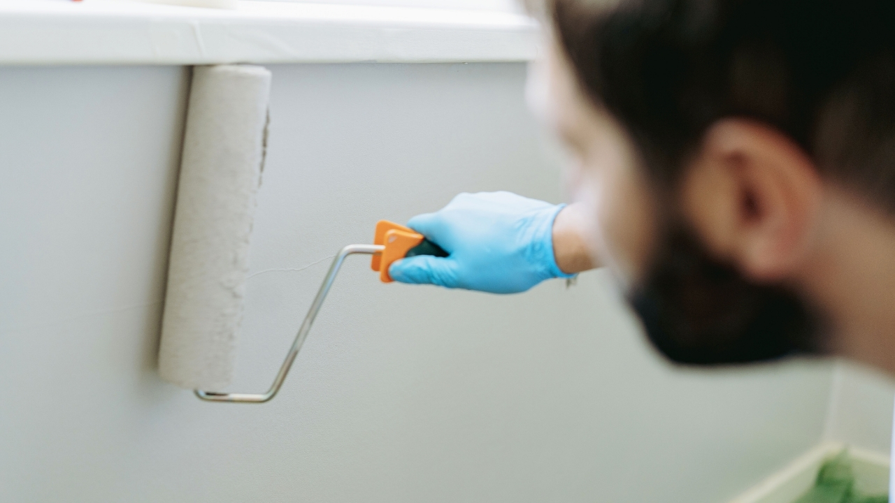
To avoid being blindsided, you need to test neutrals in a way that mimics real life instead of a staged photo. Start by painting large swatches on multiple walls, ideally at least 18 by 24 inches, so you can see how the color responds to different angles of light. If you prefer not to paint directly on the wall, use poster board or peel-and-stick samples, but still move them around the room and place them near key elements like your sofa, cabinets, or tile.
Then, evaluate those swatches at several times of day and under every light source you actually use. Turn on your overhead fixtures, table lamps, and any accent lighting, and pay attention to how the color shifts as the sun moves. Compare it against your trim color and flooring, since those will influence your perception as much as the paint itself. By the time you are ready to commit, you should have watched the color through enough cycles that there are no surprises left, even if it looks slightly different on your phone than it does in person.
Lighting choices that make neutrals look “off”
Even the best-tested neutral can be undermined by the wrong bulbs. Warm incandescent or 2700K LED lights tend to emphasize yellow and red undertones, which can make a beige feel richer but can also push a greige into a muddy, tan territory. On the other hand, very cool 5000K LEDs can exaggerate blue and green undertones, turning a soft gray into something that feels clinical or stormy once the sun goes down.
To keep your walls from shifting wildly between day and night, aim for consistent color temperature across your fixtures and choose bulbs that complement your paint’s undertone rather than fight it. If your neutral already leans cool, a slightly warmer bulb can balance it without making the room feel orange; if your walls are warm, a neutral 3000K to 3500K bulb can keep them from looking too yellow. Treat lighting as part of the color decision, not an afterthought, and you will be far less likely to end up with a room that only looks right in a filtered photo.
Choosing neutrals that work for your home, not the algorithm
Instead of chasing the single “it” neutral of the moment, focus on how you actually live and what your space needs. Look at your fixed elements first, like flooring, countertops, and large furniture, and decide whether you need a cooler or warmer backdrop to harmonize with them. A gray that flatters white oak and cream upholstery may clash with espresso cabinets and blue stone, even if it is trending online.
Use inspiration photos as a starting point, not a shopping list. When you find a color you like on screen, dig deeper into how it behaves in different settings, paying attention to notes about undertones and lighting sensitivities. Then bring it into your home through real samples, evaluate it under your own conditions, and be willing to pivot if it starts to pull strange hues. The neutral that truly works for you might be less famous on social media, but it will look right every day, not just in a perfectly edited square.
Like Fix It Homestead’s content? Be sure to follow us.
Here’s more from us:
- I made Joanna Gaines’s Friendsgiving casserole and here is what I would keep
- Pump Shotguns That Jam the Moment You Actually Need Them
- The First 5 Things Guests Notice About Your Living Room at Christmas
- What Caliber Works Best for Groundhogs, Armadillos, and Other Digging Pests?
- Rifles worth keeping by the back door on any rural property
*This article was developed with AI-powered tools and has been carefully reviewed by our editors.


