The “warm white” problem that makes everything in the room look dingy
Photo credit: Followtheflow/Shutterstock.com
Warm white is supposed to be the safe choice, the paint and bulb color that flatters everyone and works in every room. Yet you can repaint, swap lamps, and still end up with walls that look oddly yellowed and fabrics that feel tired. The problem is not that you chose warmth, it is that “warm white” has become a vague label that hides big differences in undertone, light quality, and context.
Once you understand how color temperature, natural light, and finishes interact, you can keep the cozy mood you want without the dingy cast you dread. The goal is not to abandon warm white, but to choose it with the same precision you would bring to a sofa fabric or a stone countertop.
Why “warm white” so often disappoints in real rooms
On a paint chip or in a bulb aisle, warm white looks calm and forgiving. In your living room, it can suddenly read as nicotine stain. That disconnect happens because your eye judges color relative to its surroundings, not in isolation. A wall that looked soft in a bright showroom can feel murky once it competes with your flooring, upholstery, and the particular daylight in your climate, especially when winter light flattens contrast and exaggerates shadows.
In places with long, gray seasons, painters see this constantly. When Jan and her team walk into Pittsburgh homes, they find that whites that seemed crisp in September can look lifeless by January, when low, overcast light turns them into what they describe as a “shadow trap” that makes every corner feel like a cloudy day brought indoors, especially if you chose a cool white that clashes with warm finishes and throws dingy-looking shadows across the room in winter.
How color temperature actually works
To fix the problem, you need to treat color temperature as a measurable tool, not a vibe. Light is described in kelvins, and that number tells you whether a bulb will skew warm, neutral, or cool. When you see “Warm White Light” on a box, it usually means a lower kelvin value that leans yellow or amber, while “Cool White Light” sits higher on the scale and looks bluer and more clinical. That shift is not subtle, it changes how every surface in the room appears and how alert or relaxed you feel.
Lighting specialists stress that choosing between warm white and cool white is not just aesthetic, it affects how you function in the space, which is why they urge you to understand how color temperature is measured in K and how much difference a few hundred kelvins can make in your daily life when you are deciding between Warm White Light and Cool White Light. Once you start reading those numbers, you can predict whether a bulb will deepen the cream in your walls or strip it out and make everything look chalky.
The trend toward warmer palettes, and why that matters
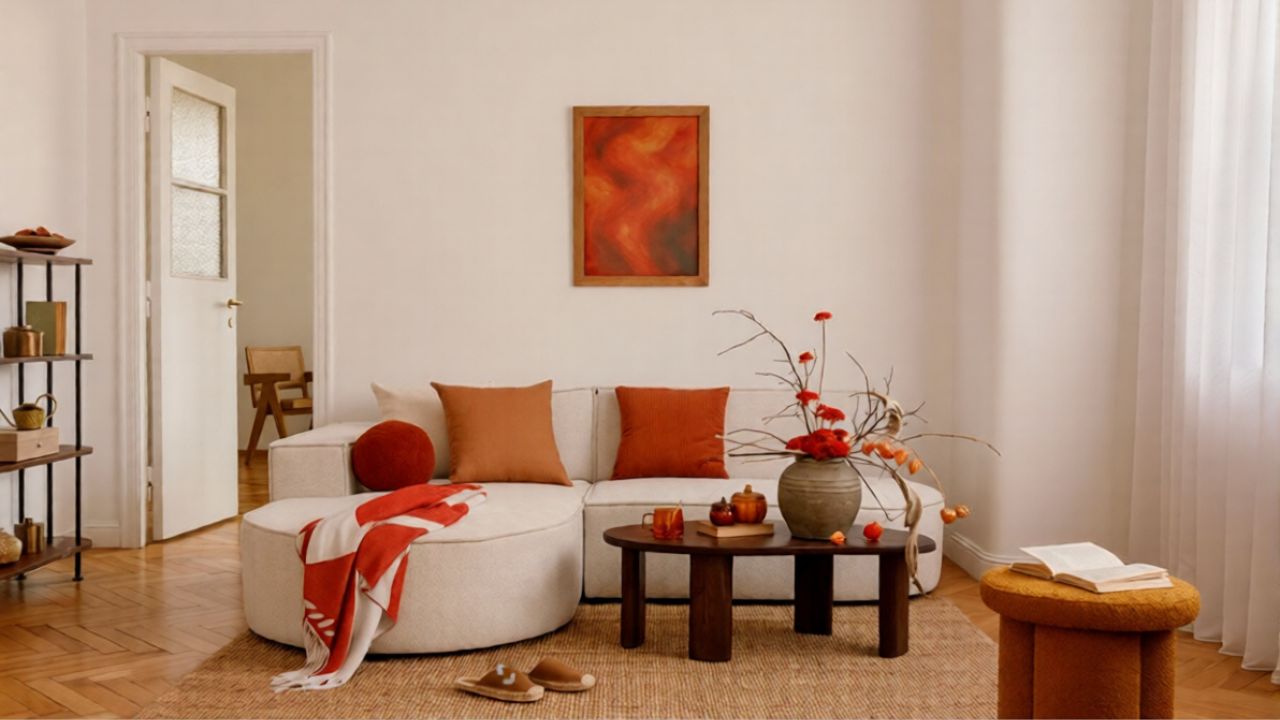
Even as you wrestle with dingy-looking rooms, the broader design world is moving firmly toward warmth. Color forecasters point out that if you have been tracking home color trends, you have probably noticed a clear shift toward warmer tones both inside and out, with Blues and greens now being used in softer, muddier versions that wrap the space without overwhelming it in current palettes. That means your warm white is no longer sitting next to stark black and chrome, it is surrounded by caramel woods, clay textiles, and earthy blues.
Design editors describe how cool grey, once the default neutral, has been replaced by Warm Neutrals that feel calmer and more human. They note that Cool grey was even coined “millennial grey,” and that the tide has turned toward greige and sandier tones that soften edges and make rooms feel more serene in Warm Neutrals trend reports. If you drop a generic warm white into that context without checking its undertone, it can either harmonize beautifully or tip the whole scheme into beige soup.
When warm whites clash: undertones and trim mistakes
The most common way warm white goes wrong is not the wall color itself, but what you pair it with. If your trim is a crisp, cool white and your walls are a creamy warm white, the contrast can make the walls look dirty by comparison. Color consultants warn that the human eye reads the cooler, bluer white as “clean” and the warmer one as “aged,” even if both paints are brand new, which is why mismatched undertones around doors and baseboards are so unforgiving.
One designer spelled this out bluntly in a video captioned “Learn from my mistake on this one,” explaining that you should not pair a cool white trim color with a warm white wall color and that several years ago she had to repaint after discovering how harsh that combination looked once the room was furnished, which is why she now makes sure Cool whites pair up with similarly cool walls instead of creamy ones in her Learn warning. If your room feels dingy, start by checking whether your baseboards, doors, and ceilings are quietly sabotaging your wall color.
Why some “warm whites” are better than others
Not all warm whites are created equal. Some are what color experts call “clean” creams, with a controlled dose of yellow that feels sunny but not sticky. Others are more complex, with touches of gray, green, or pink that help them adapt to changing light. Because stark white walls need plenty of white furnishings to look right, otherwise the room will just look unintentionally unfinished, many professionals steer clients toward these more nuanced shades that can handle real-life furniture and flooring without turning dingy.
Color consultant Maria Killam, for example, highlights how a color like Complex Cream or BM Indian White behaves differently from a basic builder beige, precisely because those subtle undertones keep it from going flat in low light and help it bridge between warm woods and cooler stone in her best warm whites guide. Major paint brands lean into this too, with options such as Sherwin-Williams SW 7012 Creamy marketed as a soft, balanced white that can read warm without veering into yellow, a quality you can see in the way SW 7012 Creamy is positioned as a flexible backdrop rather than a statement color.
The lighting wars: warm, cool, and the “dirty” perception
Even the best paint color will fail under the wrong bulb. Online, you can see the divide: one commenter insists that bright white light room lighting is always better than warm, arguing that Everyone who praises cozy amber bulbs is ignoring how they distort colors and make tasks harder, and that they prefer a cooler, more neutral light for clarity in their unpopular opinion. On the other side, lighting designers point out that a lot of folks have a perception that warm light can look “dirty” and change the colour of a room, but that good quality warm LEDs around 3000 K can actually be flattering and are used in many professional projects as a standard color temperature.
One lighting specialist notes that many of their projects use 3000k colour temperature specifically because it balances warmth and clarity, countering the idea that any warm light will automatically make a room feel small or grimy in their explanation. At the same time, product guides explain that Stores often use cool white lighting to make products look more vibrant, while Warm White LED Lights are described as Cozy and Inviting, with characteristics that suit living rooms and bedrooms better than offices or garages in LED comparisons. The takeaway for your home is that you should match bulb temperature to the job of the room, not to a blanket preference for “warm” or “cool.”
How bulbs can rescue (or ruin) your warm white walls
If your walls look dingy, your first move should be to check the bulbs, not the paint can. In one home design group, a commenter advised someone struggling with yellow-looking walls to switch to Daylight light bulbs and explained that the higher the Kelvins the brighter they are, and that this shift would take the yellow out that they were seeing by pushing the light closer to neutral daylight with higher Kelvins the. That kind of targeted change can make a warm white read fresher without repainting, especially in north-facing rooms.
At the same time, you do not need to flood your home with harsh, blue-toned light to avoid dinginess. Another homeowner described how the bulbs in their house are all 3,000K for the color temperature and that more than that is blindingly bright and makes everything feel like a hospital, so they prefer to stay in that warm-neutral zone that still feels clean at around 3,000K. Lighting guides echo this, noting that Different Home Spaces Need Different Lighti, and that you can use warmer bulbs in lounges and bedrooms while reserving cooler, daylight-mimicking LEDs for kitchens and workspaces where you need accuracy in LED advice.
Space, perception, and why warm light can feel smaller
Part of what you are reacting to when a warm white room feels dingy is not dirt, but a shift in how you perceive space. Research on lighting and interiors explains that warm white light does not physically shrink a room, but it can make it feel smaller by reducing contrast and depth perception, especially if you rely on a single overhead fixture and skip task and accent lighting in Perception vs. Reality: Does Warm Light Shrink Space. When every surface is bathed in the same amber wash, your eye has fewer cues to read corners and edges, so the room can feel compressed and a little stale.
Designers who specialize in dark or windowless spaces lean hard on layering to counter that effect. One guide to Rectifying Poor Artificial Light, framed as Your Guide to a Brighter, Cosier Apartment, stresses that Dimmers are Your Best Friend if allowed, because they let you tune warm light up for cleaning and down for relaxing, and that you should mix ceiling fixtures with floor lamps and wall lights to create pockets of brightness instead of one dull glow in a Brighter, Cosier Apartment plan. Another set of tips on how to Choose finishes to brighten a dark room with no natural light recommends adding mirrors to the walls and using reflective surfaces so that whatever light you do have, warm or cool, bounces around and lifts the overall mood rather than pooling in one spot by adding mirrors.
Putting it together: a practical checklist for non-dingy warm white
Once you see how many variables sit behind that innocent “warm white” label, you can approach your next project like a small design experiment instead of a gamble. Start with the paint: look for complex creams and balanced off-whites rather than the most saturated beige, and compare them directly to your trim and flooring to catch undertone clashes before you commit. Sampling a color like SW 7012 Creamy on multiple walls and at different heights will show you whether it stays soft or turns muddy in your particular light, especially if you view it next to existing finishes and a key piece of furniture from a favorite product line.
Then tackle lighting with the same rigor. Use warm bulbs in the 2700–3000 K range where you want to relax, but add at least one daylight or higher kelvin source for tasks, as the Daylight and Kelvins the guidance suggests, and layer table lamps, sconces, and floor lamps so no single fixture has to do all the work as Your Best Friend. Finally, learn from professionals who have tested these combinations at scale: one popular video titled “This Color Is SO Overhyped… Use These Instead” walks through how a ubiquitous warm white can look flat on walls, trim, and ceilings all at once, and argues for choosing more tailored alternatives that respect your home’s light and materials rather than chasing a one-size-fits-all favorite in that color critique. If you still love white rooms, a long-running Houzz discussion on how to get white rooms to look great at night suggests using multiple sources of light instead of just recessed cans, and notes that a slightly warmer bulb can feel cozy while a cooler one might look too cold, which is a reminder that your goal is balance, not allegiance to a single temperature for white rooms at night.
Like Fix It Homestead’s content? Be sure to follow us.
Here’s more from us:
- I made Joanna Gaines’s Friendsgiving casserole and here is what I would keep
- Pump Shotguns That Jam the Moment You Actually Need Them
- The First 5 Things Guests Notice About Your Living Room at Christmas
- What Caliber Works Best for Groundhogs, Armadillos, and Other Digging Pests?
- Rifles worth keeping by the back door on any rural property
*This article was developed with AI-powered tools and has been carefully reviewed by our editors.