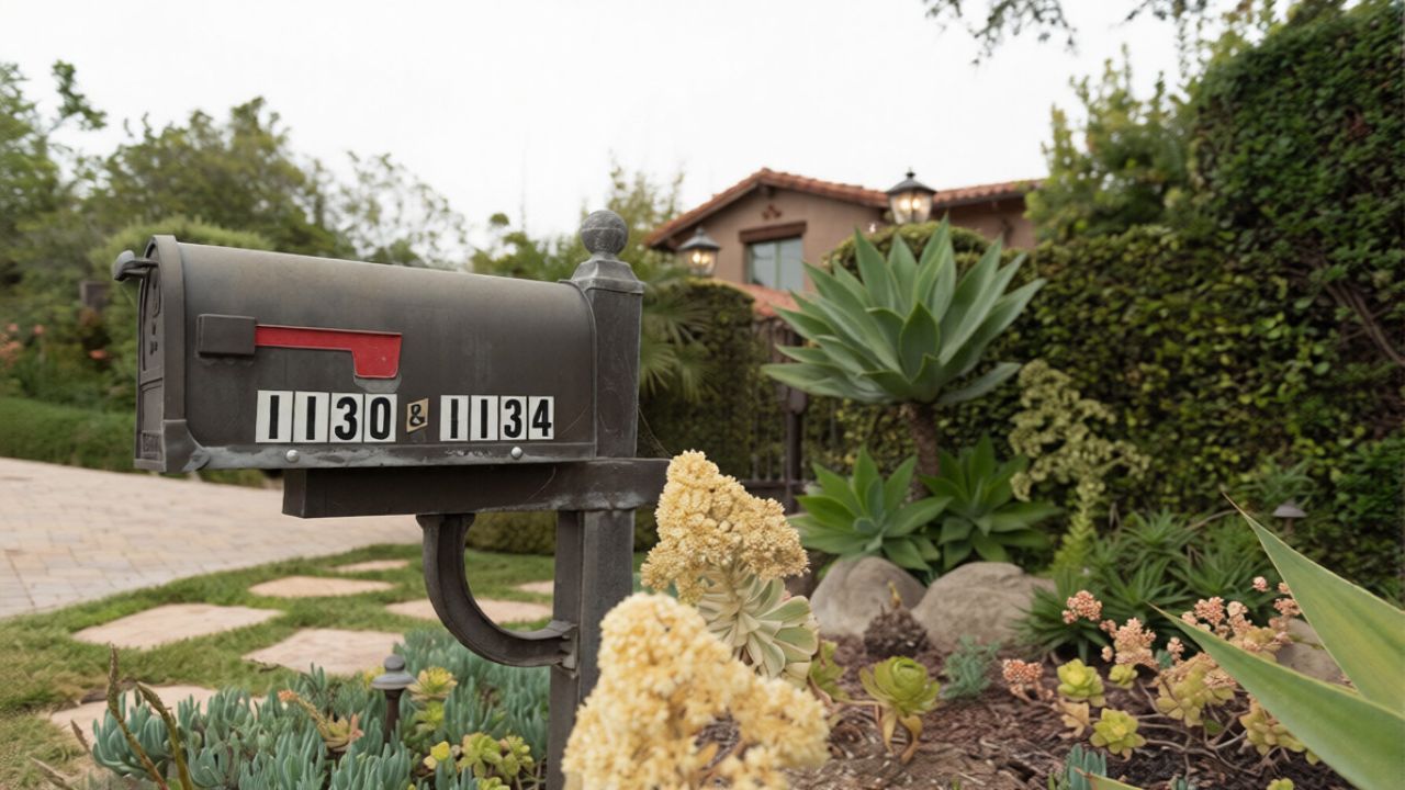
The mailbox and house-number combo that can make a home look cheaper
Photo credit: Panas Wiwatpanachat/shutterstock.com
The fastest way to cheapen an otherwise polished exterior is to ignore the tiny details that greet people first. A flimsy mailbox paired with undersized, hard‑to‑read numbers can make even a well kept property feel like an afterthought. When you treat that mailbox and house‑number combo as a single design decision instead, you turn a potential liability into one of the most cost effective upgrades on your block.
Done well, those few square inches of metal and vinyl quietly signal care, quality and even safety. Done poorly, they suggest corners cut everywhere else. The difference is not about spending lavishly, it is about choosing the right materials, placement and style so your address looks intentional rather than improvised.
Why the mailbox and numbers matter more than you think
Your mailbox and address numbers are often the first things visitors, delivery drivers and potential buyers actually study. They slow down to find the right house, scan the curb, then lock onto whatever carries the numbers. If what they see is a dented box and peeling stickers, you have already framed their expectations before they ever reach the front door. Real estate agents routinely talk about curb appeal for a reason, and your address hardware is one of the smallest but most visible pieces of that puzzle.
Designers who focus on exteriors point out that house numbers should be placed where they are easy to see, ideally at eye level or higher and clear of overgrown foliage or other obstructions, so they function as both a visual anchor and a practical tool. Guidance on address placement stresses that Ideally your numbers sit where someone can read them from the street without squinting or guessing. When that basic job is handled with care, the entire front of your home feels more considered.
The “cheap combo” that drags everything down
The look that instantly lowers the tone is familiar: a thin, leaning post with a generic black box, paired with tiny brass digits stuck haphazardly on the side or on the curb. Often the numbers are mismatched, crooked or half missing, and the mailbox door no longer closes cleanly. You might not notice it when you pull into the driveway every day, but anyone seeing your place for the first time reads that combination as neglect, even if the rest of the property is immaculate.
That impression is reinforced when the numbers themselves are hard to read because they blend into the background. Practical advice on address placement emphasizes Contrast and visibility, urging you to Always choose light numbers on dark exteriors or dark numbers on light exteriors so they do not disappear at a distance. When you ignore that basic rule and slap low contrast stickers on a faded box, the result looks not just cheap but careless.
Visibility and safety: not just a style decision
Beyond aesthetics, your mailbox and numbers have a safety job to do. Emergency responders, ride share drivers and couriers all rely on being able to spot your address quickly from the street. If your numbers are too small, too low or hidden behind shrubs, you are effectively asking people to guess. That can be frustrating for a food delivery and far more serious if an ambulance is trying to find you at night.
Experts on address placement recommend mounting numbers at an eye level height, typically between 4 feet and 6 feet from the ground, so they are readable from the street or sidewalk. One guide on best practices refers to this as the Ideal Height for, a range that balances visibility with proportion on the facade. When you coordinate that placement with your mailbox, either by repeating the numbers on the box or aligning them with a wall mounted unit, you make your home easier to find and subtly more reassuring to anyone approaching.
How cheap materials age your exterior overnight
One of the fastest ways to make your address look bargain basement is to rely on the flimsiest materials you can find. Thin plastic boxes, low grade metals that rust quickly and bargain bin stickers might look acceptable on day one, but they rarely survive a full season of sun, rain and snow without warping or fading. The result is a mailbox that looks tired long before anything else on the facade does, dragging the whole composition down.
Interior design advice about low cost furnishings translates neatly outdoors. Analysts of budget decor warn that Cheap pieces often chase fast moving trends and can While they might seem on point at first, they Worse, tend to look worn down sooner than you would like. The same pattern shows up in low end mailboxes and number sets that fade, crack or peel, forcing you to replace them more often and broadcasting that you opted for the cheapest option available.
What a quality mailbox actually looks like
Upgrading your mailbox does not mean installing something ornate or oversized. It means choosing a design that feels solid, proportionate to your house and consistent with the rest of your exterior finishes. A well made box has a door that closes cleanly, hardware that feels substantial in your hand and a finish that can stand up to weather without bubbling or flaking. Even a simple rectangular shape can look upscale if the materials and details are right.
Higher quality options often use cast aluminum, which resists rust and holds paint well. One example is a Cast Aluminum Whitehall paired with a matching Plaque, a wall mount style that comes in a large, popular size and is designed as a coordinated set. Another manufacturer describes Our cast aluminum units as sturdy, unyielding to rust and built to last a lifetime, with the promise that their mailboxes will heighten the look of your home rather than detract from it. When you choose that level of construction, you are buying both durability and a visual signal of quality.
House numbers: size, style and placement that do not look bargain bin
Once your mailbox is sorted, the next step is to treat your house numbers as a design element instead of an afterthought. That starts with legibility. You want numbers that are large enough to read from the street, in a font that is simple and clear rather than overly decorative. Design guidance on address hardware stresses How to Choose House Numbers and Readability, urging you to Make sure your numbers can easily be read and to consider Size requirements that some cities specify.
Material matters just as much as typography. Specialists in address hardware note that By selecting a durable material, your house numbers will remain a functional and stylish feature of your home’s exterior for years to come. That might mean solid metal, powder coated finishes or high quality acrylics that resist UV damage. When those numbers are mounted cleanly at the recommended height and aligned with either your door or mailbox, they read as part of a cohesive design rather than a last minute hardware store grab.
Coordinating mailbox and numbers so they look intentional
The real upgrade happens when your mailbox and numbers clearly belong to the same visual story. That does not require a matching set from a single brand, but it does mean echoing finishes, fonts or shapes so the eye reads them as a pair. If your mailbox is a clean, modern rectangle in matte black, for example, sleek black metal numbers in a similar line weight will feel deliberate. If your home leans more traditional, a curved box in bronze with classic serif numbers can achieve the same effect.
Designers who focus on curb appeal suggest a simple tactic: Play it smart and Buy two matching sets of house numbers, installing one on your new mailbox and the other at your entrance. That repetition reinforces your address, helps visitors confirm they are in the right place and makes the whole front elevation feel more polished. When the same font and finish appear in both spots, nothing about your address looks improvised.
Budget friendly upgrades that still look high end
You do not need a custom metalworker to escape the cheap looking combo. There are off the shelf solutions that balance cost and quality, especially if you are willing to do a bit of installation work yourself. For mailboxes, look for simple, well reviewed models in sturdy metals rather than the lightest plastic on the shelf. For numbers, consider vinyl or metal sets that are cut cleanly and designed to withstand weather without curling or cracking.
Some manufacturers offer address decals specifically sized for mailboxes, such as a set where Only a modest investment gets You two sets of cut to order numbers, one for each side of the box, with Material specified as 3M Vinyl. On the curb appeal side, home improvement guides point out that Replacing house numbers is an easy, cheap upgrade that instantly boosts curb appeal, while Faded or worn digits can give buyers a poor first impression. A few carefully chosen pieces can therefore deliver an outsized visual return.
Integrating the mailbox into the rest of your facade
Finally, your mailbox and numbers should not feel like a separate project bolted onto the front of your house. They need to sit comfortably within the broader composition of siding, trim, lighting and landscaping. That might mean aligning a wall mounted box with a porch light, echoing the finish of your door hardware or choosing a post style that matches your fence. When those relationships are considered, the mailbox becomes part of a larger visual rhythm instead of a lonely object at the curb.
Home decor specialists note that the Mailbox or Mail slot is sometimes the first thing people see when they pull up to your house, and that a new box, post and set of numbers can quickly clean up the image of your home. When you coordinate those elements with the rest of your exterior, you avoid the mismatched, piecemeal look that makes even a well maintained property feel cheaper than it is. Instead, you send a clear, quiet message that every detail, right down to the digits on your mailbox, has been chosen with care.
Like Fix It Homestead’s content? Be sure to follow us.
Here’s more from us:
- I made Joanna Gaines’s Friendsgiving casserole and here is what I would keep
- Pump Shotguns That Jam the Moment You Actually Need Them
- The First 5 Things Guests Notice About Your Living Room at Christmas
- What Caliber Works Best for Groundhogs, Armadillos, and Other Digging Pests?
- Rifles worth keeping by the back door on any rural property
*This article was developed with AI-powered tools and has been carefully reviewed by our editors.