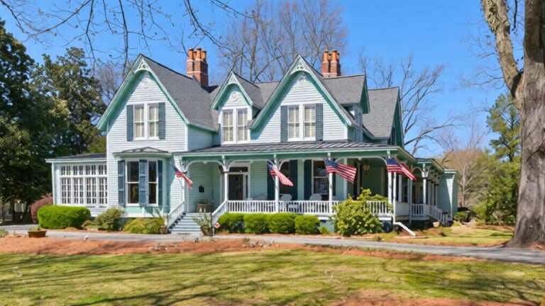
HGTV’s most common paint choice is starting to feel tired in 2026
Every time you turn on HGTV in 2026, you see the same safe, sandy walls framing kitchen reveals and open-concept living rooms. What once felt fresh and calming now reads as background noise, and you can feel your own enthusiasm for that default neutral starting to fade. You are not imagining it: the most promoted paint choice on HGTV is finally bumping up against its limits, just as warmer, richer colors are pushing into the spotlight.
You are being nudged to love a particular kind of beige, yet the broader 2026 color story is far more interesting, from deep charcoals to jewel-toned blues and mushroom neutrals. If you are tired of watching another “after” shot blend into the last, you have plenty of evidence, and plenty of alternatives, to help you pivot.
How HGTV made one beige feel inescapable
You live in a moment when a single neutral can dominate your screens for an entire year, and HGTV has helped cement that pattern. The network’s partnership with HGTV Home by Sherwin-Williams gives one hero shade a starring role across programming, branded content, and the annual Dream Home, so you keep seeing the same walls, trim, and cabinets dressed in a familiar mid-tone tan. Over time, that repetition quietly trains you to see that color as the “right” answer for resale, for open layouts, and for any room where you feel stuck.
For 2026, that hero shade is Universal Khaki, a warm, mid-tone tan that color experts describe as part of an earthy, elegant palette designed to encourage slowing down and resetting. HGTV Home by Sherwin-Williams presents Universal Khaki as the 2026 Color of the Year within an Honest Essentials collection of grounded neutrals, and the messaging around it is everywhere you look. When you hear that this same hue is also the 2026 Color of the Year for Sherwin-Williams more broadly, in coverage that likens it to a fresh canvas and timeless workwear, you understand why it has become the default backdrop for so many HGTV-style spaces.
Why Universal Khaki now feels more like a uniform than a choice
At first glance, Universal Khaki sounds like exactly what you want: a flexible, warm neutral that will not scare off future buyers. You are told it flatters wood tones, pairs well with black accents, and hides everyday scuffs, so it feels like a smart, low-risk decision. Yet when you see it on repeat across living rooms, bathrooms, and exteriors, the very quality that made it appealing, its quiet versatility, starts to feel like a uniform you never quite chose.
Official descriptions emphasize the shade’s understated elegance and “everyday versatility,” positioning Universal Khaki as a color that encourages you to design with purpose rather than chase fads. In press materials that unite Sherwin-Williams and HGTV Home by Sherwin-Williams around this one pick, Universal Khaki is framed as the 2026 Color of the Year for both brands, which further amplifies its presence. The more that unified campaign saturates your feeds, the more you may sense that you are decorating inside someone else’s script instead of using paint to express your own taste.
The larger 2026 trend: warmth, but with more personality
Step back from the HGTV bubble and you see that 2026 is not just about one tan, it is about a broader swing toward warmth that gives you many more options. Color forecasts highlight a move away from icy grays and into earth-inspired neutrals that feel grounded and livable. You are encouraged to think in terms of sunbaked clays, soft browns, and warm creams that still behave like neutrals but carry more character than a standard contractor beige.
Designers and paint pros describe this shift as a response to years of cool, blue-leaning grays that left rooms feeling flat. Guidance on interior paint trends notes that warmer, earth-toned neutrals are taking over, with shades that echo natural materials and pair easily with organic textures. When you read that “Warm Earth Tones Replace Cool Grays” and see bathroom vanity trends celebrating earth-tone cabinetry while declaring the cool gray era officially over, you realize the market is inviting you to embrace warmth in a more expressive way than a single khaki wall.
Color of the Year picks that quietly contradict the HGTV default
While HGTV’s most visible partnership keeps steering you toward Universal Khaki, other 2026 Color of the Year announcements are telling a different story. You see deep, moody charcoals, soft off-whites, and saturated blues sharing the same calendar year, which undercuts the idea that one mid-tone tan is the only safe or stylish choice. If you pay attention to the full slate of brand picks, you gain permission to treat beige as one option among many, not the inevitable answer.
Roundups of every 2026 Color of the Year show how varied these official picks really are, from Pantone’s Cloud Dancer to Benjamin Moore’s Silhouette and Sherwin-Williams’ own Universal Khaki, all cataloged alongside other major brands. When you look at how these hues are broken down, including descriptions of deep charcoals with plum and brown undertones and warm, buttery creams like Melodious Ivory that make entire rooms glow, you can see that the industry itself is more adventurous than the single shade dominating HGTV’s sets. That contrast helps explain why the network’s go-to neutral is beginning to feel out of step with the wider paint conversation.
The rise of mushroom neutrals and “mushroom newtral” energy
One of the clearest signals that you are ready to move past HGTV’s favorite beige is the growing obsession with mushroom neutrals. These colors sit somewhere between gray and brown, with soft, earthy undertones that shift gently in different light. They give you the same calming effect you once relied on greige for, but with a richer, more organic mood that feels current instead of overused.
In trend breakdowns, you see creators like Jan joking that every year brings a new “it” color while pointing out that mushroom neutrals are the ones about to explode. When Jan talks through this “mushroom newtral” idea in a 2026 paint trend video, you hear a clear argument for shades that feel like the inside of a mushroom cap, complex and slightly moody rather than flat beige. That kind of commentary gives you language for why Universal Khaki can feel too straightforward and why you might gravitate toward subtler, more layered neutrals that still play nicely with wood, stone, and black metal.
Nature-driven palettes are outgrowing flat khaki
Another pressure point on HGTV’s go-to color is the way nature-driven palettes have evolved. You are still seeing “back to nature” messaging, but the colors attached to it are getting bolder and more specific. Instead of generic sand tones, you are offered greens that echo eucalyptus leaves, blues that recall deep water, and browns that look like real soil or bark, all of which make Universal Khaki feel like only one narrow slice of the outdoors.
Social content around the HGTV Dream Home underscores that 2026 color trends are going back to nature but with a modern twist, highlighting greens and blues inspired by forests, oceans, and mountains. At the same time, you see paint brands spotlighting shades like Hidden Gem, a confident blue-green described as the crowned jewel of a 2026 palette, alongside warm hues like Warm Mahogany that cater to homeowners with trend fatigue by offering a rich, grounded backdrop. When you compare those saturated, nature-rooted colors to the familiar khaki on HGTV walls, you may feel that the network’s default neutral no longer fully captures the modern, biophilic mood you are aiming for.
Even neutrals are getting more character than HGTV’s standby
Neutrals are not disappearing in 2026, but they are gaining more personality than the beige that dominates HGTV reveals. You are seeing creams with golden undertones, off-whites that glow like candlelight, and tans that flirt with terracotta or caramel, all of which add subtle drama without tipping into bold color territory. That evolution makes a straightforward mid-tone khaki feel comparatively flat, especially in rooms where you want the walls to contribute to the atmosphere rather than simply recede.
Color roundups describe Melodious Ivory as a warm, buttery cream that makes any room glow as if it belongs in a Nancy Meyers film, and other guides talk about hot paint colors of the year that mix brown, plum, and a little terracotta into deep, sophisticated charcoals. When you study these palettes, including the way designers pair such shades with white cabinetry or natural wood, you see a roadmap for neutrals that still feel safe but have more story. In that context, the HGTV-favored Universal Khaki starts to look like the baseline you move beyond, not the destination.
Designers are already calling time on certain “safe” colors
You are not alone if you sense that some once-reliable colors are losing steam. Interior designers are already flagging specific shades they expect to fall out of favor in 2026, and the list includes more than just dramatic accent colors. When pros talk about deep reds, certain cool blues, or overused dark tones fading, they are really pointing to a larger fatigue with any paint choice that feels formulaic or tied to a past decade’s staging playbook.
Reports on paint colors going out of style mention deep reds as one of several hues that designers expect to see less of as homeowners seek calmer, more flexible backdrops. Trend forecasts for 2026 also emphasize that the cool gray era is officially over, with warm earth tones now taking center stage and Sherwin-Williams’ Universal Khaki cited as part of that shift. Yet when you pair those warnings with predictions that 2026 will be all about warmth, with rich, nature-inspired hues like olive green and other saturated tones taking the lead, it becomes clear that simply swapping gray for khaki is not enough to keep your rooms feeling fresh.
How you can pivot away from the HGTV script without tanking resale
If you have already painted with HGTV’s favorite neutral, you do not have to start from scratch to move your home forward. You can treat Universal Khaki as a supporting player and layer in more current colors through accent walls, cabinetry, or adjoining rooms. For example, you might keep a khaki hallway but transition into a living room wrapped in a mushroom neutral, or repaint a beige island in a confident blue-green to echo the jewel tones showing up in 2026 palettes.
Color of the Year roundups aimed at homeowners show you how to do exactly that, walking through ways to use each brand’s pick in real rooms and pairing them with existing finishes. Guides that collect every 2026 Color of the Year so far, including Pantone, Cloud Dancer, Benjamin Moore, and others, give you a menu of hues that play nicely with warm neutrals without copying the HGTV formula. When you study those examples and the official visuals for HGTV Home by Sherwin-Williams, which show Universal Khaki inside a broader Honest Essentials palette, you can start to edit your own spaces so they feel aligned with 2026 trends rather than locked into one televised choice.
Reading between the lines of HGTV’s color partnerships
As you weigh whether HGTV’s most common paint choice still serves you, it helps to understand the structure behind what you see on screen. The network’s collaboration with HGTV Home by Sherwin-Williams is not just about aesthetics, it is also a marketing partnership that shapes which colors are promoted as aspirational. When Sherwin-Williams and HGTV Home by Sherwin-Williams unite to name Universal Khaki as their shared 2026 Color of the Year, they create a powerful feedback loop that keeps that shade in front of you across shows, social clips, and branded projects.
Like Fix It Homestead’s content? Be sure to follow us.
Here’s more from us:
- I made Joanna Gaines’s Friendsgiving casserole and here is what I would keep
- Pump Shotguns That Jam the Moment You Actually Need Them
- The First 5 Things Guests Notice About Your Living Room at Christmas
- What Caliber Works Best for Groundhogs, Armadillos, and Other Digging Pests?
- Rifles worth keeping by the back door on any rural property
*This article was developed with AI-powered tools and has been carefully reviewed by our editors.