The holiday lighting mistake that makes your front porch look messy
Your front porch is the first thing guests and neighbors see, and holiday lights can either frame it beautifully or make it look like visual static. The most common misstep is not a single bad product, but a cluttered approach that piles on colors, patterns, and cords until the entry feels chaotic instead of welcoming. With a few strategic choices, you can turn the same number of bulbs into a clean, polished display that looks intentional from the street and up close at the door.
The key is treating your porch like a small stage set rather than a storage area for every light strand you own. When you edit, coordinate, and install thoughtfully, you avoid the messy effect that drags down even expensive decor and instead create a calm, glowing frame that flatters your architecture and your other decorations.
The real “messy porch” culprit: visual overload
The biggest mistake that makes your porch look disorganized is visual overload, where you layer too many strands, colors, and blinking effects in a tight space. Your eye has nowhere to rest, so instead of reading as festive, the entry reads as clutter, especially in photos and from the sidewalk. Experts note that Overloading with Too Many Lights is one of the most frequent missteps, because it is easy to assume that more bulbs automatically equal more cheer.
On a porch, that overload often shows up as multiple competing focal points: icicles on the eaves, net lights on shrubs, rope lights on railings, and a different color on the door frame. Instead of highlighting your architecture, the lights start to obscure it, which is exactly what detailed guidance on Christmas light placement warns against. When every surface is wrapped, the porch loses its shape and the whole facade can feel smaller and more cramped.
Chaotic color and blinking patterns drag everything down
Even if you keep the number of strands reasonable, your porch can still look messy if the colors and patterns fight each other. Mixing warm white, cool white, and multiple saturated colors in a small entry creates a patchwork effect that reads as cheap, especially when each strand has a different level of brightness. Reporting on holiday decor points out that the fastest way to make Christmas decor look low end is chaotic color and blinking overload, and that is magnified on a compact porch.
Rapid flashing, chasing patterns, and multiple twinkle modes layered together add to the sense of disorder, especially when they reflect in glass doors and windows. Instead of a calm glow that flatters your wreath and planters, you get a strobe effect that can be uncomfortable for guests and distracting for neighbors. Outside, more is not always more, and a single consistent setting that runs around the clock, not just after dark, tends to look far more refined than a porch that seems to be cycling through every mode on the remote.
Ignoring symmetry and balance around the front door
Because the front door is the natural focal point of your porch, any imbalance around it is instantly noticeable. When you wrap only one column, run a light strand up one side of the trim, or cluster decor on a single step, the whole entry can feel lopsided. Detailed advice on Ignoring Symmetry and Balance notes that uneven lighting around a doorway or porch creates visual tension, which your brain reads as mess even if each individual piece is attractive.
You do not need a perfectly mirrored setup, but you do need a sense of rhythm. That might mean matching lanterns on both sides of the door, wrapping every baluster instead of every third one, or repeating the same warm white strand along both railings. The simplest way to correct imbalance is to step back to the sidewalk, identify the brightest or most decorated area, and then echo that treatment across similar features so the porch feels cohesive rather than improvised.
Outdated color mixes versus modern monochrome magic
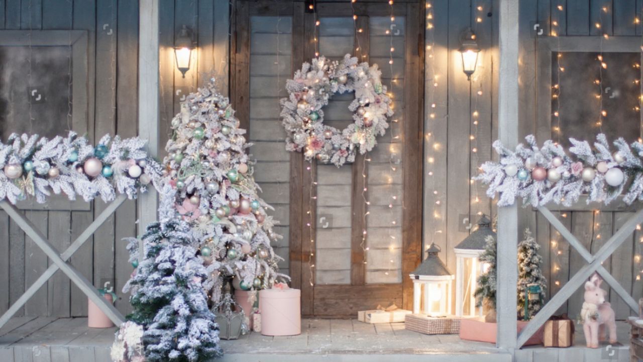
Another reason a porch can look messy is that the color story feels dated, especially when you mix older multicolor strands with newer LEDs. Clashing temperatures, like icy blue next to yellowed warm white, can make even a tidy installation feel off. Current guidance on Trending Styles for 2025 highlights that Monochrome Magic and a Minimalist palette are setting the tone, because a single hue feels calm, cohesive, and undeniably sophisticated.
On a porch, that might mean committing to all warm white, all cool white, or one accent color like red or blue instead of mixing everything together. A monochrome or tightly edited scheme lets your garlands, bows, and wreaths stand out, rather than competing with a rainbow of bulbs. When you keep the color story simple, even a generous number of lights reads as intentional rather than cluttered, which is exactly the effect that modern Monochr trends are chasing.
Poor installation and visible cords ruin a polished look
Even the best color plan falls apart if your installation looks sloppy. Sagging strands, random staple placement, and cords draped across steps instantly make a porch feel messy and can also create safety hazards. Detailed guidance on Poor Installation Techniques and Visible wiring stresses that exposed extension cords and overloaded outlets not only look unprofessional but also increase the risk of circuit overload if you ignore wattage limits.
On a porch, you should treat cords like you would treat lamp wires inside your living room: hide them along trim, tuck them behind planters, and avoid running them where people walk. Safety experts advise you to Avoid placing wires through doors or windows where they can get pinched or overheated, and to use outdoor rated connections Instead of improvised fixes that are not what they seem. When the hardware disappears and the glow is all you notice, the porch immediately feels calmer and more deliberate.
Skipping the planning step on railings and balusters
Railings and balusters can either frame your porch beautifully or add to the clutter, depending on how you space your lights. Wrapping them at random intervals or changing the pattern halfway across the porch creates a jagged, unfinished look. Professional installers recommend that you Decide the spots you will decorate and measure each structure before you start, so you know whether you are wrapping every baluster or every few and can keep that rhythm consistent.
On a small porch, consistency matters more than density. A simple pattern, like one loop around each post or a straight line along the top rail, often looks cleaner than an elaborate weave that changes direction. When you plan your path in advance, you avoid the last minute tangle of extra cord at the end of the run, which is one of the details that makes a porch look thrown together instead of thoughtfully designed.
Forgetting to test and edit before you hang
Nothing makes a porch feel messier than a strand with half the bulbs out or mismatched brightness levels between sections. If you only discover those issues after everything is hung, you are more likely to layer on extra strands to compensate, which adds to the clutter. Practical advice on how to make your lights look professional emphasizes that you should Test Every Strand of Christmas Lights Before Hanging Them, a step that is often forgotten but saves time and frustration.
Testing is also your chance to edit. Lay the strands out, plug them in, and look at the color temperature, brightness, and pattern side by side. If one set blinks aggressively or skews a different shade of white, pull it from the porch plan and use it somewhere less prominent, like a backyard fence. That small bit of discipline keeps the entry from turning into a patchwork of whatever happened to work when you climbed the ladder.
When “tacky” porch decor overwhelms your lighting
Lights are only part of the story; cluttered decor can make even a restrained lighting plan feel busy. Oversized inflatables, plastic figurines, and too many competing signs can crowd a small porch and leave no visual space for the glow of your garlands and roofline. Designers who specialize in seasonal styling warn that certain tacky holiday porch decor pieces, especially those that do not weather elegantly, can quickly dominate the scene and cheapen the overall effect.
Instead, you are better off choosing a few substantial elements and letting your lights do more of the work. A single lush garland, a classic wreath, and two planters with simple branches or lanterns can look far more expensive than a porch packed with novelty items. When you edit the physical decor, your lighting pattern becomes clearer, and the whole entry reads as curated rather than crowded.
How to simplify your porch lights without losing personality
Editing does not mean stripping away everything that feels personal or joyful. It means choosing a clear theme and repeating it confidently instead of trying to include every idea at once. Homeowners who favor a clean look often echo the approach of one commenter named Oakley, who described a preference for simplicity and a straight string of lights, noting that blue is a favorite, as a way to keep the front of the house festive without visual noise.
You can do the same by picking one signature move, like a single color wrapped neatly around the door frame, or a straight line of warm white along the porch roof, and then supporting it with a few understated accents. Keep cords hidden, patterns consistent, and colors limited, and your porch will read as intentional and welcoming rather than messy. The result is not less festive, just more focused, which is exactly what makes a holiday entry feel polished from the street and inviting at your front step.
Like Fix It Homestead’s content? Be sure to follow us.
Here’s more from us:
- I made Joanna Gaines’s Friendsgiving casserole and here is what I would keep
- Pump Shotguns That Jam the Moment You Actually Need Them
- The First 5 Things Guests Notice About Your Living Room at Christmas
- What Caliber Works Best for Groundhogs, Armadillos, and Other Digging Pests?
- Rifles worth keeping by the back door on any rural property
*This article was developed with AI-powered tools and has been carefully reviewed by our editors.