The siding color combo that makes a house look older than it is
Your siding color scheme can quietly add years to your home, even if the structure itself is relatively new. The wrong combination does not just look unfashionable, it can drag down curb appeal and make buyers assume the rest of the property is tired too. By understanding which palettes age a façade and which ones feel current, you can choose colors that respect your home’s architecture without locking it in the past.
The most aging exterior mistake is not a single hue but a dated pairing, especially when trim, siding, and accents fight each other instead of working as a coordinated whole. When you shift to more timeless combinations, you immediately sharpen the lines of your house, highlight its best features, and create a backdrop that will still feel fresh years from now.
The aging combo: muddy beige siding with dull brown trim
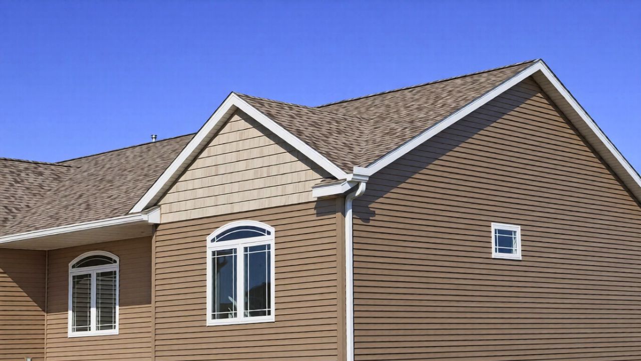
The siding color pairing that most reliably makes a house look older than it is is muddy beige vinyl or aluminum siding with flat, medium brown trim. You see it on plenty of 1970s and 1980s subdivisions, where beige reads slightly pink or yellow and the brown leans toward a drab, “earthy” tone. Together, they blur rooflines, flatten architectural details, and give even a well maintained home the look of a dated rental that has not been touched in decades.
Color experts point out that these kinds of heavy, brown based neutrals feel locked to a specific era, the same way Blue or red aluminum siding instantly signals a mid century exterior. When you pair a muddy beige field color with dull brown trim, you recreate that “very 70’s” palette on a newer structure, which is why the house reads older at a glance. The combination lacks contrast, so details disappear, yet it is not soft enough to feel intentionally minimalist, leaving the whole façade stuck in a stylistic no man’s land.
Why some neutrals feel timeless and others feel tired
Not all neutrals are equal, and the undertone is what determines whether your siding feels classic or dated. Warm neutrals that skew too yellow, pink, or orange tend to recall specific decades, especially when they are used wall to wall without crisp trim to balance them. Cooler or more balanced neutrals, by contrast, sit quietly behind the architecture and let the form of the house lead, which is why they age more gracefully.
Designers who focus on exteriors consistently recommend Neutral color palettes when you want a look that will not date quickly. Certain shades, such as sage green or slate, are cited as examples of colors that transcend trends because they bridge warm and cool families and sit comfortably in a landscape. When you compare those to the muddy beige and brown pairing, you can see why the latter feels tired: it is neither crisp nor complex, just flat, which makes every other element of the exterior feel older too.
Historic inspiration without slipping into faux nostalgia
If your house has traditional bones, you might be tempted to lean into historic colors, but copying an old palette without context can also make a relatively young home look like a theme set. The key is to understand what was actually used when a style was new, then translate that into a cleaner, contemporary version instead of defaulting to generic “heritage” beige and brown. That way, you honor the architecture without freezing it in a specific decade.
Owners of older properties are often advised to Research color palettes that were available and popular when the house was built, including paint brochures from companies like Seroco (Sears) from 1916. Paint manufacturers also publish Historic Paint Colors by Era, listing Featured Colors such as Classic Sand SW, Porcelain SW, Classic Ivory SW, and Silver Gray SW 004. When you borrow from those families instead of defaulting to muddy beige, you get nuance and depth that feel rooted rather than nostalgic, which keeps your exterior from looking like a costume.
The power of contrast: black and white done right
One of the simplest ways to avoid an aging beige and brown combo is to embrace deliberate contrast. High contrast schemes sharpen rooflines, window casings, and porches, which instantly modernizes even a traditional façade. A crisp pairing also photographs better, which matters if you plan to sell or simply want your home to look as polished in real life as it does in listing photos.
Exterior specialists often recommend you Go Classic with a Black and White, noting that You can rarely go wrong with this high contrast combination. Siding manufacturers echo that Siding and trim color combinations built around a White House with White Trim or deep accents give Any siding color a boost. Compared with muddy beige and brown, black and white feels intentional and current, which makes the whole structure read as fresher and more valuable.
Modern neutrals that flatter most façades
If stark black and white feels too bold for your street, you can still avoid an aging look by choosing updated neutrals with cleaner undertones. Greige, soft taupe, and light gray with a hint of warmth tend to sit comfortably next to brick, stone, and landscaping. They also give you more flexibility with accent colors on the front door or shutters, so you can refresh the look over time without repainting the entire house.
Color guides highlight Apr combinations like Beige, Cream, and White as Soft and Universally, especially when you layer them across siding, trim, and accents. Broader roundups of the Most Popular House note that, Depending on where you live, you will see a range of grays, whites, and soft greens that feel current without being flashy. Swapping muddy beige for one of these cleaner neutrals is often enough to make a 1990s or early 2000s home look like it was updated far more recently.
Greens, sages, and the new “heritage” palette
Green is having a long moment on exteriors, but the specific shade matters if you want your home to feel timeless rather than trendy. Deep forest greens can look stately on the right architecture, while bright Kelly greens can veer into novelty. The sweet spot for many houses is a muted, gray influenced green that plays well with stone, brick, and wood.
Color specialists describe Sep hues like Sage Green as sitting between green and gray, which makes them especially forgiving on large surfaces. Advice shared with owners of older homes notes that if you are keeping a gray body color, you should consider greens made from yellow plus black, especially sage, because they harmonize with existing materials instead of fighting them, as one Oct discussion of trim options explains. When you use sage or similar tones in place of muddy beige, you still get a grounded, traditional feel, but the house reads as thoughtfully updated rather than frozen in a past decade.
Monochrome done well versus monochrome gone wrong
Another way homes accidentally age themselves is through low contrast monochrome schemes that blur everything into one mid tone. Beige siding with slightly darker beige trim, or brown siding with only marginally lighter brown fascia, can make a house look like a single block, which feels heavy and dated. Yet monochrome can be striking when you handle it with enough variation in depth and texture.
Exterior design guides point out that Monochromatic Colors built around gray, black, and white are among the most classic combinations, and that There are few pairings more enduring than those subtle shifts in value. The difference between that and the aging beige and brown look is clarity: in a well executed monochrome scheme, you can still read the columns on the porch and the trim around the windows, while in a muddy palette, everything blends together. If you love a tone on tone look, keep the undertones clean and the contrast between siding and trim noticeable enough that the architecture still stands out.
Color combinations that signal “updated” at a glance
When you want your home to feel current, it helps to look at the combinations that are showing up repeatedly on new builds and thoughtful renovations. These schemes tend to mix one dominant neutral with a deeper accent and a crisp trim, which gives the façade rhythm and hierarchy. They also often borrow from nature, which keeps them from feeling gimmicky even as trends shift.
Designers highlight However effective three color schemes can be, especially when they blend with modern architecture, such as pairings that include Navy Blu or yellow and cream. Other resources on 5 standout siding colors emphasize how a carefully chosen front door or shutter color can transform a neutral body color into something special. When you compare these layered, intentional palettes to the flat beige and brown pairing, the difference in perceived age is immediate: one looks like a conscious design decision, the other like a builder default that has not been revisited in decades.
How to choose a palette that will age gracefully
To avoid locking your home into a specific era, you need a simple process for testing colors before you commit. Start by identifying the fixed elements you are not changing, such as brick, stone, or roof shingles, and pull your siding and trim colors from the same family of undertones. Then, test large swatches on different sides of the house so you can see how the colors behave in morning and afternoon light.
Look to curated lists of 28 popular siding colors to understand which hues are working across regions and styles, and pay attention to how often soft whites, grays, and greens appear. Many of these palettes are designed to evoke a subtle sense of nostalgia in viewers without tipping into kitsch, which is exactly what you want if you are replacing a muddy beige and brown combination. By grounding your choices in tested color families and checking them against your home’s permanent materials, you give your exterior the best chance of looking fresh for years instead of quietly aging it before its time.
Like Fix It Homestead’s content? Be sure to follow us.
Here’s more from us:
- I made Joanna Gaines’s Friendsgiving casserole and here is what I would keep
- Pump Shotguns That Jam the Moment You Actually Need Them
- The First 5 Things Guests Notice About Your Living Room at Christmas
- What Caliber Works Best for Groundhogs, Armadillos, and Other Digging Pests?
- Rifles worth keeping by the back door on any rural property
*This article was developed with AI-powered tools and has been carefully reviewed by our editors.