The “warm neutral” trend that photographs great and looks bad in real life
Warm neutrals promise a soft, flattering backdrop that makes your home and your photos look effortlessly polished. Yet the same beige that glows on Instagram can turn flat, dingy or oddly pink once it is on your walls and under your actual lighting. The disconnect between what photographs beautifully and what you want to live with every day is at the heart of the “warm neutral” problem.
If you are choosing paint or furniture based on how it looks in a reel or a styled shoot, you are effectively designing for the camera first and your own eyes second. Understanding why these hues behave so differently in person, and how the current wave of cozy neutrals is evolving, helps you avoid a room that only works in pictures.
Why warm neutrals are everywhere right now
You are not imagining it: warm neutrals are dominating your feed and the showroom floor. Designers are leaning hard into creamy whites, tan upholstery and pale brown woods because they feel calm and upscale without the starkness of gallery white. One collection from Bernhardt is presented as proof that Warm neutrals can turn a bedroom into something that looks like a hotel suite, complete with layered textures and soft lighting that flatter every angle.
Paint brands are following the same instinct, pushing palettes of Warm creams, pale browns, tan shades and beige hues that are marketed as a way to feel more grounded and connected to nature. Forecasts for the next wave of color trends describe a Color Forecast built around Earth Tones, Reimagined, where greens, browns and clay-inspired neutrals are meant to replace the icy grays of the last decade. On paper, and especially on camera, it is a compelling story of comfort and sophistication.
The camera loves neutrals more than your eyes do
Part of the appeal is technical: cameras are kinder to neutrals than to many saturated colors. Photographers point out that neutrals photograph beautifully in every season, which is why you see so many oatmeal sweaters and beige backdrops in family sessions. Soft browns and creams keep skin tones from competing with the background, and they hold detail even when the light is harsh or the exposure is slightly off.
Your own vision, however, is far more sophisticated than your phone’s sensor. As one photographer named guimmer explained in a discussion of why skin tones shift on camera, Our eyes constantly correct white balance and adapt to different lighting, while the camera just sees what it sees. That means a beige wall that looks balanced to you in person can skew yellow, gray or even green in a photo, and the reverse is also true: a neutral that looks perfect in a styled image may feel off once your brain is doing its own color correction in real time.
Lighting: the hidden culprit behind “why does this look wrong?”
Lighting is the quiet saboteur of your warm neutral dreams. A color that reads as a soft greige on a paint chip can turn muddy in a north-facing room or go peachy under warm LED bulbs. Professional advice on wall color makes it clear that Lighting Conditions Play a Huge Role in how paint appears, with cool daylight making colors look bluer and warm artificial light making them appear more yellow or orange.
That is why a beige that looks creamy in a filtered Instagram reel can feel like nicotine stain in your own living room. On social media, creators often shoot at the brightest time of day, with diffused light and carefully chosen camera settings that make every surface glow. In your home, you are dealing with cloudy afternoons, overhead fixtures and the color cast from nearby buildings or trees. Without testing, you will not know whether your chosen neutral will stay warm and inviting or shift into a chilly gray that makes the room feel like a basement.
When “warm neutral” turns into “sad beige”
There is also an emotional cost when you lean too hard on a single safe palette. Nowhere is that clearer than in nurseries, where parents have embraced all-neutral schemes so thoroughly that critics have labeled the look But nowhere
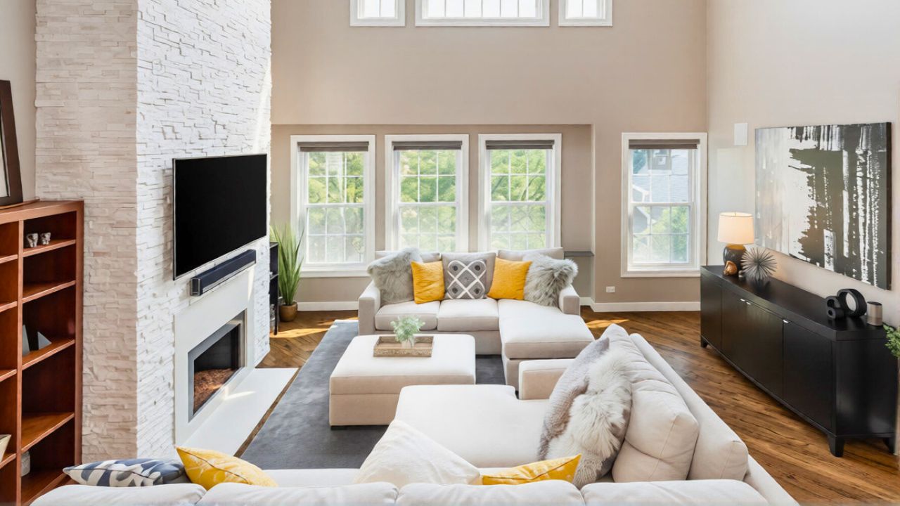
Adults feel a similar flattening effect when every surface is the same warm greige. Stylists warn that Neutral/beige rooms are not as effortless as they look, and that most people go too far in one direction, ending up with spaces that feel bland instead of serene. The problem is not the color family itself but the lack of contrast, pattern and material variety. In photos, a beige-on-beige room can read as chic minimalism; in person, it can feel like you are living inside a paper bag.
Designs that flatter the lens but fail in real life
Some of the most shared interiors are built to impress in a single frame, not to support daily life. All-white and nearly white rooms are a prime example. Stylists acknowledge that All-white rooms can feel sterile and unforgiving in real life, even though they photograph as clean and expansive. The camera does not show you the constant maintenance, the anxiety about stains or the way a bright white sofa can make guests sit on the edge of the cushion.
Even within the warm neutral trend, certain choices are more about optics than comfort. A bedroom styled to look like a hotel, with layers of beige and taupe, may be perfect for a shoot but impractical for a home where you want to read, work and relax. Designers who specialize in neutrals stress that you need contrast, texture and a mix of materials to avoid a boring space, and that a room built only for the grid often ignores those fundamentals. When you copy the look without the underlying design work, you inherit the problems without the polish.
Why your sample looked perfect and your walls look wrong
The frustration often starts at the paint store. You fall for a tiny swatch that seems like the ideal warm neutral, only to discover that it shifts dramatically once it covers an entire wall. Color consultants like Mar have been blunt that Neutrals can be deceptively tricky, and that what looks perfect on a sample can completely change once it is on the walls. The larger surface interacts with your flooring, your ceiling color and the light bouncing off nearby buildings, which is why a beige that seemed warm in the store can make your room feel chilly.
Mar also jokes about the anxiety of chasing the “right” neutral, noting that What seems like a safe choice can still trigger second-guessing once it is up. The only reliable way to avoid that spiral is to test large swatches in multiple spots and at different times of day, then live with them for a few days before committing. You are not just choosing a color; you are choosing how your walls will react to every sunrise, lamp and cloudy afternoon.
How the warm neutral trend is evolving toward richer color
There are signs that the market is already correcting for the pitfalls of pale, camera-friendly neutrals. Forecasts for the coming year highlight These Rich Neutrals Are Going To Be Everywhere In 2026, with designers saying goodbye to light and breezy and hello to warm and rich. Instead of barely-there beige, you are seeing caramel, tobacco and deep camel that offer more depth and flexibility. These tones still function as neutrals, but they have enough saturation to hold their own against strong daylight and to feel cozy at night.
Paint companies are also leaning into specific shades like an Espresso Martini brown that is framed as a Rich hue and the Coziest Comeback Paint Color. At the same time, tile and finish manufacturers are promoting Warm Colors for Living Room Walls that draw on terracotta, sand and clay, often paired with natural stone and wood for a touch of country elegance. The throughline is clear: instead of chasing the palest neutral that photographs well, you are being encouraged to embrace warmth and character that you can actually feel when you walk into the room.
Designing for your life first, the photo second
If you want a home that looks good both on camera and in person, you need to flip the usual script. Start with how you use the room, how much natural light it gets and what mood you want to feel, then choose a palette that supports that, rather than copying a reel. Remember that Hendrickson Photography and Shutterstock images of pristine spaces are staged to minimize clutter and maximize light, conditions that are hard to replicate in daily life.
From there, layer in contrast and texture so your warm neutrals do not collapse into “sad beige.” Mix creamy walls with darker wood, add pattern through rugs or upholstery, and bring in color through art or greenery. If you still love the look of a neutral-heavy feed, treat it as a starting point, not a template. The goal is not to reject warm neutrals, but to use them with enough nuance that your rooms feel as good at 10 p.m. on a rainy Tuesday as they do in a perfectly edited snapshot.
Like Fix It Homestead’s content? Be sure to follow us.
Here’s more from us:
- I made Joanna Gaines’s Friendsgiving casserole and here is what I would keep
- Pump Shotguns That Jam the Moment You Actually Need Them
- The First 5 Things Guests Notice About Your Living Room at Christmas
- What Caliber Works Best for Groundhogs, Armadillos, and Other Digging Pests?
- Rifles worth keeping by the back door on any rural property
*This article was developed with AI-powered tools and has been carefully reviewed by our editors.