Wall art arrangements that make small spaces feel intentional
Small rooms show everything. That’s why the way you hang art matters as much as what you hang. The right arrangement can organize a wall, pull a room together, and make tight spaces feel styled on purpose. Here are layouts and tricks I use when square footage is at a premium.
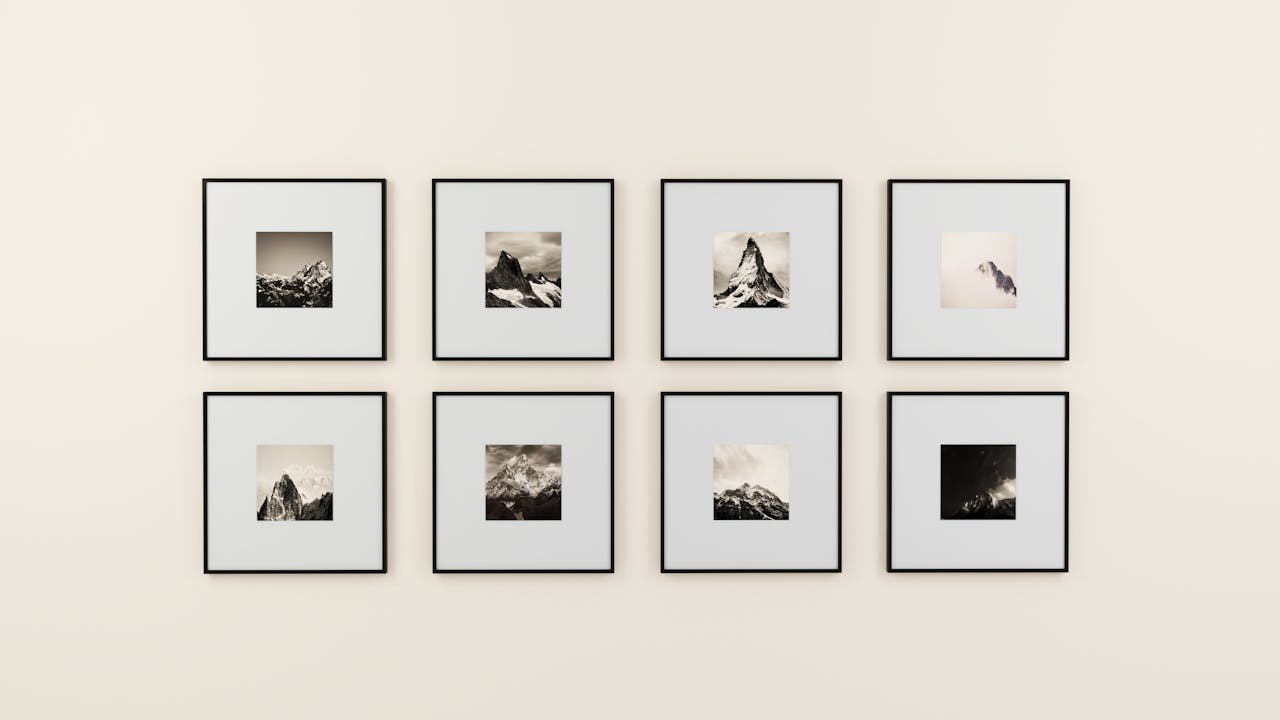
Tight grid that behaves like one big piece
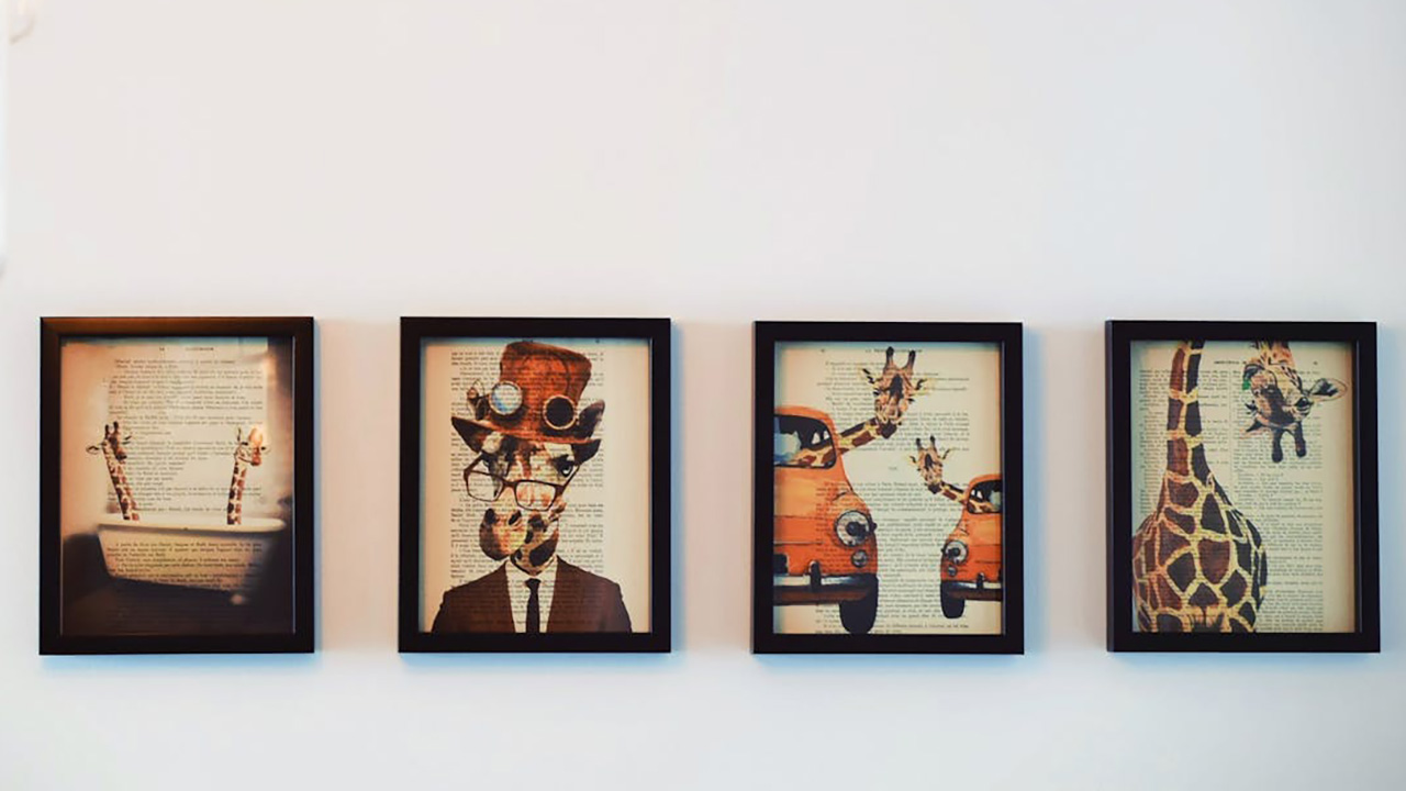
A 2×3 or 3×3 grid reads as a single rectangle, which calms a busy wall. Use matching frames and consistent spacing—think two inches all around.
Keep imagery related in tone—black-and-white photos, botanicals, sketches—so the set feels unified. A grid is great above a sofa or console when you can’t source one oversized piece.
Asymmetrical gallery with a clear anchor
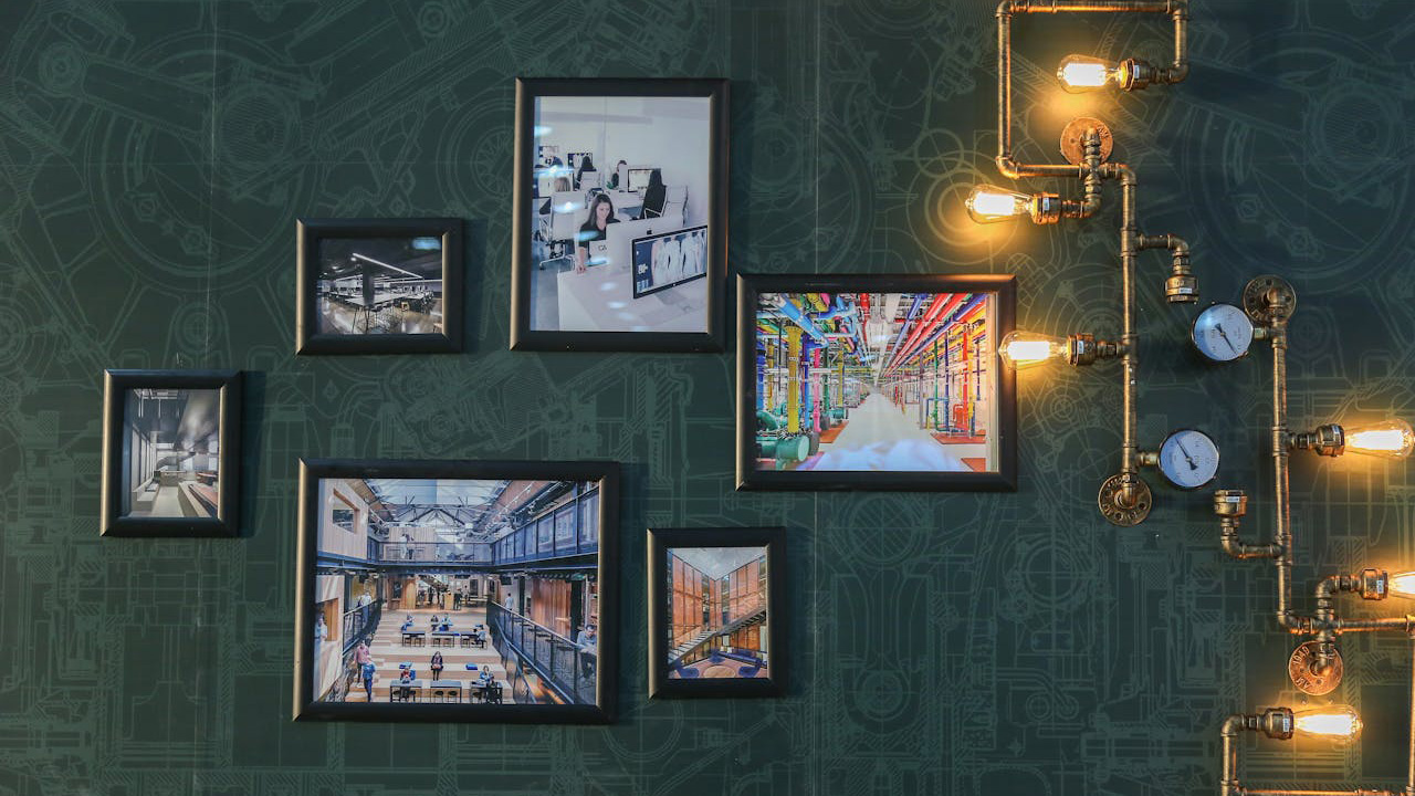
Start with one dominant piece, then build a loose halo of smaller frames around it. The anchor gives your eye a place to land, so the mix doesn’t feel chaotic.
Keep the outer edge of the arrangement roughly rectangular. That invisible boundary makes the whole cluster feel tidy even with different sizes.
Picture ledges for easy rotation
Two narrow ledges let you layer frames and swap art without new holes. It’s ideal for renters and for people who like to change things seasonally.
Vary heights and overlap a few pieces for depth, but keep frame colors to two finishes max. Add one sculptural object—a small vase or bowl—to break the planes.
Vertical pair to lift low ceilings
Stack two pieces with equal width to create a column of interest. It draws the eye up and adds architecture to a blank slice of wall.
Use similar mats and frames so the pair reads as a unit. This trick is perfect between windows or beside a bookshelf.
Oversized art as a visual headboard
In tight bedrooms, one large piece behind the bed can stand in for a headboard or amplify a low one. It forces the room to read as intentional instead of “we ran out of space.”
Choose something with calm movement—landscape, abstract wash—so it supports sleep. Keep bedside lamps simple to avoid competing shapes.
Salon strip over a long sofa
Instead of spreading art across the whole wall, hang a continuous “strip” that follows the sofa’s length. It organizes the room and keeps the sightline clean.
Align the bottoms or centers of frames along a gentle line. Consistent alignment is what separates styled from scattered.
Triptych to stretch a narrow wall
Split one image into three vertical panels or use three related pieces with the same mat and frame. The gaps make the wall feel wider.
Maintain even spacing between panels and center the set on the wall, not the nearest object. The rhythm does the work for you.
Float mount for dimension without clutter
Float-mounting a print shows the paper’s edges and adds a shadow line inside the frame. It reads custom without going ornate.
Keep mats generous and frames slim. In small rooms, that negative space is your friend—it gives art room to breathe without eating square footage.
Like Fix It Homestead’s content? Be sure to follow us.
- I made Joanna Gaines’s Friendsgiving casserole and here is what I would keep
- Pump Shotguns That Jam the Moment You Actually Need Them
- The First 5 Things Guests Notice About Your Living Room at Christmas
- What Caliber Works Best for Groundhogs, Armadillos, and Other Digging Pests?
- Rifles worth keeping by the back door on any rural property
*This article was developed with AI-powered tools and has been carefully reviewed by our editors.