10 Fixer Upper color choices that don’t look right in 2025
When Fixer Upper first aired, Joanna Gaines had a huge influence on color trends. Her go-to paint picks became the default in homes everywhere—especially for people chasing that clean, modern farmhouse look. But design keeps moving, and the same soft grays and muted neutrals that once felt fresh are starting to feel flat or dated.
If you’re rethinking your walls, cabinets, or even trim, here are the Fixer Upper-era color choices that aren’t hitting the same in 2025.
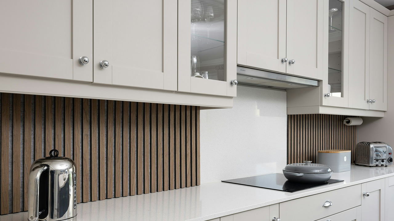
Cool-Toned Gray Walls

For years, cool gray was the paint color everyone swore by. It was in nearly every Fixer Upper house—soft, modern, and an easy contrast to white trim. But in 2025, those blue-leaning grays feel cold and disconnected.
People are shifting toward warmer neutrals that feel more inviting. Even if you still want a gray, a warmer greige or taupe adds more depth and plays better with the natural tones that are trending now.
Bright White Everything

Joanna made bright white walls a design staple. They made rooms feel bigger, cleaner, and more pulled together. But in practice, they’re hard to live with. They show every fingerprint and scuff and can make a space feel sterile if you don’t balance it out.
More homeowners are swapping crisp white for warmer, creamy tones. These off-whites still feel fresh, but they don’t wash everything out. They also work better with wood, stone, and layered textures that are gaining popularity again.
Soft Sage Green

This muted green shade showed up on everything from cabinets to front doors. And while it had its moment, the dusty sage tones from the Fixer Upper playbook can feel a little tired now—especially paired with white shiplap or black hardware.
Green is still everywhere in 2025, but the tone has shifted. Deeper olive, warm eucalyptus, and more saturated natural greens are replacing the pale, almost chalky versions that once ruled farmhouse kitchens.
Black Interior Doors

Painting interior doors black was one of Joanna’s signature moves. It added contrast and drama without going too bold. But in real life, black doors can feel heavy—especially in homes that don’t get a lot of natural light.
Now, people are leaning toward lighter woods or soft taupes to add interest without darkening the space. Black still works in the right setting, but it’s no longer the universal go-to it once was.
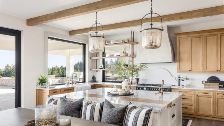
Greige Cabinets
The gray-beige cabinet trend took off thanks to Fixer Upper, but in 2025, that middle-of-the-road tone doesn’t always cut it. It can look washed out, especially when paired with similarly muted flooring or backsplashes.
Richer tones like mushroom, tan, or creamy putty feel more grounded and pair better with natural materials. If you’re updating your cabinets, a warmer, less chalky neutral adds more life to the space.
Pale Blue Accents

That barely-there blue Joanna often used in bathrooms, bedrooms, or laundry rooms has lost its appeal. It leans more juvenile than calming now and tends to clash with the warmer tones trending in today’s homes.
People are trading these washed-out pastels for moodier colors or warmer soft tones. Muted clay, dusty mauve, or even earthy blushes feel more current and work better in layered, lived-in spaces.
Cool White Trim

Joanna’s go-to trim was a clean, cool white—especially next to gray walls or cabinetry. But in 2025, that kind of contrast reads as harsh in a lot of homes, especially now that color palettes are softening.
More designers are choosing warmer whites or even off-white with a touch of beige or cream. It makes the whole room feel cozier and avoids that stark, showroom vibe that can make a house feel less like home.
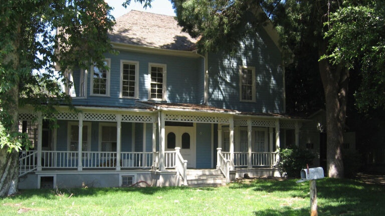
Black and White Exterior Paint

The black-and-white farmhouse exterior became iconic thanks to Fixer Upper. But now that it’s on every block, it doesn’t stand out the way it used to. In some settings, it even looks too severe or trendy.
People are leaning into warmer exteriors with earthy neutrals, browns, and muted greens that blend better with the landscape. A little contrast still works, but the full black-and-white combo is starting to feel overdone.
Navy Accent Walls

Joanna’s use of navy—especially in home offices or bedrooms—gave spaces a crisp, preppy feel. But in 2025, navy feels more limiting than layered. It can weigh a room down and doesn’t mix well with the softer tones trending now.
If you want depth, muddy blues or blue-greens feel fresher and pair better with natural wood, warm metals, and modern decor. Navy isn’t out entirely, but it’s no longer the statement color it once was.
Soft Blush Pink

Blush pink was everywhere in Fixer Upper-inspired nurseries and guest rooms. While it had a good run, it now reads more dated than delicate—especially in adult spaces.
If you still like the warmth of pink, look for earthier shades with brown or terracotta undertones. These colors feel more grounded and work better with the layered, organic styles that are replacing the black-and-white farmhouse look.
*This article was developed with AI-powered tools and has been carefully reviewed by our editors.