10 Paint Colors That Make a Clean Home Feel Cluttered
You can clean every inch of a room, declutter like a pro, and still feel like something’s off. A big reason? The paint color. Some shades—even ones that are trendy—can make a space feel busier, smaller, or downright chaotic.
If a room never quite feels clean no matter how much you scrub, your wall color could be part of the problem. These are the paint colors that tend to make a space feel cluttered, even when it’s not.
Bright Cherry Red
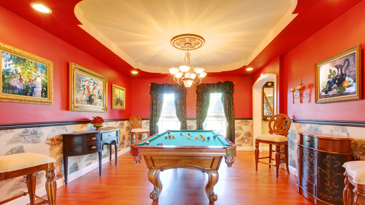
Red demands attention. Even when the room is spotless, this color makes everything feel loud and busy. It’s overstimulating, especially in small spaces.
A softer terracotta or a muted clay works better. You get warmth without the visual chaos.
Neon Anything
Neon greens, hot pinks, and electric blues belong on signs—not walls. They overwhelm the space and make every object stand out in a bad way.
If you like bold, try saturated colors with depth, like navy, emerald, or mustard. They’re dramatic without feeling cluttered.
Dark Brown
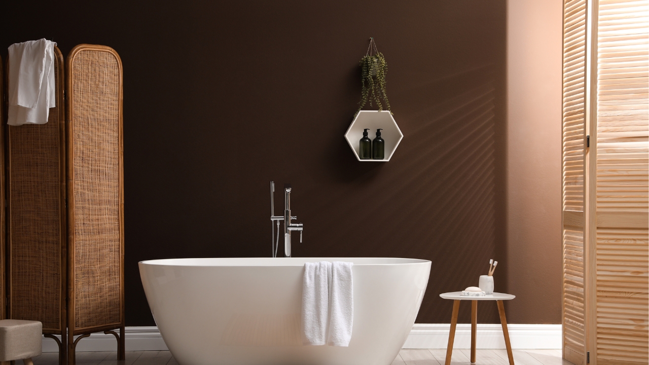
Deep brown walls instantly shrink a space. Instead of cozy, it often feels heavy and crowded—like the walls are closing in.
If you want warmth, try warm taupes, mocha, or creamy mushroom tones. They give you depth without making the room feel boxed in.
Super Saturated Yellow
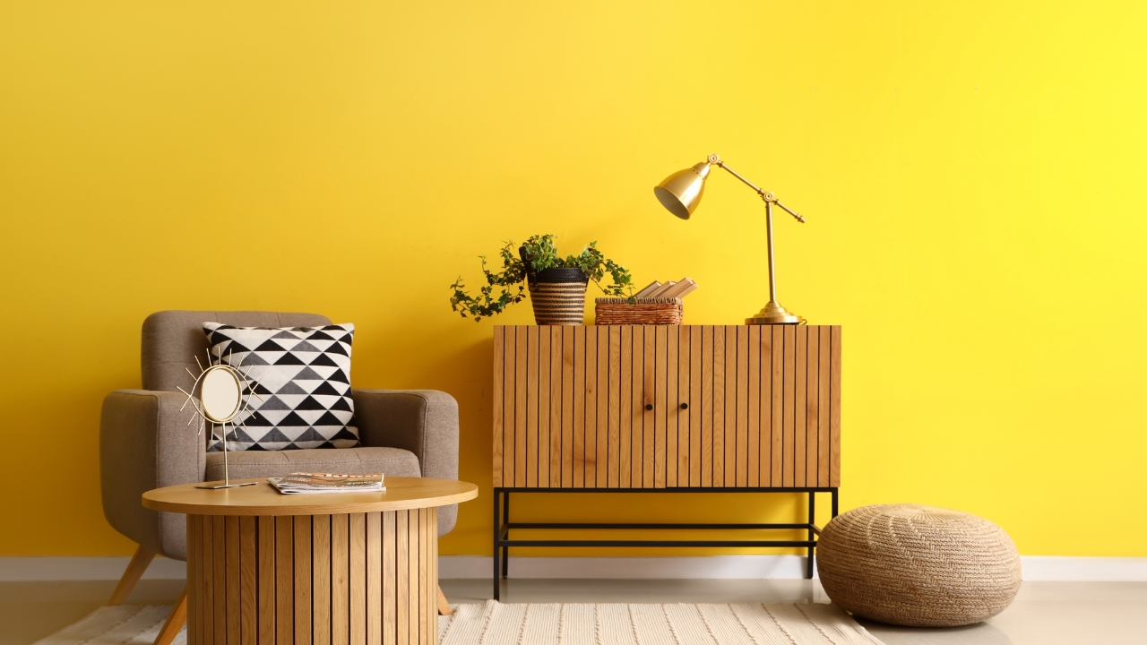
A little yellow is cheerful. A whole wall of highlighter-yellow? That’s stressful. It creates a glare that makes every object pop, even the ones you wish didn’t.
Soft buttercream or a warm wheat shade brings in the sunshine without the chaos.
Olive Green
While trendy, the wrong olive green can make a room feel muddy and weighed down. It tends to swallow light and highlight clutter.
If you like green, lean toward sage, soft eucalyptus, or dusty mint. They read fresher and cleaner.
Purple with Blue Undertones
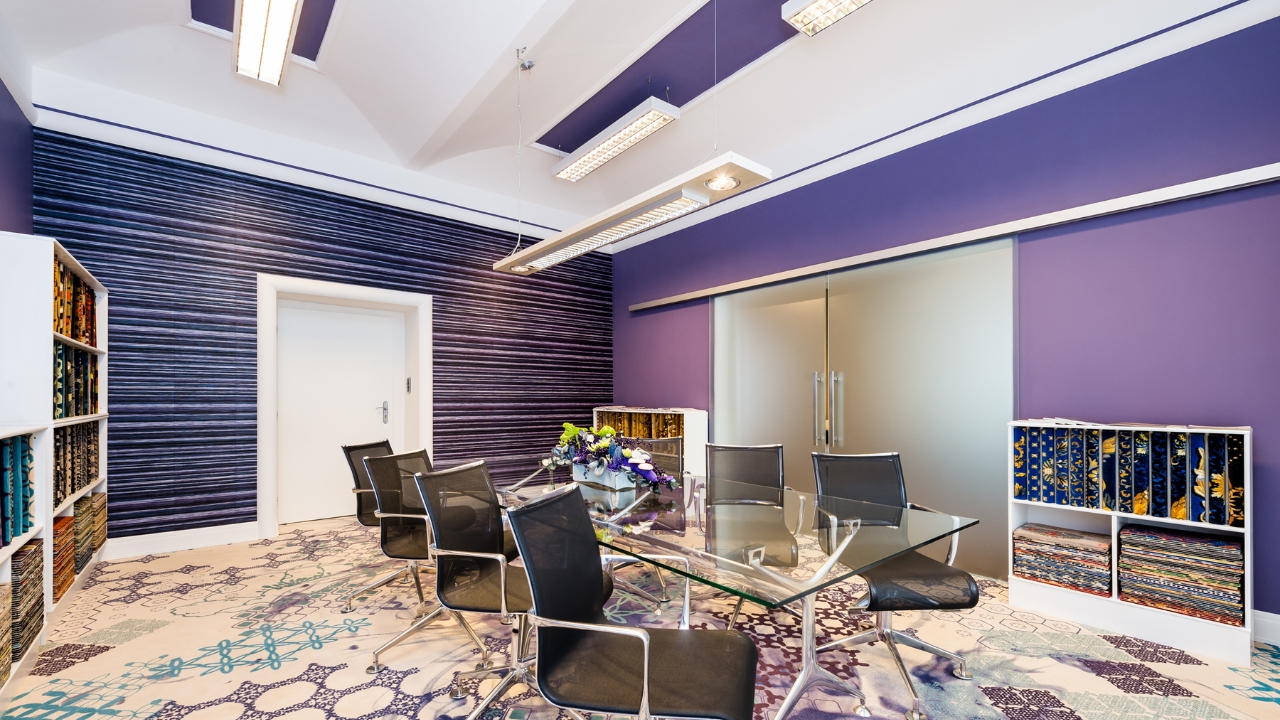
Purples that lean cool, especially with strong blue undertones, can feel heavy and mismatched. Instead of calming, it turns clutter into the star.
Swap for lavender-gray, soft mauve, or even a warm plum if you want purple without the mess factor.
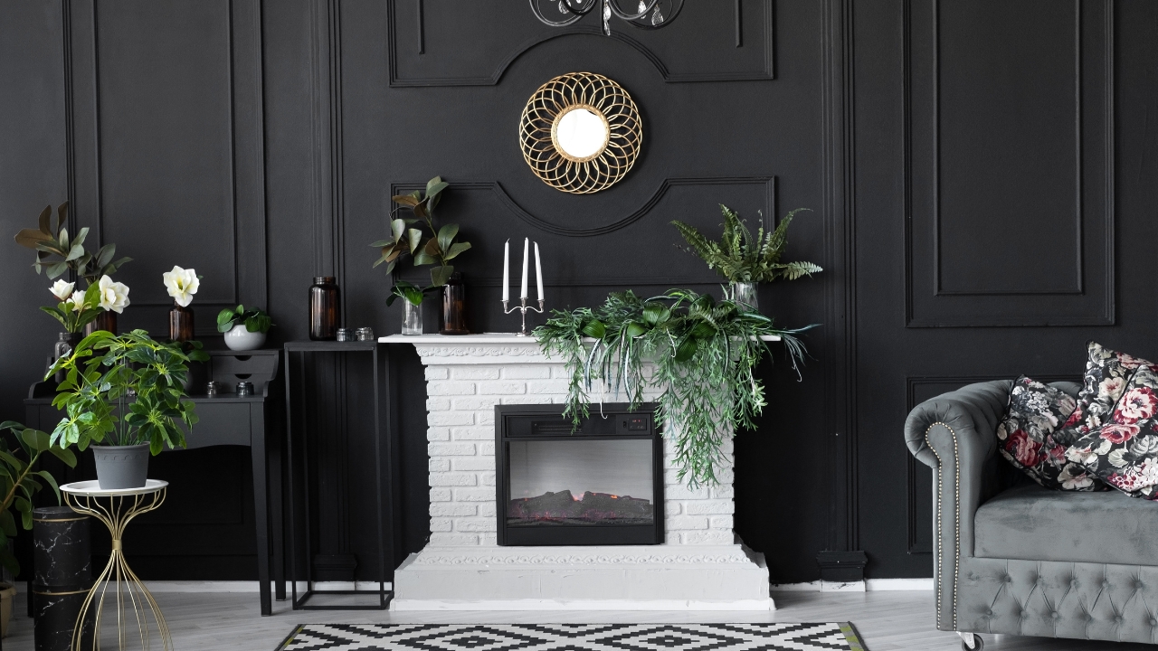
Jet Black
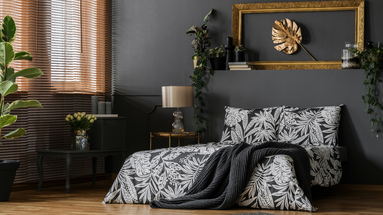
Black walls can be striking but are incredibly unforgiving. Every speck of dust, every random item, and every smudge pops like crazy.
If you like dark, charcoal, slate, or soft blackened navy delivers the mood without overwhelming the space.
Bright Orange
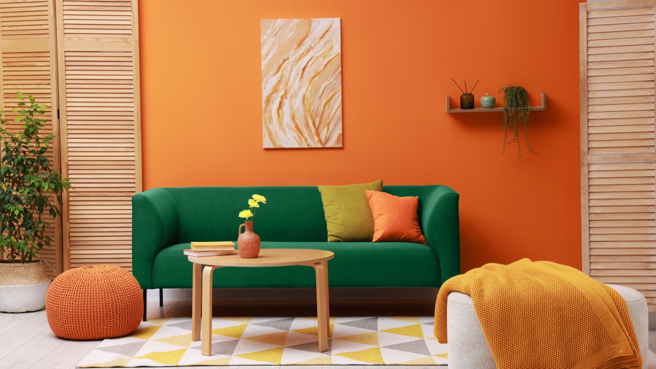
Orange is high energy, but on walls, it gets chaotic fast. It’s loud, and it clashes with nearly everything else in the room.
Swap it for terracotta, rust, or a muted burnt orange. They add warmth without the overwhelm.
Mint Green
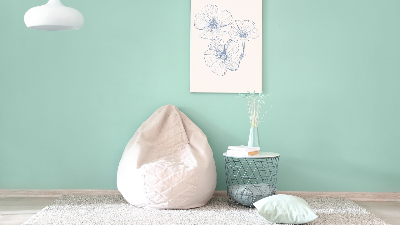
It feels fresh in theory, but mint can actually make a room feel cold and visually cluttered. It bounces light in strange ways that make the space feel unsettled.
If you want something soft and fresh, go for dusty sage, pale eucalyptus, or a green-gray blend.
Dark Navy (In the Wrong Room)
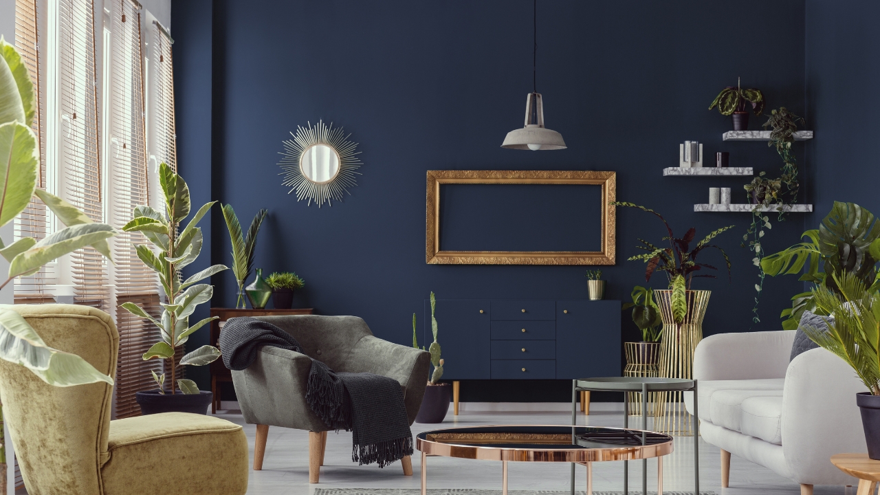
Navy can be gorgeous, but when paired with too much dark furniture or in small, poorly lit spaces, it makes everything feel cramped.
It works better as an accent or paired with crisp whites, wood tones, or light flooring to balance the weight.
*This article was developed with AI-powered tools and has been carefully reviewed by our editors.