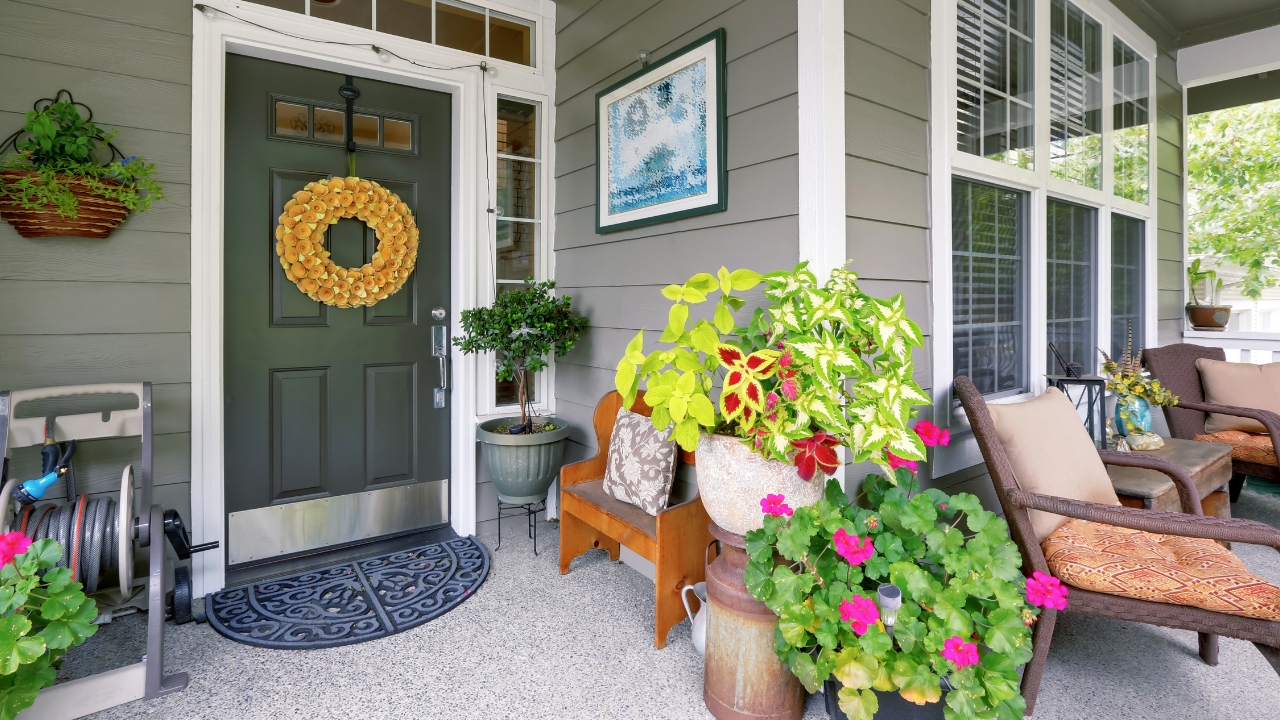
10 Things That Make Your Front Porch Look Dated Instantly
Your front porch works like a headline for your home, setting expectations long before anyone rings the bell. A few small missteps can make that entry feel tired, cluttered, or oddly off, even if the rest of your house is beautifully updated. By spotting the details that instantly age the space, you can trade them for simple, current choices that feel welcoming instead of worn out.
Rather than chasing every trend, you will get better results by editing out the most dated offenders and letting a few thoughtful pieces carry the story. From clutter and kitschy signs to bad lighting and plastic greenery, most porch problems can be corrected in an afternoon, often with items you already own.
1. Clutter and Overcrowding Everywhere
Nothing dates your porch faster than visual chaos. Piling on mismatched planters, extra side tables, storage bins, pet gear, and seasonal decor all at once makes the space stop feeling intentional and start looking like a catchall. Designers who study curb appeal repeatedly point to clutter and overcrowding as the first things that make an entry look messy rather than styled, especially when scattered shoes and random accessories build up around the door.
Several pros group clutter and overcrowding under the same problem, because too many objects, even if they are individually attractive, read as visual noise. Another group of designers flags clutter and overcrowded as a top reason a porch looks tacky, especially when you add scattered items that do not belong outdoors. You get a more current look when you treat the porch like a small room: edit down to a clear seating zone, one or two planters, and a single focal piece near the door, then store everything else out of sight.
2. Kitschy Signs and Cliché Slogans
Novelty signs can date your porch almost instantly, particularly when every surface carries a slogan. Leaning a giant board that says “Welcome” next to the door, hanging multiple plaques with sayings, and adding a doormat with another phrase can make the entry feel more like a theme park set than a real home. Over time, those sayings shift from charming to overused, which leaves the entire entry stuck in a specific trend cycle.
Designers now encourage you to retire kitschy outdoor signs with phrases such as “Sit a Spell” or “Keep Calm” if you want your porch to feel current. One expert, Cassie Scaldaferri, specifically calls out signs that say “Sit a Spell” or “Keep Calm” as examples that drag down curb appeal instead of adding personality. Another source on tacky porch mistakes warns against signage and novelty phrases that dominate the view as soon as you walk up. You get a fresher look when you swap slogan-heavy boards for one understated plaque, a simple house number, or even a piece of outdoor art that does not rely on text at all.
3. Tiny, Awkward Furniture That Feels Like a Toy Set
Underscaled furniture can make your porch feel both dated and uncomfortable. Relying on petite bistro sets with spindly legs or tiny rocking chairs that look more decorative than functional makes the space read as staged rather than lived in. The effect gets worse if you line up several small pieces along the wall so the porch looks like a waiting room instead of a relaxed outdoor room.
Designers who study outdoor trends now warn that small furniture, such as a tiny table or undersized chair, can make your porch feel skimpy and out of date. One expert notes that petite pieces shrink the space visually instead of grounding it. Another group of designers, in a separate rundown of things that make, points out that scattered, mismatched chairs send the same dated message. You create a more current feel when you choose fewer, larger pieces that match the scale of your porch, such as a full-size bench with a side table instead of three tiny chairs.
4. Plastic Wreaths, Faux Flowers, and Faded Greenery
Artificial greenery has improved, but plastic still gives your porch away at a glance. When your wreath is obviously synthetic, your potted plants never change with the seasons, and the colors are a little too bright or already faded, the whole entry starts to feel stuck in time. The effect is especially strong around holidays, when plastic garlands and bright faux berries can look more like leftover party decor than a thoughtful seasonal touch.
Design experts now single out Plastic Wreaths and as a front door trend that instantly kills curb appeal. One stylist notes that plastic foliage had its moment and that moment is over, especially when you leave the same wreath up all year. Another set of porch specialists, who list tacky porch details, warns that faded or dusty faux plants send the message that you do not maintain the space. You get a fresher effect when you use real greenery in a few key spots, rotate simple seasonal wreaths, or at least choose high quality faux stems that mimic natural colors and change them out a few times a year.
5. Outdated, Harsh, or Dim Lighting
Lighting on your porch does more than keep you from fumbling with keys; it sets the mood for the entire facade. When your fixtures are builder basic, yellowed, or far too small for the space, they immediately age the entry. Bulbs that are too bright and harsh or so dim that guests can barely see the steps create the same dated feel, because they signal that the lighting has not been updated since the house was built.
Designers now describe Bad Lighting Outdoor as a key reason porches lose curb appeal, and they encourage you to choose fixtures that resemble the thoughtful options you would use indoors. Another group of lighting experts, who analyze home lighting mistakes, points out that wrong color temperature and poor placement can make even a freshly painted entry feel flat. You can modernize the look quickly by swapping in a larger, more current fixture, choosing warm white bulbs, and adding a secondary source like a discreet step light or a lantern on a timer.
6. Neglected Hardware and Tired Metal Finishes
Front door hardware, railings, and mailbox details are small, but they carry a lot of visual weight. A scratched brass handle from the 1990s, a crooked knocker, or chipped, rusting railings can make the whole porch read as dated even if you just painted the siding. Old metal finishes often clash with newer elements like modern house numbers or a fresh light fixture, which makes the entry feel pieced together over decades instead of cohesive.
Staging experts who focus on curb appeal recommend that you change out dated, including door handles, knockers, and light fixtures, to modern standards. Another guide to front porch decorating suggests swapping old metal fixtures or at least cleaning and polishing them so they look intentional instead of forgotten. You instantly update the space when you choose one finish, such as black or brushed nickel, and repeat it across the handle set, mailbox, and lighting so everything feels like part of the same design story.
7. Trend Overload and Theme-Park Styling
Leaning too hard into a single trend can timestamp your porch just as quickly as neglect. When every element screams one style, such as all-white “farmhouse” everything or a hyper-minimal “Scandi” setup, the entry can feel like a set piece from a specific year. That sense of overcommitment gets worse when you add themed decor for every holiday, from oversized inflatables to multiple coordinated signs, so the porch never has a neutral baseline.
Design pros warn about the risk of going so hard on a modern Scandi aesthetic that your home looks like it was plucked off a showroom floor. The same caution applies outdoors, where trend overload or full “cluttercore” styling can make all the excess feel uncurated instead of collected. Another guide to tacky front porch advises you to avoid cluttering your porch with too many novelty items or oversized decorations. You get a more timeless effect when you pick one or two subtle nods to a style you love, then layer in neutral furniture, simple textiles, and greenery that can flex with changing trends.
8. Ignored Mailbox, Packages, and Practical Details
Functional elements can quietly date your porch when you ignore them. A dented mailbox, a leaning post, or a unit with a style that clearly belongs to another decade can undo a lot of fresh paint and new furniture. Package storage has the same impact. When boxes pile up on the steps or you rely on a cracked plastic bin beside the door, the first impression is cluttered and outdated rather than polished.
Outdoor decor specialists describe Treating the Mailbox as an afterthought as one of the fastest ways to timestamp a home. They also call out ignoring package delivery altogether as a mistake, because it leads to piles of boxes that undermine your styling. Window and door experts who work on curb appeal, such as the team at Universal Windows, consistently tie updated fixtures and clean sightlines to a more current look. You can modernize your porch quickly by upgrading the mailbox to a simple, contemporary design and adding a discreet bench or box where deliveries can land without cluttering the steps.
9. No Visual Balance or Cohesive Color Story
Even if every individual item on your porch is attractive, the space can still look dated when nothing feels balanced. When one side of the door is heavy with plants and furniture and the other side is bare, or when you mix too many unrelated colors and finishes, the porch reads as a collection of leftovers. That imbalance often happens gradually as you add pieces over time without stepping back to see how they work together.
Stylists who track Outdated Porch trends that are reducing your curb appeal stress that balance is key and that a little contrast should be allowed to shine instead of competing elements fighting for attention. Another guide to porch decorating mistakes lists “Mistake 1: Overcrowding the Space” and explains that too many items in different styles make it hard for your eye to rest. You create a fresher look when you choose a tight palette, repeat one or two materials (such as black metal and natural wood), and mirror elements on either side of the door so the whole composition feels intentional rather than accidental.
Like Fix It Homestead’s content? Be sure to follow us.
Here’s more from us:
- I made Joanna Gaines’s Friendsgiving casserole and here is what I would keep
- Pump Shotguns That Jam the Moment You Actually Need Them
- The First 5 Things Guests Notice About Your Living Room at Christmas
- What Caliber Works Best for Groundhogs, Armadillos, and Other Digging Pests?
- Rifles worth keeping by the back door on any rural property
*This article was developed with AI-powered tools and has been carefully reviewed by our editors.