10 Trends That Are Quietly Destroying Curb Appeal
Some trends catch on fast, but not all of them age well—or actually look good once they hit real front yards. What you see on Instagram or at a big box store display doesn’t always translate to something that boosts your home’s appearance. In fact, a few of the most popular landscaping and exterior design ideas are quietly working against you.
If your goal is to keep your curb appeal looking clean, classic, and welcoming, these are the trends worth skipping.
Overusing Black Paint on the Exterior

Black accents can look sharp, but painting your whole house black or going too heavy with dark trim often backfires. Instead of looking modern, it can make a home feel uninviting—especially in older neighborhoods or homes without the right architectural lines.
Black also fades fast in direct sun, which means more upkeep. A few dark touches can add contrast, but leaning too far into the trend tends to drag curb appeal down, especially once the paint starts looking worn.
Fake Turf Lawns in the Front Yard

Artificial turf has its place, but putting it across your entire front yard can feel out of place—especially in neighborhoods with natural grass. It often looks stiff, overheats in the sun, and can give off a plastic shine that instantly reads fake.
Over time, seams become visible, debris gets stuck in it, and it can start looking worse than a patchy lawn. A drought-tolerant mix of native plants or even gravel with intentional design usually holds up better visually.
Monochrome Landscaping Palettes
Neutral yards can look clean, but when every plant, stone, and pot is some shade of gray or white, the yard ends up looking flat and lifeless. It photographs well, but in person, it can come across as cold or half-finished.
You don’t need a rainbow of color, but adding some variation—whether it’s greenery, texture, or even a warm-toned element—makes the space feel more inviting. Uniformity without balance rarely works outside a magazine shoot.
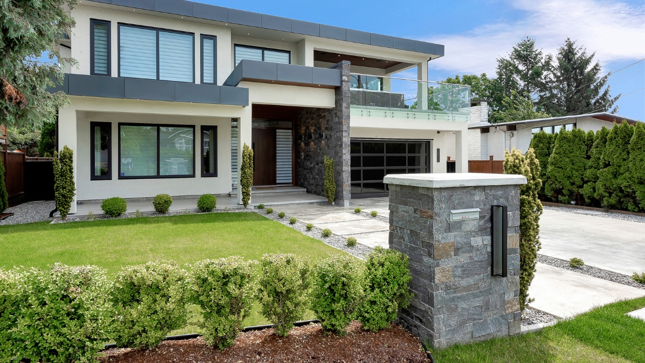
Tiny Porch Columns on Large Houses

Swapping out old porch posts for sleek, narrow columns is a trend that’s picked up speed, but scale matters. On bigger homes, skinny columns look weak and disproportionate. They make the whole front of the house feel off-balance.
Columns need to match the size and style of the home. If they’re too small, the house ends up looking awkward and top-heavy instead of clean-lined. Sometimes sticking with chunkier, classic posts makes more sense long term.
String Lights Across the Lawn

String lights can be cozy in a backyard or patio, but draping them across the front yard, especially over grass or between trees, often looks messy. It’s a look better suited for a backyard gathering than your main curbside impression.
During the day, you’re left with sagging wires and plastic clips in plain view. And unless you’re lighting up the lawn every night, it reads more like leftover party décor than intentional design.
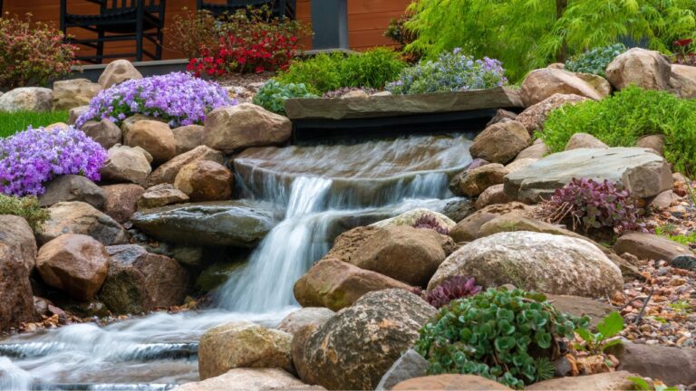
Excessive Use of Gabion Walls

Gabion walls—those wire cages filled with rocks—can be a cool industrial feature when used sparingly. But in residential settings, especially when they’re everywhere, they tend to look heavy and out of place.
They don’t always mesh well with traditional homes and can give off a cold, unfinished vibe. Plus, they collect debris and are hard to clean. If your goal is curb appeal, there are cleaner, more timeless ways to add structure.
Front Yards With No Grass or Groundcover

There’s a trend toward ripping out all grass in favor of hardscape and sparse planting, and while it can be low maintenance, it often ends up looking dry and sterile. A fully bare yard with only stone and a few scattered plants rarely feels welcoming.
You don’t need a full lawn, but groundcover, mulch, or a mix of plants helps soften the space. Without it, the front of the house can look more like a commercial lot than a home.
Matching the House to the Garage Door
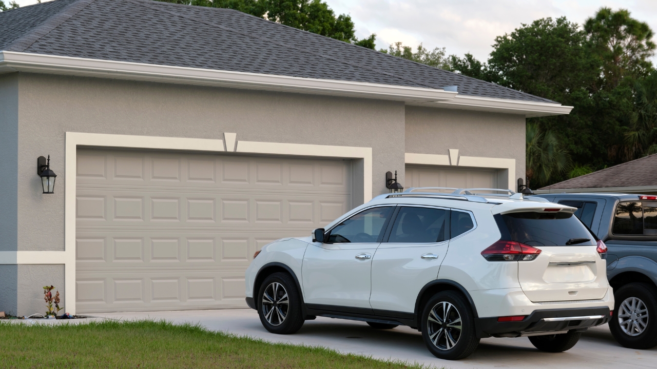
Painting the garage door to match the house exactly might seem like it’ll blend in better, but it often draws even more attention to it—especially on homes where the garage dominates the front.
A better move is to break it up. A complementary color or even a wood-tone finish can help the garage door feel more intentional without making it the main focal point. Matching everything too closely can actually make the front feel flat.
Overdone Gravel Driveways

Gravel driveways can look charming when done right, but oversized gravel or poorly maintained ones quickly kill curb appeal. The rocks scatter, weeds pop up, and ruts form from tires over time.
It also doesn’t work well in every region or home style. If it’s not installed with proper edging and upkeep, it ends up looking temporary. Asphalt or concrete may not be trendy, but it’s often cleaner and more cohesive with the overall design.
Trendy Front Doors That Don’t Match the House
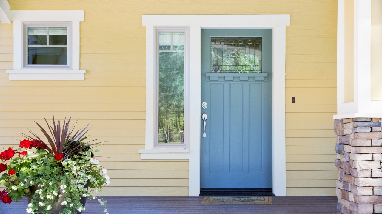
Swapping out a front door for something trendy—like an ultra-modern slab or one with funky glass panels—can totally clash with the rest of the home. The front door should complement the style, not fight it.
It’s tempting to follow what’s popular, but if the door doesn’t fit the architecture, it sticks out in a bad way. You’re better off updating the hardware, paint color, or lighting around the door than trying to force a modern look on a traditional setup.
*This article was developed with AI-powered tools and has been carefully reviewed by our editors.