This lighting flaw is ruining your entire home asthetic
Photos flatten rooms in forgiving ways. You can scroll design feeds and think your space should look the same with a few swaps. Then evening hits, the overheads glare, and the room feels harsher and smaller than you expected. The usual culprit isn’t furniture—it’s lighting that works for a picture but not for people.
If your house reads cold or chaotic at night, fix light quality and placement before you buy another pillow. When lighting supports life—conversation, reading, cooking—your style finally shows up the way you intended.
pick one color temperature and commit
Mixed bulbs create patchy rooms. Choose 2700K–3000K for a warm, residential feel and replace bulbs in connected spaces so they match. If your kitchen runs 3000K, don’t let the adjacent dining drop to an icy 4000K. Consistency matters more than the exact number.
Pro move: Keep one spare box of your chosen bulbs on hand and restock before you run out so color temp doesn’t drift.
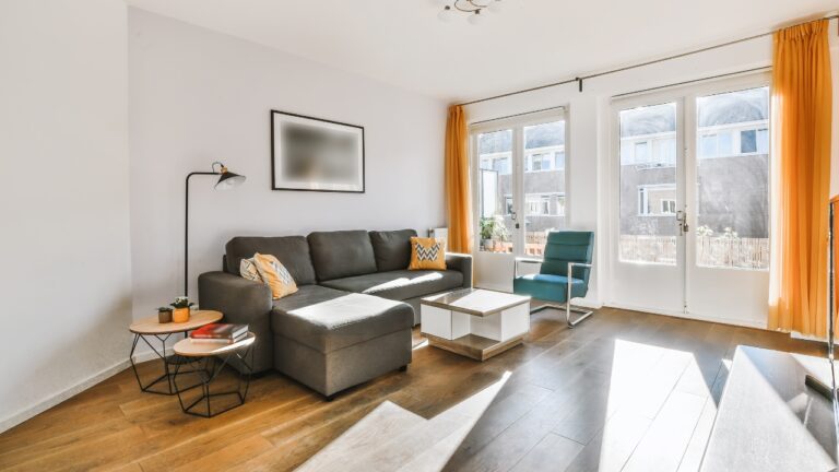
kill the “overhead only” habit
Ceiling fixtures are great for cleaning and projects. They’re not great for conversation or relaxing. Aim for three light layers in every sitting zone: ambient (ceiling or wall), task (table or floor lamp), and accent (sconces or picture lights). Lamps at seated height bounce light off walls, softening faces and warming paint.
Quick test: Turn off overheads at dusk, then add lamps one by one. If you can’t see to read or there’s a dark void behind the seating, add a lamp or a wall sconce.
fix shadows where you actually live
Counters and reading chairs reveal bad light first. Under-cabinet bars remove hand shadows while chopping; a swing-arm floor lamp behind a chair solves squinting. Place lamps so shades sit near eye level when seated. Too-tall lamps make glare; too-short lamps pool light on your knees.
Tip: Use drum or empire shades with white liners for maximum diffusion; black-lined shades look dramatic in photos but kill usable light.
dimmers that actually get used
A dimmer is only helpful if it’s smooth and flicker-free. Pair dimmable bulbs with compatible dimmers and set night presets for dining and living areas. Lower light flattens clutter and calms color contrasts so your palette reads richer.
Set-and-forget: Smart plugs on lamps give you one-tap scenes (“Evening,” “Movie,” “Reading”) without rewiring.
place light to flatter paint and art
Light a wall, not just the middle of the room. Wash large surfaces with lamp glow or directional sconces and your paint will look deeper. If art looks dull, it’s often underlit; picture lights or a targeted sconce bring colors back without changing the piece.
Aim: Avoid spotlight “hot donuts” on walls by pulling fixtures a little farther from the surface or using wider-beam bulbs.
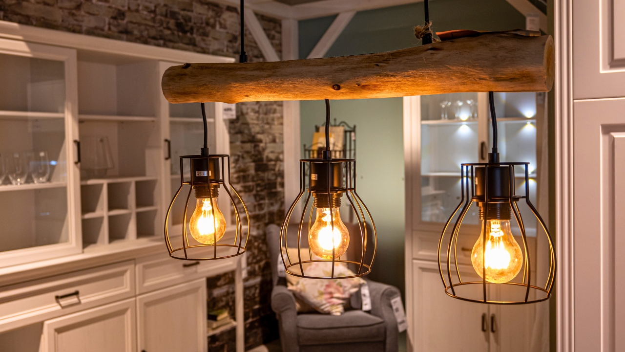
choose bulbs that render color well
High CRI (color rendering index) bulbs—90+—make fabrics and skin tones look natural. Cheap bulbs turn leather ashy and woods lifeless. You’ll notice this especially on green, navy, and burgundy fabrics.
Where to use: Living rooms, dining rooms, and bedrooms benefit most. Utility spaces can get standard bulbs.
warm up reflective surfaces
Shiny counters and glass tables bounce glare from overhead cans. Soften with lamps that aim light sideways and up, or switch recessed trims to “wall wash” models that spread light. In kitchens, put under-cabinet light toward the backsplash, not the front of the cabinet, so it grazes tile without throwing hot spots onto counters.
Tiny tweak: Swap clear glass lamp shades for frosted or fabric to cut sharp reflections.
curb the temperature shift room to room
A hallway lamp at 5000K next to a family room at 2700K makes both look off. Unify adjacent spaces, especially within a single view. If you love cooler task light in a home office, isolate it with a door or use 3000K and add task lamps for punch.
Reality: Photos tolerate mixed temps. Eyes don’t. Your brain reads mismatch as low quality.
the payoff is how the room feels at night
Your feed won’t show it, but your evenings will. With one temperature, multiple layers, and bulbs that render color well, your fabric textures come forward, wall color calms down, and people look like themselves. Your style translates from screen to real life—finally.