You were told to go bold—but this color choice is already outdated
Big color decisions can be fun. A dark accent wall, a saturated kitchen island, or a punchy front door feels fresh on day one. The trouble shows up in year two when the tone locks you into a narrow palette, throws weird shadows on skin, or makes every seasonal swap clash. Some “bold” choices age well; others start arguing with your house.
You don’t have to repaint everything. You do need to understand which color moves tire quickly and how to pivot toward options that last longer without going flat.
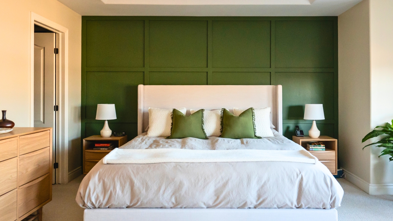
Saturated accent walls that box the room
A single wall in heavy navy, forest, or charcoal can look sharp in a photo but shrink an average room in person, especially with low ceilings or small windows. The sharp edge where dark meets light highlights any imperfect paint line and makes trim look dingy by comparison. Over time, it limits art choices and fights soft textiles.
Pivot: If you like depth, wrap the color on all walls in a lighter tint of the same hue or drop to a mid-tone with higher LRV (light reflectance value). The space reads cohesive without the visual stop sign of one dark wall.
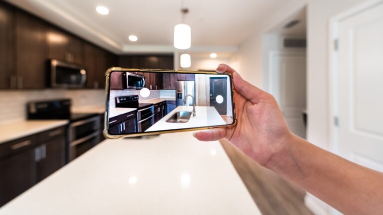
High-chroma cabinet colors that freeze the kitchen
Teal lowers, emerald islands, and tomato red ranges have cycles. They can be fun for a season, but they anchor the room so strongly that changing bar stools or rugs never feels right. They also telegraph a specific year. That’s fine if you plan to repaint often; most families don’t.
Pivot: Use a neutral base for fixed elements—cabinets, counters, backsplash—and bring saturated color with stools, art, and window treatments. If you already painted cabinets, swap hardware and lighting to quiet the color and add large neutral runners to balance it.
Very cool whites that read sterile
Crisp photos pushed a lot of people toward icy walls. In homes with warm floors, creamy trim, or low natural light, cool white reads sterile and blue. It emphasizes drywall seams, makes leather and wood look ashy, and creates a jolt between rooms if adjacent spaces carry warmer tones.
Pivot: Sample warm, balanced whites (think subtle beige or greige undertones). Test large swatches in morning and evening light. If you can’t repaint soon, warm the room with lamp light at 2700–3000K and add natural textures—linen, wood, sisal—to soften the blue cast.
Trend metals used as paint
Matte black looks clean on hardware and fixtures; walls painted nearly black can work in media rooms or libraries with layered light. But trend metals like rose gold and heavy brushed brass as wall or large-surface colors age fast. They’re better as accents you can change.
Pivot: Keep metals to hardware, frames, and small lighting. Repeat one dominant metal and one supporting metal through the sightline. Let walls carry a neutral tone that will live through multiple cycles of hardware changes.
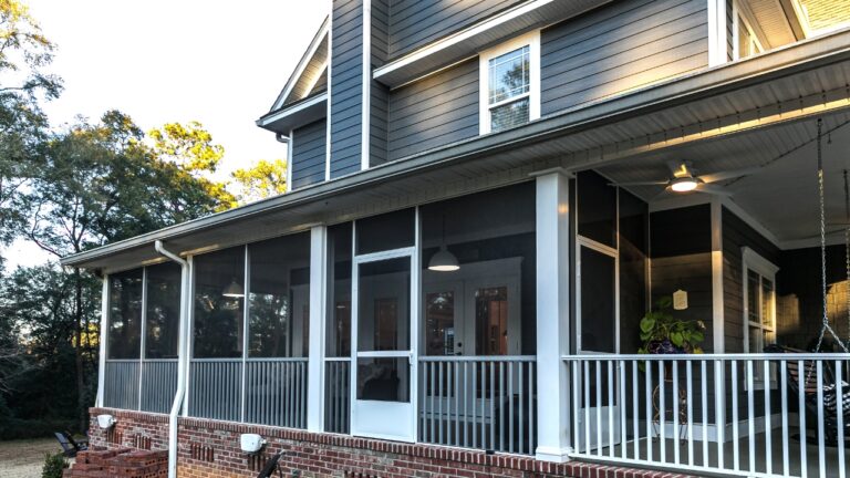
Front doors that clash with the façade
Bold front doors are popular for a reason—they’re cheerful and easy to spot. The part that ages is contrast without context. A neon or high-chroma hue can fight brick, stone, or siding undertones and make trim look dirty. It also fades faster if it’s not a quality exterior formula.
Pivot: Pull a color from the fixed materials—stone veining, brick speckle, or roof tone—and deepen it by two or three steps. You still get presence without breaking the façade. Use a durable exterior paint and plan a refresh every few years.
The lighting mismatch that ruins good color
Many “bold gone wrong” moments come from lighting, not paint. Cool cans over a warm wall make the wall look dingy. Warm bulbs over a cool wall make it look sickly. Mixed temperatures in connected rooms make any color feel off.
Fix: Pick one color temperature for connected spaces and replace bulbs so the house reads as one. If the wall still looks wrong, you’re probably looking at undertone conflict—your wall is green-gray and the adjacent space is pink-beige. Choose a bridge color that neutralizes the clash.
Use saturation as a removable layer
If you love color, keep it in pieces that can rotate: drapes, pillows, throws, lampshades, and art. These add life without anchoring the whole room to a single decision. One large, saturated piece—like a rug—can carry the room if walls and large furniture stay calmer.
Guide: Aim for a 70/20/10 balance—70% neutral envelope (walls, large furniture), 20% mid-tone support (wood, woven textures, secondary textiles), 10% high-saturation hits you can change.
Sample larger and decide slower
Tiny swatches and phone photos mislead. Paint two-by-three-foot samples on multiple walls, watch them morning and night, and compare against flooring and fabric. Live with samples for a week. If a color energizes you at noon and annoys you at 7 p.m., believe the evening.
Note: Paint sheen matters. Eggshel l or matte on walls hides more sins than satin. Keep satin or semi-gloss for trim and doors.
The goal is staying power, not silence
Color should help the house feel alive during every season, not trap it in last spring’s trend. When walls and large fixed pieces carry a tone you can live with for years, you can change accents at will and keep the space feeling current. That’s how “bold” stays fresh—by moving into things you can swap.
Like Fix It Homestead’s content? Be sure to follow us.
- Man Says He Found Out the Fence He Paid For Wasn’t Actually on His Property
- Woman Says Her Neighbor Started Taking Mulch From Her Delivery Pile Before She Could Even Spread It
- I made Joanna Gaines’s Friendsgiving casserole and here is what I would keep
- What Caliber Works Best for Groundhogs, Armadillos, and Other Digging Pests?