10 ways to use texture like a designer
Photo credit: Mohammad Lotfian/Unsplash.com
Color gets the attention, but texture is what makes a room feel finished. When you mix smooth and nubby, matte and soft sheen, the space looks richer without adding visual clutter. These are the moves that give you that quiet, high-end feel fast.
Pair smooth with nubby so nothing feels flat
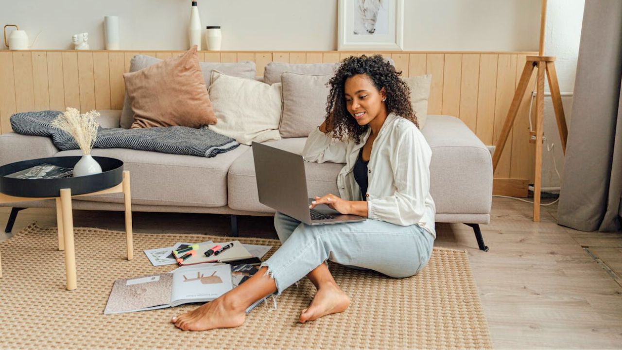
If your sofa is a smooth performance fabric, bring in a chunky knit throw or a nubby linen pillow. Smooth wood side tables? Add a woven tray or rough pottery bowl. That contrast adds depth without piling on color. It also photographs better—your eye can feel the room, not just see it.
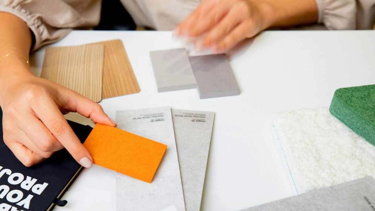
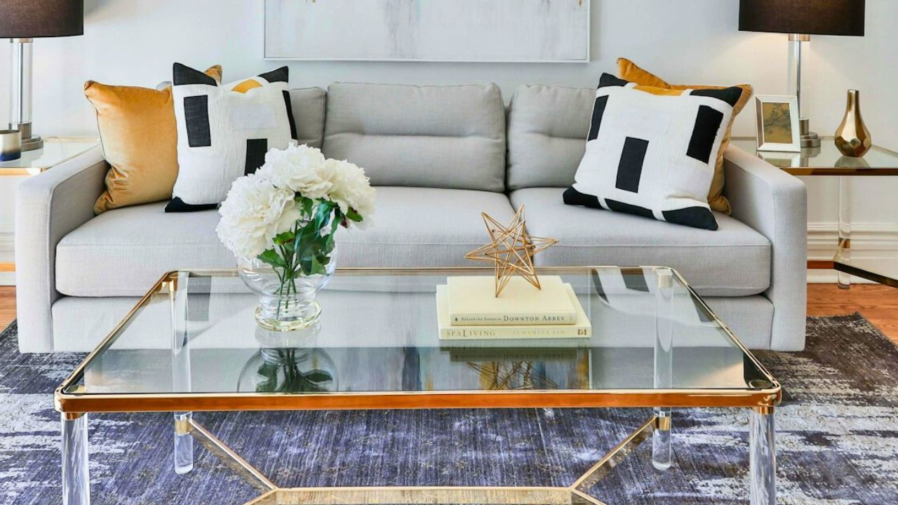
Layer at least three tactile materials in every zone

Think sofa area, dining corner, or entry. Give each zone a minimum of three textures: fabric, wood, and something woven or stone. Example: linen panels, oak console, seagrass basket. Three is the threshold where a space starts to feel intentional instead of sparse.
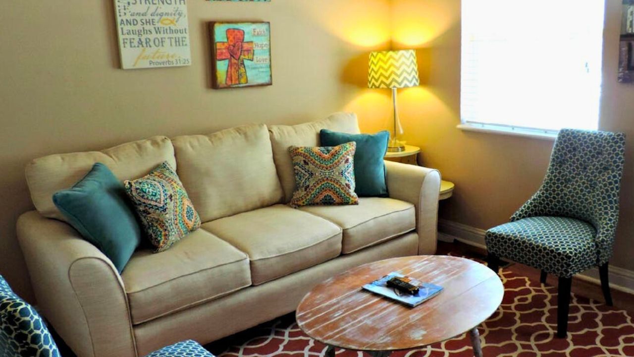
Use woven pieces to calm busy rooms
If you’ve got loud art or a patterned rug, counter it with texture that reads quiet—jute rugs, cane fronts, rattan trays, or seagrass baskets. Woven texture swallows visual noise in the best way. It lets color be the star without the whole room turning chaotic.
Add one “honest” material you can touch
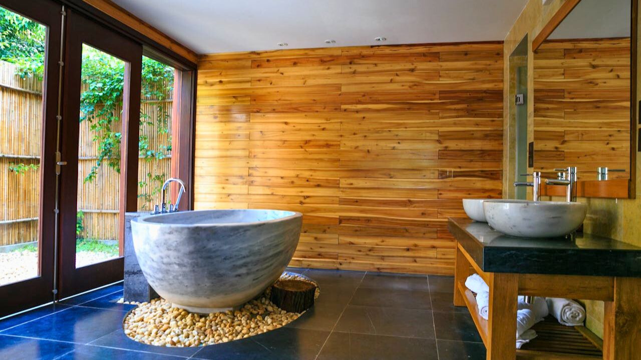
Rooms feel cheap when everything is coated or shiny. Bring in something honest—raw wood, unglazed clay, cast iron, or stone. Even a single travertine bowl or reclaimed board as a tray gives the space weight. Honest materials age well and make budget pieces around them look more serious.
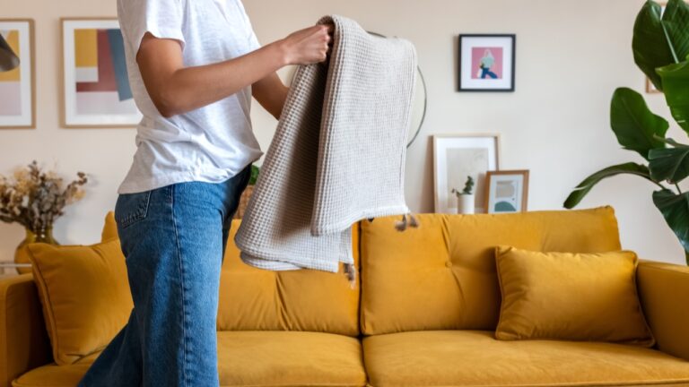
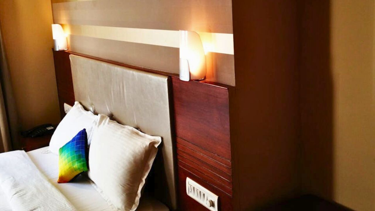
Mix fabric hand, not just fabric color
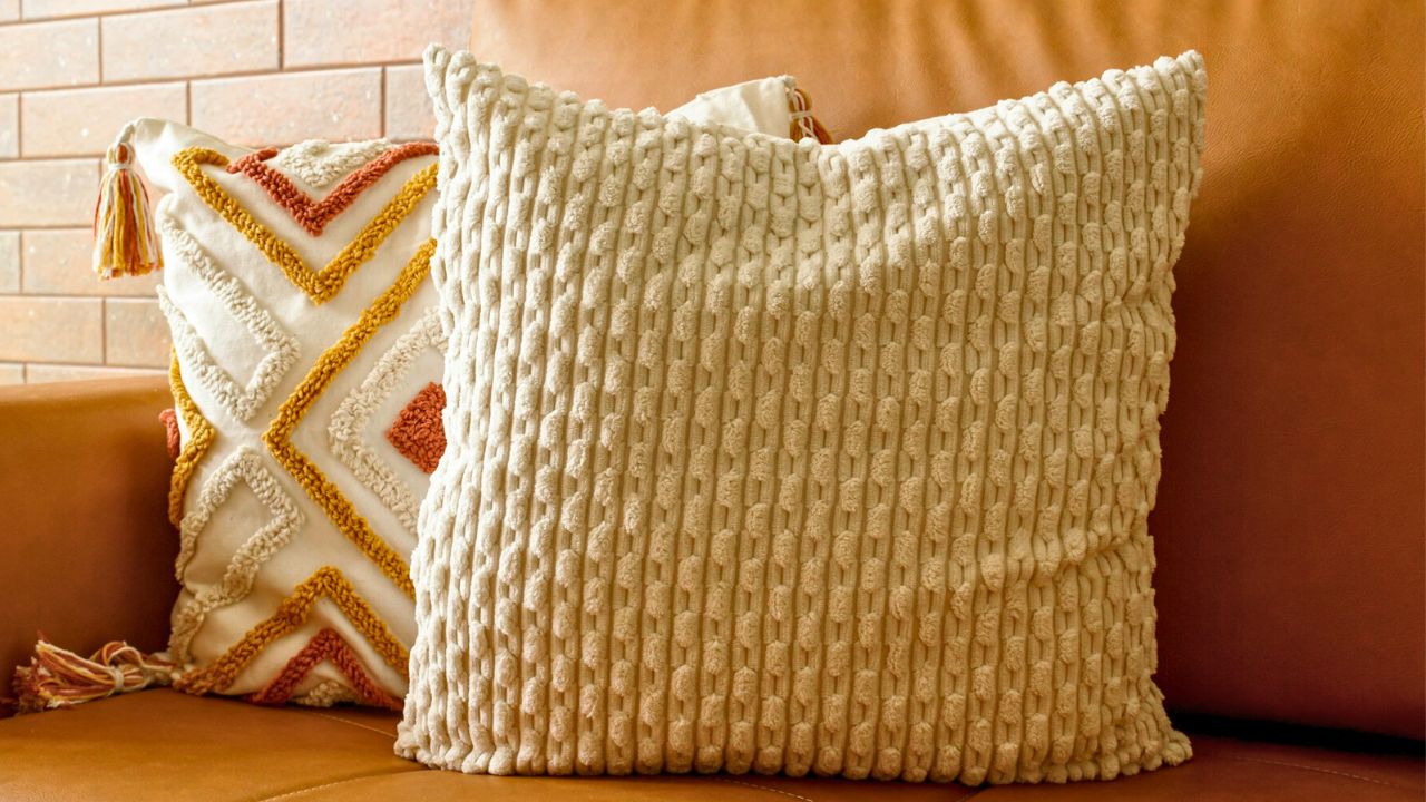
Pillows all cut from the same cotton blend read flat. Try a combo: linen, velvet, and a subtle boucle. Keep the palette tight so the hand does the work. On beds, stack crisp percale sheets, a quilted coverlet, and a washed-linen duvet. It feels hotel-level without buying fancy furniture.
Bring texture to the walls without busy patterns
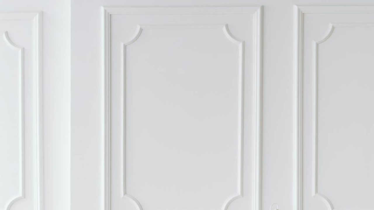
You don’t need wallpaper to get dimension. Consider grasscloth on a single wall, vertical shiplap painted to match the room, or even a limewash finish in a soft neutral. These add movement that’s quieter than prints, and they make small rooms feel more considered.
Use light to show texture you already own
Texture dies under cold, overhead glare. Swap to warm bulbs (2700–3000K), then aim light across surfaces instead of straight down. A lamp grazing a plaster wall or a sconce over a woven shade throws the kind of shadow that makes everything look richer.
Let plants count as a texture
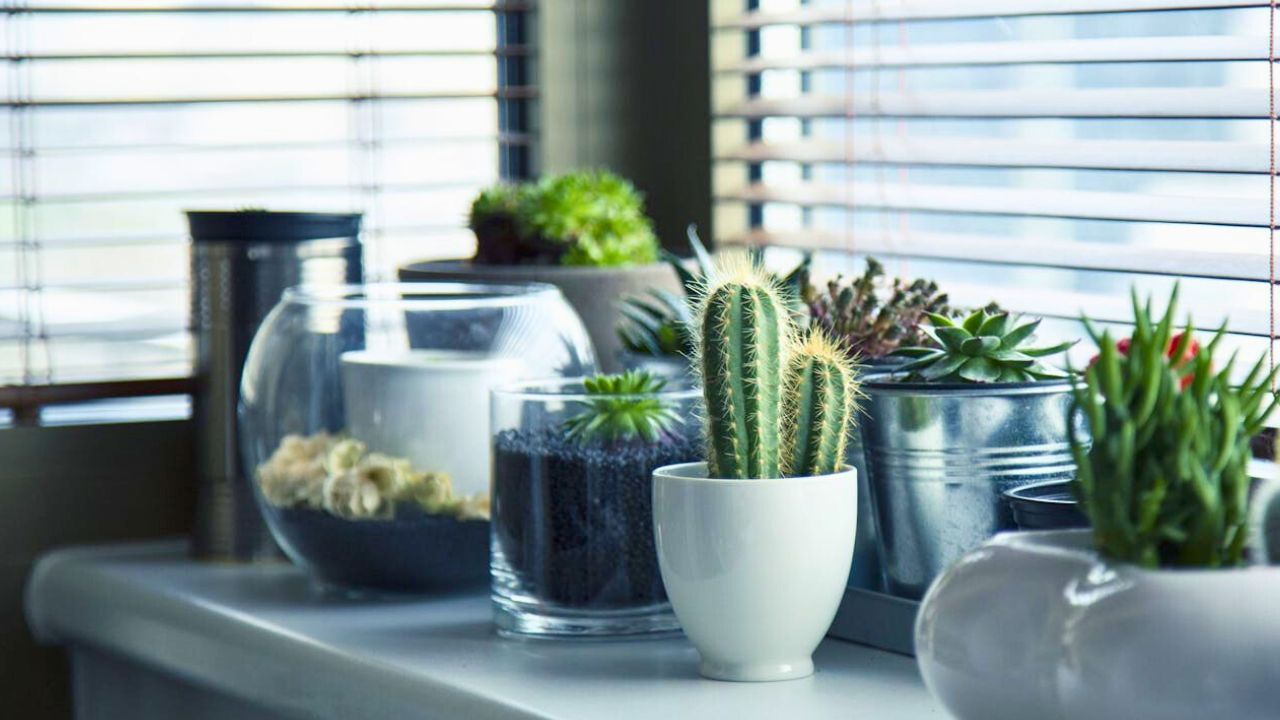
Greenery is a living texture—leaf shine, bark, and soil all add “feel.” One healthy plant beats five struggling ones. Place it where light hits leaves and, if you can, next to something hard like stone or metal. The contrast makes both read better.
Ground glossy finishes with something matte
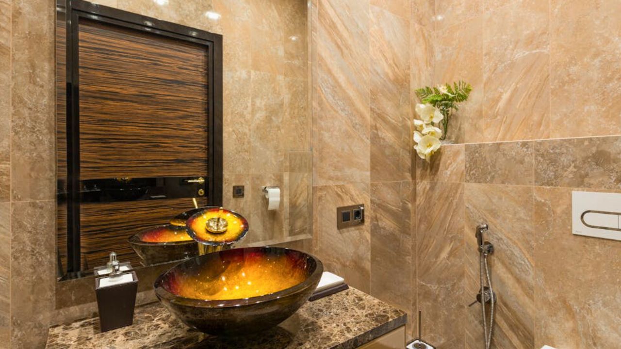
Love a lacquered tray or glazed tile? Great. Offset with matte paint, wool rugs, or raw wood so the gloss doesn’t tip into costume. The mix reads high-end because it shows restraint. If two glossy items are arguing, remove one or add a matte layer between them.
Edit so the textures can breathe
Too many textures crammed together cancel each other out. Leave air. On a coffee table, you don’t need five different materials. Do three and give them space. Texture works when you can actually see (and touch) it.
Like Fix It Homestead’s content? Be sure to follow us.
- Man Says He Found Out the Fence He Paid For Wasn’t Actually on His Property
- Woman Says Her Neighbor Started Taking Mulch From Her Delivery Pile Before She Could Even Spread It
- I made Joanna Gaines’s Friendsgiving casserole and here is what I would keep
- What Caliber Works Best for Groundhogs, Armadillos, and Other Digging Pests?