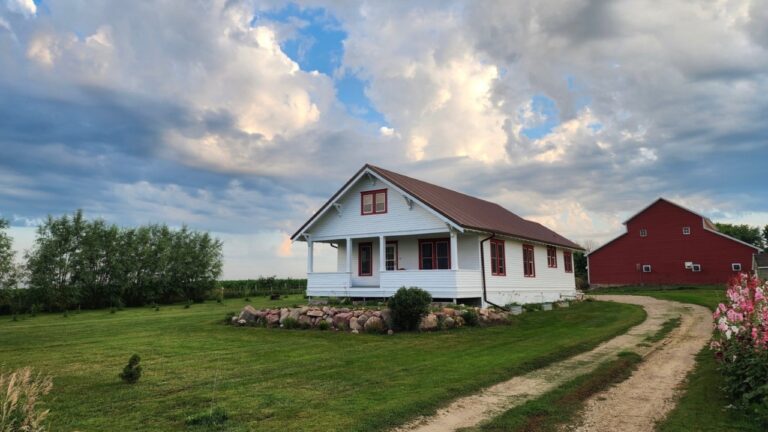
The exterior paint choice that makes trim lines look uneven
Photo credit: Artography/Shutterstock.com
When your exterior paint is wrong, even perfectly straight trim can suddenly look wavy, crooked, or out of square. The culprit is often not the carpenter’s work but the color and sheen you chose for the siding that sits right next to that trim. By understanding how light, contrast, and finish interact outdoors, you can avoid the exterior paint choice that makes your trim lines appear uneven and instead create a façade that looks crisp from the curb.
The stakes are high, because once you see a “bent” fascia or a jagged window casing, you cannot unsee it, and buyers will not either. With a few strategic decisions about color depth, reflectivity, and application, you can keep your home’s edges reading as clean and intentional, even if the underlying surfaces are less than perfect.
How sheen tricks your eye into seeing crooked trim
Your eye reads straightness by following the line where two surfaces meet, and sheen can distort that line. A glossy or semi gloss siding color next to a lower sheen trim will reflect sunlight in bands, so any small ripple in the siding suddenly looks like a kink in the trim. Interior pros note that the more reflective a finish is, the more it highlights edges and details, which is why trim is often painted in a higher sheen to make profiles stand out in a controlled way, as explained in guidance on reflective finishes.
Outside, the sun exaggerates this effect. If you choose a shiny siding color and a duller trim, the siding will bounce light while the trim absorbs it, creating a jagged visual boundary that reads as uneven even when the boards are straight. Paint specialists point out that sheen is not just about durability but also about how the finish supports your overall design style, and that is as true on the exterior as it is in rooms where you are choosing the right for trim.
The specific exterior sheen that makes trim look wonky
The finish that most often sabotages straight looking trim is a high gloss or very shiny siding paint paired with flatter trim. On a large exterior wall, that glossy skin acts like a mirror, so every stud line, nail pop, or slight bow in the sheathing shows up as a bright or dark streak that cuts right through the trim intersection. When your eye tracks along the trim, it is actually following those reflections, which bend and twist, so the trim appears to do the same.
Manufacturers consistently recommend lower sheen options for broad exterior walls for exactly this reason. Guidance on exterior projects notes that Flat and Velvet paints are best for concealing surface irregularities on siding, while higher sheens are better reserved for smoother elements like doors or metal railings. When you reverse that logic and put the shine on the siding instead of the trim, you amplify every defect in the wall plane and make the trim look like it is fighting to stay straight.
Why ultra flat siding can actually help your trim
At the other end of the spectrum, a very low sheen siding color can be your best ally if you want trim to read as crisp and true. A truly flat finish softens light, so it hides minor waves and patches in the wall surface instead of spotlighting them. Paint experts describe Flat paint as having a velvety, matte appearance that is particularly good at disguising imperfections because it lacks reflective properties.
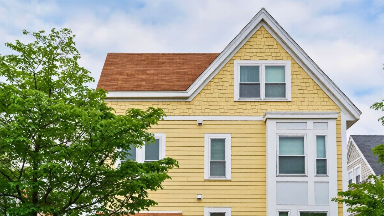
When you pair that softer siding with a slightly higher sheen trim, the trim becomes the clean, consistent line your eye locks onto. Interior guidance on making details stand translates neatly outdoors: let the walls recede with a matte or low sheen, and let the trim carry a controlled level of reflection. That way, even if the siding has subtle dips or the framing is not perfect, the trim still reads as straight because the wall behind it is visually quiet.
How extreme colors distort trim lines
Sheen is only half the story. Color intensity can also warp how you perceive straightness, especially in full sun. Neon or very bright siding shades create harsh contrast with white or light trim, so the boundary between the two becomes a high voltage stripe that exaggerates every brush mark and caulk bead. Exterior design specialists warn that neon or bright on a façade are not only hard to live with but can quickly look dated, and that visual fatigue often starts with the way they fight against trim and architectural lines.
On the opposite end, very dark siding can be flattering but unforgiving. Deep colors absorb more light and heat, which can highlight uneven drying and patchy coverage along trim edges. At the same time, dark hues are popular because they promise Minimal Maintenance and for homeowners who want a low maintenance exterior. If you choose a very dark siding color, you need to be even more disciplined about straight cut lines and consistent coverage, or the contrast with light trim will make every wobble look like a structural flaw.
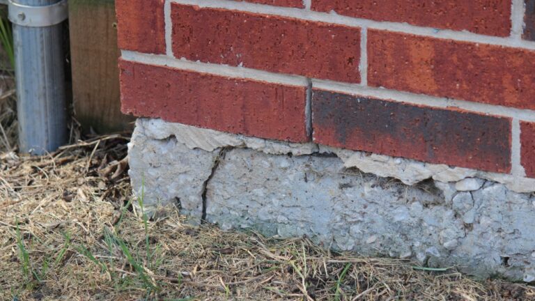
When prep and coverage make straight trim look crooked
Even with the right color and sheen, poor preparation can sabotage your trim lines. Dirt, chalky old paint, and glossy existing finishes prevent new paint from bonding evenly, so the topcoat can flash or dry in patches along the trim edge. Professional advice on fixing coverage problems points to Skipping Surface Prep as a key reason paint does not adhere well, especially on dirty or glossy surfaces, and that uneven adhesion shows up most clearly where siding meets trim.
Coverage itself is another culprit. If you try to get away with a single coat, especially when you are putting a lighter color over a darker one, the underlying shade will telegraph through in streaks that hug the trim line. Painting contractors emphasize that the first coat is often not enough to cover the underlying surface, particularly when you are covering a darker color with a lighter one, and that a second coat provides a uniform finish. Without that uniformity, the edge where siding meets trim looks jagged, even if your tape line was straight.
Application tools that sharpen or blur your trim edges
The tools you use to cut in around trim can either sharpen or blur the line, which changes how straight the trim appears against your siding color. Brushes give you control but can leave visible strokes if the paint is too thick or the bristles are poor quality, while rollers cover quickly but can push paint under tape or into the trim profile. In a detailed walk through of trim technique, one pro compares brush and roller methods and asks which one will give the nicest finish on trims, highlighting how your choice of tool affects the final edge quality in a segment labeled Oct.
On exteriors, that edge is magnified by distance. From the street, a slightly fuzzy line where siding meets trim reads as a wavy board, not a minor application flaw. That is why many painters rely on a combination of a high quality angled brush for the cut line and a small roller to smooth the field, so the transition stays crisp even under harsh light. If you lean too heavily on a roller right up to the trim, the stippled texture can creep over the edge and make the trim look like it is swelling or shrinking along its length.
Using tape and correction tricks to rescue “crooked” lines
Even careful painters end up with lines that look off once the tape comes down, especially when the siding color is bold or glossy. The good news is that you can correct those apparent kinks without repainting the entire wall. One practical demonstration shows a contractor responding to a seller who says, “Just give me a white line I am selling the house,” and then using painter’s tape to straighten and widen that line so it reads as intentional rather than accidental.
The same strategy works when your siding color is making trim look uneven. By slightly adjusting the width of the trim paint or sharpening the edge with fresh tape, you can visually straighten a board that is actually bowed or hide a wavy cut line that the sheen has exaggerated. The key is to step back to the curb, see where the line appears to dip or bulge, and then correct that specific segment rather than chasing perfection up close where the distortions are less obvious.
How dark siding and low maintenance goals complicate trim
Many homeowners are drawn to deep, moody siding colors because they promise a modern look and fewer touch ups. Dark exteriors are often marketed around Practicality, with dark hues described as a smart choice for those seeking a low maintenance exterior that hides dirt and wear. The trade off is that dark fields make light trim pop dramatically, so any irregularity in the trim line becomes a focal point instead of fading into the background.
To keep that contrast from turning into a liability, you need to be disciplined about both color and finish. Avoid pairing very dark siding with a high gloss finish that will telegraph every framing flaw, and instead lean on a lower sheen that softens the wall plane. Then, choose a trim sheen that is slightly higher but not mirror like, so it reads as crisp without throwing bright highlights that jump around as the sun moves. That balance lets you enjoy the low maintenance benefits of dark siding without sacrificing the perception of straight, well built trim.
Color depth, imperfections, and the illusion of movement
Even if your siding is not extremely dark, certain colors and finishes can magnify surface flaws that run right into your trim. Paint educators warn that some finishes are the worst at hiding imperfections, especially when they are too shiny or too deep in color, and they caution that if you want to minimize the look of nicks, knots, and bumps, you need to avoid those combinations, as explained in a segment labeled Oct. When those imperfections line up with trim intersections, they create the illusion that the trim itself is bending or twisting.
By contrast, a more forgiving color and sheen can calm that visual noise. Interior guidance on Choosing the Right emphasizes that aesthetics and durability must work together, and that principle holds outside as well. If your siding has visible patches or repairs, a flatter, mid tone color will keep those from reading as waves that cut through your trim lines, while a carefully chosen trim sheen will give you just enough definition to frame windows and doors without making every joint look like a mistake.
Like Fix It Homestead’s content? Be sure to follow us.
Here’s more from us:
- I made Joanna Gaines’s Friendsgiving casserole and here is what I would keep
- Pump Shotguns That Jam the Moment You Actually Need Them
- The First 5 Things Guests Notice About Your Living Room at Christmas
- What Caliber Works Best for Groundhogs, Armadillos, and Other Digging Pests?
- Rifles worth keeping by the back door on any rural property
*This article was developed with AI-powered tools and has been carefully reviewed by our editors.