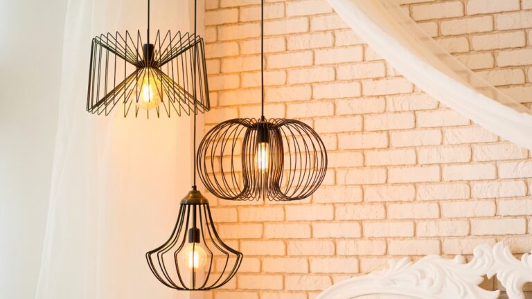
Paint Colors That Make a Room Feel Upscale
Color alone can completely change the feel of a room. While furniture and décor matter, the paint you choose sets the foundation. Certain shades naturally feel more refined and give a space that elevated look. You don’t need to spend extra money for high-end style—choosing the right color does the work for you.
Deep Navy
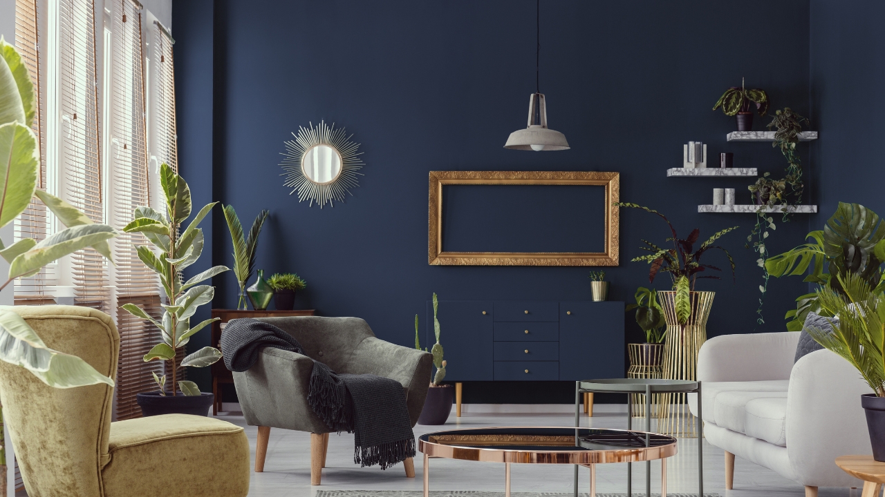
Navy blue is timeless and adds depth without feeling overwhelming. It works especially well in bedrooms, dining rooms, and offices.
Paired with white trim or metallic accents, it immediately feels upscale. Brands like Sherwin-Williams and Behr offer a range of navies that suit both modern and traditional homes.
Charcoal Gray
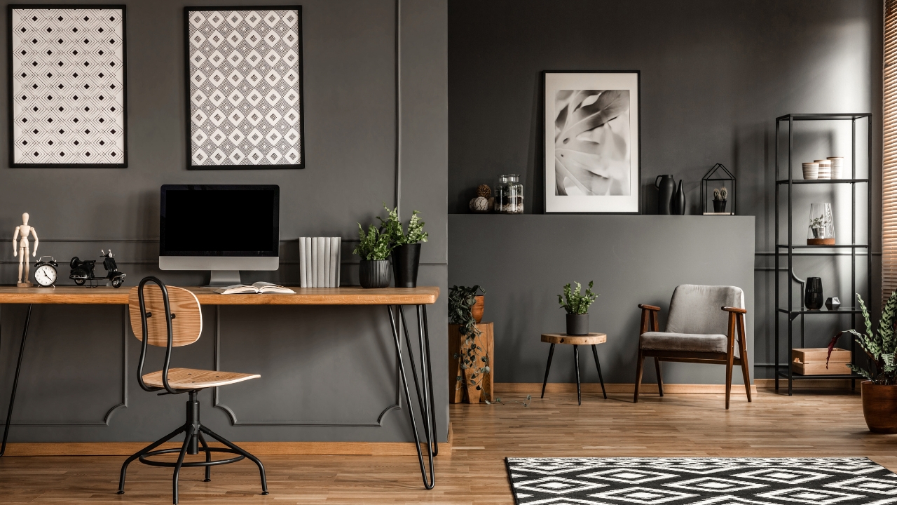
Charcoal is another sophisticated shade that feels high-end. It adds richness without being as stark as black.
Used on an accent wall or cabinets, it makes a space feel grounded and polished. It pairs well with wood tones and lighter furniture for balance.
Soft Greige

Greige—a mix of gray and beige—is popular because it looks neutral while still having depth. It’s a go-to choice for upscale interiors because it works with nearly any style.
It makes spaces feel warm but still clean, especially in living rooms and kitchens. Paint brands like Benjamin Moore and Behr both carry multiple shades of greige.
Olive Green
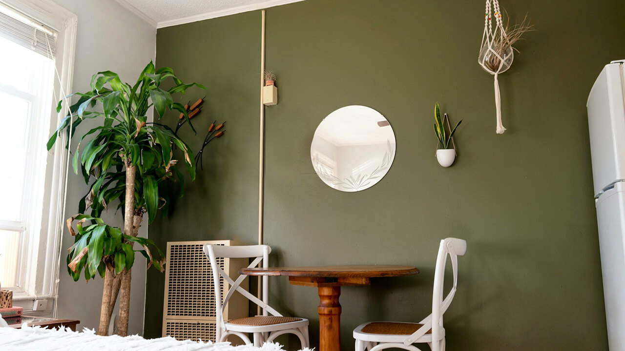
Olive has a sophisticated, earthy tone that feels more upscale than bright green. It works well in dining rooms, offices, and even bedrooms.
Paired with brass or black hardware, it looks elevated and intentional. Sherwin-Williams “Ripe Olive” is a designer favorite that brings this look to life.
Warm Taupe
Taupe has been a staple in high-end homes for years because it feels elegant but not flashy. It’s versatile enough for walls, trim, or even cabinetry.
Pair it with crisp whites or darker woods to create a layered, expensive-looking palette. Behr and Sherwin-Williams both offer timeless taupe shades.
Deep Burgundy
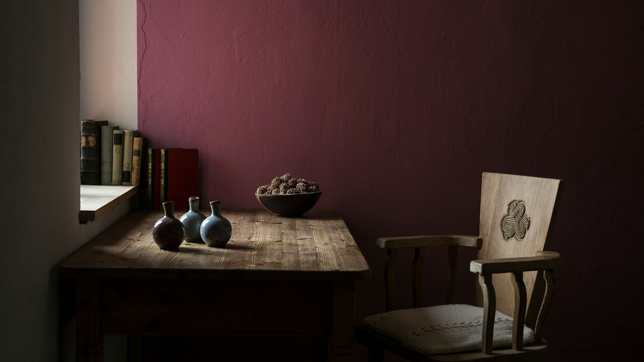
Burgundy brings richness and drama to a space. It’s often used in dining rooms or studies where you want a sense of formality.
Paired with gold or brass accents, it feels especially upscale. Even when used sparingly, it makes a strong statement.
Crisp White
Not all whites are the same. Bright, crisp whites feel modern and clean, which instantly elevates a space.
Choosing a high-quality paint with good coverage ensures the finish looks polished rather than flat. It’s a simple choice that always feels refined.
Slate Blue

Slate blue has a calming tone that still carries weight, making it perfect for bedrooms or bathrooms. Unlike brighter blues, it feels more sophisticated and works with both cool and warm accents.
It pairs especially well with brushed nickel or chrome hardware, giving spaces a polished look. Brands like Benjamin Moore’s “Smoke” or Behr’s “Slate Blue” are good examples.
Mocha Brown
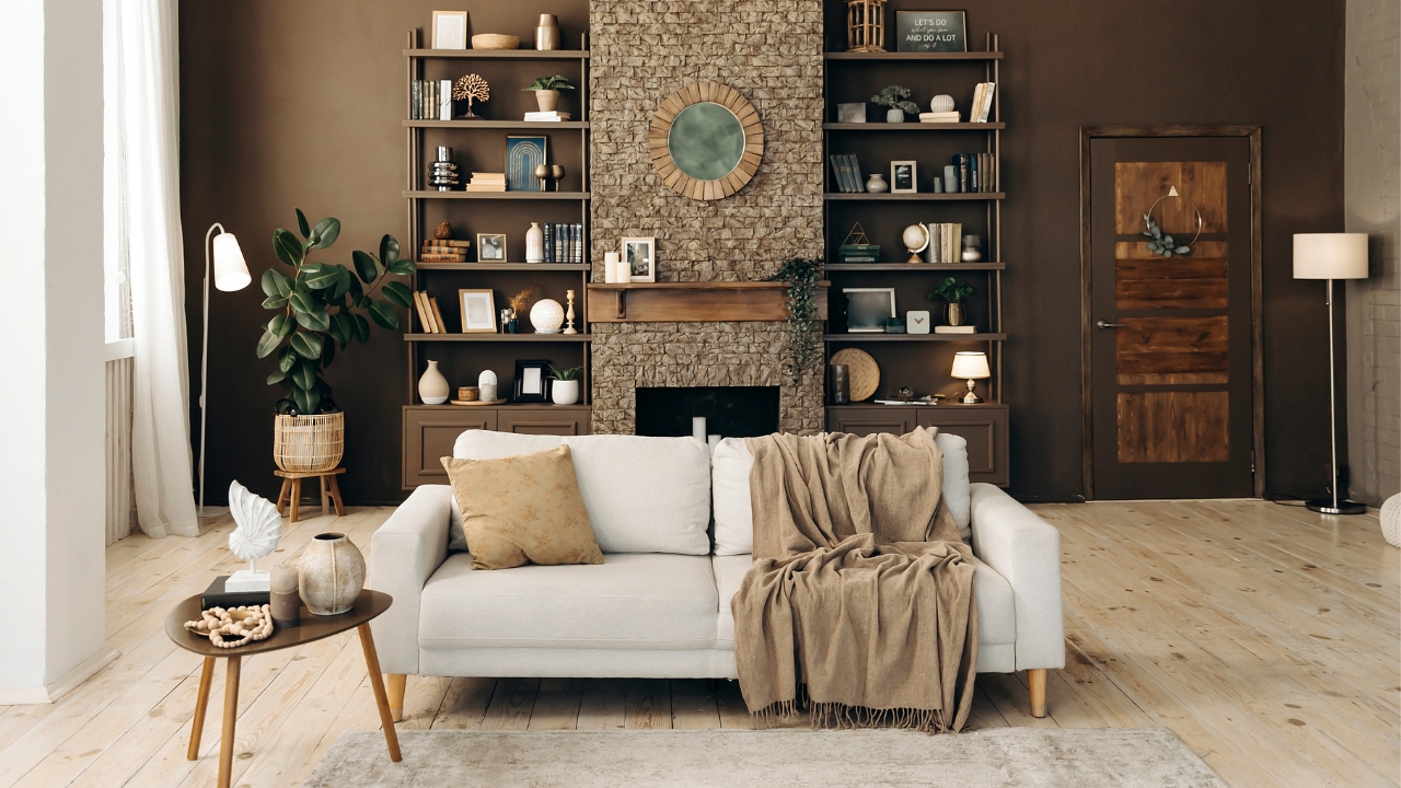
Rich mocha tones bring warmth without being too dark. They’re a great option for living rooms or libraries where you want a cozy but upscale look.
Mocha works well with leather furniture, natural wood, and gold accents. It creates a sense of richness that feels custom, even when the materials themselves are budget-friendly.
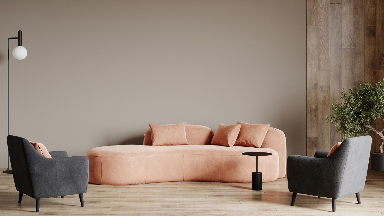
Soft Blush

A muted blush adds a touch of elegance without being overwhelming. Unlike bright pinks, it has a subtle, neutral quality that pairs well with taupe, gray, or white.
Designers often use it in bedrooms, nurseries, or even powder rooms to give a soft, sophisticated feel. Benjamin Moore’s “First Light” is a popular choice for this effect.
*This article was developed with AI-powered tools and has been carefully reviewed by our editors.