The living room color choices that are about to feel dated in 2026
Color cycles move quickly, and the shades that once made your living room feel fresh can start to drag the whole space backward. As designers look ahead to 2026, they are already flagging specific hues that will make a room feel tired, even if your furniture is brand new. If you are planning to repaint, it pays to know which colors are losing favor so your living room feels current for more than a single season.
Instead of chasing every micro trend, you can use the next wave of color guidance to make smarter, longer lasting choices. By understanding which tones are slipping out of style and why, you will be better equipped to edit what you already have, tweak what can be saved, and invest only in updates that will still look intentional a few years from now.
The shift away from cool gray living rooms
For more than a decade, cool gray has been the default answer when you did not want white but still wanted a neutral. That era is ending. Designers now point out that icy, blue based grays can make a living room feel flat and even a little gloomy, especially in climates with limited natural light. When your walls, sofa, and rug all sit in the same cool gray band, the result is a room that photographs well but feels lifeless in person.
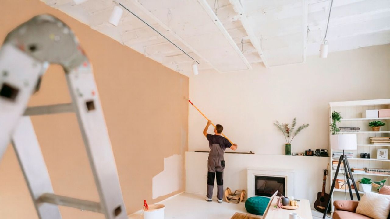
Color experts looking toward 2026 describe a broader move toward warmth, with richer neutrals and more saturated hues replacing the cool grays that once dominated open plan spaces. Reporting on upcoming living room palettes notes that bolder shades are going to be popular in 2026, specifically calling out how these deeper colors are stepping in where cool grays and beiges used to sit. If your walls are still painted in a chilly gray, you do not need to swing to neon, but shifting toward a greige with a beige or taupe undertone will keep the room from feeling stuck in the last design cycle.
Why bright white is losing its grip
Bright white once signaled a clean, gallery like living room, but by 2026 that stark look is set to feel more sterile than sophisticated. When every surface is painted in a high contrast, cool white, the space can read more like a rental walk through than a place you actually live. Designers are finding that such intense whites highlight every scuff and shadow, which makes maintenance harder and the room less forgiving of everyday life.
Color forecasters now suggest that you treat bright white as an accent rather than a default wall color, especially in living rooms where you want warmth and softness. In guidance on upcoming paint shifts, designers explicitly warn that bright white will not be seen as a go to in 2026, with softer off whites and complex creams taking its place. If your living room is currently coated in a stark white, consider warming it up with a slightly creamy tone on the walls while keeping doors and trim in a crisper white for contrast that still feels intentional.
The end of builder beige and flat neutrals
Beige is not disappearing, but the bland, builder grade version that once covered every new construction living room is on its way out. Those flat, slightly pink or yellow beiges can make a room feel dated because they lack depth and do not play well with the richer woods and textiles that are coming back into favor. When your walls are a noncommittal beige, it becomes harder to layer in character without the whole space feeling washed out.
Designers tracking upcoming shifts emphasize that neutrals are evolving rather than vanishing. Reporting on colors that are expected to feel tired in 2026 notes that some long standing staples are starting to make spaces feel flat and uninspired, which is exactly what happens when you rely on a one note beige. To keep your living room neutral but current, look for shades with a mix of undertones, such as mushroom, stone, or sand, which add subtle complexity and pair more gracefully with both warm metals and the deeper colors that are gaining ground.
Deep red living rooms that feel heavy
Deep red has a long history in traditional living rooms, from oxblood libraries to burgundy accent walls. As you move into 2026, that intensity is starting to feel more oppressive than cozy, especially in smaller spaces. Saturated reds can visually shrink a room and cast a warm tint on everything, which makes it harder to mix in other colors without the whole palette feeling muddy.
Designers who are mapping out which hues are fading from favor specifically call out Deep Red as one of the paint colors expected to go out of style. That does not mean you need to purge every red object, but it is a signal that full red walls or large red feature zones will date a living room quickly. If you love warmth, consider shifting to terracotta, rust, or cinnamon, which still deliver a cozy feel but with a more nuanced, earthy quality that aligns with the richer, nature inspired palettes designers are backing for 2026.
Overly cool blues that read more corporate than calming
Blue will always have a place in living rooms, but the specific blues that dominated the last decade are losing their appeal. Very cool, almost electric blues can make a space feel more like a tech office than a home, especially when paired with gray flooring and chrome accents. These sharper blues lack the softness that people are now seeking in their main gathering spaces, where comfort and tactility are taking priority over minimalism.
Color experts looking ahead to 2026 are steering you toward more grounded, muted blues that echo denim or stormy skies rather than office carpeting. In discussions of which hues are falling out of favor, designers note that some of the cooler blues that once felt fresh are being replaced by richer tones as bolder colors gain traction in living rooms. If your walls are currently a bright, icy blue, softening them to a blue with a hint of green or gray will keep the room feeling serene without tipping into dated territory.
Minty and pastel greens that feel too sweet
Green has surged in popularity as people look for ways to bring a sense of nature indoors, but not every shade is aging well. Minty and very pastel greens that once felt playful are starting to read as overly sweet, especially when used wall to wall in a living room. These lighter greens can skew juvenile and clash with the deeper woods, leather, and stone that are becoming more common in current interiors.
Designers who are mapping the next wave of color trends are clear that greens are staying, but they are shifting toward more grounded, botanical tones. Reporting on upcoming palettes notes that blues and greens are evolving, with softer, more complex versions taking the lead. If your living room is painted in a pale mint, consider deepening it to a sage, olive, or moss, which will still feel fresh but will also sit more comfortably alongside the warmer neutrals and natural textures that are defining the next phase of design.
Monochrome gray on gray schemes
Even if you have already moved away from pure gray walls, a living room that layers gray sofa on gray rug on gray curtains is starting to feel stuck in the last trend cycle. Monochrome gray schemes can look sleek in photos, but in real life they often lack the contrast and warmth that make a room inviting. Without variation in tone or texture, the space can feel like a waiting room rather than a place to relax.
Designers who are advising clients for 2026 are encouraging more dynamic combinations, even in neutral rooms. Insights on outdated palettes point out that when every element sits in the same cool range, spaces feel flat and uninspired, which is exactly what happens in a gray on gray living room. To update this look without replacing everything, you can keep one or two gray anchor pieces, then introduce warmer woods, cream or camel textiles, and a single bold accent color on pillows or art to break up the monotony.
High contrast black and white that lacks nuance
Black and white living rooms had a strong run, especially in modern and industrial spaces, but the stark, high contrast version of this palette is starting to feel harsh. When your walls are bright white, your furniture is jet black, and there is little in between, the room can come across as more theatrical than livable. This kind of rigid contrast also leaves little room for the layered, collected look that is gaining momentum.
Color experts who are looking ahead to 2026 are not banning black and white, but they are softening how you use them. Instead of crisp white walls with black everything, they suggest warmer whites, charcoal instead of pure black, and the addition of wood, stone, or muted color to bridge the gap. Reporting on paint colors that are expected to feel dated highlights how some once trendy high contrast schemes are being replaced by palettes where Deep Red and other intense hues are giving way to more nuanced, layered tones. In practice, that means you can keep your black metal coffee table or white media console, but you should consider softening the walls and adding textiles in oatmeal, clay, or muted blue to keep the room from feeling locked in a black and white filter.
How to future proof your living room color palette
Knowing which colors are fading is only half the equation; the other half is choosing hues that will still feel considered a few years from now. Designers who are advising on 2026 palettes consistently point you toward richer, more saturated colors that still feel grounded, along with neutrals that have depth rather than a single flat undertone. Guidance on living room updates notes that bolder shades are going to be popular in 2026, which you can interpret as an invitation to experiment with color in a thoughtful way instead of defaulting to the safest option.
To keep your living room from feeling dated, focus on building a palette that balances comfort, personality, and flexibility. Start with a warm, complex neutral on the walls, then layer in one or two accent colors that you genuinely love, whether that is a deep blue, an earthy green, or a muted plum. Pay attention to how your chosen colors interact with your existing flooring, furniture, and light, and remember that you can always express trendier shades through pillows, throws, or art rather than committing them to every wall. By making deliberate choices now, you will sidestep the colors that are on their way out and create a living room that still feels relevant well past 2026.
Like Fix It Homestead’s content? Be sure to follow us.
Here’s more from us:
- I made Joanna Gaines’s Friendsgiving casserole and here is what I would keep
- Pump Shotguns That Jam the Moment You Actually Need Them
- The First 5 Things Guests Notice About Your Living Room at Christmas
- What Caliber Works Best for Groundhogs, Armadillos, and Other Digging Pests?
- Rifles worth keeping by the back door on any rural property
*This article was developed with AI-powered tools and has been carefully reviewed by our editors.


