10 Property Brothers picks that aren’t aging the way people hoped
The Property Brothers built a brand around sleek makeovers and clean, polished finishes. Their renovations always look finished and photo-ready—and for a while, their go-to design choices were everywhere. But now that some time has passed, a few of those picks aren’t holding up as well in real life.
Whether it’s high-maintenance materials or trends that lost steam, these are the choices that looked great at reveal time but haven’t aged quite the way people expected.
High-Gloss Cabinetry
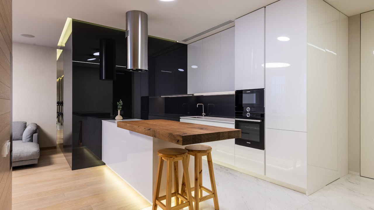
The glossy kitchen cabinets used in so many Property Brothers kitchens looked upscale and modern on camera. But in real life, fingerprints, smudges, and scratches show up constantly—especially if you have kids or pets around.
They’re also harder to touch up when the finish starts to dull or chip. Matte and satin finishes are proving to be more forgiving, especially in homes that actually get used every day.
Fully Mirrored Closets
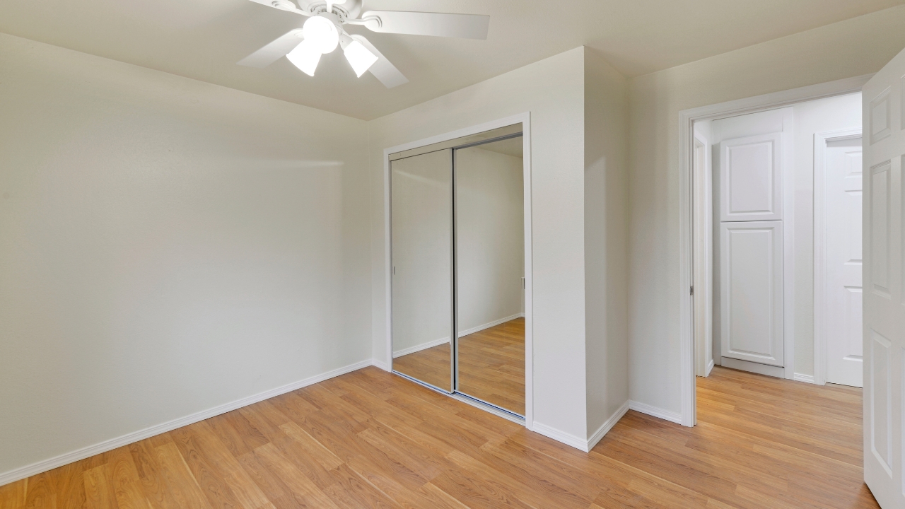
The brothers often installed wall-to-wall mirrored closet doors to open up a space and reflect light. While it worked on screen, living with full mirrors across a bedroom wall isn’t for everyone. They show every streak and make decorating tricky.
These days, people are swapping them for sliding doors with wood, frosted glass, or paneled details. You still get the function, but without the constant upkeep—or the flashbacks to 1980s interiors.
Gray Flooring Throughout
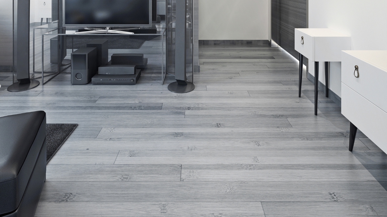
Gray-toned laminate or vinyl flooring was everywhere in their early makeovers. It matched everything and made homes feel modern, but years later, the cool undertone can feel cold and less inviting.
Neutral wood tones are back in full force now—warmer finishes that still hide dirt but look more timeless. If you’re picking floors today, gray doesn’t have quite the same staying power it once seemed to promise.
Pop-Out Electric Fireplaces

Mounted electric fireplaces with tile surrounds were a favorite feature in Property Brothers living rooms. They added drama and a central focus—but many don’t actually provide much heat, and they can take up valuable space in smaller rooms.
A more subtle built-in or a traditional fireplace renovation tends to age better. Flashy features like this can feel bulky or dated once the novelty wears off.
Over-Styled Bookshelves
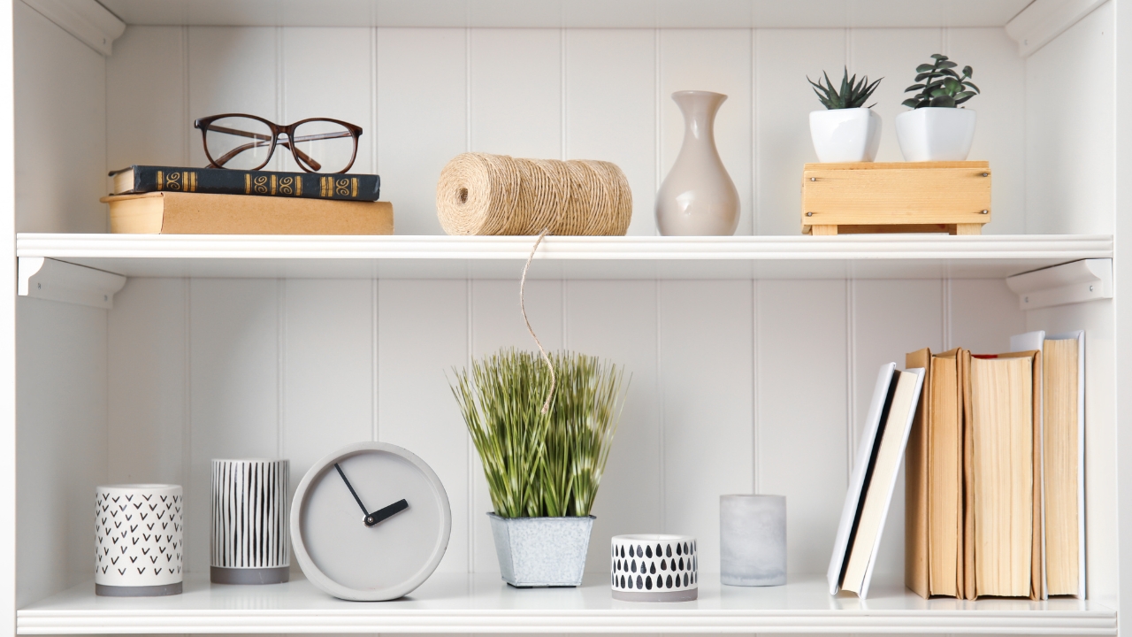
Their staging style always included styled bookshelves packed with matching baskets, vases, and objects. It looked clean and curated—but it didn’t leave much room for actual living.
In real homes, people need storage that works. Bookshelves packed with decor aren’t practical long-term. Now, a more relaxed, lived-in approach is trending, and overly styled shelves feel more like a catalog than a home.
Ultra-Modern Pendant Lighting
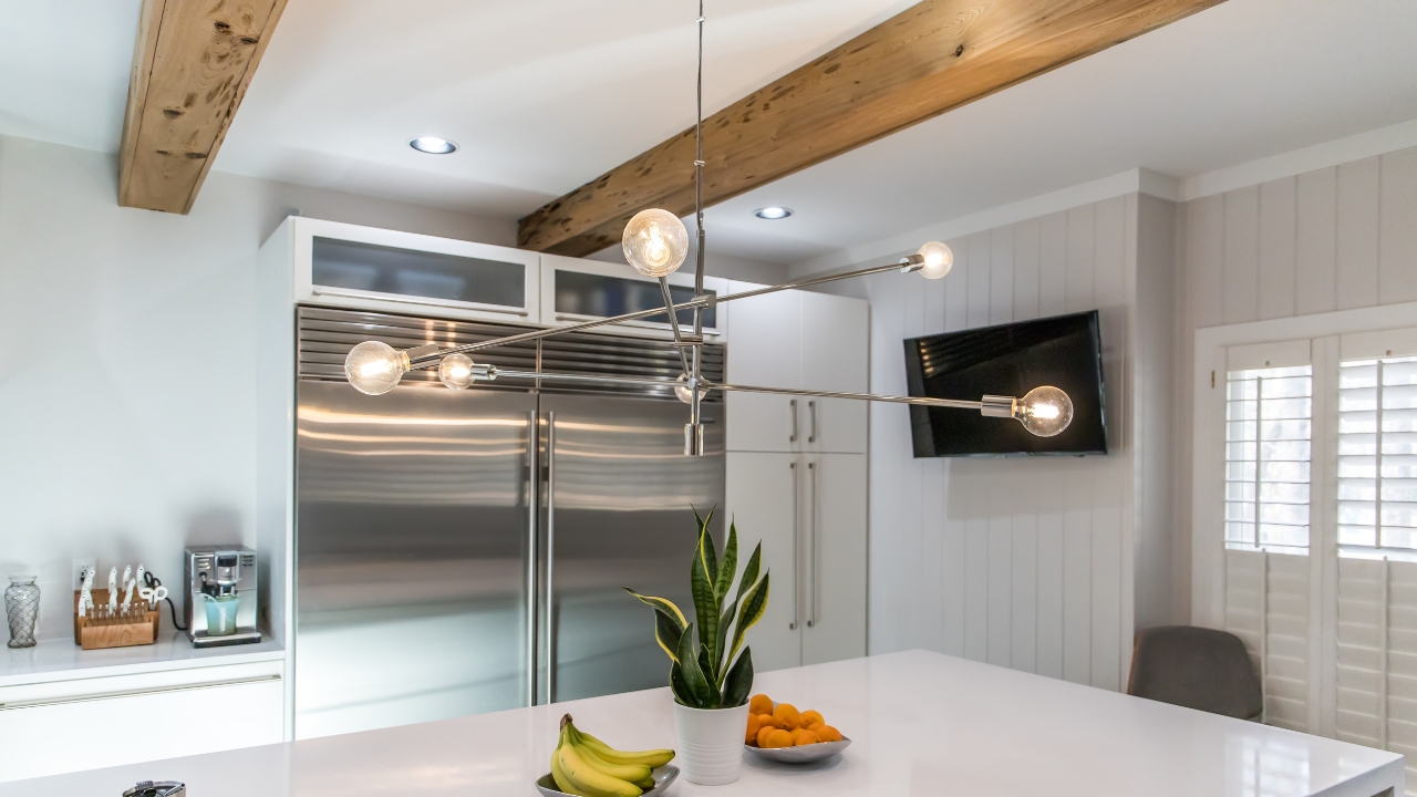
Many of their kitchen and dining spaces feature sharp, geometric pendant lights with metallic or black finishes. While they made a statement, some of those modern shapes haven’t aged well—especially the ones that leaned too trendy.
Lighting is one of the easiest things to update, but also one of the fastest to date a room. More classic shapes and finishes are getting attention again for their longer shelf life.
Massive Kitchen Islands With Waterfalls
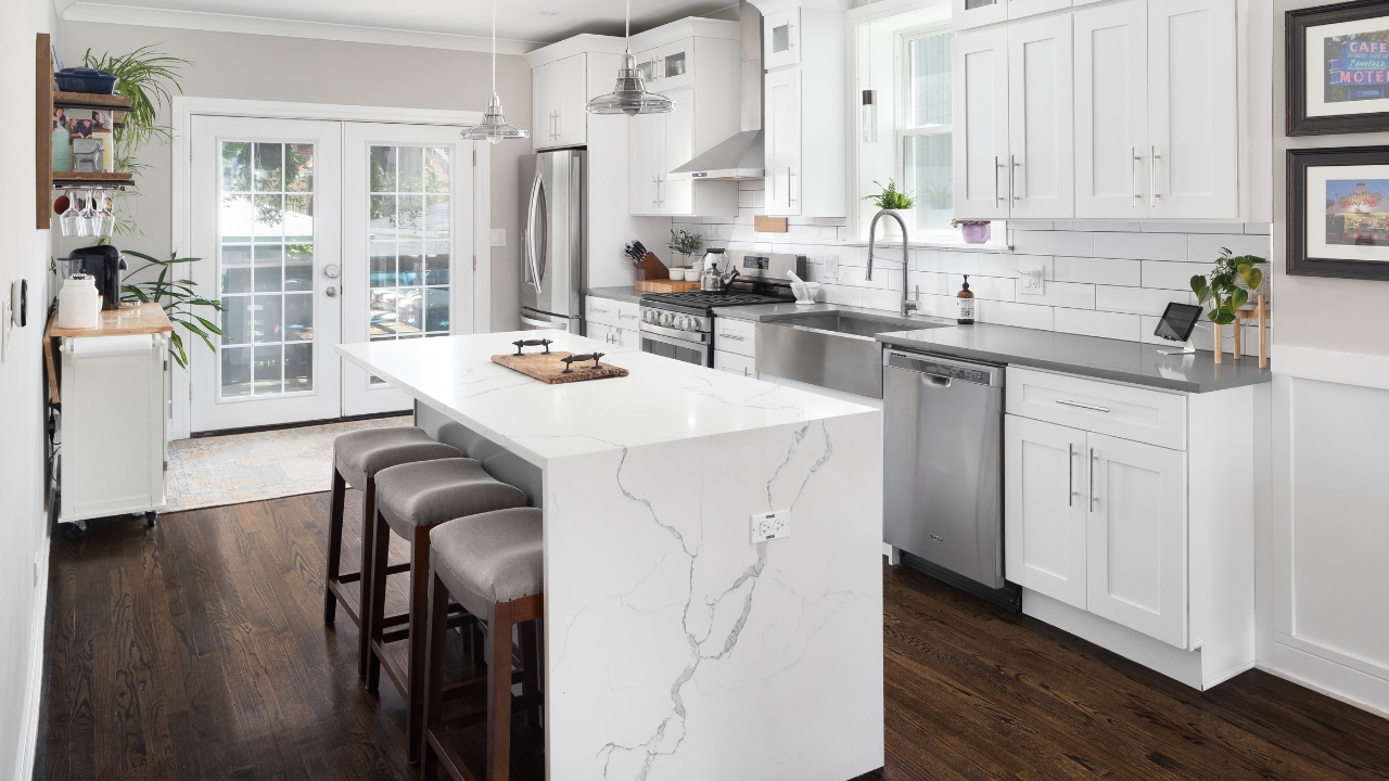
Waterfall countertops on oversized islands became a staple in their renos. And while they looked clean and dramatic, they’re also expensive, prone to chipping on the edges, and hard to replace if damaged.
For families, the return on that investment doesn’t always add up. People are leaning toward function-forward islands with extra storage, outlets, and seating that actually gets used.
Floor-to-Ceiling Feature Tile
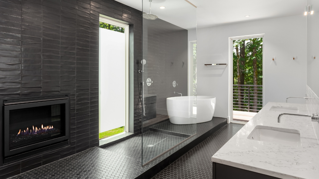
The Property Brothers often wrapped entire fireplace walls or bathrooms in tile—sometimes in bold patterns or textures. It looked high-end, but tile that dominant can overwhelm a space over time.
It’s also costly to replace if trends shift. These days, using bold tile in smaller areas—like backsplashes or niche walls—is a safer way to keep a design from aging too quickly.
Built-In Dining Benches
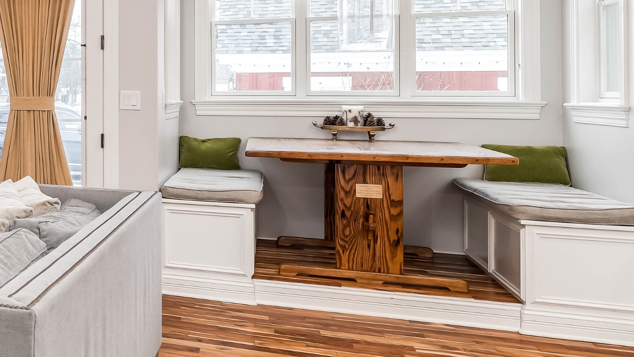
Built-in banquettes with upholstery were a go-to in tight dining areas. They created a cozy nook look, but in real life, they’re hard to clean and not always comfortable.
They also lock you into a specific layout, which doesn’t work well if your family grows or your needs change. Freestanding tables with flexible seating are usually easier to live with long-term.
Ultra-Neutral Everything
To appeal to buyers, the brothers often kept walls, furniture, and floors in the same neutral palette. While it made the spaces feel cohesive, it also made them feel a little bland once the cameras were gone.
Real families want warmth and personality. Too much beige or gray can make a house feel unfinished instead of flexible. Color, contrast, and layered materials are making a comeback—and they tend to hold up better with time.
*This article was developed with AI-powered tools and has been carefully reviewed by our editors.