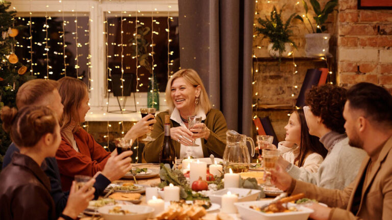
10 things decorators are begging you to stop using in 2026
Photo credit: Unsplash
Every year, designers quietly start phasing out trends that have overstayed their welcome—and 2026 is shaping up to be a year of cleaner, warmer, and more natural spaces. That means a lot of the looks that were popular over the past decade are officially on their way out. Some are simply tired, while others clash with the shift toward softer, more timeless interiors.
If you want your home to feel current without constant redecorating, here’s what decorators say you should finally stop using this year.
All-gray interiors

Gray walls, gray floors, and gray furniture had their moment, but designers have moved on. The color was meant to feel modern and neutral, but it sucked the warmth out of homes. Now, it makes even new spaces feel dated and cold.
Warm neutrals like creamy white, greige, and tan are taking over. They pair better with natural light and give furniture more contrast. You don’t have to repaint everything—just start layering in softer tones to balance all the gray.
Farmhouse signs and word art

“Gather,” “Blessed,” and every other farmhouse-style sign are finally being retired. What started as a cozy touch turned into a decorating cliché. It’s one of the quickest ways to date a home now.
Decorators are steering people toward meaningful artwork, vintage pieces, or photography instead. It’s not that words can’t belong in your home—they just shouldn’t look mass-produced. Personal touches feel more elevated and authentic than anything that comes pre-framed with cursive text.
Edison bulb fixtures

Exposed bulbs and industrial lighting were once the height of cool, but now they’re harsh and impractical. The amber glow that looked moody on Pinterest leaves most rooms dim and orange-tinted in real life.
Designers are recommending shaded or diffused lighting that flatters your space instead of highlighting every flaw. Think linen shades, frosted glass, or sculptural fixtures that add warmth without the glare.
All-white kitchens

Crisp white cabinets and subway tile used to be the definition of timeless, but after years of seeing them in every renovation, they’ve started to feel sterile. They also require constant cleaning to look fresh, which most people don’t have time for.
Designers are now favoring warmer wood tones, natural stone, and subtle color on cabinets. A creamy off-white or muted green can still feel bright but adds character and texture that flat white can’t match.
Wall-to-wall shiplap

Shiplap has officially gone from trend to overused feature. It was charming when limited to accent walls, but when it started covering entire homes, it lost its appeal.
Decorators are turning to alternative textures like vertical paneling, limewash, and plaster finishes. These still give you dimension but feel less repetitive. A little texture goes a long way—especially when it looks intentional instead of copied from a TV reveal.
Matching furniture sets

Buying every piece in a set might feel easy, but it flattens the personality of a room. It makes everything look staged, like a furniture showroom instead of a home.
Designers prefer mixing styles—pairing a vintage sideboard with a modern sofa or combining different wood tones. The mix creates depth and makes your space look curated over time instead of pulled straight from a catalog.
Fake plants

A few good-quality faux stems are fine, but filling your home with plastic greenery is no longer fooling anyone. They fade, collect dust, and don’t add the life or movement that real plants bring.
Even low-maintenance real plants—like snake plants, pothos, or ZZ plants—are better long-term. Designers are also using dried branches and preserved florals for a more natural, sustainable look that doesn’t feel fake.
Heavy drapes and outdated valances

Those ornate window treatments with tassels and fringe instantly date a home. They block natural light and make rooms feel smaller and stuffier than they are.
Sheer panels, linen curtains, and clean-lined shades have replaced them. They let light filter in while still providing privacy. The trend is all about openness and softness—not weight and clutter.
Granite countertops with heavy patterns

The high-contrast granite that dominated early-2000s kitchens is on its way out. Those speckled browns and golds make even updated spaces feel dated.
Quartz, soapstone, and subtle natural stone are taking over instead. Lighter, more uniform patterns create a calm backdrop that works with nearly any color palette. If replacing countertops isn’t in the budget, consider refinishing or pairing them with updated hardware and lighting for balance.
Overstaged decor
Too many perfectly arranged trays, candles, and stacked books can make your home feel stiff and impersonal. It’s the kind of look that photographs well but doesn’t feel lived in.
Designers are encouraging people to decorate with purpose instead—fewer items, but ones that matter. Leave room for life to happen. A home should look used and loved, not constantly ready for a photo shoot.
*This article was developed with AI-powered tools and has been carefully reviewed by our editors.