Why your walls might be making your furniture look worse
Photo credit: Procreators/Shutterstock.com
If the sofa you loved in the store looks drab at home, it’s usually not the sofa. Walls carry more weight than we give them credit for—undertones, sheen, and where the paint stops and starts can make good pieces read tired. A few smart shifts let the furniture you already own do its job.
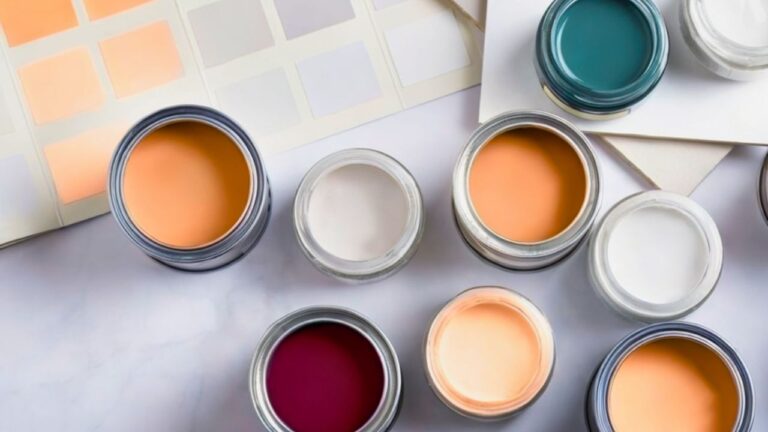
Check undertone before you blame the couch
Paint has hidden temperature. A “greige” that leans pink will make taupe upholstery look dirty; a cool gray can turn warm oak orange. Grab large samples and tape them behind the sofa, then look morning, noon, and night. If the wall keeps making your fabric go ashy or muddy, you’re fighting undertone, not quality.
Respect evening light, not just midday
Rooms rarely live at noon. In lamplight, some paints sink flat and make wood feel heavy. Test your color with the actual bulbs you’ll use after sunset (2700–3000K is your friend). If the wall dies at night, shift one step warmer or slightly darker so the furniture holds its shape when the sun clocks out.
Fix sheen so surfaces read right
Too much gloss on big walls bounces glare and highlights every patch; dead-flat shows scuffs that cheapen the view. Aim for eggshell on walls, semi-gloss on trim, and flat on ceilings. When sheen is right, upholstery texture pops and wood grain looks intentional instead of blotchy.
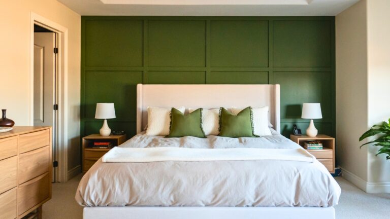
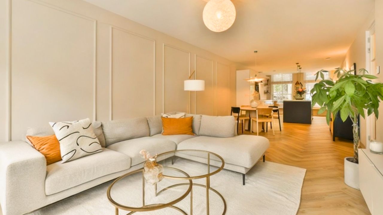
Use contrast to outline silhouettes
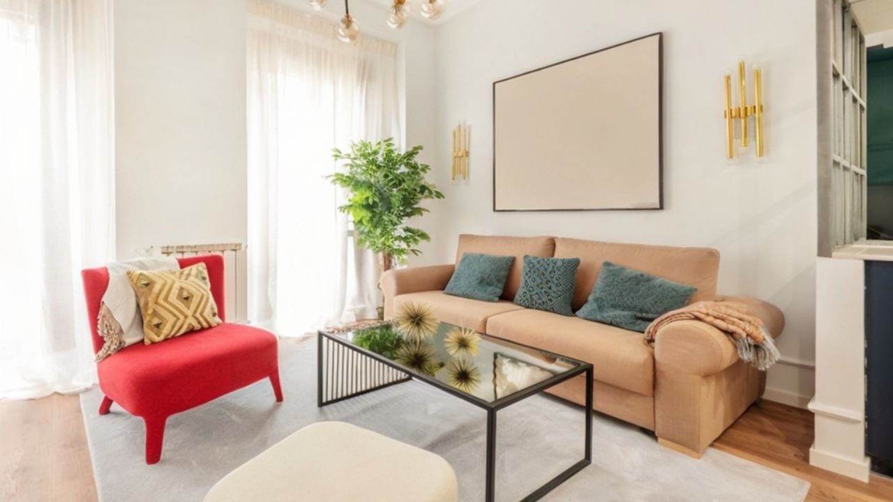
A camel or oatmeal sofa against a near-white wall reads calm; a dark charcoal sofa needs a wall with a little warmth or depth so it doesn’t “hole punch” the room. You want just enough difference that cushions and arms have a clear outline. If the wall and sofa are nearly identical, pillows work overtime and still won’t save the read.
Let trim color do quiet tailoring
Crisp trim can rescue tired pieces. A warm white on baseboards, window casing, and interior doors gives a clean “frame” around everything you own. When edges are clear, even a simple IKEA bookcase looks more deliberate. If your trim is yellowed, a fresh coat often makes the furniture look new by comparison.
Stop the two-tone chop at awkward heights
Half-painted walls or short accent stripes break furniture into weird proportions. If you love a wainscot look, keep the rail around 34–38 inches and let artwork or a tall mirror bridge the line. Lower than that and your sofa looks oversized; higher and chairs feel stubby.
Use the back wall to correct the room’s mood
Long, narrow rooms feel calmer when the far short wall gets a deeper color. It visually pulls the space toward you, which helps long sectionals and long consoles belong. Keep the side walls lighter so the depth trick lands without turning the room into a cave.
Make art work with the palette you actually have
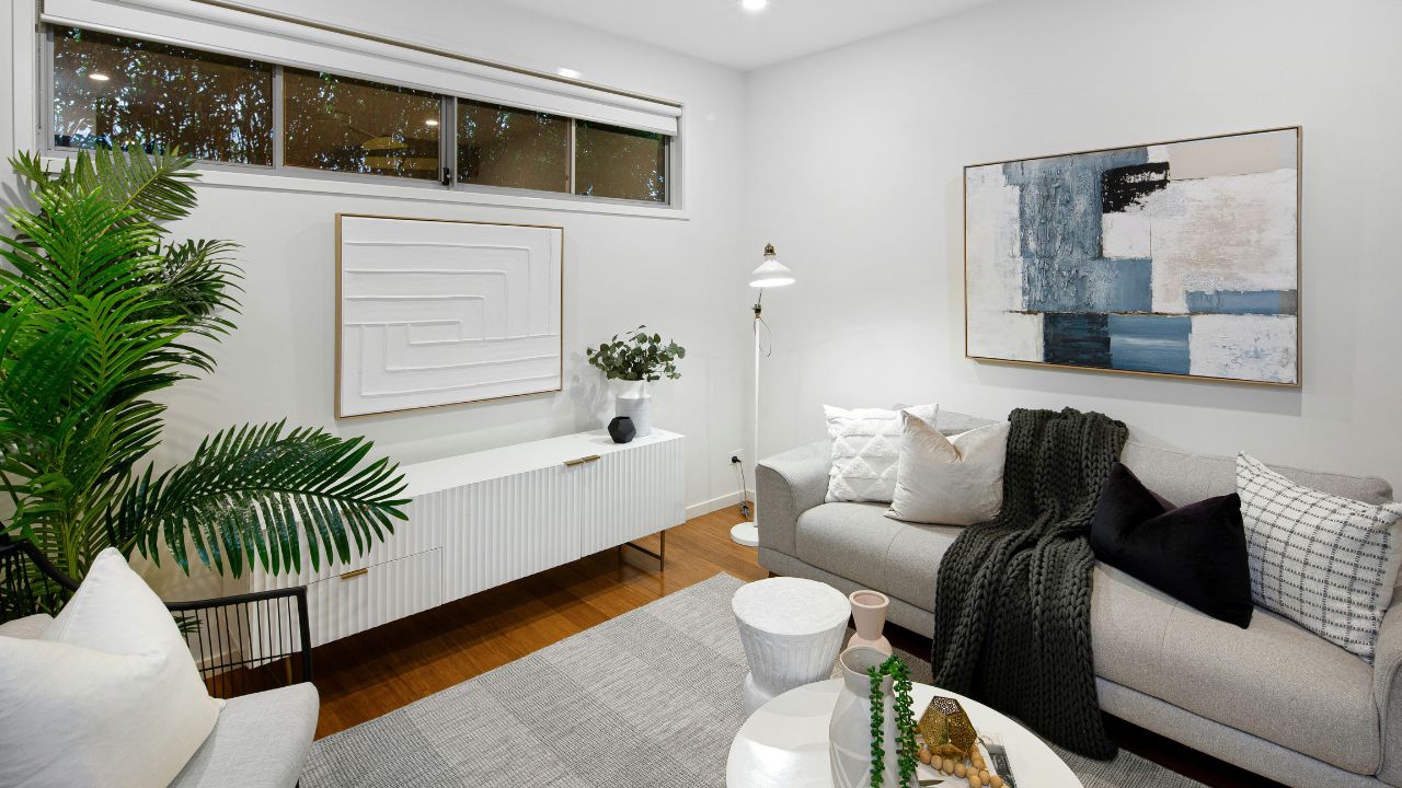
Art doesn’t need to match, but it shouldn’t fight your biggest pieces. If your rug is warm and the sofa is neutral, let the art bring in one cool note on purpose, not five. Hang with bottoms aligned over the furniture so the wall color, art, and upholstery read as one decision.
Like Fix It Homestead’s content? Be sure to follow us.
- Man Says He Found Out the Fence He Paid For Wasn’t Actually on His Property
- Woman Says Her Neighbor Started Taking Mulch From Her Delivery Pile Before She Could Even Spread It
- I made Joanna Gaines’s Friendsgiving casserole and here is what I would keep
- What Caliber Works Best for Groundhogs, Armadillos, and Other Digging Pests?