10 color choices that are harder to live with than they look online
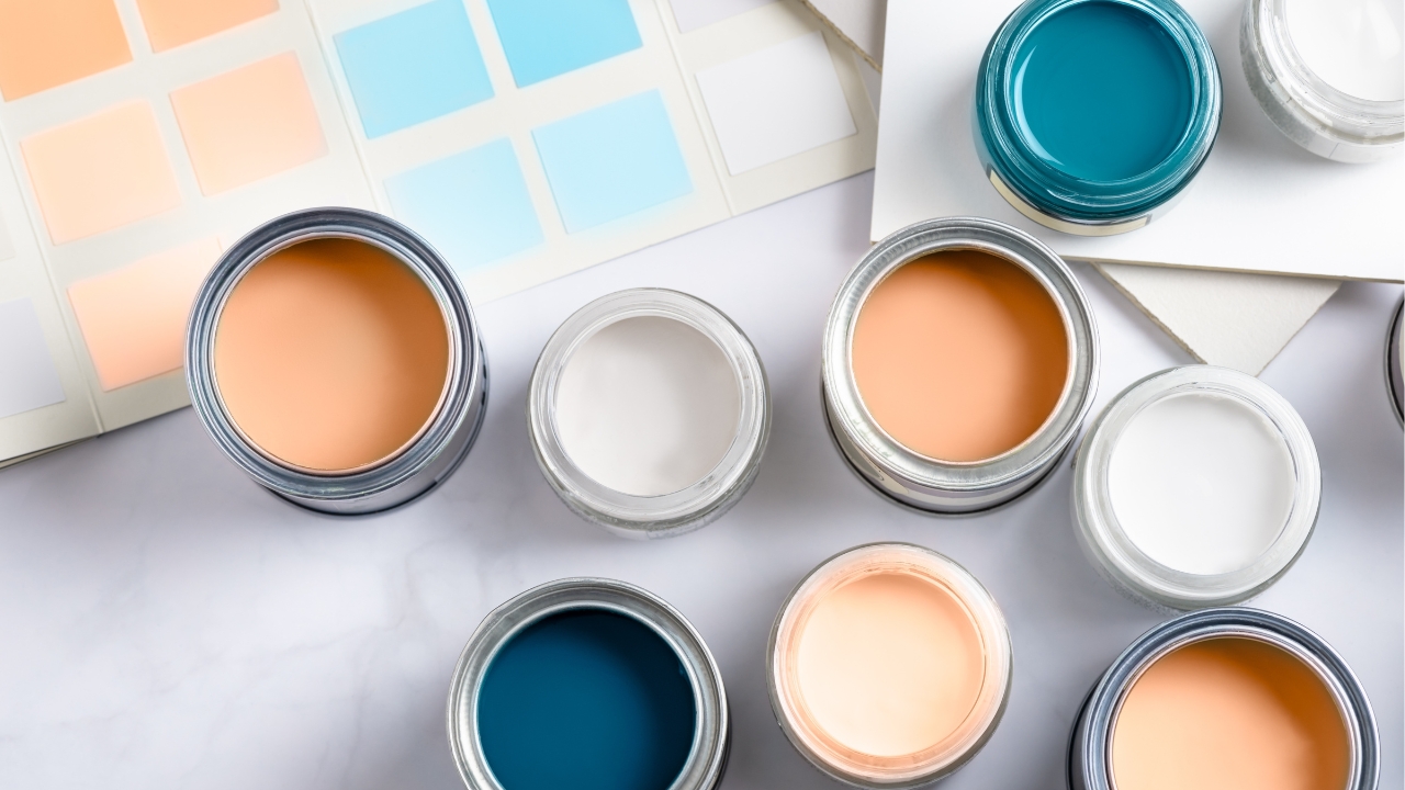
Some paint colors look great in photos but are a whole different story when you’re actually living with them. What works in a perfectly lit Instagram post doesn’t always work in real life—especially when your lighting, decor, and day-to-day use aren’t filtered or staged.
Certain trendy shades might look fresh at first but end up being high-maintenance, visually overwhelming, or just plain irritating once they’re on every wall. These are the ones that tend to be more trouble than they’re worth.
Bright white with cool undertones
It sounds clean and classic, but cool-toned whites can feel sterile fast—especially in homes with natural wood trim or warmer flooring. They also show every smudge, fingerprint, and scuff. If your lighting leans warm, the contrast can be jarring, and the space may end up feeling more like a hospital than a home.
Jet black walls

Black can be dramatic in the right space, but it’s not forgiving. It highlights imperfections in drywall, shows dust quickly, and often requires several coats to look even. It also absorbs light, making rooms feel smaller and heavier. Unless the room gets tons of sunlight and has high ceilings, black walls can wear on you quickly.
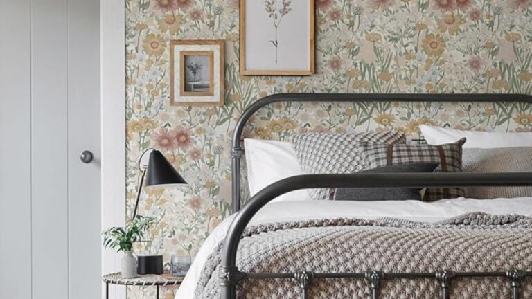
Pastel yellows
These can feel cheerful online, but in real life, they often read more like an old nursery or a faded rental. They’re also surprisingly hard to match with furniture, flooring, or trim without everything clashing. In artificial light, they can look dingy instead of bright.
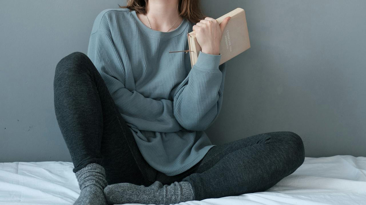
Navy blue in small spaces

Navy looks rich in magazines, but in tighter rooms it can close in fast. It absorbs light and can make the room feel like a cave unless there’s a strong balance of white trim, reflective surfaces, and natural light. It also tends to scuff easily on high-traffic walls.
Cool gray with blue undertones
Grays that lean blue might seem trendy, but they can feel cold and flat when paired with the wrong flooring or lighting. In north-facing rooms, they often look gloomy instead of sleek. And once they’re up, they don’t always work with warm-toned furniture.
Sage green with heavy gray base
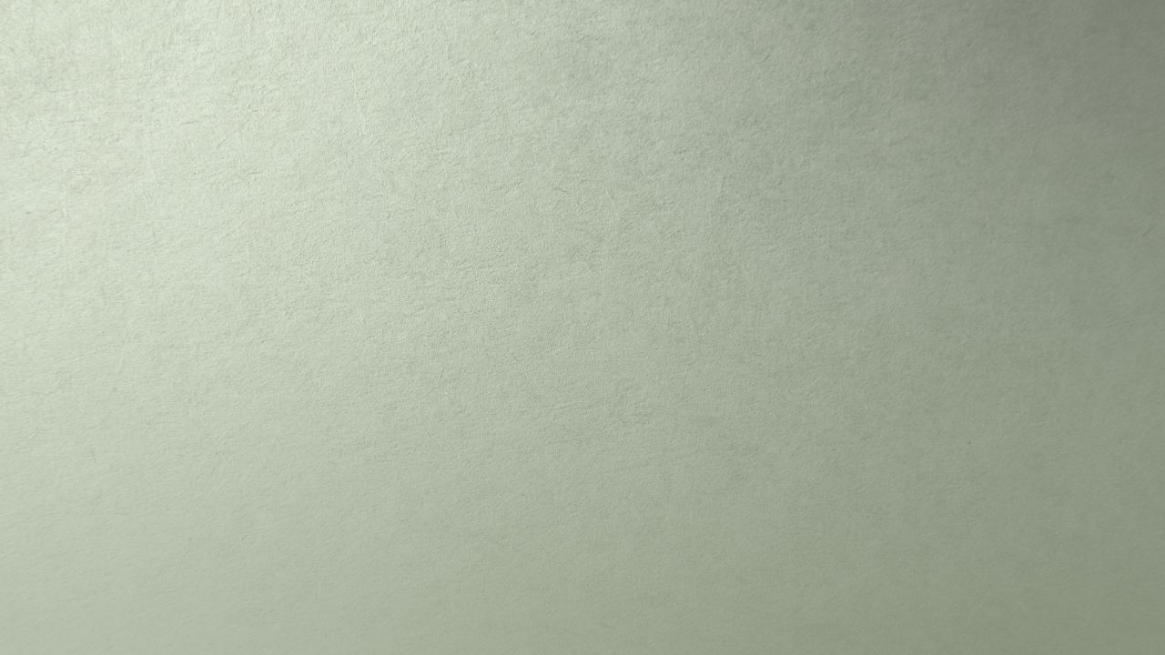
This one’s everywhere right now, but not all sage paints are created equal. Some versions lean too gray and end up feeling muddy or lifeless, especially in lower light. You lose the freshness that made it appealing in the first place, and it can make rooms feel washed out.
Coral pinks
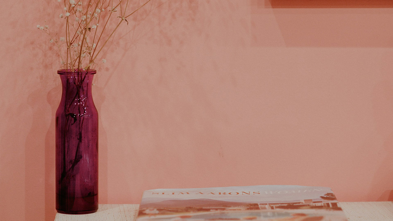
Coral might pop in online shots, but it’s hard to pull off in a full room. It tends to reflect off nearby surfaces and can cast a weird tone on skin, furniture, and artwork. It also fades fast and can look outdated sooner than you expect.
Burgundy or deep red
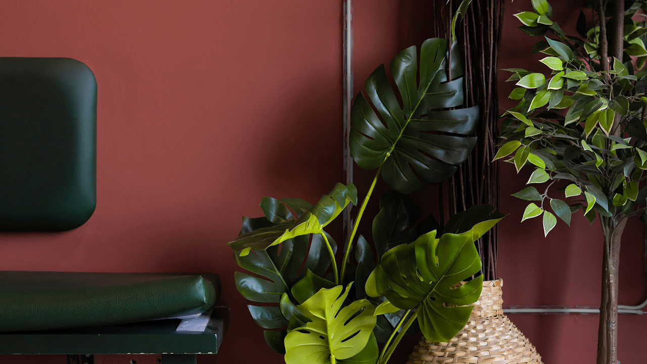
These colors are heavy and moody, which can be cozy in the right context—but usually, they just dominate a room. They don’t play well with most natural wood tones, and they can make even large rooms feel boxed in. You’ll also notice every nick or scratch in the paint.
Teal with green undertones
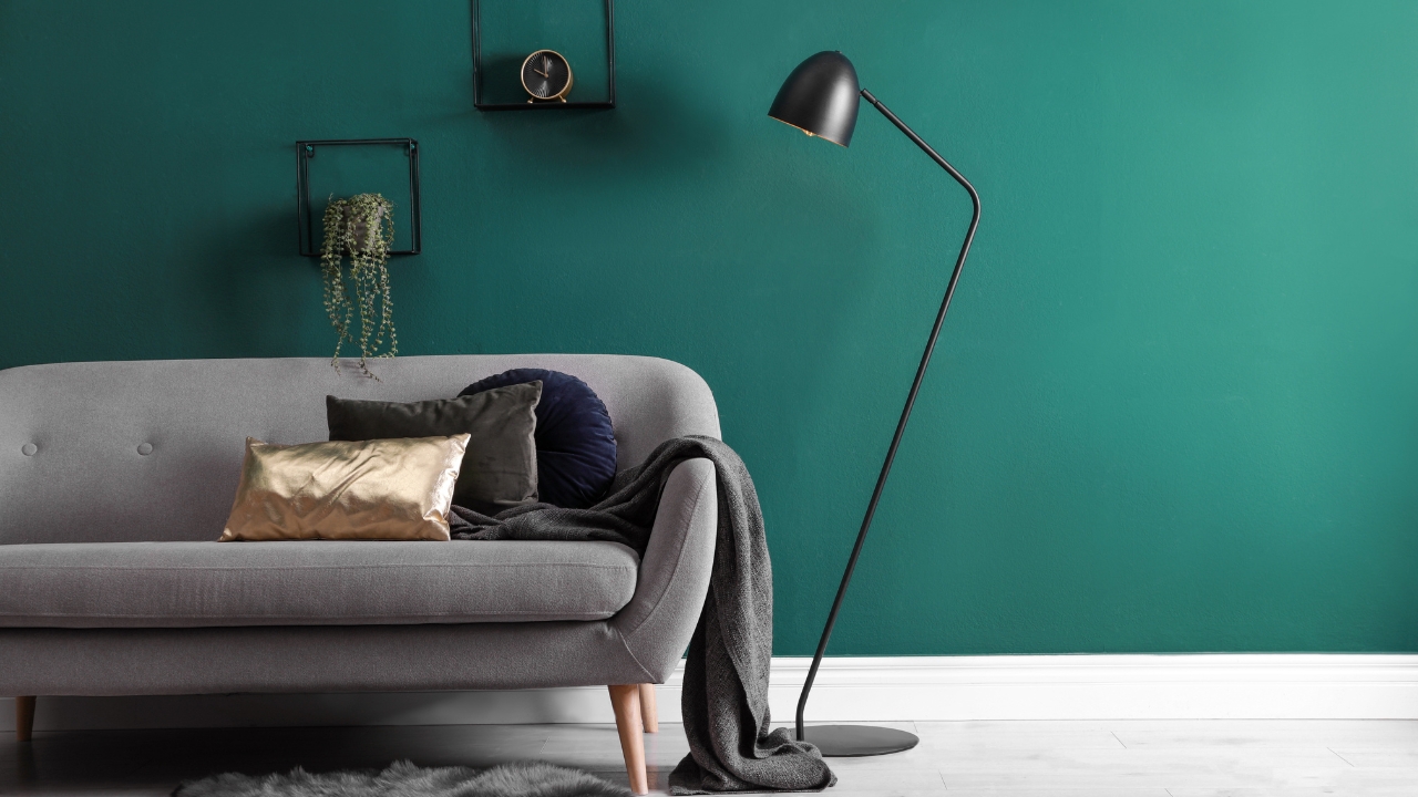
While teal can feel fun or retro online, it often reads chaotic in person. It’s tricky to match with floors, cabinets, or trim, and when the lighting shifts, it can suddenly look way greener than you planned. In large amounts, it can also start to feel overwhelming.
Terracotta orange
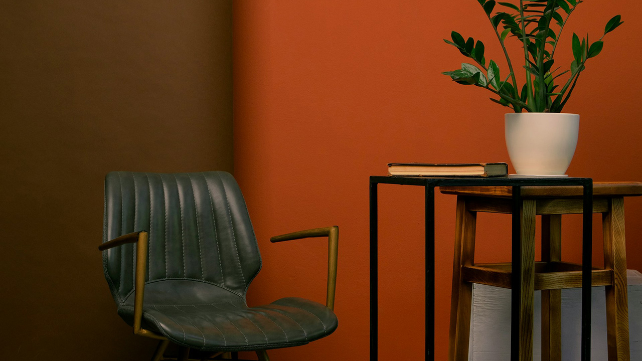
This color can look warm and earthy in photos, but it easily turns harsh in the wrong lighting. It’s tough to decorate around without going full desert theme, and it can make nearby wood tones clash hard. Once it’s up, it tends to limit what else works in the room.
*This article was developed with AI-powered tools and has been carefully reviewed by our editors.