Designers notice this mistake the second they walk into your kitchen
You might think your kitchen looks fine—clean counters, decent appliances, good lighting—but designers notice one thing before anything else: the cluttered or awkward layout around your counters and cabinets. It’s not always about mess; it’s about visual balance.
When things are off-center, crammed together, or visually heavy on one side, the whole kitchen feels uncomfortable without you even realizing why.
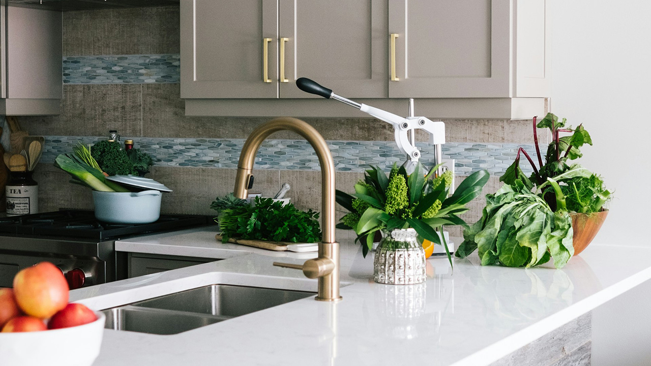
Countertops overloaded with stuff
One of the quickest giveaways that a kitchen lacks design balance is when every inch of counter space is covered. Coffee makers, toasters, air fryers, utensil crocks, spice racks—each one might be useful, but together they create visual chaos. Designers know that empty counter space makes a kitchen look cleaner and more intentional. The solution isn’t throwing everything out—it’s deciding what truly earns a permanent spot and what can be tucked away until needed.
Cabinets that don’t line up with function
Designers immediately spot when upper cabinets, drawers, and appliances weren’t planned for how the kitchen actually works. A drawer that hits the oven handle, an upper cabinet too shallow for plates, or the dishwasher blocking access to a cupboard all signal poor flow. These things might seem small, but they’re the kind of daily annoyances that make a space feel thoughtless. Real kitchen design feels effortless because it’s built around how you actually move and use it.
Lighting that highlights the wrong things
Overhead lighting that’s too harsh—or worse, poorly placed—instantly makes a kitchen feel dated or unfinished. Designers look at how light falls across surfaces, where shadows form, and whether task areas like sinks and counters are well lit. Under-cabinet lights, warm bulbs, and even dimmers can make the space look intentionally designed instead of just illuminated. You shouldn’t need to squint to chop vegetables or end up spotlighting your upper cabinets more than your counters.
Mismatched finishes that fight each other
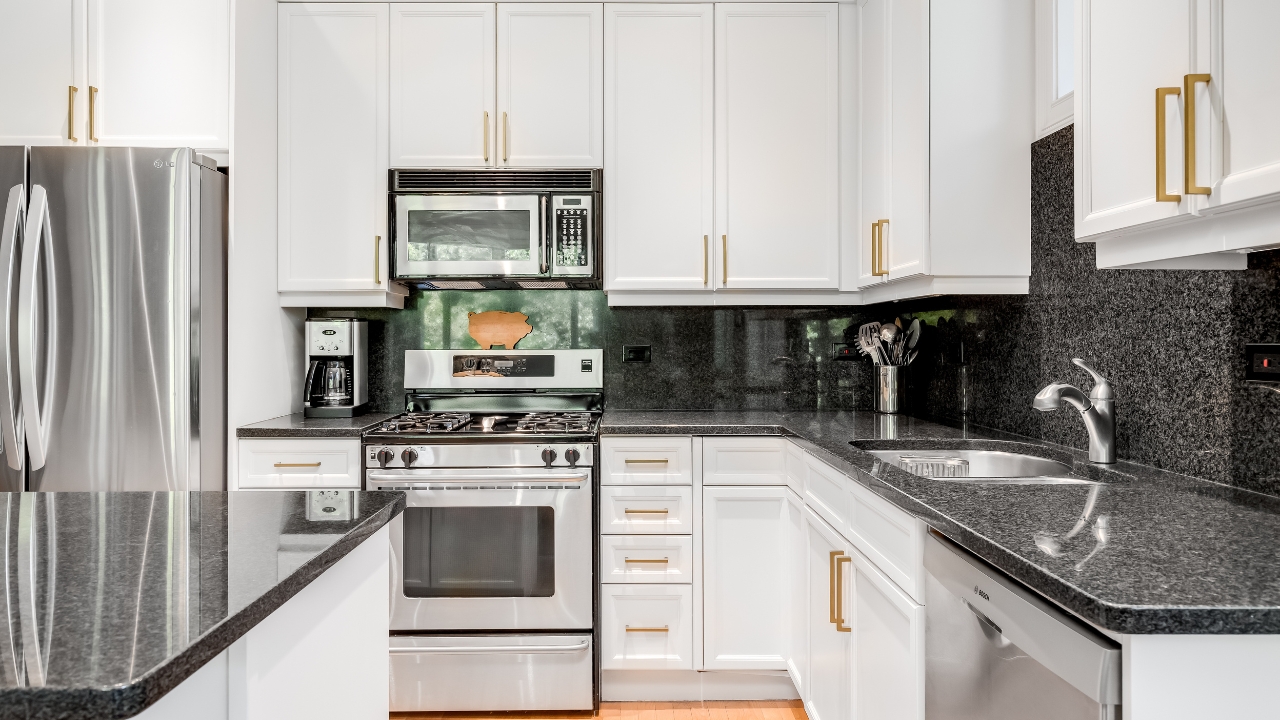
Mixing metals and materials can look great when done with purpose—but too many competing finishes make a kitchen feel disjointed. Designers notice when cabinet hardware, faucet, and light fixtures don’t relate to each other or when multiple colors of stainless steel clash. It’s not that everything has to match perfectly; it just needs to feel cohesive. Sticking to one tone family or repeating materials throughout can pull everything back together.
A backsplash that breaks the rhythm
The backsplash is one of the first things the eye catches, and designers can tell right away when it was an afterthought. Tiles that stop at odd points, busy patterns fighting with countertops, or mismatched grout colors all throw off the balance. A backsplash should complement the rest of the space, not compete with it. Even a plain subway tile done cleanly looks more polished than a trendy design that overwhelms the room.
The overall flow feels off
Designers can walk into a kitchen and instantly feel when it doesn’t “flow.” That usually means the work triangle—between the sink, stove, and refrigerator—isn’t practical. You shouldn’t have to take ten steps or dodge an island to cook dinner. A good layout feels intuitive. Even in smaller kitchens, rearranging key pieces or removing one unnecessary item can dramatically change how functional and open it feels.
When designers walk into a kitchen, they’re not judging your style—they’re reading how well it functions and feels. If the room looks cluttered, cramped, or disconnected, it doesn’t matter how expensive the finishes are.
Fixing those small layout and balance issues makes your kitchen feel more intentional—and you’ll notice the difference every time you walk in.
Like Fix It Homestead’s content? Be sure to follow us.
- I made Joanna Gaines’s Friendsgiving casserole and here is what I would keep
- Pump Shotguns That Jam the Moment You Actually Need Them
- The First 5 Things Guests Notice About Your Living Room at Christmas
- What Caliber Works Best for Groundhogs, Armadillos, and Other Digging Pests?
- Rifles worth keeping by the back door on any rural property
*This article was developed with AI-powered tools and has been carefully reviewed by our editors.