10 colors that make a space feel smaller, according to designers
Paint can completely change how a room feels, but not always in the way you want. Some colors might look gorgeous in a photo, then suddenly make your space feel like the walls are inching closer the second you finish rolling them on.
Designers say certain shades are notorious for making a room feel smaller—sometimes without you even realizing why. If you’re not going for that boxed-in vibe, here are ten colors to think twice about and some easy ways to use them without sacrificing that open, breathable feel.
Dark Gray
Dark gray is like that sophisticated friend who can sometimes come off as a bit too intense. Designers often point out that while this color can add a touch of elegance, it also has the ability to make a space feel more compact. The depth of dark gray tends to absorb light, which can shrink the perception of a room. According to Martha Stewart’s guide on paint colors, lighter shades can open up a room, whereas darker ones like dark gray do the opposite.
If you love dark gray but want to avoid a claustrophobic vibe, you might consider using it as an accent color instead of the primary wall color. Pair it with lighter tones and reflective surfaces to help balance the effect.
Deep Navy
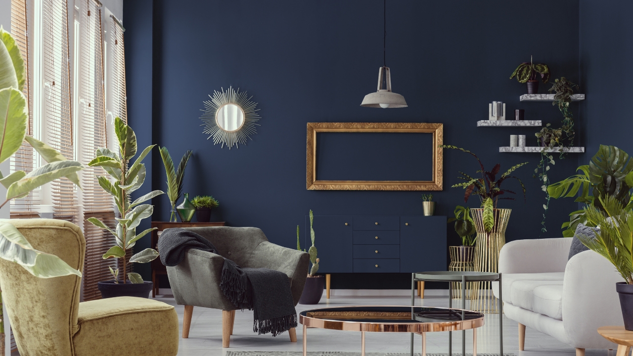
Deep navy is a classic, timeless color, often seen in traditional and modern interiors alike. While it’s undeniably chic, it also tends to make rooms feel smaller by enveloping the space with its rich hue. This is because deep navy absorbs light rather than reflecting it, much like a starry night sky. The Designer’s Guide to Color often warns against using such deep shades in small spaces unless you’re aiming for a cozy, intimate atmosphere.
To mitigate this effect, use deep navy sparingly. Accent walls or smaller pieces of furniture in this color can add drama without overwhelming the space. Consider pairing it with crisp whites or light grays to maintain an airy feel.
Rich Burgundy
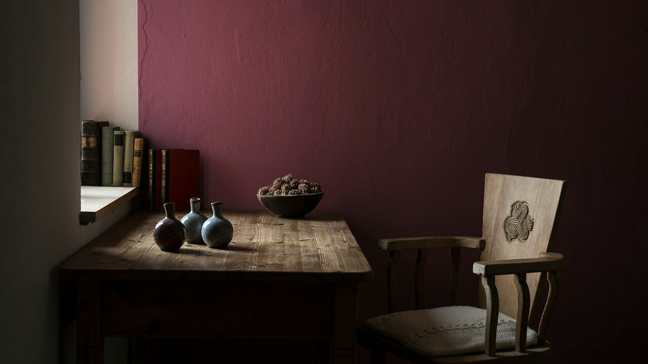
Rich burgundy is like a glass of fine wine; it brings warmth and depth but can also make a space feel more enclosed. This color is often used to create a sense of luxury and comfort, but it can quickly become overpowering in smaller rooms. According to an article in Interior Design Principles, rich colors like burgundy tend to draw walls inward, reducing the perceived volume of a room.
To make the most out of burgundy, try using it in a room with ample natural light. This will help counteract its space-reducing tendencies. Alternatively, incorporate burgundy through textiles like throw pillows or curtains for a touch of richness without the commitment.
Forest Green
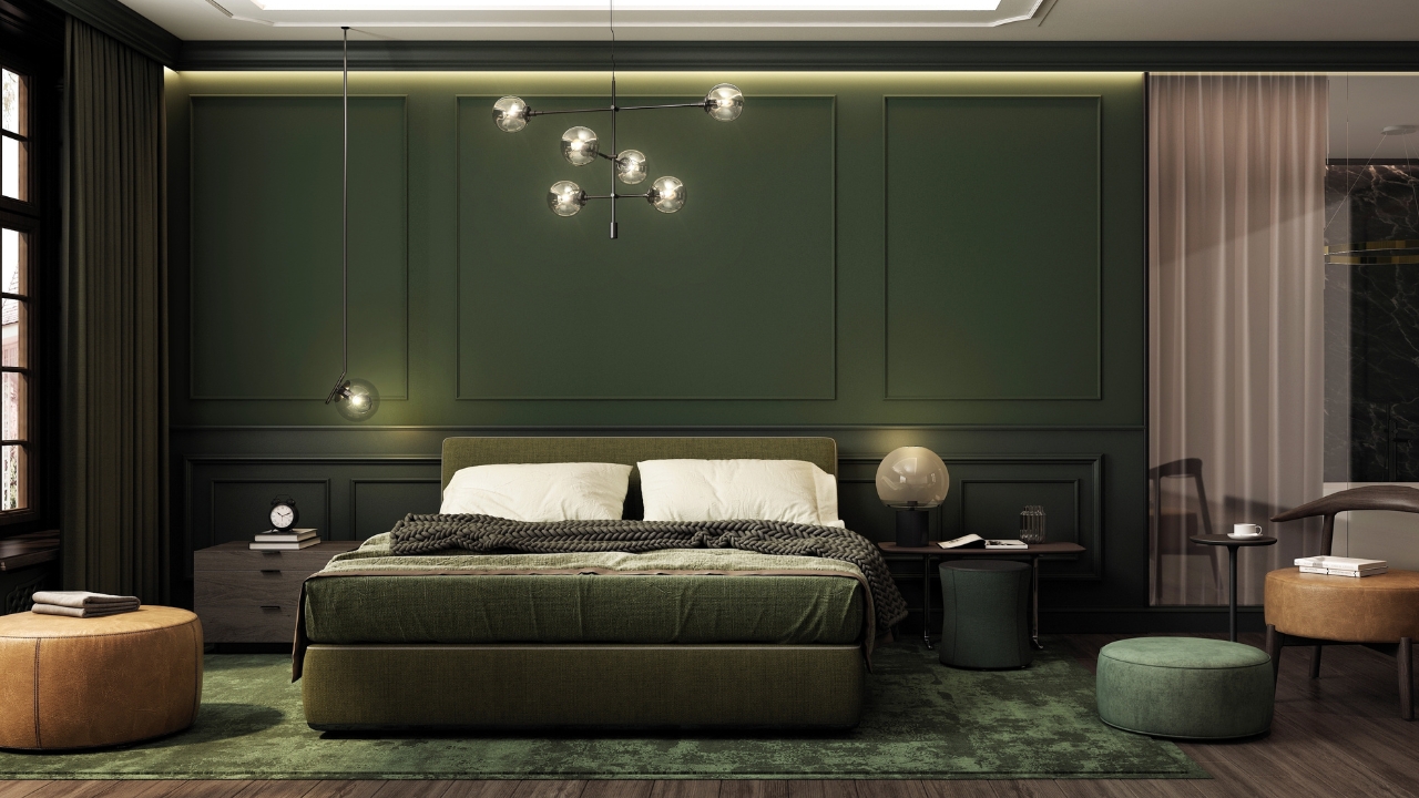
Forest green brings the outdoors in, offering a sense of tranquility and connection to nature. However, its dark tones can also make a room feel smaller and more enclosed. This is especially true in spaces that already lack natural light. As noted in Real Simple’s guide on basement colors, darker greens can absorb light, making them less suitable for tight spaces.
One way to enjoy forest green without feeling boxed in is by using it in rooms with plenty of windows. You can also balance it with lighter shades like beige or cream to keep the space feeling fresh and open.
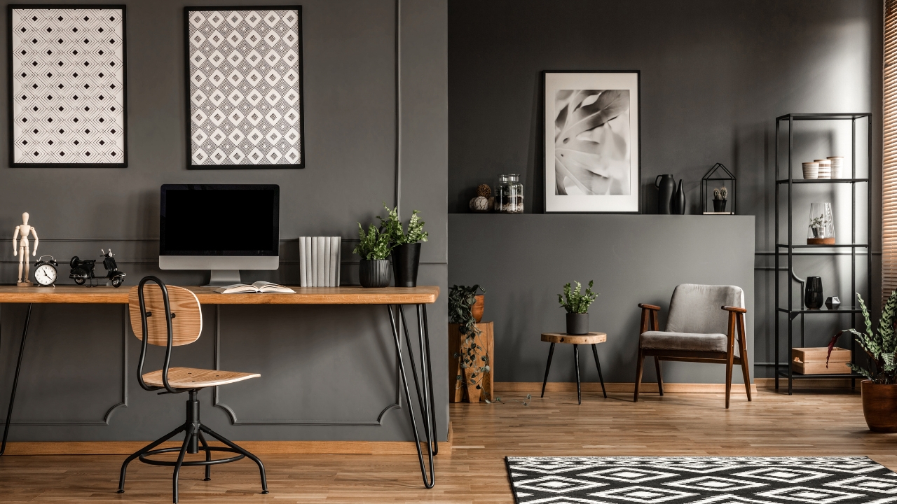
Charcoal Black
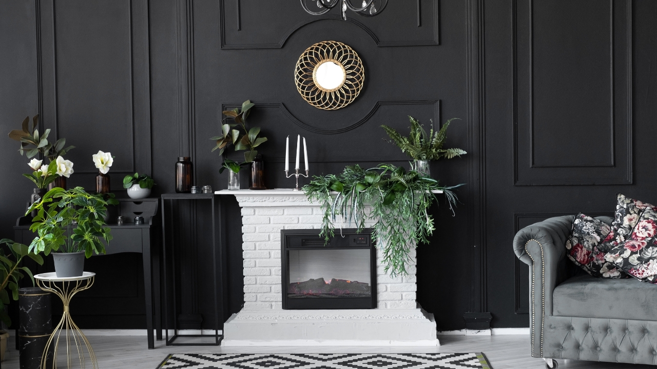
Charcoal black is undeniably dramatic and stylish. It can add an element of sleekness and modernity to a room. However, it’s also a notorious choice for making spaces feel smaller. The absence of light reflection in charcoal black can create a boxed-in feeling, particularly in rooms that already have limited space. A study on color perception highlights how darker colors can affect spatial awareness, often reducing the perceived size of an area.
To use charcoal black effectively, consider limiting it to one wall or using it on furniture pieces. This way, you can enjoy its dramatic flair without sacrificing the room’s openness.
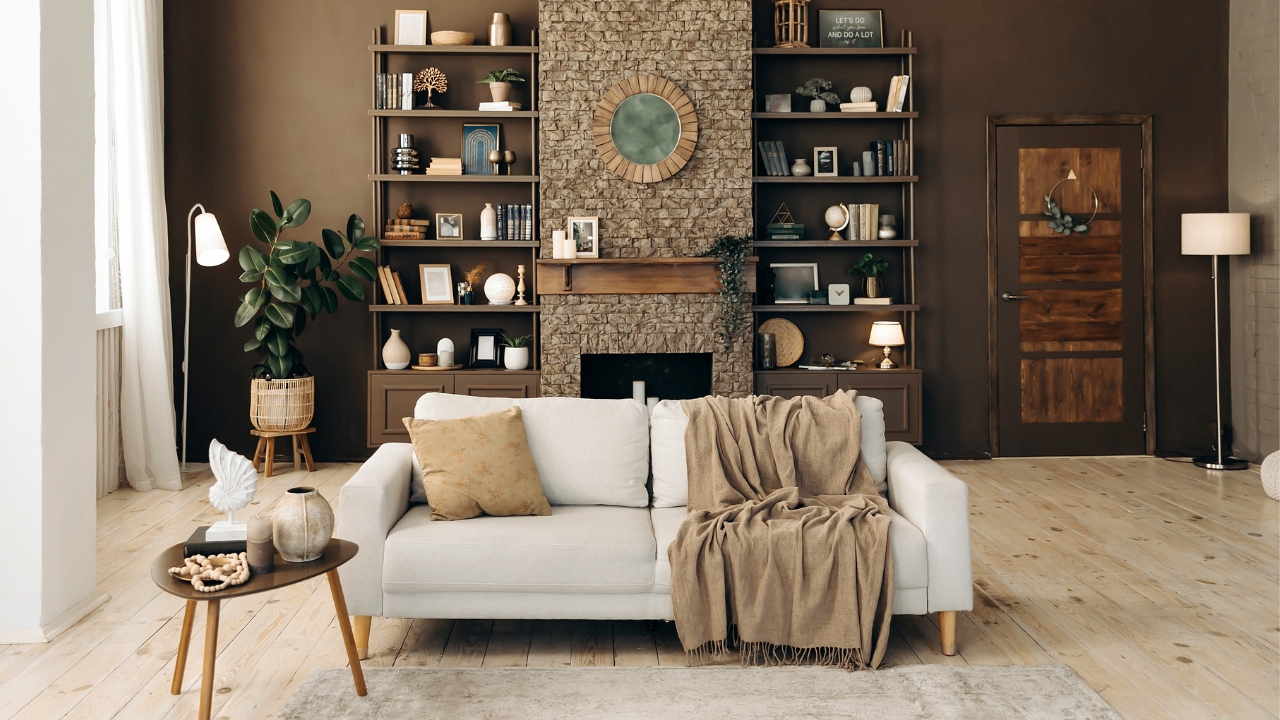
Chocolate Brown
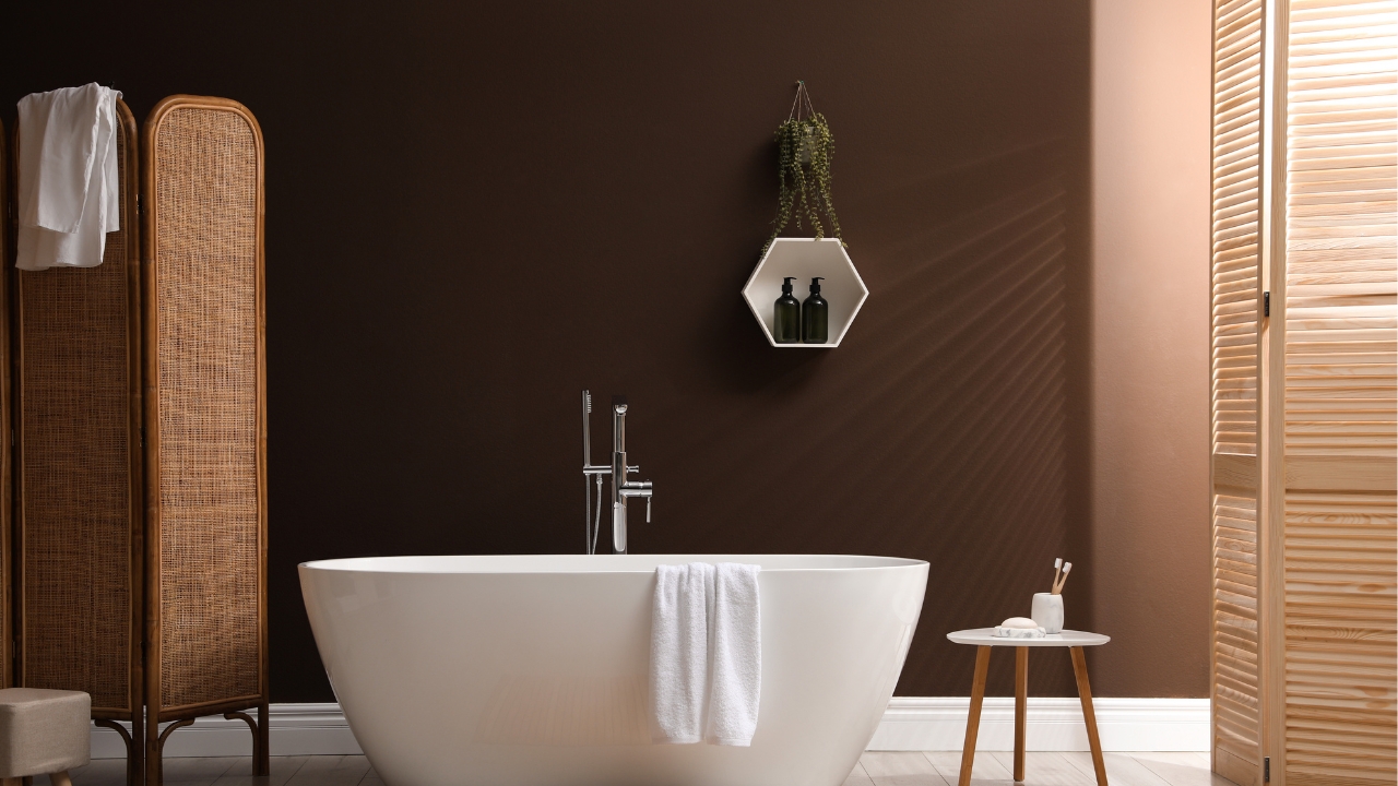
Chocolate brown is a warm, inviting color that can add coziness to any environment. But as inviting as it is, it can also make a space feel more compact. Its earthy tones can close in a room, especially if used on all walls. Many designers suggest using chocolate brown in larger spaces where its warming effect can be fully appreciated without feeling cramped.
If you love chocolate brown, try incorporating it through furniture or accent pieces. Pairing it with lighter shades like cream or pale blue can also help to balance its density, ensuring the space remains airy and welcoming.
Eggplant Purple
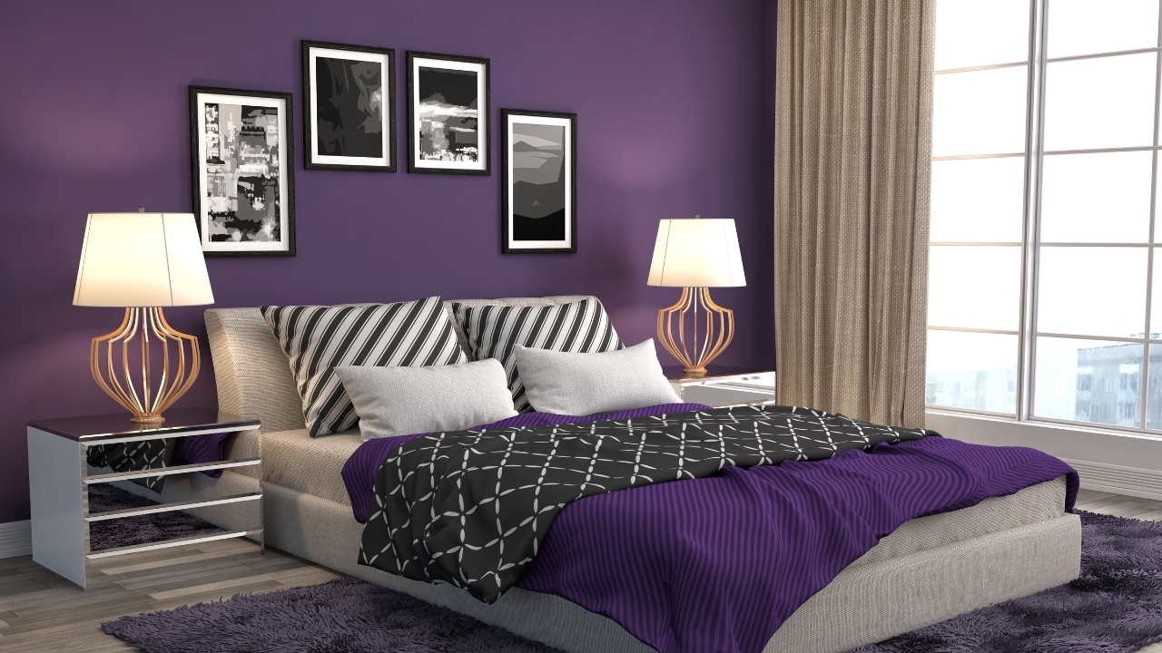
Eggplant purple is bold and dramatic, a favorite for those looking to make a statement. However, much like the other deep colors on this list, it can make a room feel smaller due to its dark, saturated nature. This color is often recommended for accent walls or furniture rather than entire rooms, as its intensity can be overwhelming in tighter spaces.
To use eggplant purple effectively, pair it with lighter neutrals and plenty of natural light. This can help break up the intensity, allowing you to enjoy its richness without compromising the room’s sense of space.
Midnight Blue
Midnight blue is a color that evokes the serene beauty of a night sky. It’s deep, calming, and can add a touch of elegance to any space. However, its intensity can also make a room feel more confined. Midnight blue absorbs light similarly to deep navy, creating a cozy yet potentially claustrophobic atmosphere if not balanced with lighter elements.
To enjoy midnight blue without shrinking your space, consider using it in larger rooms or as an accent color. Pairing it with light furniture or decor can help maintain an open, inviting environment.
Olive Green
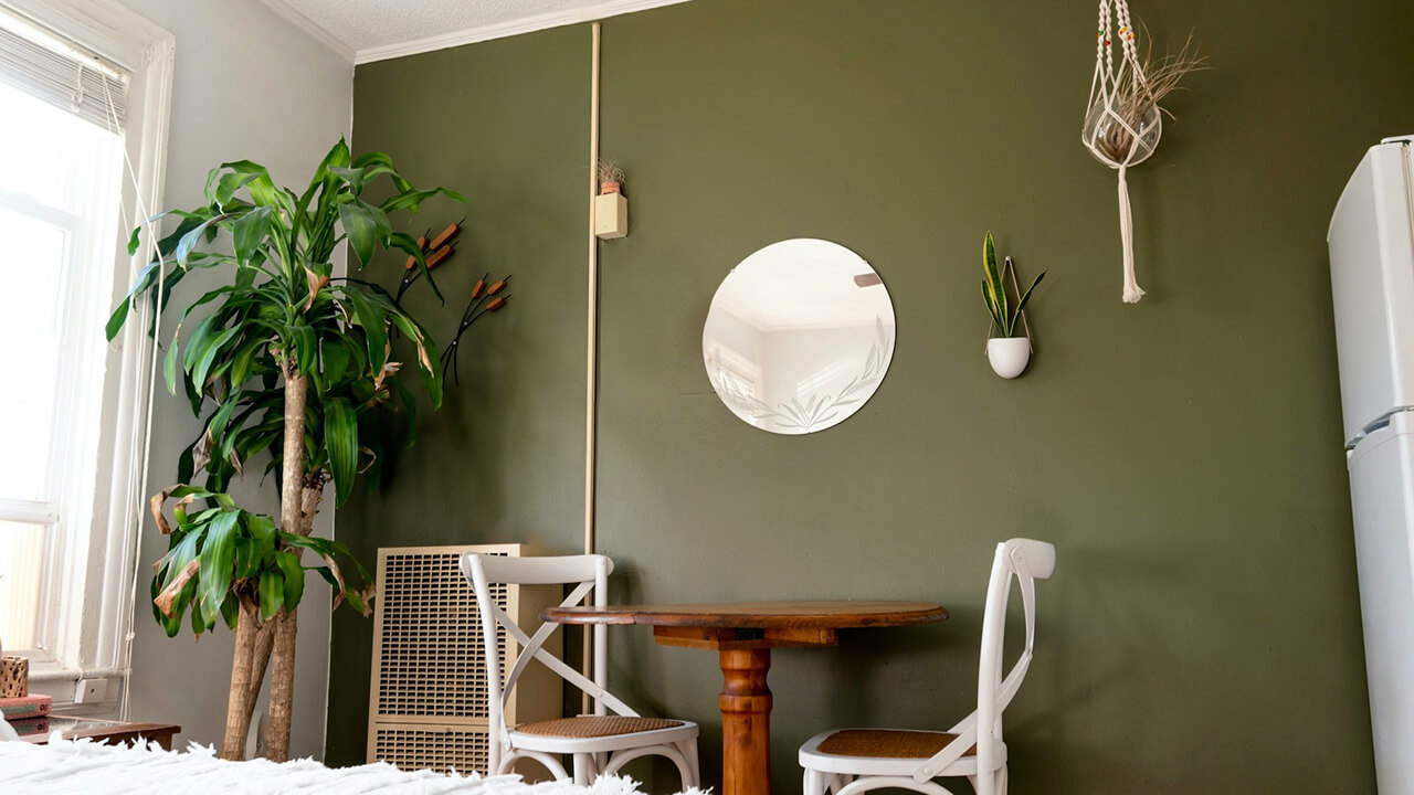
Olive green is a versatile, earthy color that can bring a sense of calm and nature into a room. It’s a popular choice for those looking to create a warm, inviting environment. However, its muted, darker tones can also make a space feel more enclosed. This is particularly true if the room lacks natural light or has low ceilings.
To make olive green work for you, try using it in combination with lighter colors like white or soft yellow. This can help to offset its density, keeping the room feeling fresh and spacious.
Burnt Orange
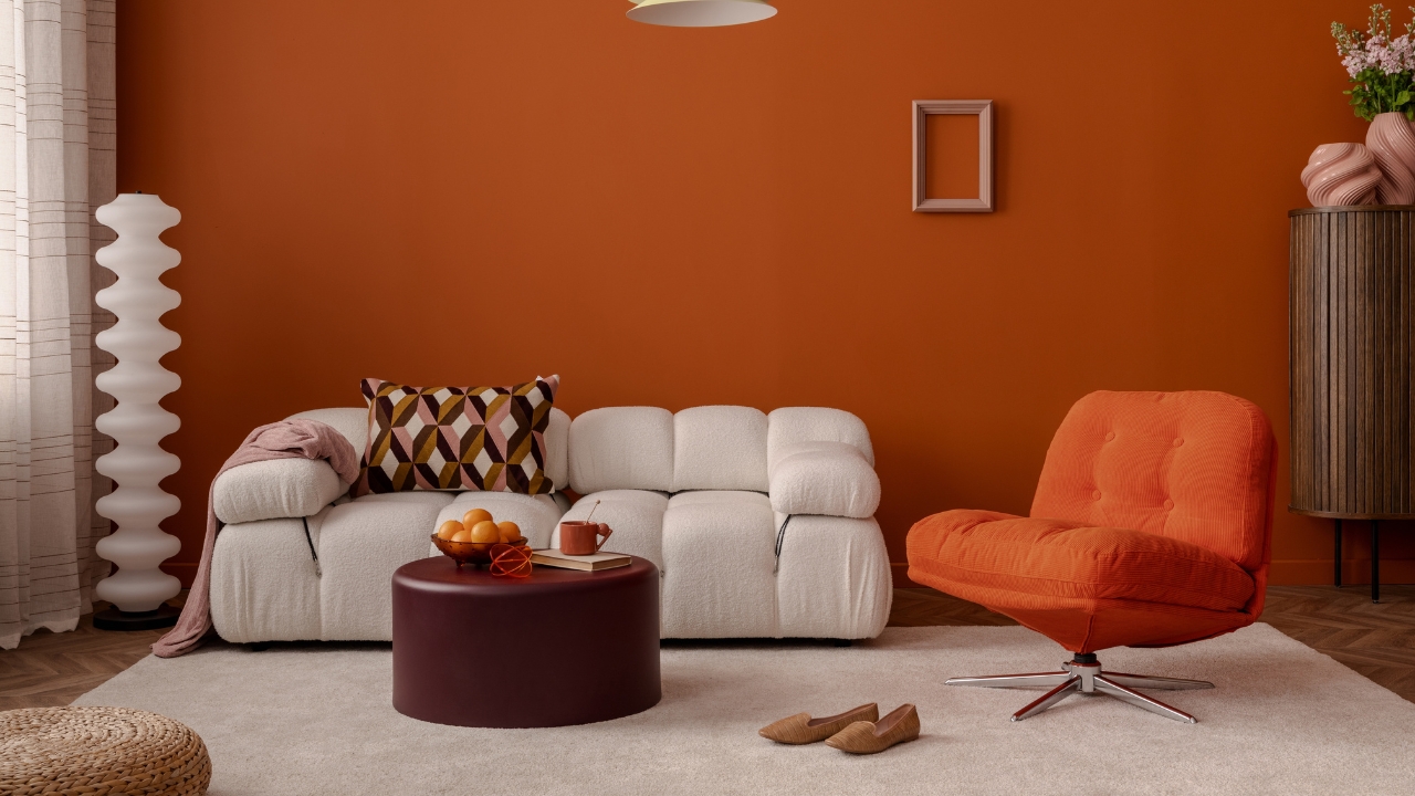
Burnt orange is a vibrant, energetic color that can add warmth and excitement to a room. Yet, its intensity can also make a space feel smaller, particularly in enclosed areas. Designers often recommend using burnt orange sparingly to avoid overwhelming the senses. It works well as an accent color, adding a touch of autumnal warmth without overpowering the space.
Try using burnt orange in textiles like rugs or throw pillows, or incorporate it through artwork. Pairing it with neutral tones can help balance its vibrancy, ensuring the room remains open and inviting.
*This article was developed with AI-powered tools and has been carefully reviewed by our editors.